About Pill Carousel
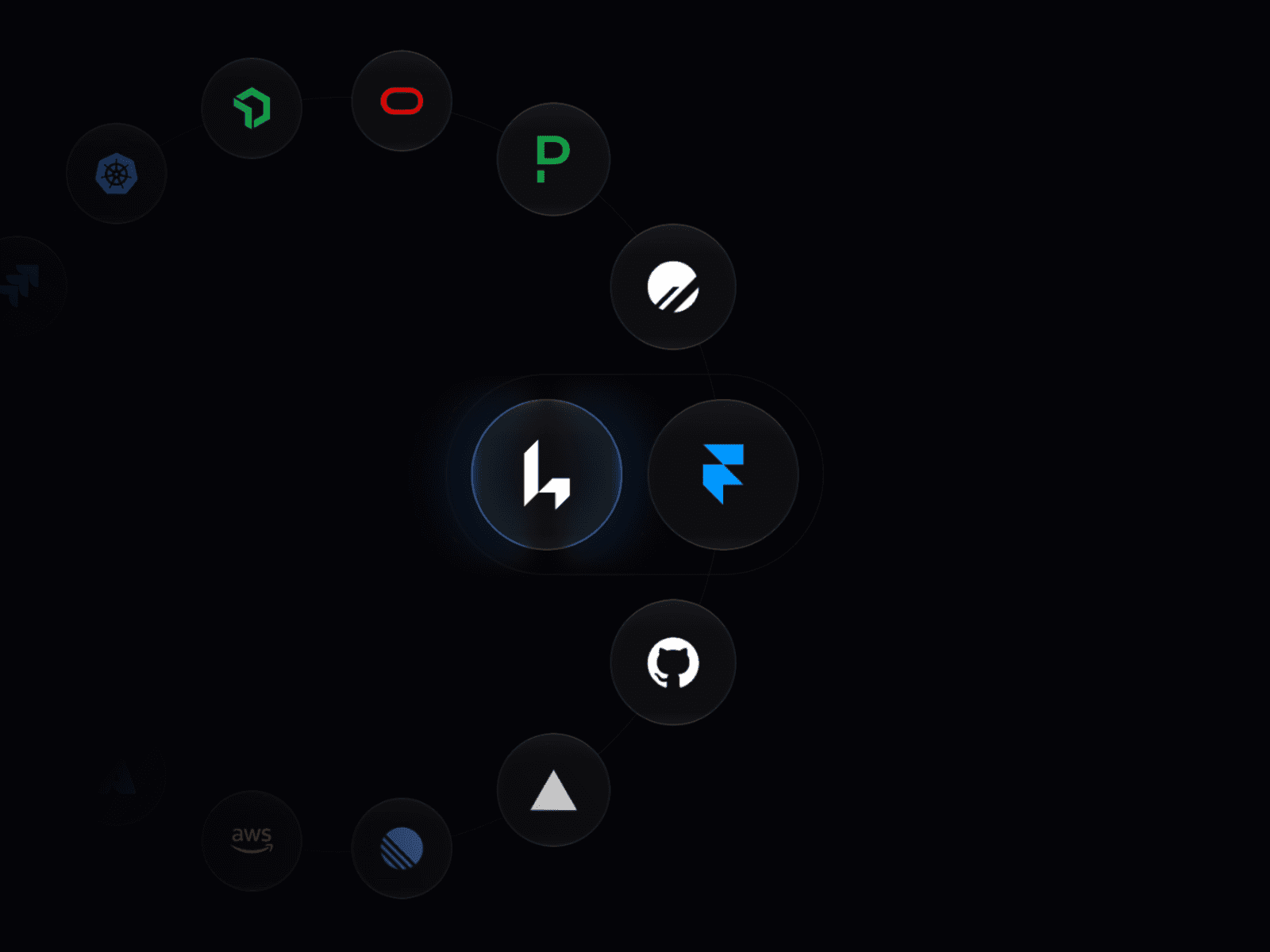
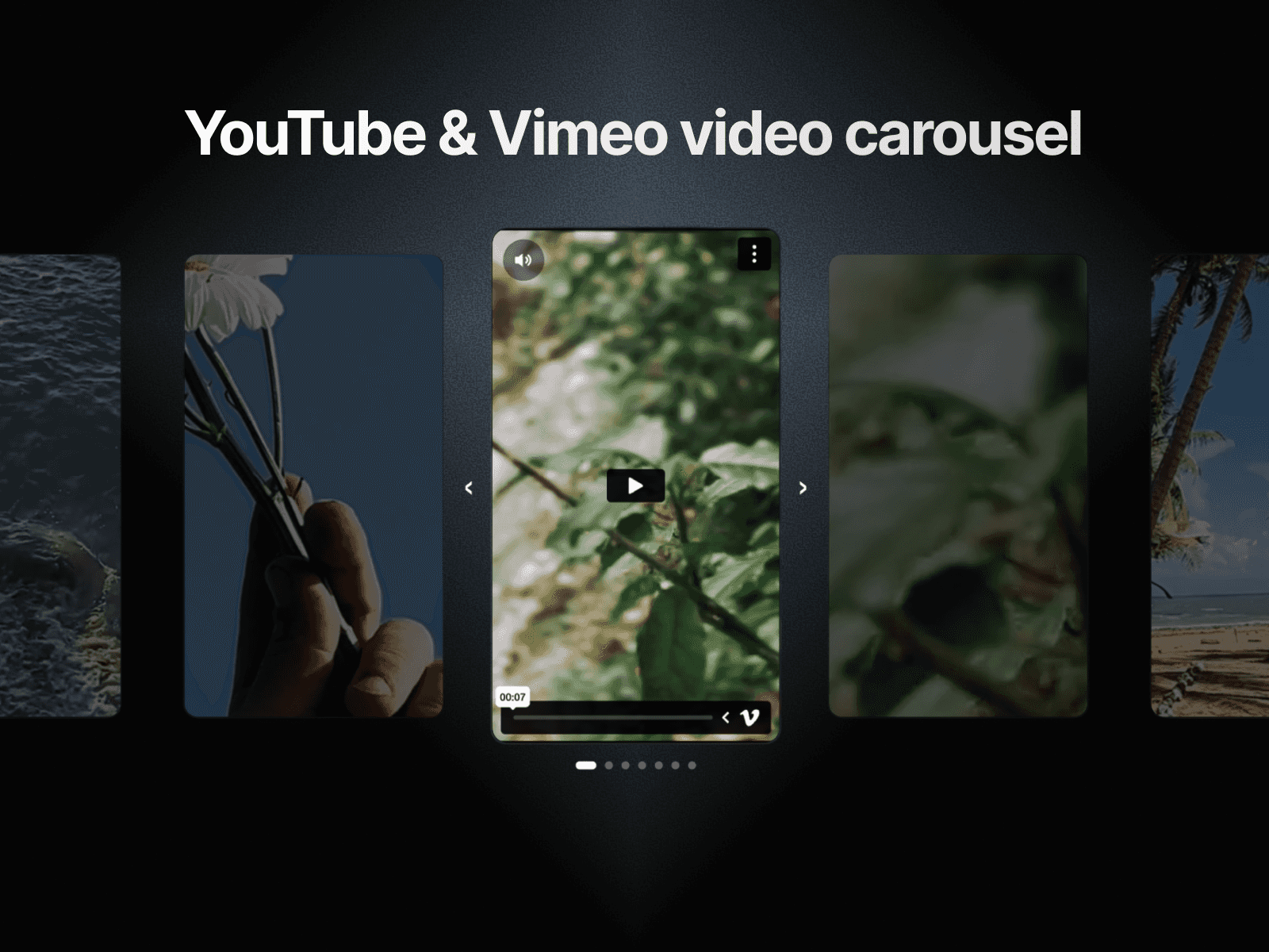
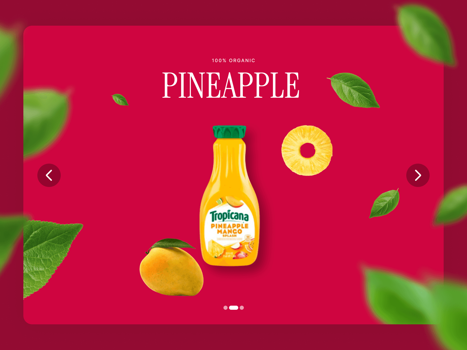
Upgrade your Framer site with a highly interactive, dual-pane media carousel. The Pill Carousel splits your content into an engaging layout: a draggable, scrollable list of navigation pills on one side, perfectly synchronized with a stack of media cards on the other.
Built with custom drag physics and smooth requestAnimationFrame interpolation, it provides a premium, app-like feel.
Key Features
Dual-Pane Synchronization: Scroll or drag the navigation pills to automatically transition the media cards with smooth, physics-based easing.
Infinite Looping: The component simulates an endless scroll, wrapping your items seamlessly in both directions.
Rich Media Support: Add images or auto-playing, looping videos to your cards via direct file uploads or external URLs.
Integrated Iconography: Native support for Phosphor Icons with variable weight controls (Thin, Light, Regular, Bold, Fill, Duotone) and custom SVG code support.
Responsive Layout: Automatically switches from a horizontal row layout on desktop to a stacked column layout on mobile devices, complete with distinct touch interactions (pan-x vs pan-y).
How to Use
Define Items: Use the Framer property controls to add as many items as needed.
Customize Icons: Choose between native Phosphor Icons, custom SVG code, or external URL icons for each item.
Configure Layout: Adjust the mobile breakpoint, pill spacing, card spread, and border radii to match your design system.
Customization Options
List Items: Full management for titles, descriptions, icons, and media (Image/Video).
Layout & Spacing: Extensive controls for spacing, container padding, and responsive breakpoints.
Typography: Advanced font controls for all text elements with mobile/desktop overrides.
UI Colors: Deep control over accent colors, backgrounds, borders, and active/inactive pill states.
Scroll Behavior: Toggle "Wheel Scroll" on or off to dictate whether the component captures mouse-wheel movement or allows natural page scrolling.