About Rhombus Grid
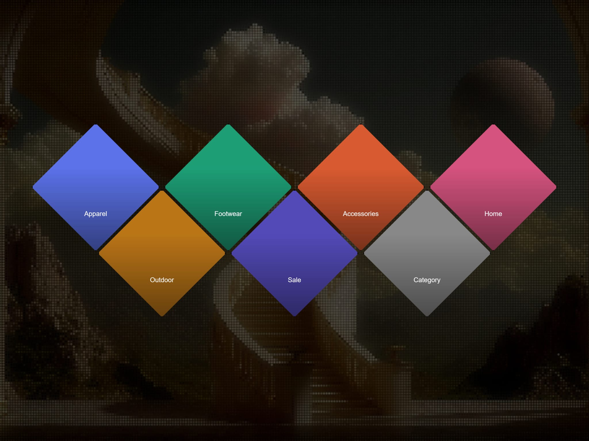
Rhombus Grid is a diamond-tiled grid layout for showcasing product categories, portfolio pieces, services, or any set of image-and-label items — with a clean fallback for narrow screens.
Items Add as many items as needed, each with its own Image, Label, Color (used as a background if no image is set, or while the image loads), and Link.
Layout
Columns — sets how many cells appear in each full row (2–8). Offset rows automatically have one fewer cell, creating the signature jagged diamond silhouette.
Gap — visual spacing between diamonds, from 0 (seamless tiling) up to clearly separated tiles.
Overlay & legibility
Overlay — None, Gradient, or Solid. Darkens the image so labels stay readable.
Overlay Color / Opacity — fine-tune the darkening effect.
Labels
Label Font / Label Color — full typography control.
Label — Always Visible, or Reveal on Hover for a clean image-first look where the label fades in only on interaction.
Border Toggle a stroke around each diamond, with independent Color and Width controls, for a "tile" look instead of seamless tiling.
Hover Effects None, Zoom (image scales slightly), Brighten, or Lift (the tile pops forward with a subtle scale and z-index boost).
Responsive fallback Below a configurable container-width breakpoint, the grid automatically switches from diamonds to a standard rounded-corner grid — set the fallback's column count and corner radius independently. Handled with CSS container queries for reliable behavior on canvas, Preview, and published sites.
Animation Items fade in with a staggered delay as the grid scrolls into view, with a configurable duration. Canvas-safe — shows immediately in the Framer editor without waiting for scroll.
Drop it into any section, add your items, and configure the look entirely from the panel.