About Scroll Highlighter
About
This component a part of the 400+ components, layouts, templates, UI Kits and code overrides from SegmentUI PRO. Click here to see the full library
Instructions
Copy and paste the component into your project file
Customize the properties:
Enter your text content
Set the phrase to highlight
Choose colors for highlight and cursor
Adjust animation settings and trigger positions
Style the font as needed
Test the scroll behavior by previewing your design
How It Works
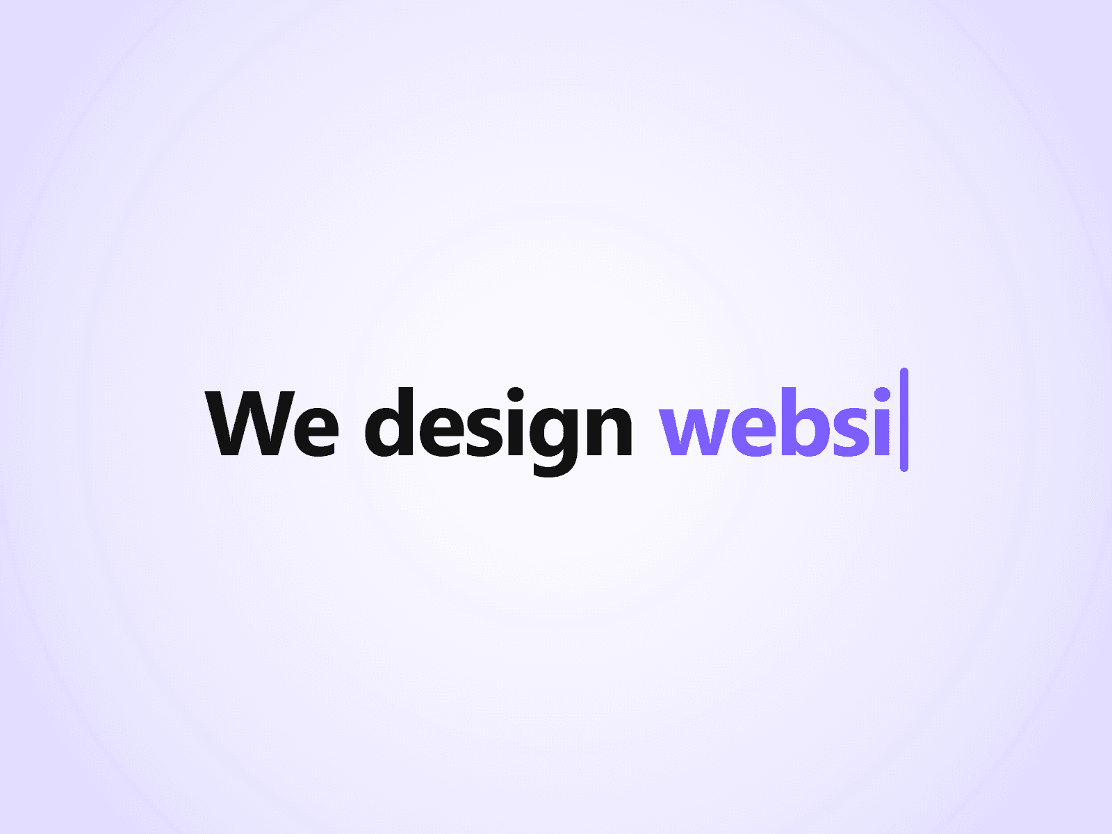
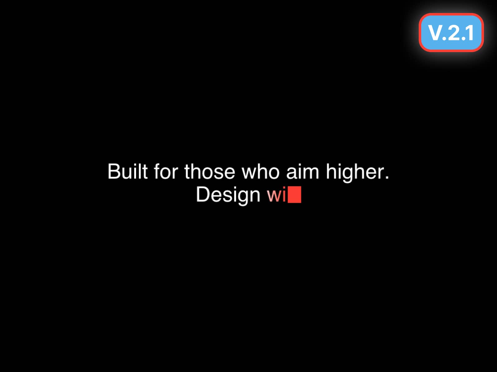
The main way it works is by allowing the user to set up a text string and selecting which word to highlight from the string. Along with that you have a bunch of controls for customising behaviour and appearance.
Highlight Color: Background color for highlighted text
Animate: Toggle the scroll-triggered animation
Show Cursor: Add a typewriter-style cursor
Cursor Color: Color of the cursor
Cursor Thickness: Width of the cursor
Trigger Position: When the animation starts (top/center/bottom of viewport)
Trigger Offset: Fine-tune the trigger position
Font Style: Customize text appearance
Support
For any queries and help setting up the component, contact hello@segmentui.com
Refund Policy
If a component does not function as advertised and the issue cannot be resolved, you are eligible for a full refund under our quality guarantee. Refunds will not be provided for any other reasons, including change of mind, accidental purchase, lack of use, or expectations of features not explicitly advertised.