About SwoopLettro Button
About this Component
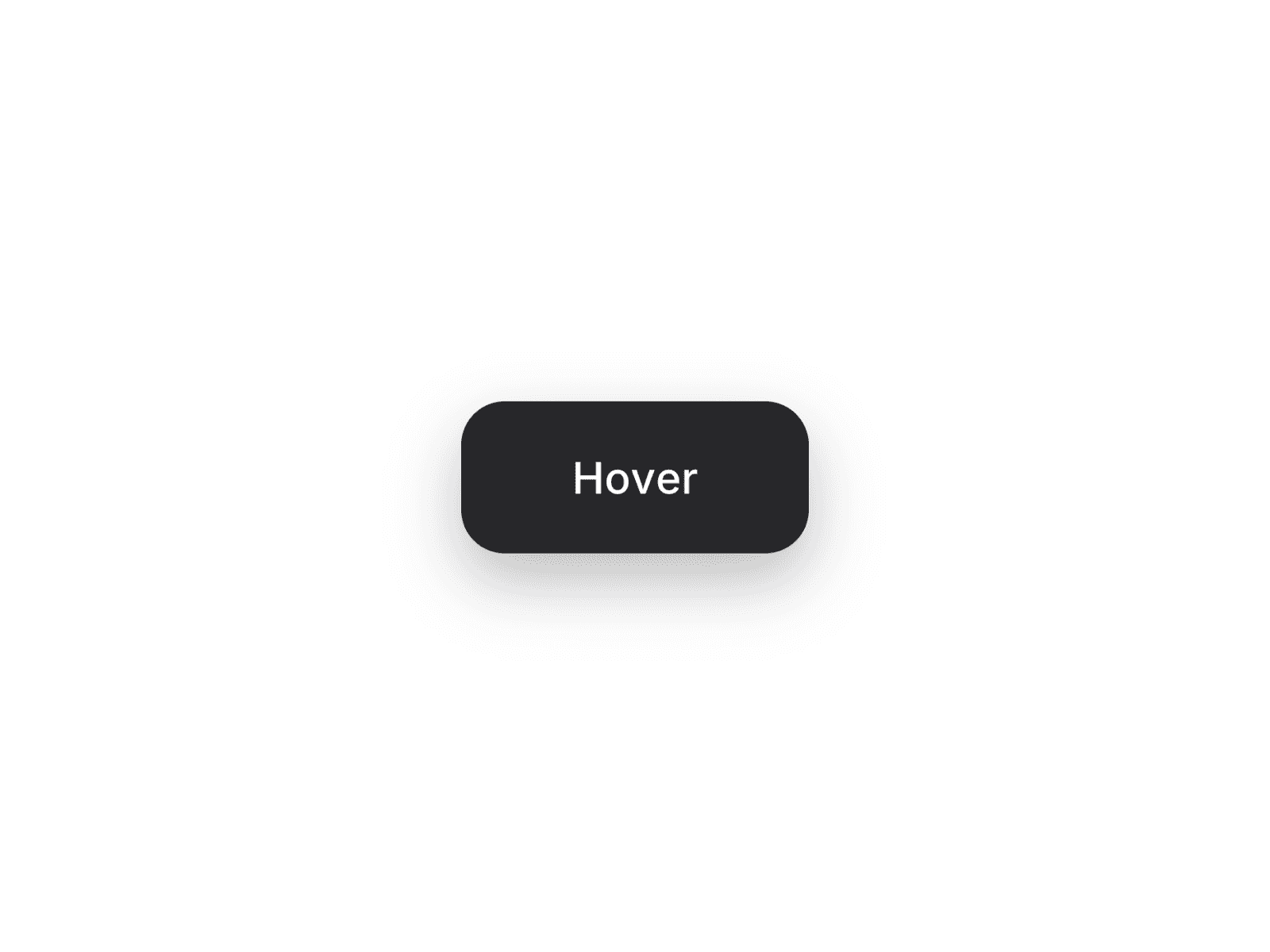
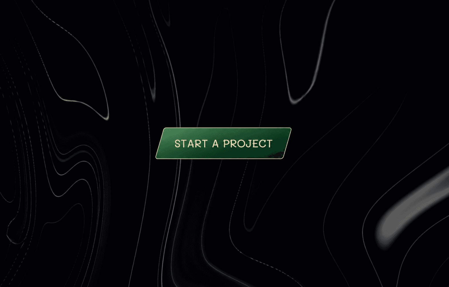
SwoopLettro is an advanced interactive button component in which each character animates independently on hover, with directional motion from above, below, or in an alternating sequence. A synchronized color sweep transforms the background, while a dynamic border sweep activates along the edges to reinforce interaction feedback. The entire system is fully customizable through the properties panel, with no code required.
Features
Per-letter swoop animation — top, bottom, or alternating direction
Staggered letter animation with configurable timing control
Directional background sweep — 8 directions, including diagonals
Gradient or solid fills for both default and hover states
Animated border with sweep highlight on hover
Glossy overlay for enhanced depth and a refined finish
Skew support for editorial layouts
Fully customizable typography and animation timing from the properties panel
Optional link support with new tab handling
Questions or custom requests?
We design and build custom Framer components tailored to your needs. Get in touch at: oceandevsofficial@gmail.com