About Team Card Flip
Features
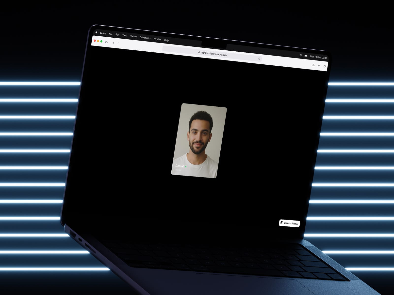
3D Tilt on Hover — The card subtly rotates to follow the cursor, creating a tactile, dimensional feel.
Physics-Based Dragging — Grab and throw the card. It snaps back with spring physics and momentum.
Click-to-Flip — Tap to reveal a back side with the team member's bio or description.
Fully Controllable — Adjust tilt intensity, slide intensity, corner radius, shadow depth, aspect ratio, text size, and more — all from the property panel.
CMS Ready — Every field (name, role, image, bio) maps directly to Framer CMS, so you can scale your team page without duplicating components.
Dark Gradient Mask — An optional overlay keeps text readable over any image. Control the intensity with a slider.
Verified Badge — A subtle green checkmark badge you can toggle on or off per member.
How to Use
Drop the Team Card component onto your canvas.
Customize the look using the property panel — set your aspect ratio, radius, shadow, and colors.
To use with CMS: create a Team collection, add fields for name, role, image, and bio, then connect them to the component's properties.
Duplicate or use inside a CMS-powered list to generate cards for your entire team automatically.
Notes
Works best at card widths between 200–350px.
The 3:4 aspect ratio is the default and works well for headshots.
For a cleaner look, disable dragging and tilt — the flip interaction works great on its own.
All interactions are mouse-based and optimized for desktop. On mobile, the flip interaction is the primary interaction.