About Velocity Carousel
✦ Make your content the center of attention.
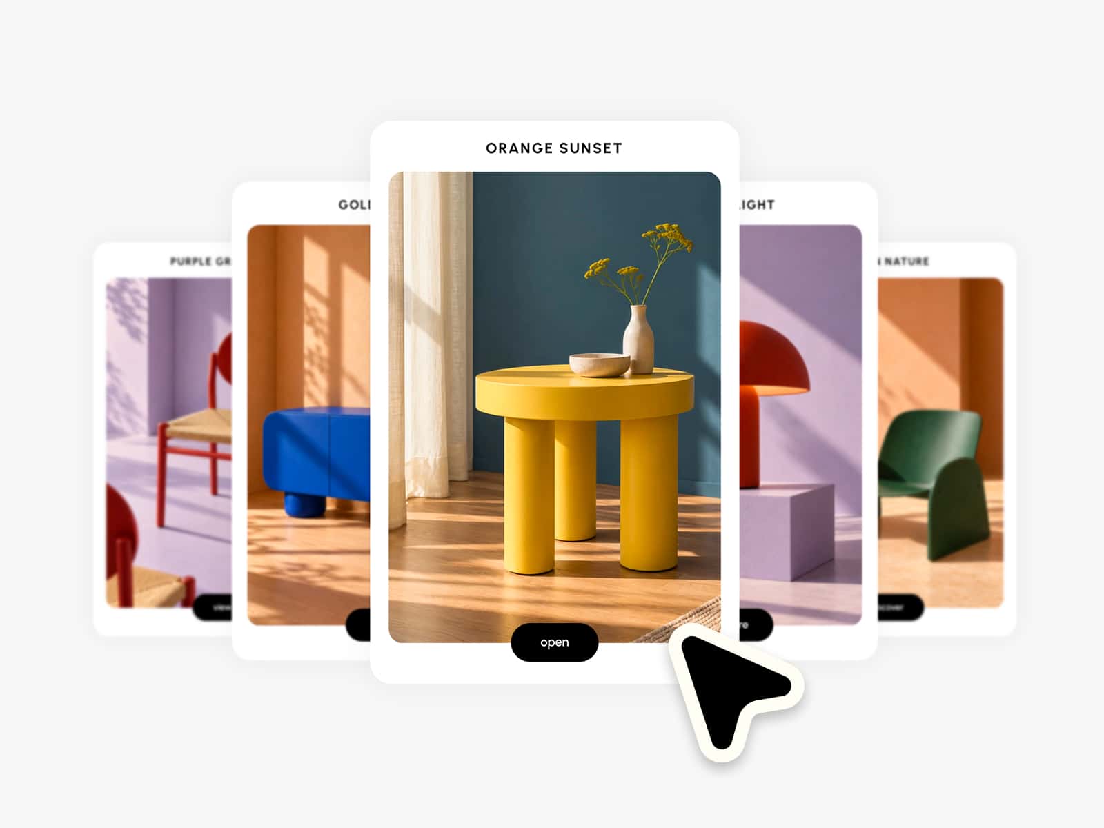
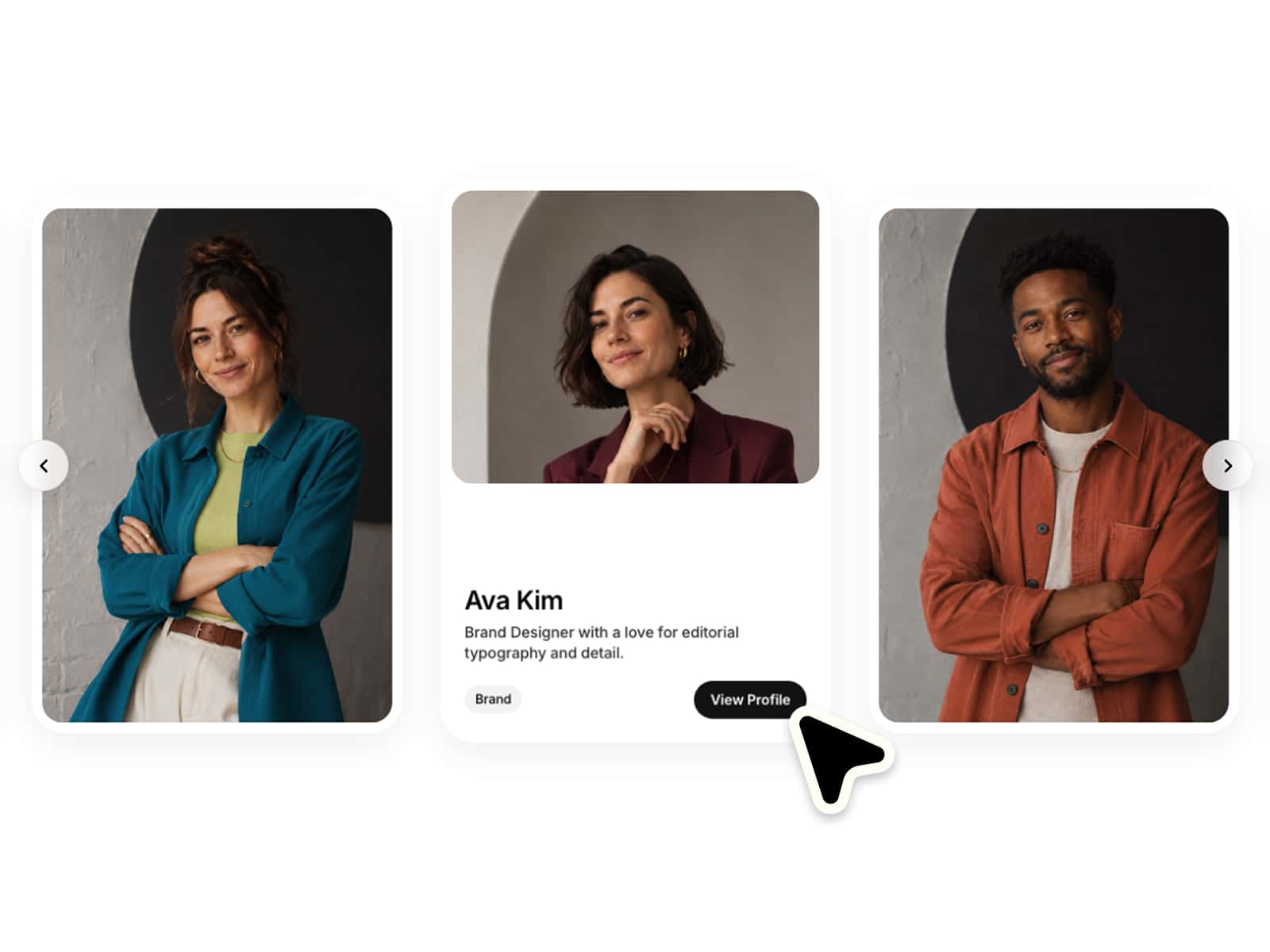
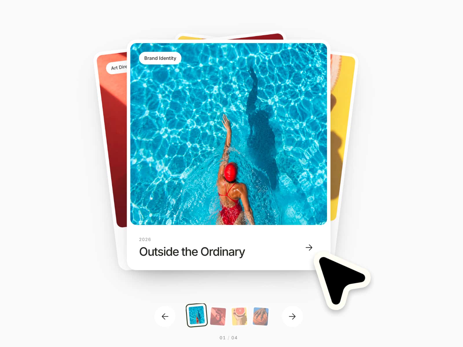
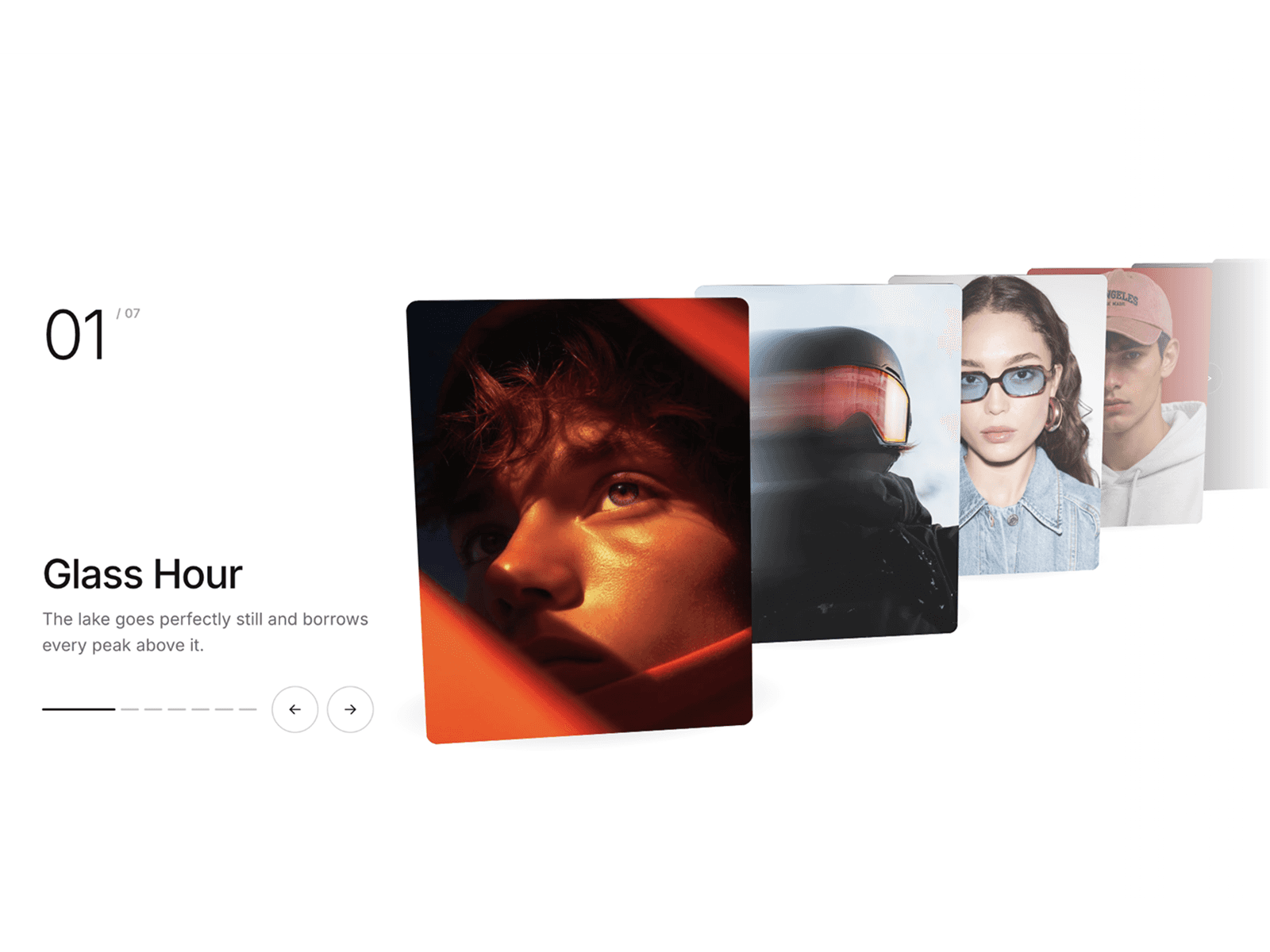
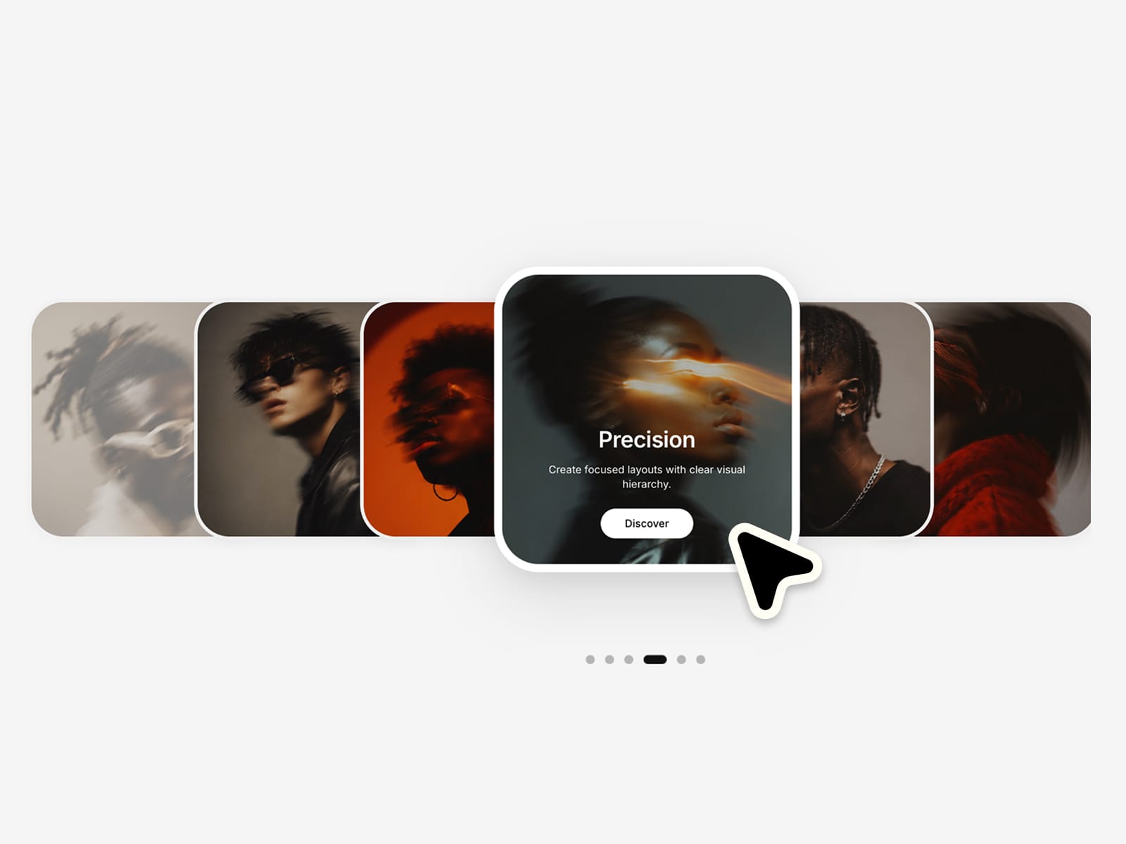
Create elegant card carousels with a centered focus, smooth interactions and a clean editorial layout. Fully responsive, easy to customize and ready to use in seconds. Make it completely your own with flexible controls for layout, styling and motion :)
⚙ What you can customize
Easily adapt every part of the component to match your own brand and style.
Images ✦ Headlines ✦ Text ✦ Button labels ✦ Links ✦ Active & inactive scale ✦ Card gap ✦ Mobile overlap ✦ Border radius ✦ Border width ✦ Overlay color & opacity ✦ Shadow intensity ✦ Animation speed ✦ Typography ✦ Background color ✦ Indicator color
🎯 Perfect for
Portfolio sections ✦ Project showcases ✦ Service highlights ✦ Case study previews ✦ Product storytelling ✦ Landing pages ✦ Brand presentations ✦ Feature sliders
📱 Responsive by default
Optimized layouts for Desktop, Tablet and Mobile with smooth touch interactions and perfectly centered cards.
🖱 Included interactions
Drag & swipe ✦ Click to focus ✦ Keyboard navigation ✦ Dot indicators ✦ CTA buttons ✦ Smooth transitions
🔗 Live Preview
https://velocitycarousel.framer.website
––––––––
❤ Thank you so much for your support! I genuinely appreciate every download. I hope you have fun customizing this component and making it your own. Happy building!