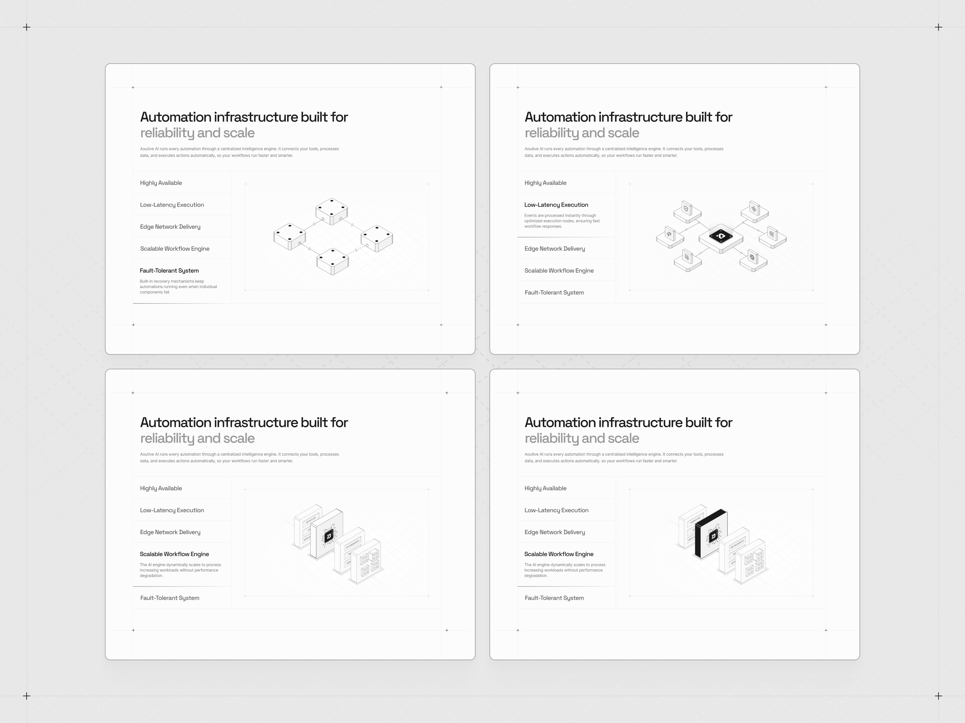
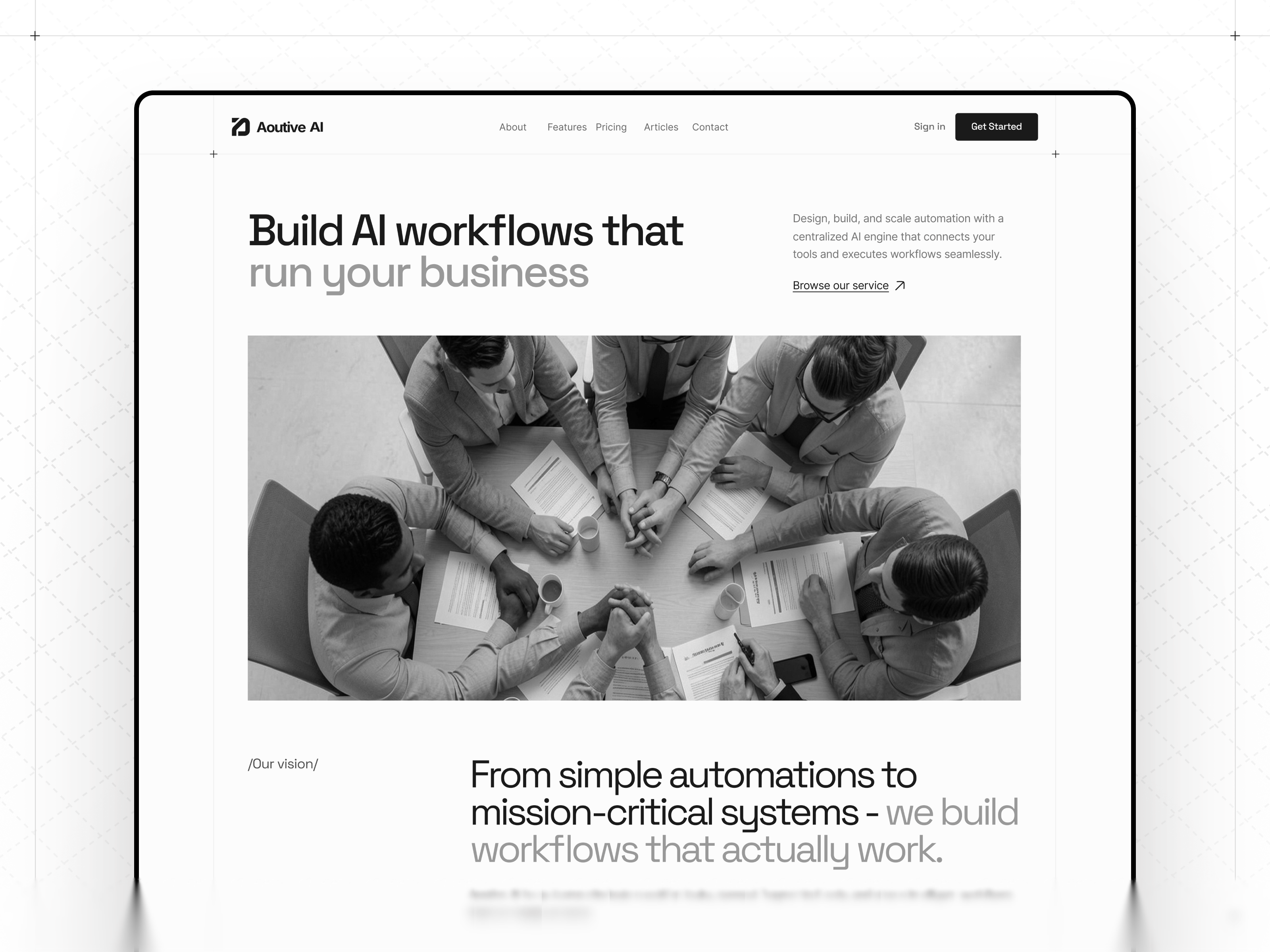
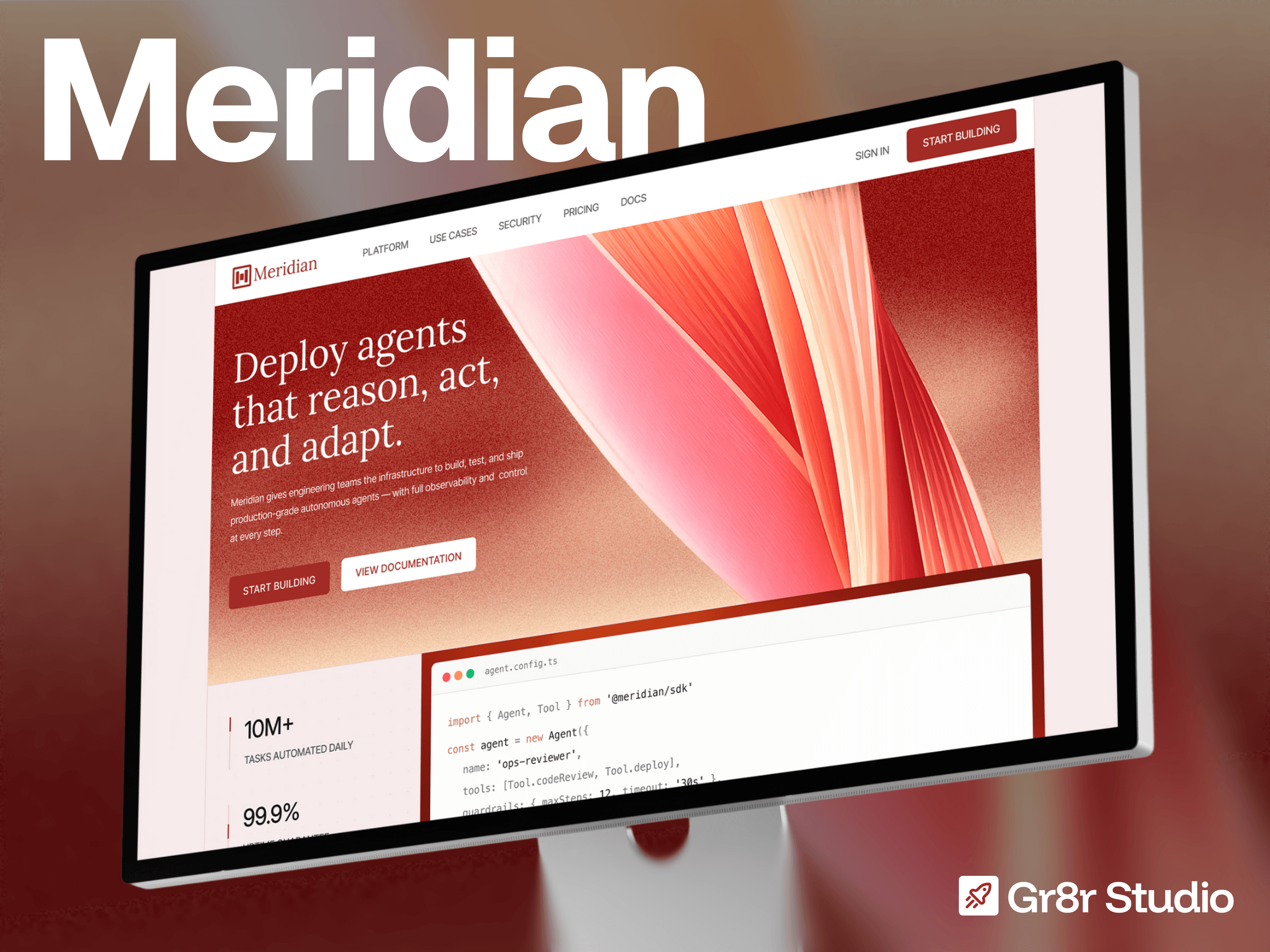
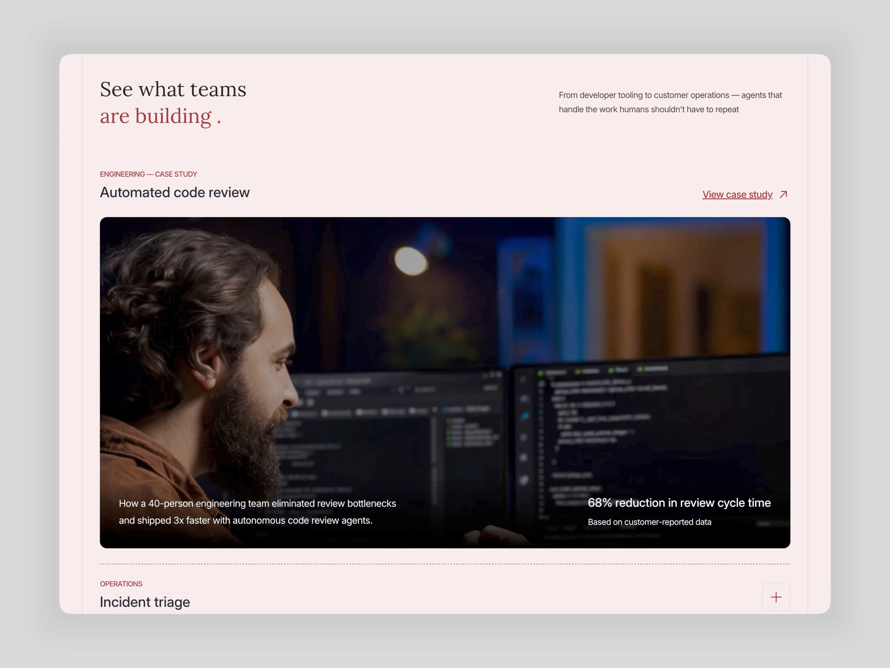
Talon is live. A dark AI detection and investigation Framer template with an eight-card feature grid, six detail sections, lifetime pricing tiers, and a changelog page across 9 pages. Built for AI detection and intelligence products.
Talon·Template

Your Growth Partner For SAAS, AI & Startup Founders. Framer Certified Partner & Expert. Open to Collab. DM me at hello@gr8rstudio.com
Talon is live. A dark AI detection and investigation Framer template with an eight-card feature grid, six detail sections, lifetime pricing tiers, and a changelog page across 9 pages. Built for AI detection and intelligence products.
A gradient square with a lightning bolt in it.
That is the feature card every SaaS template ships with. Icon, three words, move on.
I stopped doing that.
Every feature card in this CRM build shows an actual screenshot of the product. Real interface. Real data in the table. Real filter dropdown open.
Here is why that matters.
Nobody buys B2B software because the feature list sounded good. They buy it because they looked at the interface and thought "I could work in that."
An icon says the feature exists.
A screenshot says the feature is built.
Those are very different promises, and buyers can feel the difference even if they cannot name it.
→ Icons are cheap to design and cheap to believe
→ Screenshots force you to actually have the product
→ A blurry screenshot beats a beautiful icon
If you are designing for a SaaS founder, ask them for UI before you ask them for copy.
The product is the hero. Everything else is framing.
Grab it for free - https://framer.link/pnpXadg
My AI SaaS templates get all the attention.
My landscaping template gets the remixes. 189 and climbing: more than most of my AI ones combined.
Local businesses need websites too. And almost nobody is building for them.
Free Framer landscaping template → https://framer.link/otjmJe0
Norell is in second place in the free template category!
Here is the free remix link: https://framer.link/CVlmpWG
Most portfolio sites lose the client in the first 3 seconds.
Not because the work is weak.
Because the page is too loud.
Three fonts. Five colors. A hero that talks about "passion" before it shows a single project. The visitor can't tell what matters, so they leave.
I built Norell on the opposite bet:
→ One bold wordmark. Say who you are, once.
→ One quiet line. Say what you do.
→ Then get out of the way and let the work carry the page.
Big type isn't decoration here. It's hierarchy doing a job: telling the eye where to go first.
When you cut everything that isn't pulling weight, the work starts to look more expensive. Same projects. Better frame.
Restraint isn't the safe choice. It's the confident one.
Every agency template uses the same testimonial:
A headshot, a quote, a company name.
Morphe uses video. Watching a real client talk sells the studio better
than any written quote, and almost no free portfolio template includes it.
Free Framer agency template → https://framer.link/s1rwUHg
Free AI writing & content template: problem-first homepage,
6-operation grid, transparent pricing, CMS blog.
Remix it free → https://framer.link/yfBblT7
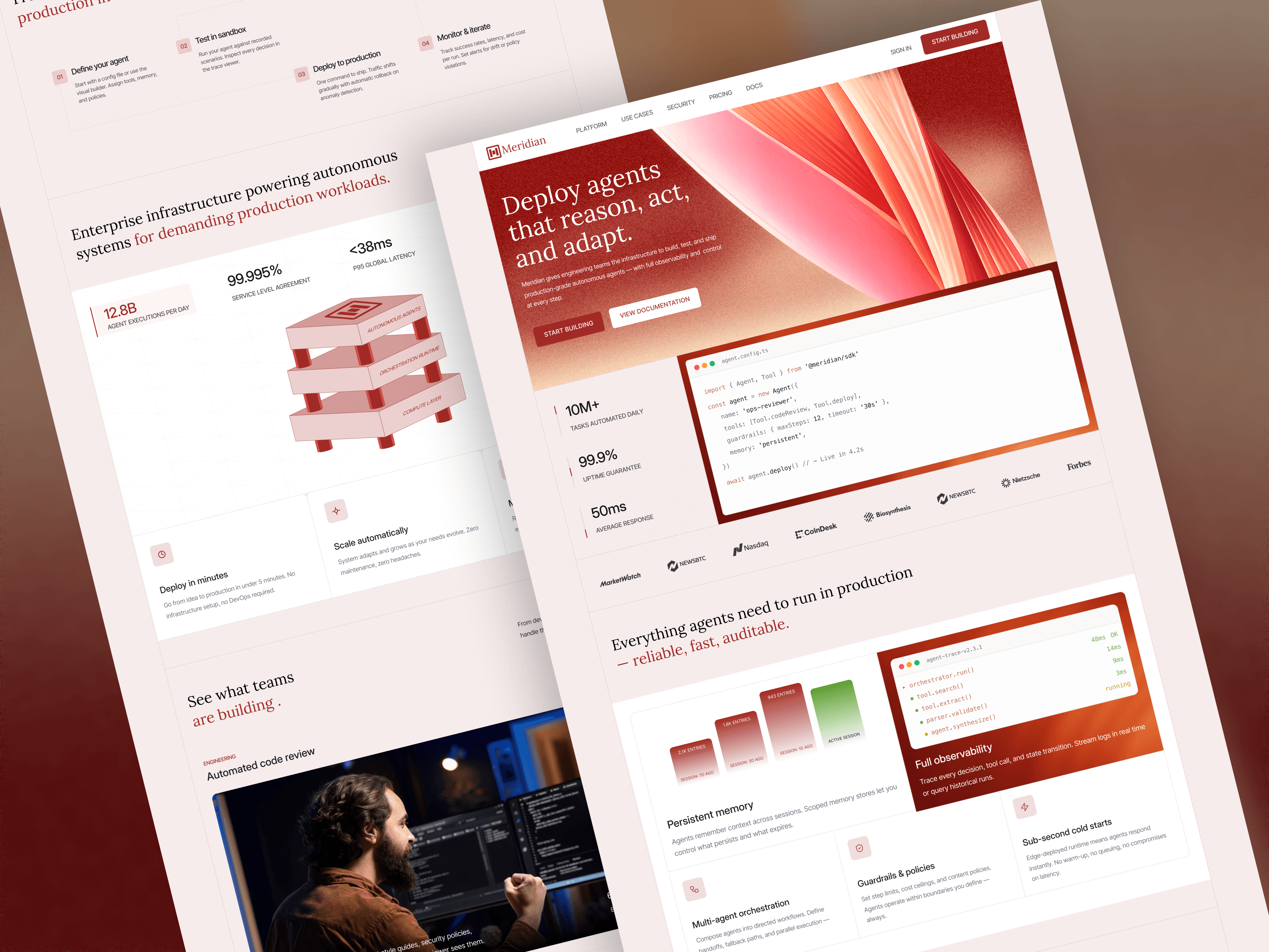
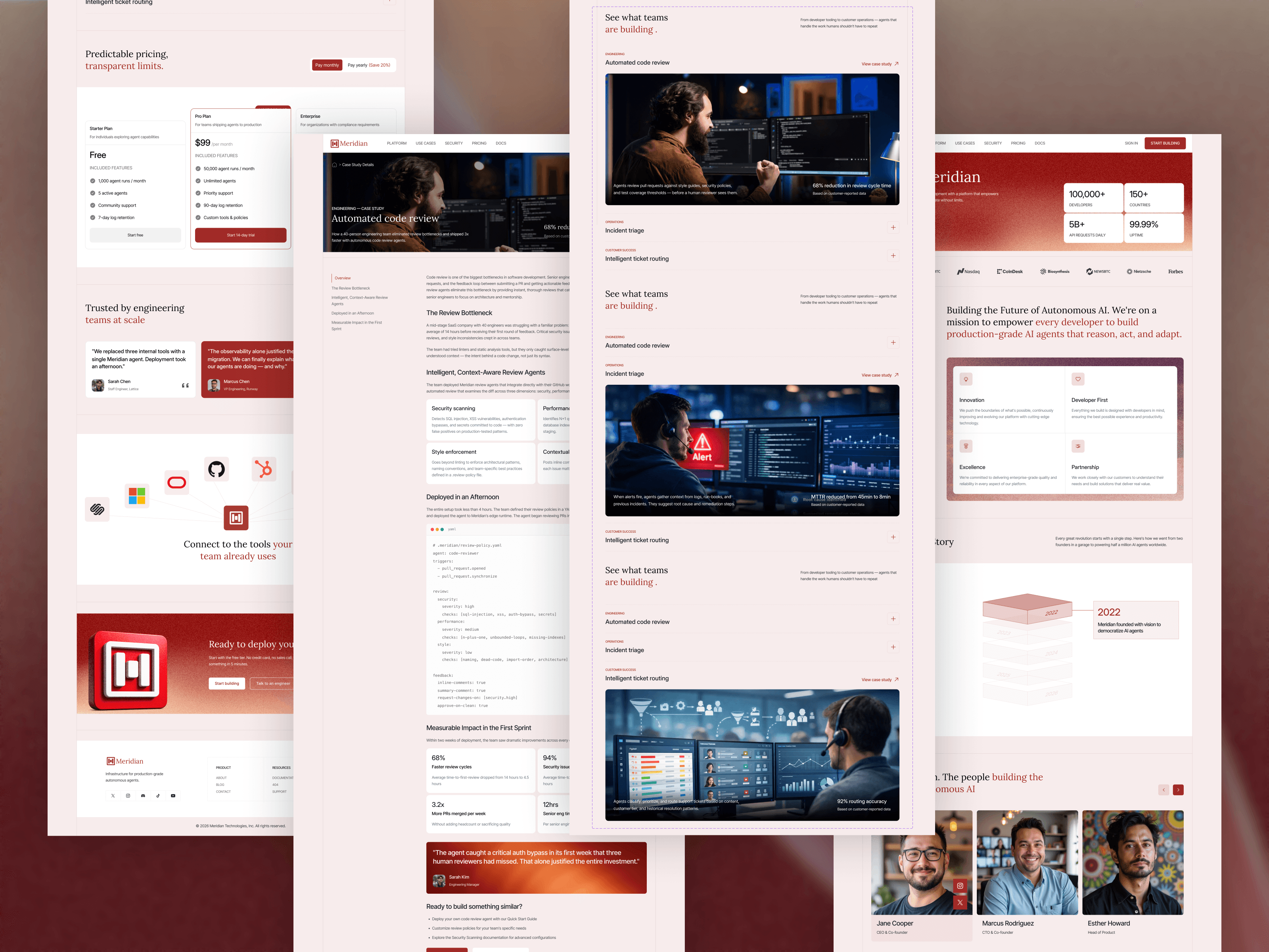
Just launched AgentForge, an AI agent developer platform Framer template. Dark developer aesthetic, four-step process section, insights tabs, three-tier pricing, and a community section. Built for AI tooling and infrastructure startups.
Free AI sales & CRM template: 11 pages, light theme, CMS blog plus a full integrations ecosystem with detail pages.
Monthly/yearly pricing toggle built in. Remix it, rename it, ship it.
Most AI agency sites are one long landing page. Then the case studies pile up, the blog starts, and the page breaks.
Prisam is a free Framer template built for what comes after launch. Dark, minimal, CMS-ready.
Home · About · Pricing · Blog + Details (CMS) · Contact · 404
Sticky scroll sections, lead capture forms, project styles for one-click rebranding.
Myniq is a free Framer template for AI SaaS startups, automation platforms, and AI agent products. Light professional design with a purple-orange palette, dashboard mockups, and 11 pages ready to launch.
What's inside:
→ Conversion-focused homepage with hero, social proof, and multi-CTA flow
→ Features, Integrations, and Pricing pages with tiered plan comparison
→ Dashboard mockups and analytics displays that make the product feel real
→ CMS-powered blog and careers pages
→ About, Contact, Legal, and 404 — the full site, not just a landing page
Pages: Home · About · Features · Pricing · Integrations · Blog (CMS) · Careers · Contact · Privacy · Terms · 404
Built for AI and SaaS founders who need a complete product website — not another one-page template.
The rest of the Gr8r Themes catalog goes deeper.
Taskzen is a free Framer template for AI startups and SaaS landing pages, with a light theme, in a marketplace full of dark ones. Light signals trust. Dark signals gaming.
→ Conversion-focused hero, social proof, feature grid
→ Pricing table, testimonials, final CTA
→ Scroll animations + Project Styles for instant rebranding
→ Optimized desktop, tablet, and mobile breakpoints
Built for fintech, healthtech, legal, and B2B founders, the industries where dark mode feels wrong.
A dashboard preview in the hero does what no headline can.
Show the product working before you describe it. Screens are proof; words are claims.
I published DataAI in 2024. I updated it again last month.
Old free templates don't die; abandoned ones do.
Maintenance is the marketing nobody sees.
Most free templates give you a homepage and a contact form.
Filo ships with 13 pages, CMS, and a full dashboard UI for free.
I deleted every testimonial on this agency site and rewrote them.
Here's why.
The originals said things like:
"Working with them was amazing. They captured our vision perfectly."
Nice words. Zero proof.
Any agency could paste that quote on any website. That's the problem — praise that fits everyone convinces no one.
So I changed the rule:
→ Every testimonial must contain one number or one specific moment
→ Our close rate on inbound leads doubled in six months
→ They pushed back when our ideas were weak
Notice the second one isn't even flattering. That's what makes it believable.
Vague praise reads like marketing.
Specifics read like memory.
Next time you add a testimonial, ask one question:
Could a competitor paste this exact quote on their site?
If yes, it's not doing anything for you.
Agency websites make the same mistake in every niche.
They sell the service. Nobody buys the service.
Think about what's in a client's head before they hire:
Not "Is SEO good?"
But "what happens after I pay these people?"
That question is wholesale.
And most agency sites never answer it.
Here's the fix I use on every service business site:
→ A numbered process section. Step 1 to step 4.
→ Each step says what happens and when
→ Suddenly the client can picture the engagement
→ Picture it, and the fear of paying disappears
Services are invisible. That's the problem.
A process section is how you make them visible.
You're not selling SEO. Or design. Or ads.
You're selling "here's exactly what happens next."
Agency folks: does your site show your process, or just your promises?
The fastest way to kill a good design: copy that's too specific.
I rewrote a full SaaS site this week, and one lesson stood out.
The design was solid.
The copy said, "built for trucking operations."
Every visitor who isn't in trucking has left.
Here's the rule I follow now:
→ Copy should be concrete enough to feel real
→ But open enough that people see their own product in it
→ "Automate documents, messages, and reports" beats naming one industry
→ Specificity sells to one buyer. Projection sells to all of them.
Designers obsess over spacing and type.
Then paste in the copy that undoes all of it.
Copy is not the content. Copy is part of the design.
Do you write your own copy, or design around placeholder text?
The best marketing decision I made wasn't a post.
It was making a free version of my most valuable work.
Most creators protect their best designs.
I stripped mine down and gave it away.
Here's what a free version actually does:
→ It removes the risk of trying your work
→ It puts your design quality in front of people who'd never pay first
→ It turns every user into a preview of the paid version
→ It markets itself while you sleep
The free version isn't the product.
It's the proof.
People don't buy from creators they haven't tested.
Would you ever give away your best work for free?