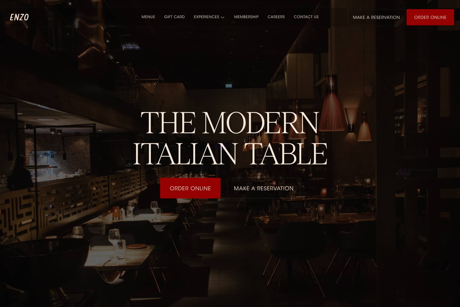
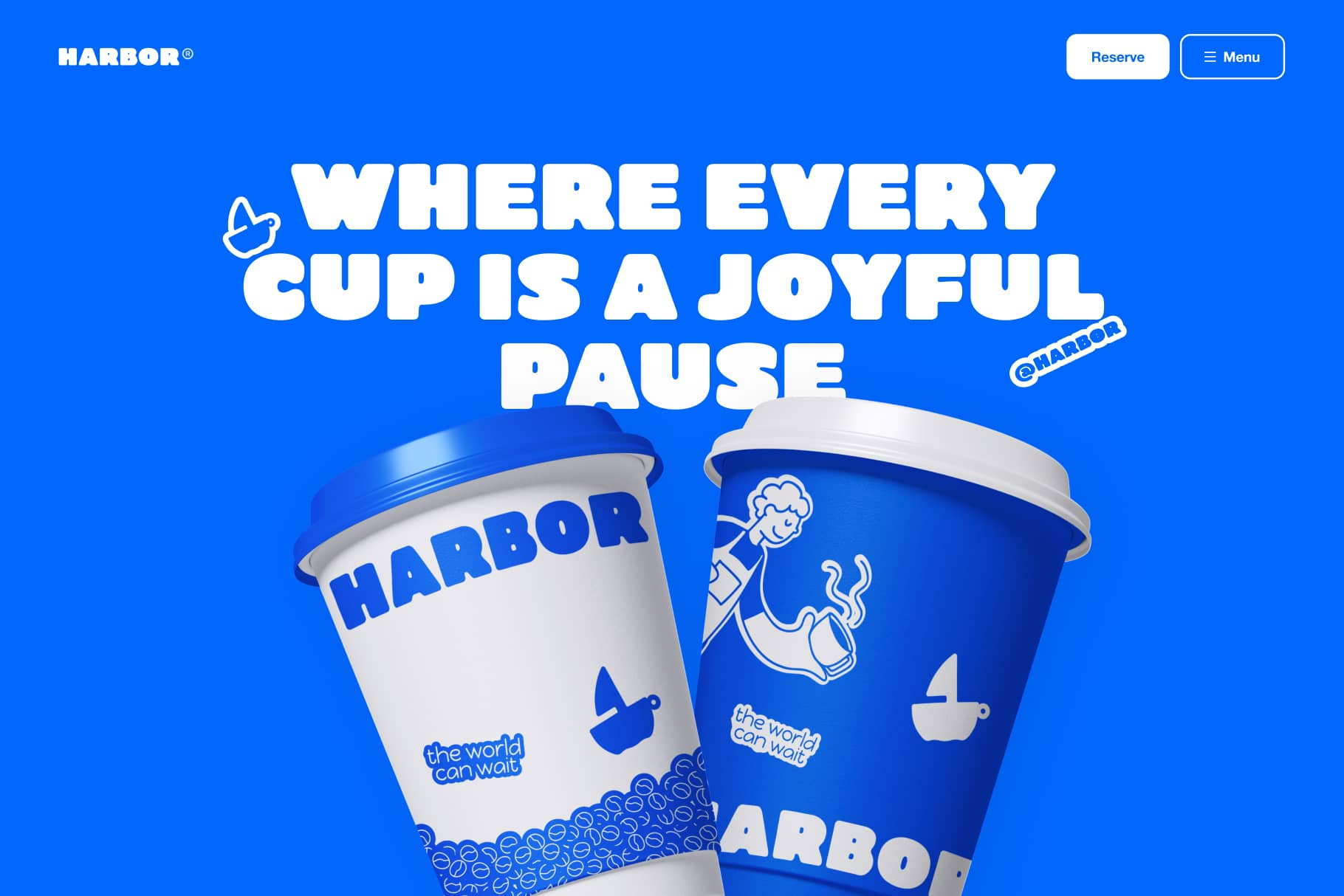
The state most template buyers see first is the one you never designed.
Most Framer templates get built and previewed with a full, tidy set of demo content. Six testimonials, nine projects, a packed blog. Then a real buyer opens it with one testimonial and two projects, and the section that looked abundant now looks empty and off.
The fix I build into every CMS section now is to design the thin states on purpose:
One item: does the grid still balance, or does a lonely card float in dead space.
Zero items: is there a real empty state, or just a section header hanging over a gap.
Long content: does a 90 character title still sit right (size the text off its container, not a fixed value).
Demo content flatters the template. Sparse content is what the buyer actually has on day one. If it holds up empty, it holds up everywhere.
What is the first section that breaks for you when the content runs thin?


