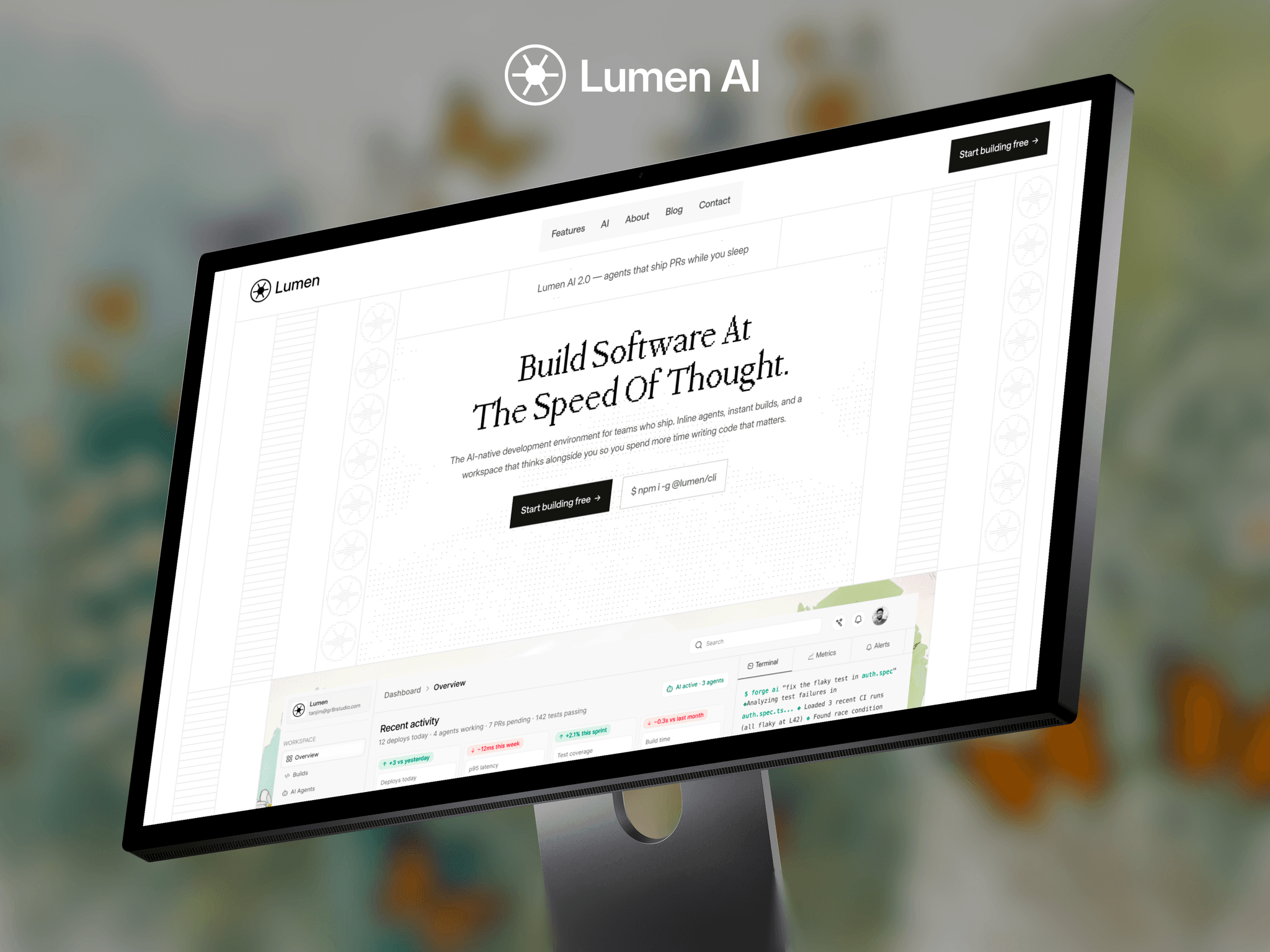
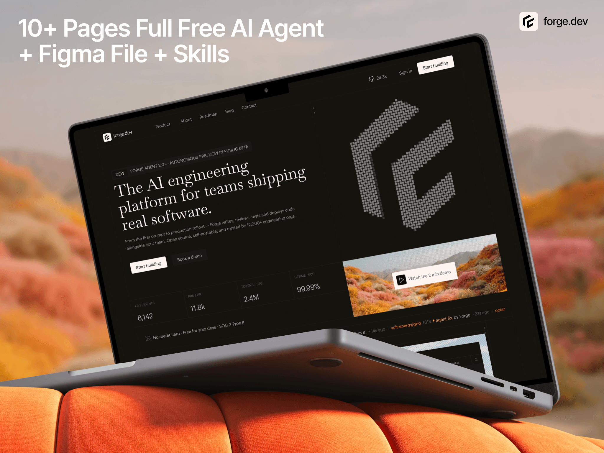
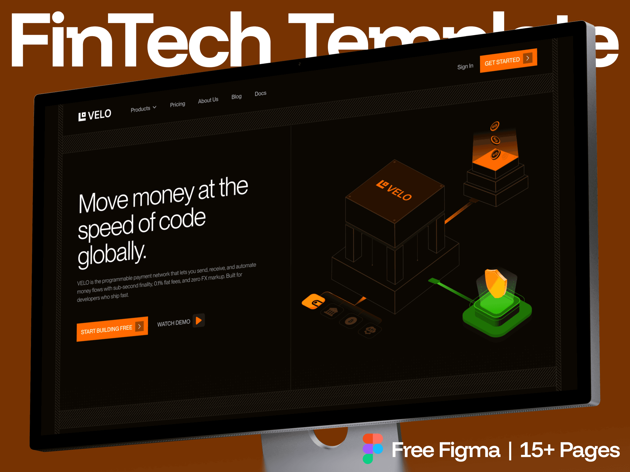
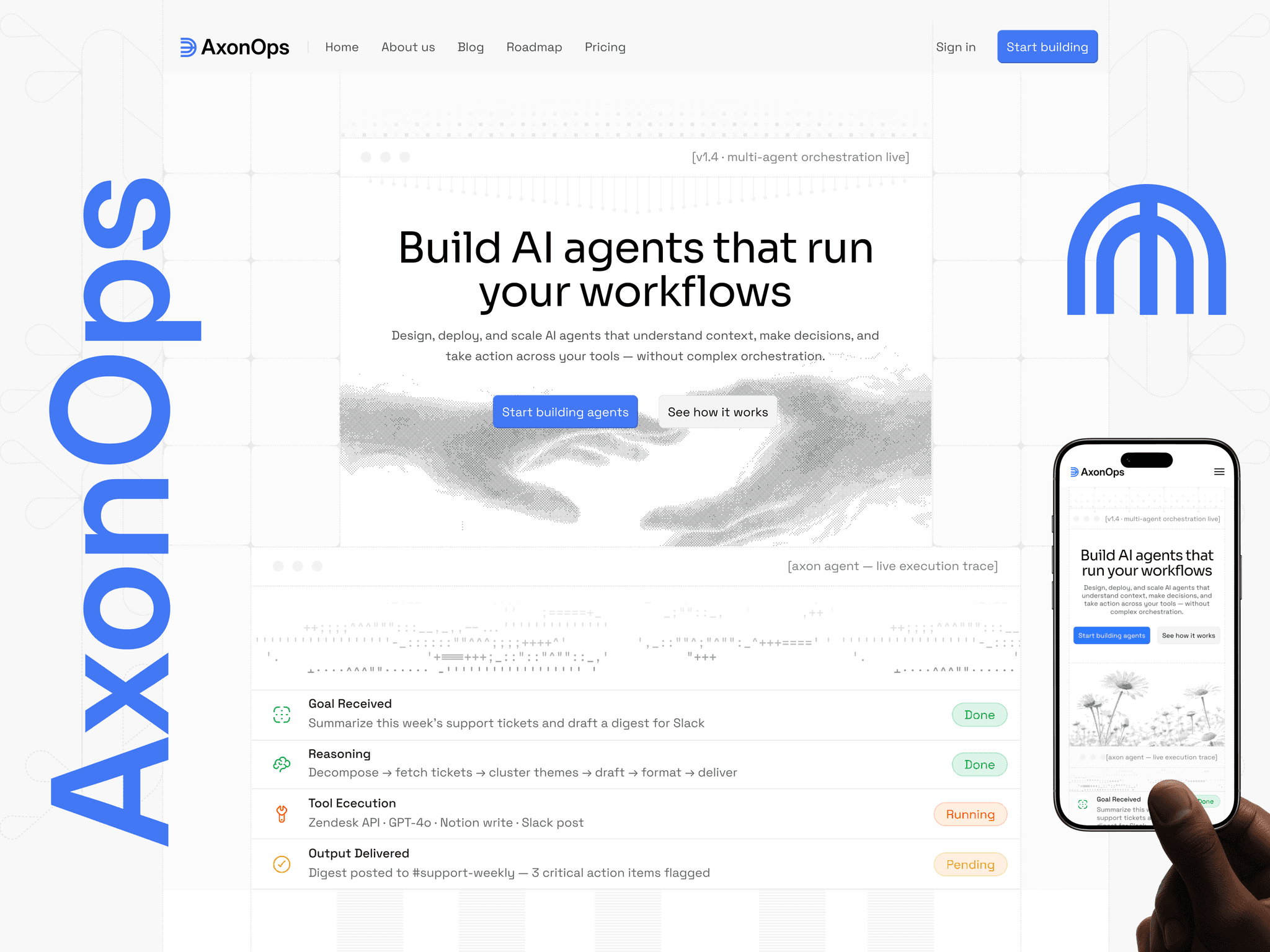

Your Growth Partner For SAAS, AI & Startup Founders. Framer Certified Partner & Expert. Open to Collab. DM me at hello@gr8rstudio.com
Lexaro - AI Writing & Content Operations Framer SaaS Website ✨
Free Remix Link 👉 https://framer.link/rZ9QatE
Do you need Free AI SaaS Website ! Take it Freely 👉 https://framer.link/moATC13
Most free AI SaaS templates use the same self-serve formula - pricing table, "Start Free Trial," done.
Enterprise buyers don't convert like that.
This one skips the pricing page entirely. Every CTA leads to "Request a Demo," because enterprise deals get closed by a person, not a checkout button.
→ Tabbed product sections instead of a feature list - Revenue Intelligence, Sales Automation, Customer Insights, Operations
→ A CEO quote instead of a wall of testimonials
→ A 4-step onboarding walkthrough that answers "how hard is this to switch to" before anyone asks
Built dark, minimal, and deliberately serious - because enterprise buyers trust boring before they trust bold.
Coffee Shop & Cafe Free Framer Website ✨
Free Remix Link 👉 https://framer.link/7B1EonQ
What do six completely different SaaS hero sections have in common?
Purple gradient. Clean white. Financial app. AI chatbot. Different colors, different products, same bones.
→ One headline that says what the product does, not what it "empowers."
→ One primary CTA. Never two competing for the same click.
→ Proof right under the headline - reviews, user count, trusted-by logos.
→ A product screenshot doing the convincing, not a paragraph.
Six templates, one formula.
The style changes. The structure never does.
All free to remix if you want to study how each one builds it differently.
Which hero section style pulls you in first?
If you wanna take these free remixes, go here 👉 Click me
Take the free remix - https://framer.link/rZ9QatE
One sentence.
That's all it took to undercut an entire page.
The template pitches consistent, on-brand writing across every document your team produces.
One line on the same page had a grammar slip.
→ Nobody reads slower than someone evaluating a writing tool.
→ The pitch and the proof are the same page. They have to match.
→ A tool selling "consistency" gets judged on it, not just described by it.
I check every other line of copy before publishing.
I almost never reread the line explaining what the product does.
That's usually the one that needs it most.
Where have you caught your own copy contradicting your own pitch?
Take free remix from here - https://framer.link/NBIYJd6
I stopped writing "cutting-edge" and "game-changing" in template copy.
Nobody believes it anymore. It's just noise now.
→ Specific beats impressive every time.
→ "Routes exceptions mid-workflow" tells a buyer more than "revolutionary AI."
→ Vague copy makes people scroll past. Concrete copy makes them read the next line.
If your copy could describe any AI product, it's not describing yours.
What's a phrase you've cut from your own copy?
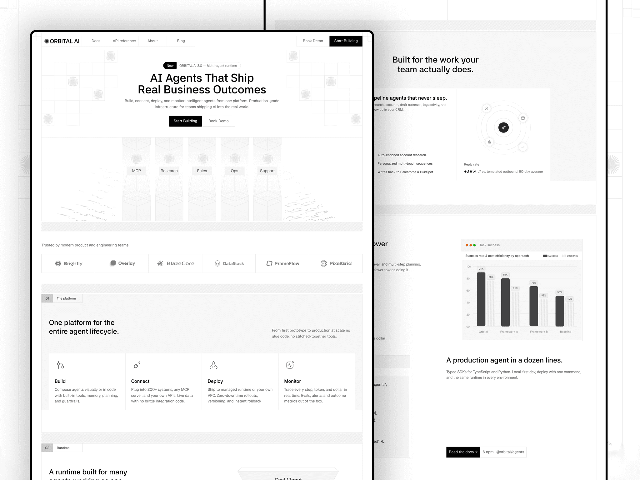
Orbital is live 🚀
A modern AI SaaS template built for AI startups, agent platforms, and developer tools.
Clean visuals, bold interactions, and a flexible structure to help you launch faster.
Check it out → https://framer.link/nAhaoau
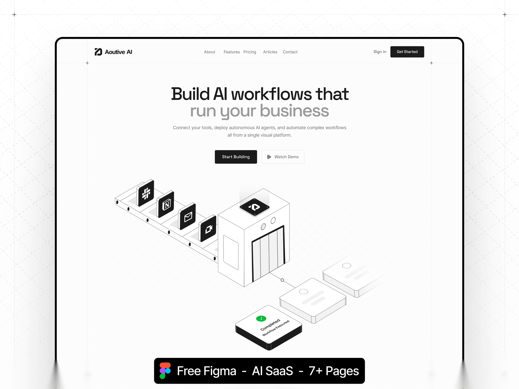
Aoutive is live. An AI workflow automation Framer template with a four-part engine section, five use case cards, an integrations grid, and three-tier pricing. Built for automation platforms and operations SaaS startups.
Agency Website Free to remix here → https://framer.link/s1rwUHg
Most agency testimonials say nothing.
"Great to work with." "Loved the results." Copy that could sit on any site, for any studio, about any project.
Morphe does it differently.
Every testimonial names something specific. Not "they were professional" - what they actually asked, what changed because of it.
A vague quote proves you existed.
A specific quote proves you thought.
That's the difference between decoration and evidence.
Framer just put ranking where creators can actually use it.
Open your profile → sort by Trending → your templates now line up in serial order. Best performer first.
No more guessing which one is carrying the profile.
And on each card → Remix button and pricing sit right there. No click into the listing to check free or paid.
One less step between "I like this" and "I'm using this."
Small screen. Real difference in how fast a visitor decides.
Take Norell from here - https://framer.link/gwtnnxI
It’s still free to grab now - https://framer.link/3jD63iU
Four dentists, four individual profile pages. Not four headshots in a grid — four actual pages, each with qualification, years of experience, and specialisation.
Patients pick a dentist by looking at their face first. That is not a design opinion, it is how the decision actually gets made. Someone is choosing a person who will put their hands in their mouth, and that is judged on the same instinct we use to size up a stranger.
A name under a photo does not answer anything. A profile page does — how long they have practised, what they specialise in, one line in their own voice.
→ Real portraits, not stock headshots
→ Specialisation stated in words a patient uses, not a code
→ Give each person their own page, not just a card
When the service is delivered by a specific human, the human is the product. Design the site like that is true, because for a dental clinic, it is.
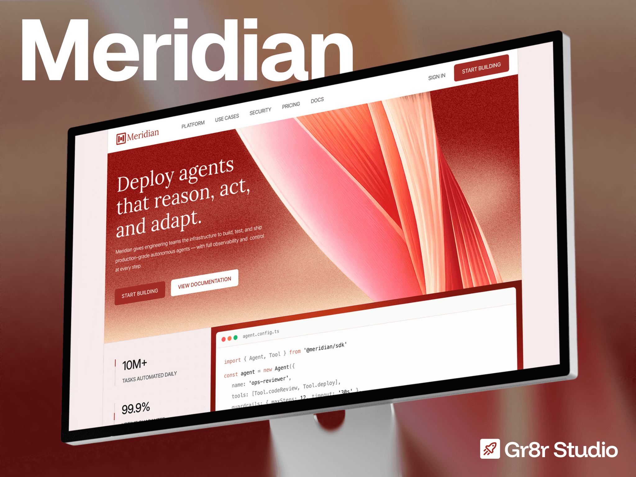
Meridian AI Agent Website is live now 💥
An AI agent infrastructure Framer template with four CMS collections covering docs, case studies, blog, and legal pages, plus a five-feature capability section and a four-step deployment flow. Built for developer platforms and agent tooling startups.
Take it. No purchase, no email, no catch - just duplicate it 👇 https://framer.link/prrY7Cy
1 year old, but still one of those designs that holds up.
Clean, flexible, and ready to give your next project a strong head start. Grab it now and make it your own.
Nobody searches for "workflow automation." They search for whatever they are tired of doing by hand. That is why Aoutive opens with six named jobs instead of six feature cards.
Free, live soon. coming something special 🔥
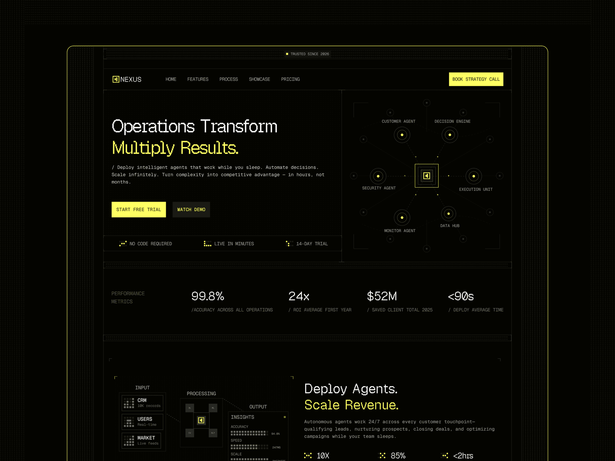
Nexus is live. A dark AI agent orchestration Framer template with an agent network hero, six-card feature grid, four-step deployment process, and three-tier pricing. Built for automation platforms and enterprise AI startups.
Take it. No purchase, no email, no catch - just duplicate it 👉 https://framer.link/flekKau
Six faces with names and job titles on a cleaning company website.
Not stock. The actual people who will be in your house on Tuesday.
Think about what is being bought here. A stranger gets a key to your home while you are at work. Nobody is comparing service lists at that point — they are deciding whether to be uncomfortable.
James Wilson, Office Cleaning Lead. Now there is a person, not a company.
When the service happens inside someone's home, the team page is the trust page.
Xenova · Creative Agency Framer Template
Grab it for free now - https://framer.link/vWwnmPc
Grab it for free - https://framer.link/qRoUJKH
I put starting prices inside the services accordion. Not on a pricing page. Inside the services section itself.
Studios hate this. The argument is always the same - every project is different, a number caps what you can charge, we prefer to qualify on a call.
Here is the version of that argument nobody says out loud: the call is where you find out whether the person can afford you, and you would rather have the call.
The buyer would not.
A founder comparing four studios is not trying to negotiate. They are trying to build a shortlist without emailing four strangers about money. If your number is missing, you are not mysterious. You are extra work.
→ "Brand identity, from 8,000" removes nothing from your negotiating position
→ The word from carries every bit of flexibility you need
→ Wrong-fit enquiries disappear, and that is the point
The studios that publish numbers are not the ones with nothing to protect. They are the ones who got tired of hour-long calls that were never going to close.
Grab it now for free - https://framer.link/33OYPjT
The comparison section is the most uncomfortable block on a SaaS homepage.
But the table is not about your competitor. It is about a buyer trying to justify the decision to someone above them. They need language they can paste into a message.
So compare against the current method, not a named rival. "Manual proposals" beats naming a company. And include one thing you do not do.
Attacking a competitor makes you look nervous. Comparing against the old way makes you look inevitable.