Grids & GigglesExpert

𝐈 𝐦𝐚𝐤𝐞 𝐢𝐧𝐭𝐞𝐫𝐧𝐞𝐭 𝐅𝐮𝐧 𝐚𝐧𝐝 𝐀𝐜𝐜𝐞𝐬𝐬𝐢𝐛𝐥𝐞 ✿ contact me @siddhantbaghel151@gmail.com
Day 11 of 30
one of the BEST free component on the marketplace!
Theme Switching Background!
Day 12 of 30
Scroll reveal Background
Preview: https://heartwarming-level-083870.framer.app/
Remix: https://framer.link/3A1BBGE
Day 11 of 30
one of the BEST free component on the marketplace!
Theme Switching Background!
Day 10 of 30:
You should add a little whimsy to your website!
with this scroll controlled timeline element.
remix:
Day 9 of 30
Most pricing tables look like glass cards with a shadow. PricingTicket looks like it got torn off a receipt roll.
Three variants: Left, Middle, Right. Middle sits upright and forward; the sides tilt and drop back. Scalloped edges are built entirely with a CSS mask, no image assets.
DAY 8 of 30:
Gold text is easy. Gold text that falls apart when you touch it is not.
GoldenDust is a canvas text component for Framer. Your headline renders sharp, and the moment your cursor gets close, the letters break into glowing particles, swirl away, then settle back and re-sharpen.
Built for luxury heroes, launch pages and anywhere a headline has to earn a second look.
Day 7 of 30!!
Most portfolio grids ask you to scan. This one asks you to travel.
SpatialGallery is an infinite WebGL tunnel built from your own images and videos.
Built for showreels, studio landing pages, and any portfolio that deserves more than a grid.
Every "our values" section is the same three-column grid.
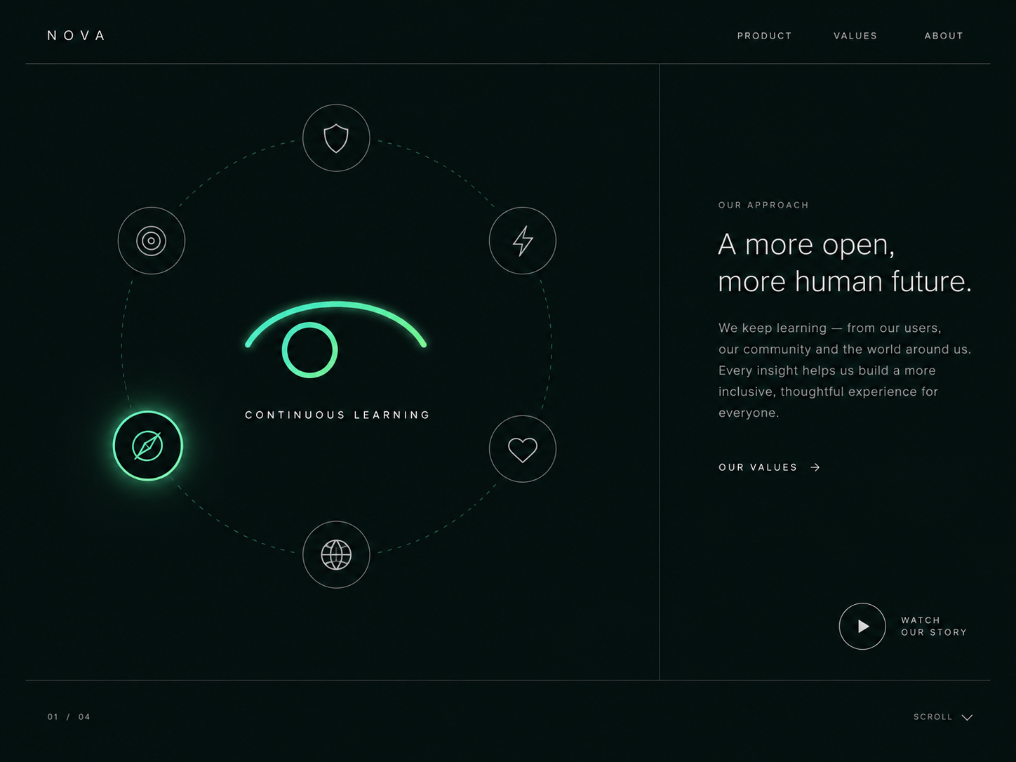
So I built Eyetrack: six principles orbiting a single eye that actually watches them.
✓ Four eye styles, Vector, Duo, Minimal and Pixel Art ✓ Pupil tracks the active icon and reacts to your cursor ✓ Breathes and blinks on its own so it never sits still ✓ Pauses only when you hover an icon, not the whole section ✓ Three palettes or bring your own colours
For about pages, brand principle blocks and anywhere a grid would be boring.
Day 6 of 30:
Eyetrack: a Framer code component built around an eye that's actually alive.
Most "orbiting feature" components just spin some icons in a circle. This one watches. The eye tracks your cursor, blinks and breathes on its own, and glances at whichever item is active as the ring turns.
✓ 5 core styles: Clay, Minimal, Vector, Pixel Art, Duo ✓ Pupil follows your cursor and dodges when you get close ✓ Idle blink + breathe loop, so it feels alive at rest too ✓ Up to 12 items, each with its own icon, label, and description
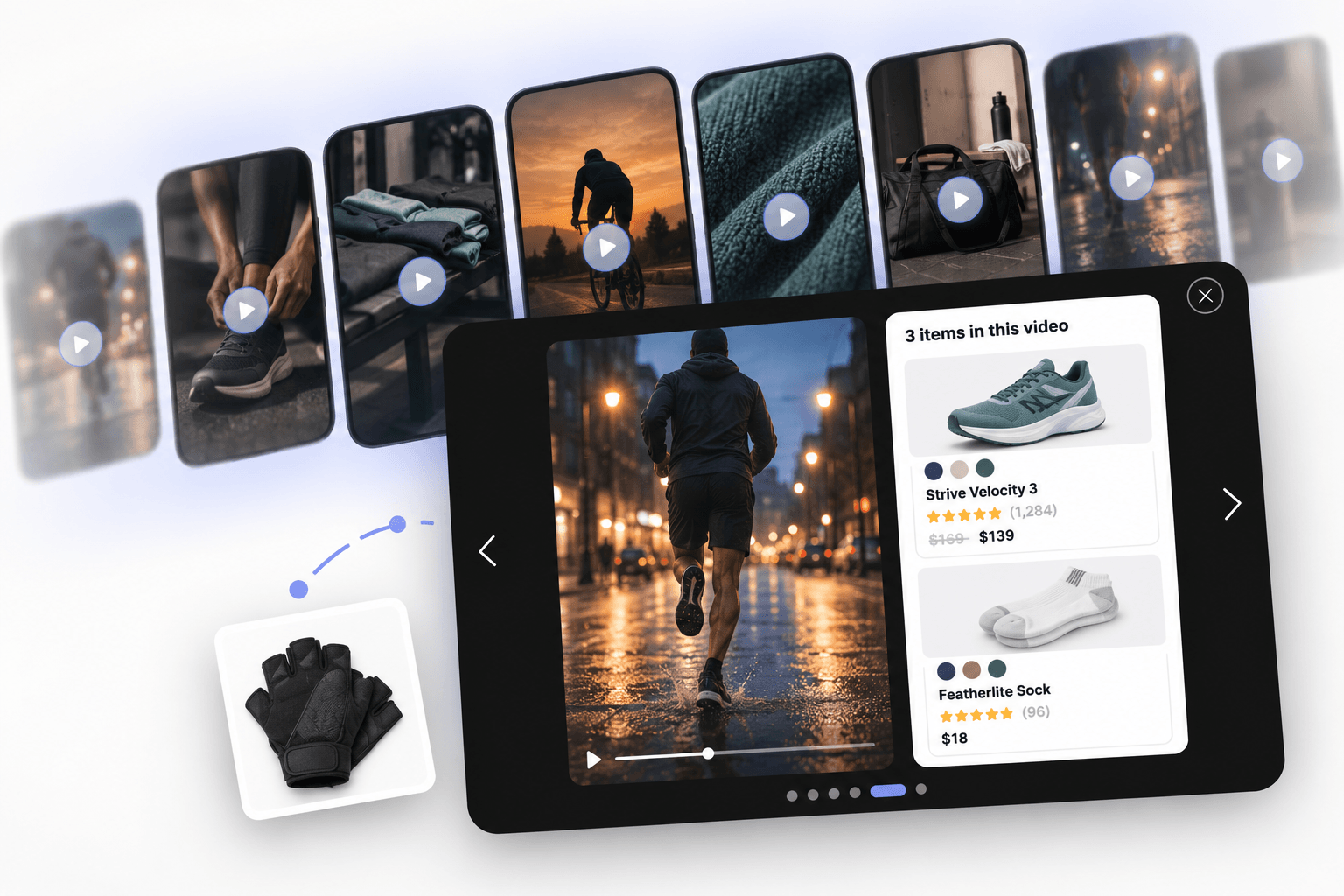
Reel sections on most stores are just a video wall. Nothing is clickable.
ShoppableReels is a looping ticker of vertical clips that opens fullscreen with the products from that video listed next to it.
✓ Drag the row, or let it drift on its own
✓ Instagram reels work: paste the link and it embeds
✓ Product cards with ratings, sale price, and colour swatches
✓ Around 40 controls, no code editing needed
For any brand sitting on reel content that never converts.
Day 4 of 30:
Reel sections on most stores are just a video wall. Nothing is clickable.
ShoppableReels is a looping ticker of vertical clips that opens fullscreen with the products from that video listed next to it.
✓ Drag the row, or let it drift on its own
✓ Instagram Reels work: paste the link, and it embeds
✓ Product cards with ratings, sale price, and colour swatches
✓ Around 40 controls, no code editing needed
For any brand sitting on reel content that never converts.
Day 3 of 30
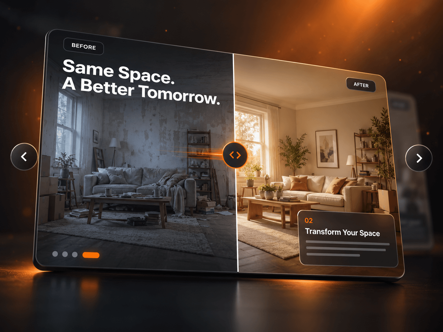
Most before/after sliders stop at one image pair. That's rarely the whole story.
BeforeAfter is a comparison slider and a carousel in one. Drag the handle to reveal, then move to the next comparison.
✓ Drag to reveal with mouse, touch, or arrow keys
✓ Unlimited slides, each with its own headline, tags, and caption card
✓ Autoplay with pause on hover
✓ Images preload so slides never flash
✓ Responsive to the component width, not the viewport
Good for retouching portfolios, renovation studios, clinic result pages, and any redesign case study where the proof is visual.
DAY 2 OF 30:
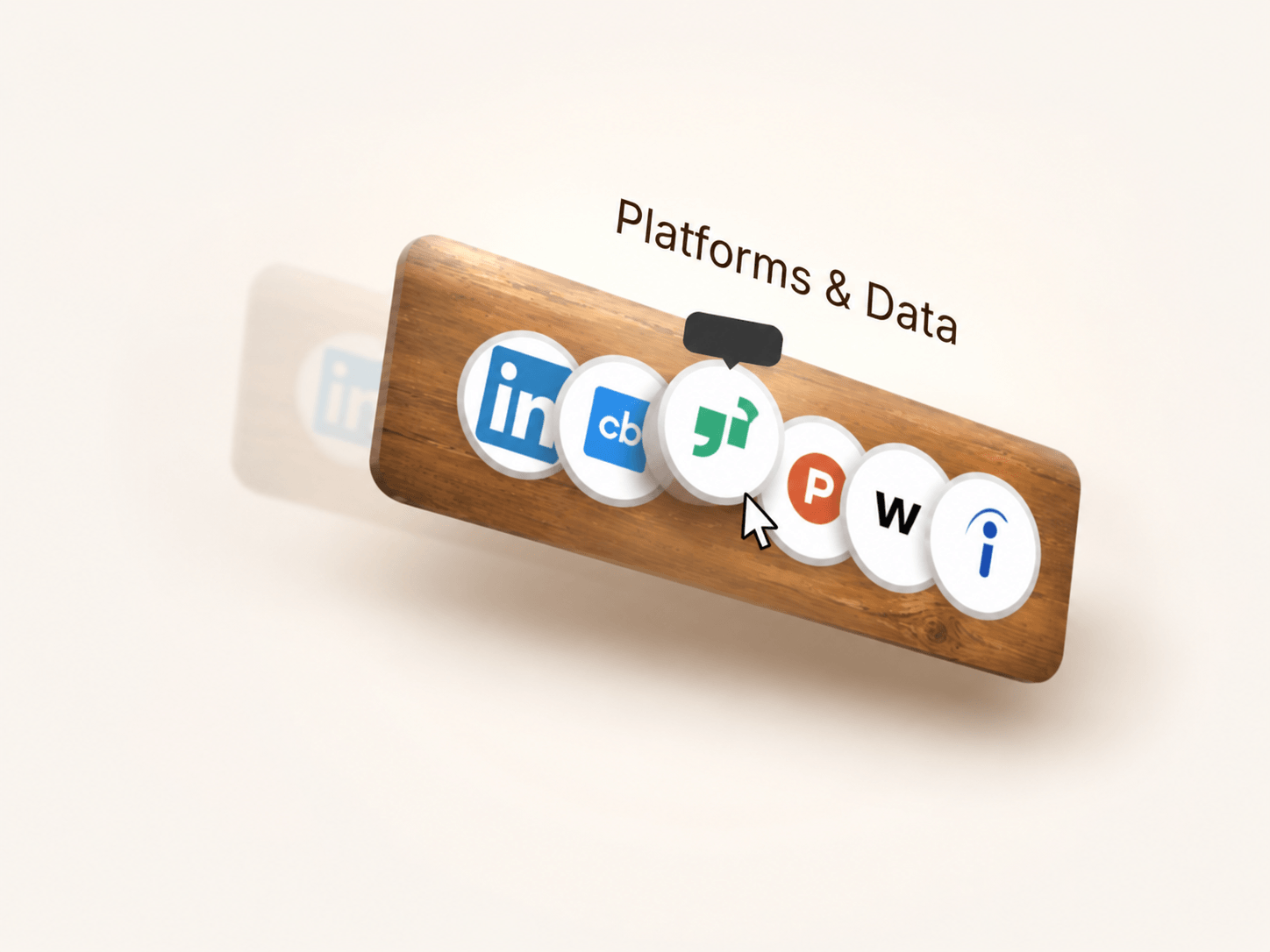
Most logo rows are a flat strip of grey icons.
So I built a shelf for them.
LinkPlank is a carved wooden board that holds your links and leans with the cursor anywhere on the page.
✓ Full-page cursor drift with real 3D tilt
✓ Light band slides across the grain as it turns
✓ Four plank shapes with adjustable taper and radius
✓ Favicons pull themselves in from each URL
✓ Tooltips rise on hover, icons lift off the board
Good for platform lists, integration rows, press logos, and footers that deserve better than a grey strip.
DAY 2 OF 30
Most logo rows are a flat strip of grey icons.
So I built a shelf for them.
LinkPlank is a carved wooden board that holds your links and leans with the cursor anywhere on the page.
✓ Full-page cursor drift with real 3D tilt
✓ Light band slides across the grain as it turns
✓ Four plank shapes with adjustable taper and radius
✓ Favicons pull themselves in from each URL
✓ Tooltips rise on hover, icons lift off the board
Good for platform lists, integration rows, press logos, and footers that deserve better than a grey strip.
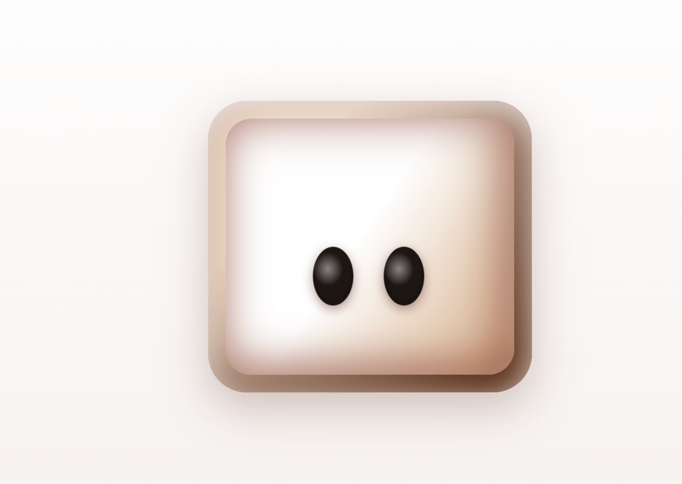
Day 1 of 30: Miosu, a robot head that looks back at you.
Move your cursor and its eyes follow. Get close, and the pupils pull together. It blinks on its own random rhythm so it doesn't just sit there staring.
✓ Cursor tracking with head drift and a slight tilt
✓ Eyes converge as you get close
✓ Every colour and size is a property control
Where would you use this?
𝟯𝟬 𝗗𝗮𝘆𝘀 𝟯𝟬 𝗙𝗿𝗲𝗲 𝗖𝗼𝗺𝗽𝗼𝗻𝗲𝗻𝘁𝘀
I took a week off due to being sick and lost all my hype and reach.
So now I will give it my all: all my components and designs for free for 30 days.
rules?
1- It's gonna be a combination of code components and smart components, so I don't cheat my way out of it.
2- I will post the component each day, but it does not count the time taken to get it approved by the Framer team.
I just need 1 suggestion: should I share the design process under each component when I post it? or just keep it limited to the component?
Anyways, it starts today with one of my favourite ones! till 3 Oct.
excited for this!
what i aim with this?
1- give back to the community, like it gave me (i miss frameruniversity)
2- make a proof of work for my skills.
3- share the useful ux insights I learned along with these ui components.
4- hopefully attract a client for my next project.
Super Excited for this!! YAYYYYYYYYYYYY