Hey everyone 👋
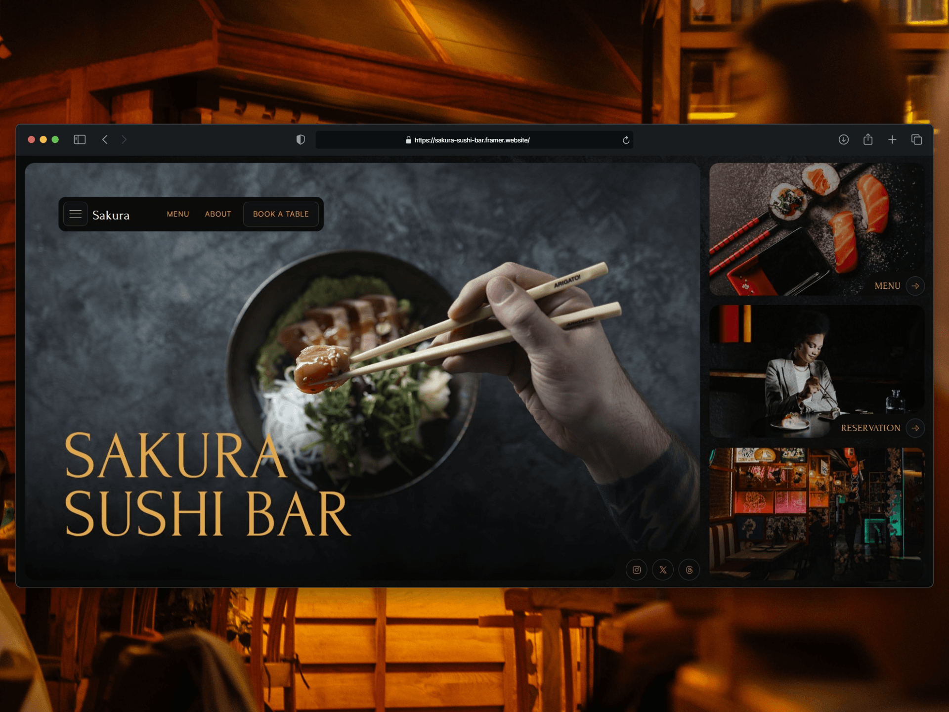
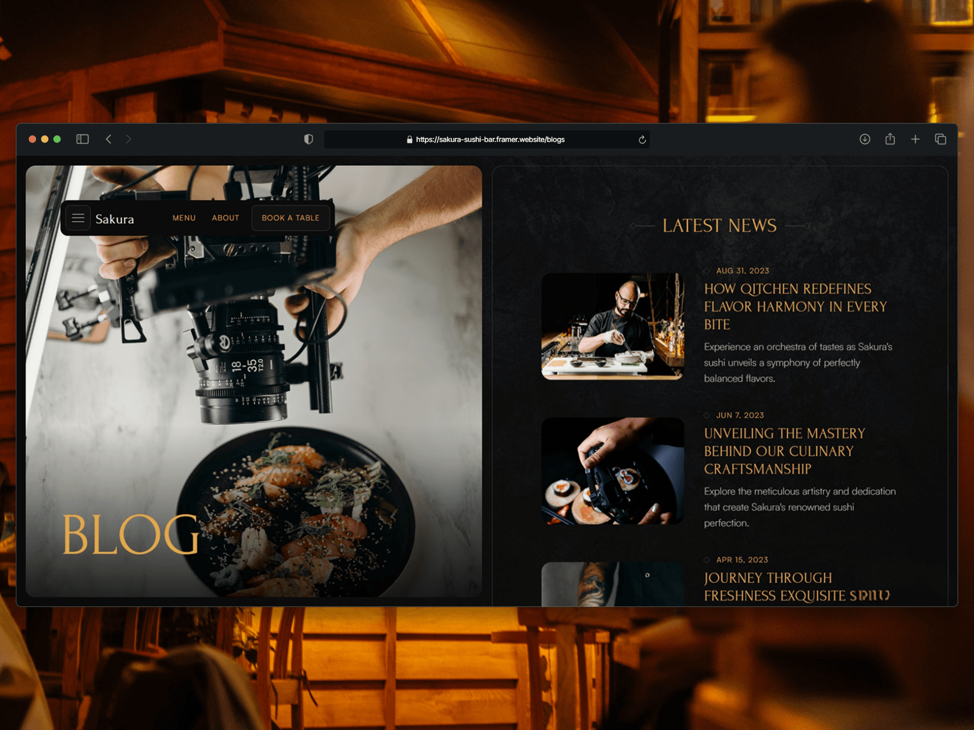
Just published Sakura — a website template for sushi bars, Japanese restaurants, and izakaya-style spots.
I kept running into the same problem: restaurant templates tend to land in one of two places. Either bright, airy, and generic — same layout, same stock pasta photo. Or dark, but so heavy that the menu becomes unreadable.
Sakura is my take on the middle. Dark and moody, but the content stays legible.
THE IDEA
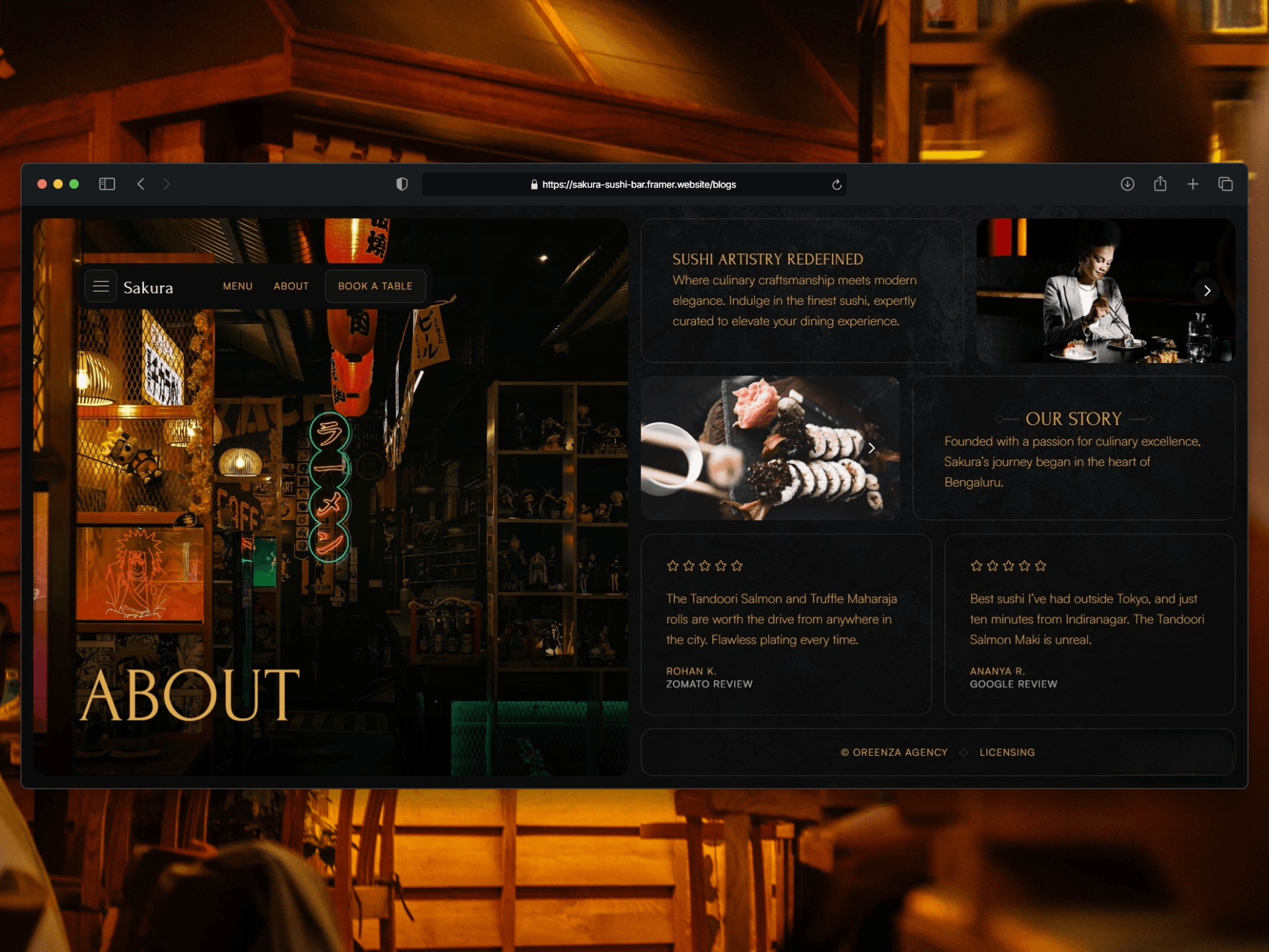
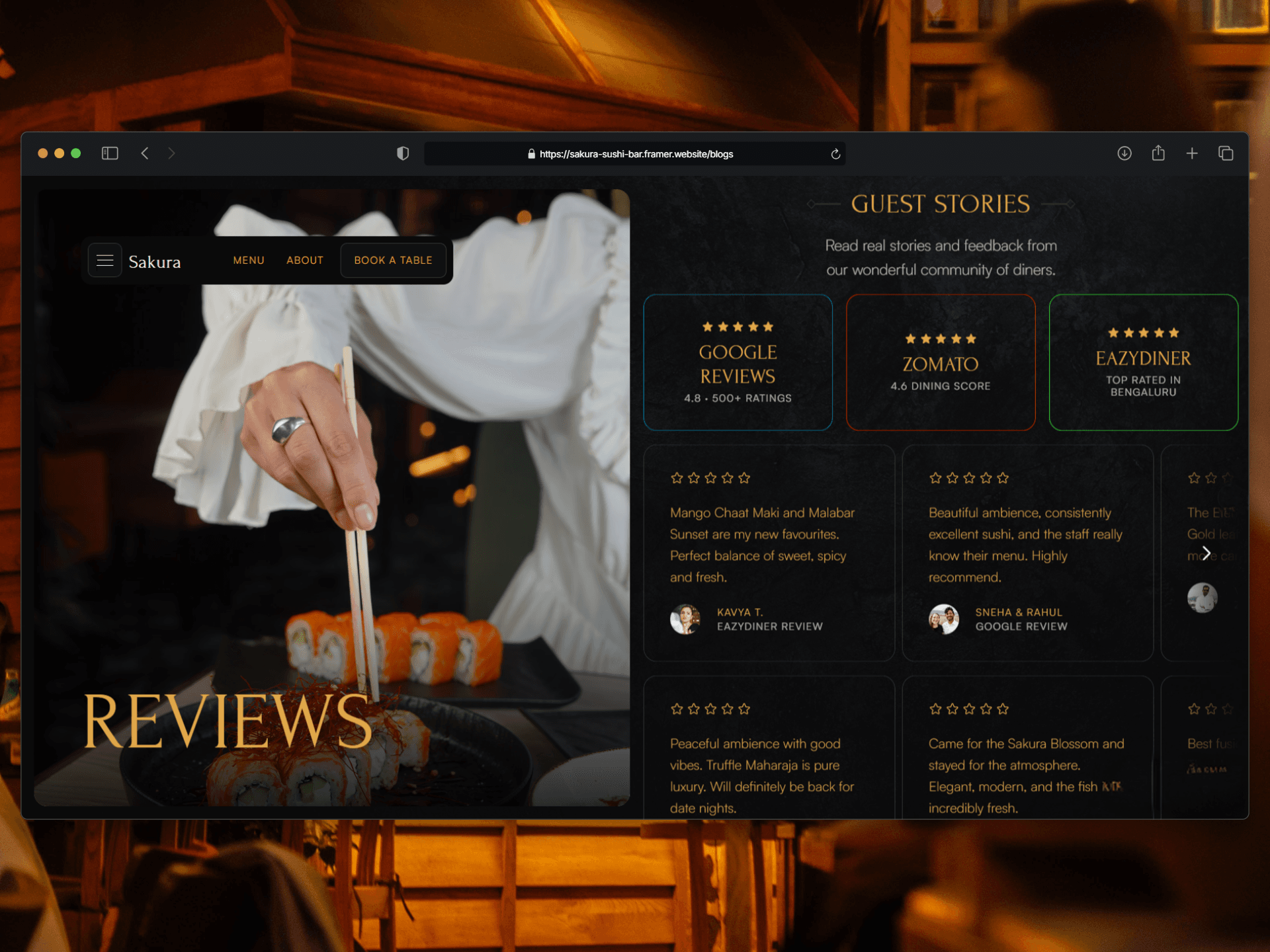
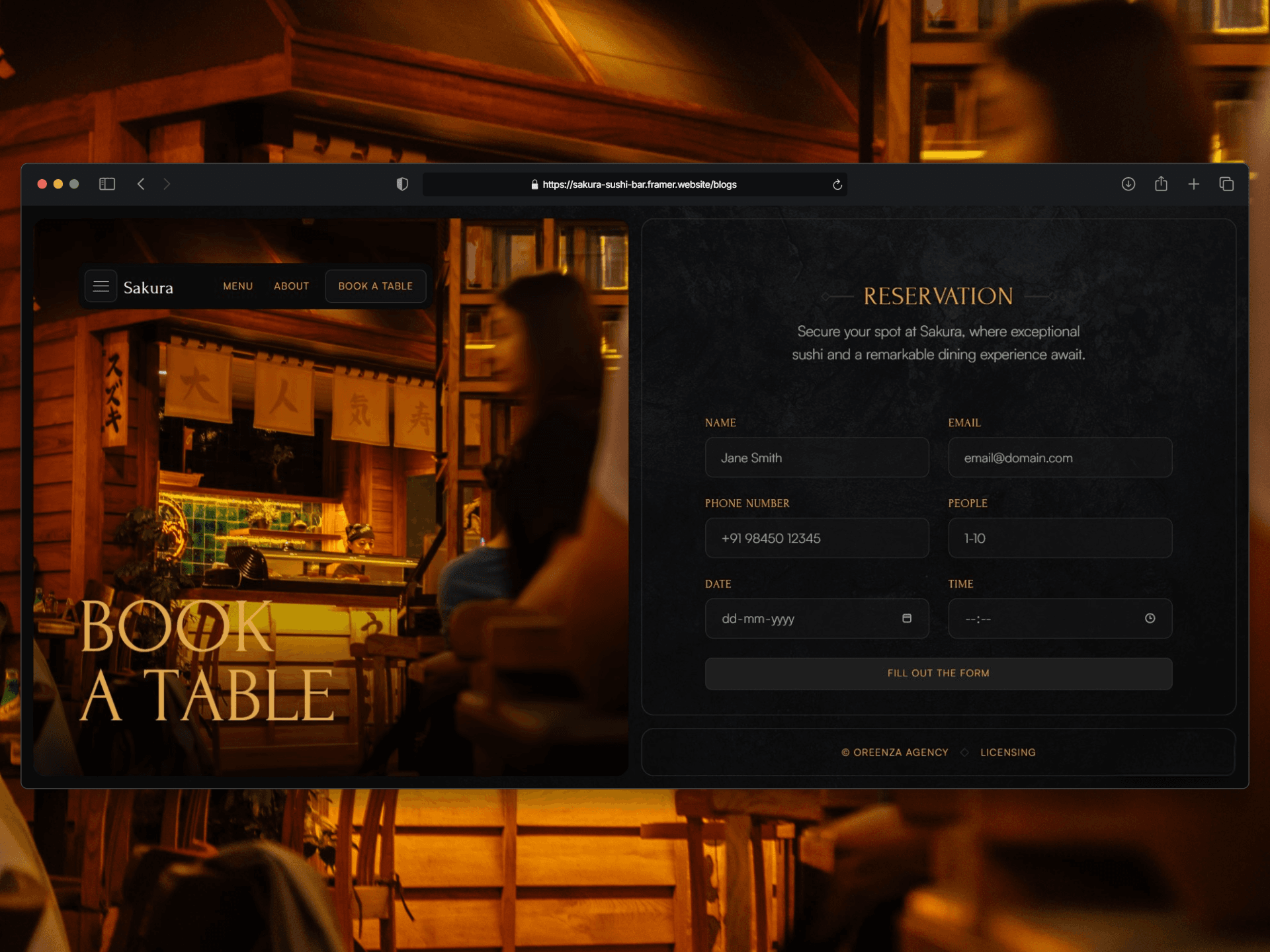
A split-screen system runs through every page. Photography on the left, content on the right. It gives the whole site a gallery feel — the food does the talking, the type stays out of the way.
Gold on charcoal, Satoshi + Forum for type. Nothing decorative for the sake of it.
WHAT'S IN THE TEMPLATE
→ 10 pages: Home, Menu, Reservation, Confirmation, About, Reviews, Contact, Blog, Licensing, 404
→ Reservation form with date, time, party size, and a confirmation state
→ Filterable menu — Maki, Uramaki, and Special Rolls, with per-item photos and pricing
→ CMS blog, already loaded with 5 posts so it doesn't look empty on day one
→ Contact page with map and socials
→ Desktop, Tablet, and Phone breakpoints on every single page
THE MENU PAGE
This one got the most attention while I was building it. Category filters up top, each item with a thumbnail, description, and price. It's the page that usually decides whether a restaurant site feels real or feels like a mockup.
Demo → https://sakura-sushi-bar.framer.website
It's live on the Marketplace now. If you build with it, I'd genuinely love to see what you change — especially the palette. The gold is easy to swap and I'm curious what other colors land well on that charcoal.
Feedback welcome too. Happy to hear what feels off.