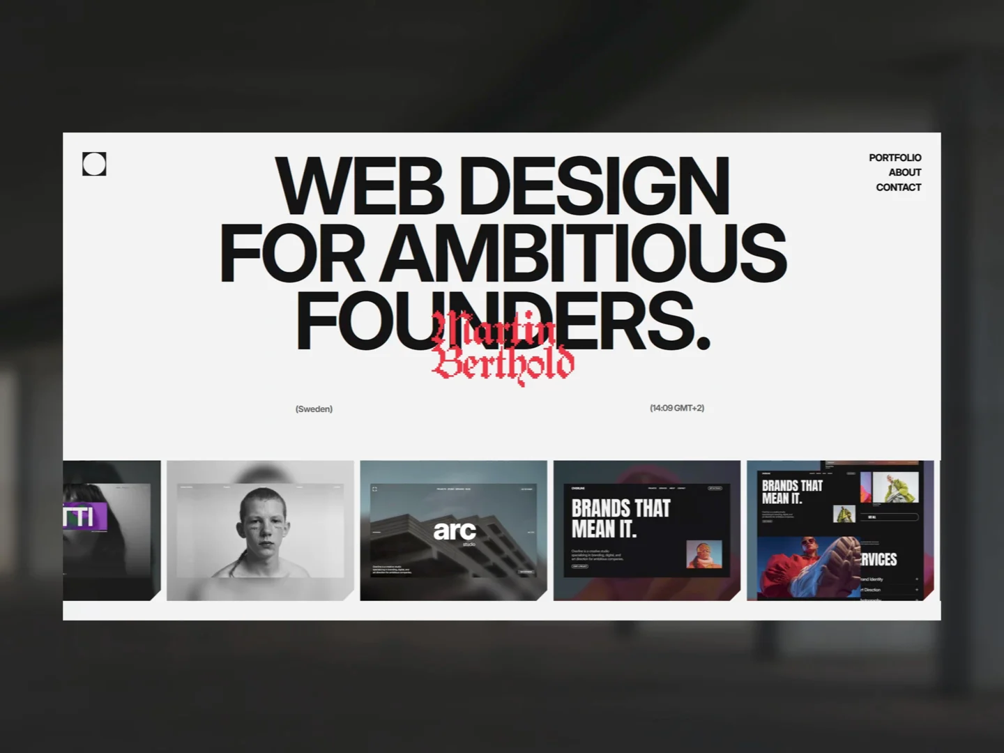
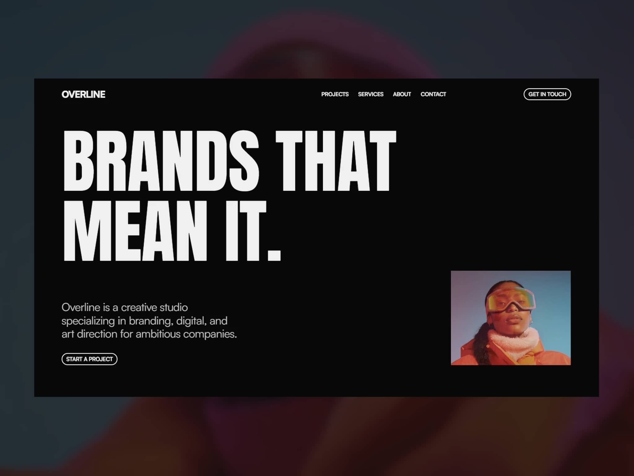
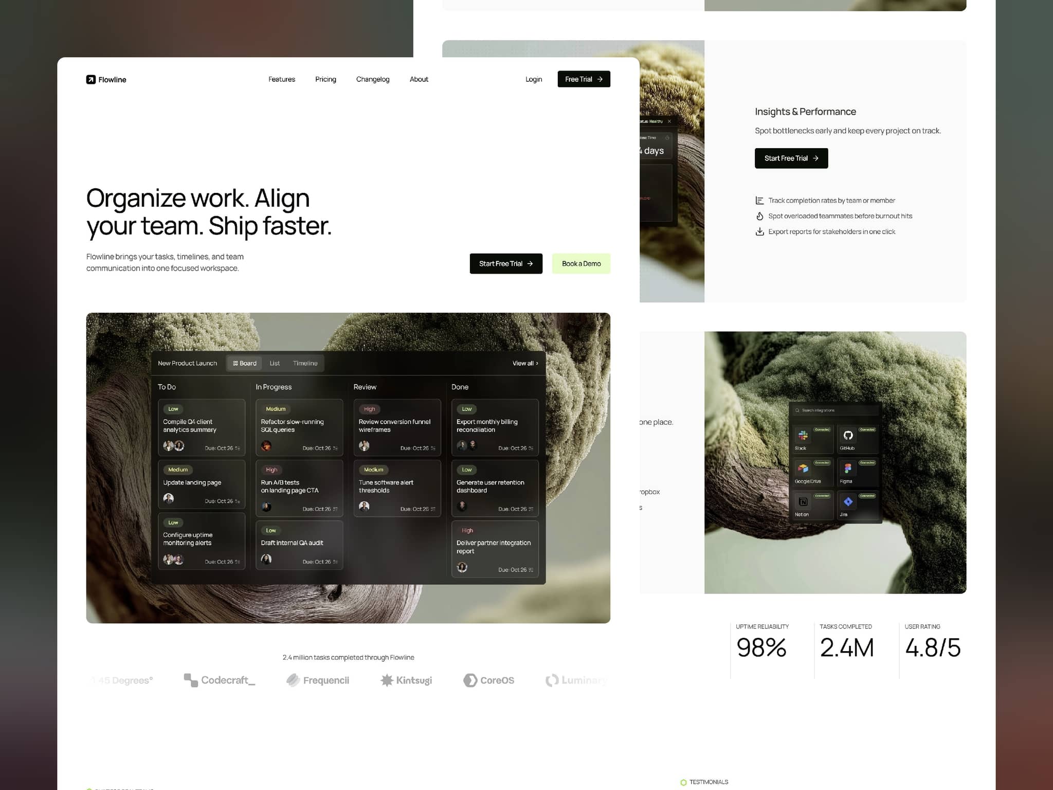
Framer expert & designer. I build custom sites for founders and ship Framer templates on the side.
Services section WIP for Consulting template.
Most templates are well optimized for mobile and tablet. But I've seen plenty that fall apart on a 4K screen.
Here's a quick way to preview and test large breakpoints:
1. Create a new breakpoint (4000px width) and name it something like "test"
2. Turn on rulers to be more precise
3. Check the alignments and how everything scales
4. Apply a max-width to sections if needed
New personal best for Morel template.
Remix to published website in 26 minutes.
Built it to be easy to customize, good to see it actually holding up.
You can check out the template here if you're curious.
Introducing Kodama 🎉
Free template for anyone launching a SaaS or startup. The idea was simple: you shouldn’t spend three weeks on a website when you could be launching your product.
So everything’s ready to go. Swap the copy, drop in your screenshots, publish.
Finally got around to trying the new Framer agent.
Started working on my new template build, so it felt like the right time.
Two tasks so far:
- Creating the basic structure of a website with correct tags applied to sections: 6 tokens
- Optimizing the hero section for mobile breakpoint: 40 tokens
Let's see if 1k tokens will be enough 🙃
Spacing behind my recent hero section for a consulting template.
I always design on an 8pt grid (with 4px half-steps), mostly because I got used to it. It's not mandatory, but it keeps things consistent and makes a layout feel clean.
Do you stick to a grid, or just eyeball your spacing?
Decided to build my next template in public here and test the community a bit.
Locking in the hero section design but can't decide which version works better 🤔
In my opinion V1 looks cleaner with white text, but in V2 the big text with overlay blend mode does not grab so much attention and let's main headline shine a bit more.
Which one would you pick ?
Behind the scenes of a new template I am working on.
Currently iterating the hero section with focus on hierarchy, grids and typo.
First sale from a remix made after 3.0 update.
That 911 GT2 ain't gonna buy itself.
Repositioning my template Delivr so it can hit broader audience (Agencies and studios) as the niche I targeted before with this was too narrow.
What changed:
- updated copy in template
- new marketplace description
- updated previews
For me, grid is a tool that turns chaos into order. It brings consistency, hierarchy and rhythm. And it's genuinely fun to experiment with.
Here's a simple 3-column grid, used on one of my portfolio templates.
Curious if anyone here designs freeform, no grid at all.
Define. A portfolio template for designers who'd rather let the work talk. Bold type, strict grid, zero noise.
Drop in your projects, publish tonight.
Link in the comment below ↓
A few weeks ago my first ever created Framer template Crimzon got visual update (new visuals and also UI Snippets created in Framer) and also some changes in structure and copy to better position it on marketplace.
After being stuck for 3 weeks in review my latest template Kodama built for Startups and early SaaS launches is finally live. Fits any product and ships also with ready-made UI assets.
Hero section explorations for my next template focused on AI Automation agencies. Now that I look at it, it would work also for SaaS niche. Let me know what you think.