Kseniia Bator
Kseniia Bator

Kseniia Bator

Product Designer with 8+ years turning complex goals into clear digital products, scalable systems, and conversion-focused Framer websites.

Creator3 Templates
Kseniia Bator
Kseniia Bator16h

Framer's "How to publish a template" guide lists Remix URL as a required field.

On a paid template, that field is disabled. You can't type a thing.

My guess - a public remix link would give the template away for free.

The docs just haven't caught up yet.

Required and forbidden at the same time. My favorite kind of field.

Kseniia Bator
Kseniia Bator2w

Genuine question for the Framer crowd - has anyone here actually landed in Hype?

I keep hearing about it like local folklore: everyone's seen a screenshot, nobody can quite explain how they got there.

If you've made it - what helped? Timing, category, presentation, sheer luck? Would love to hear what it actually looked like from the inside.

Kseniia Bator
Kseniia Bator2w

Three listings. Two of them get roughly the same number of impressions. A four-fold difference in how many people actually click through.

I pulled these this week — they're two clicks away and I'd never looked. On your own listing page: ••• → View Activity.

Mine:

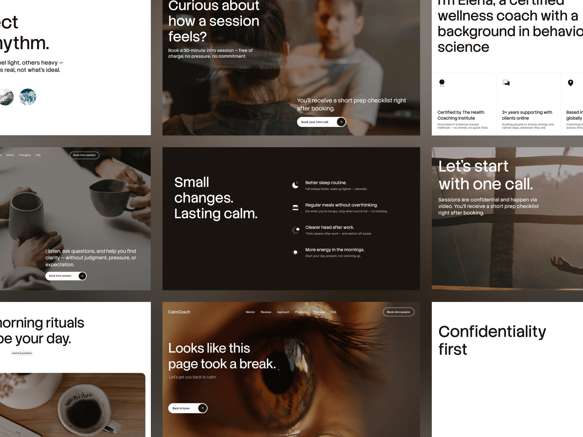
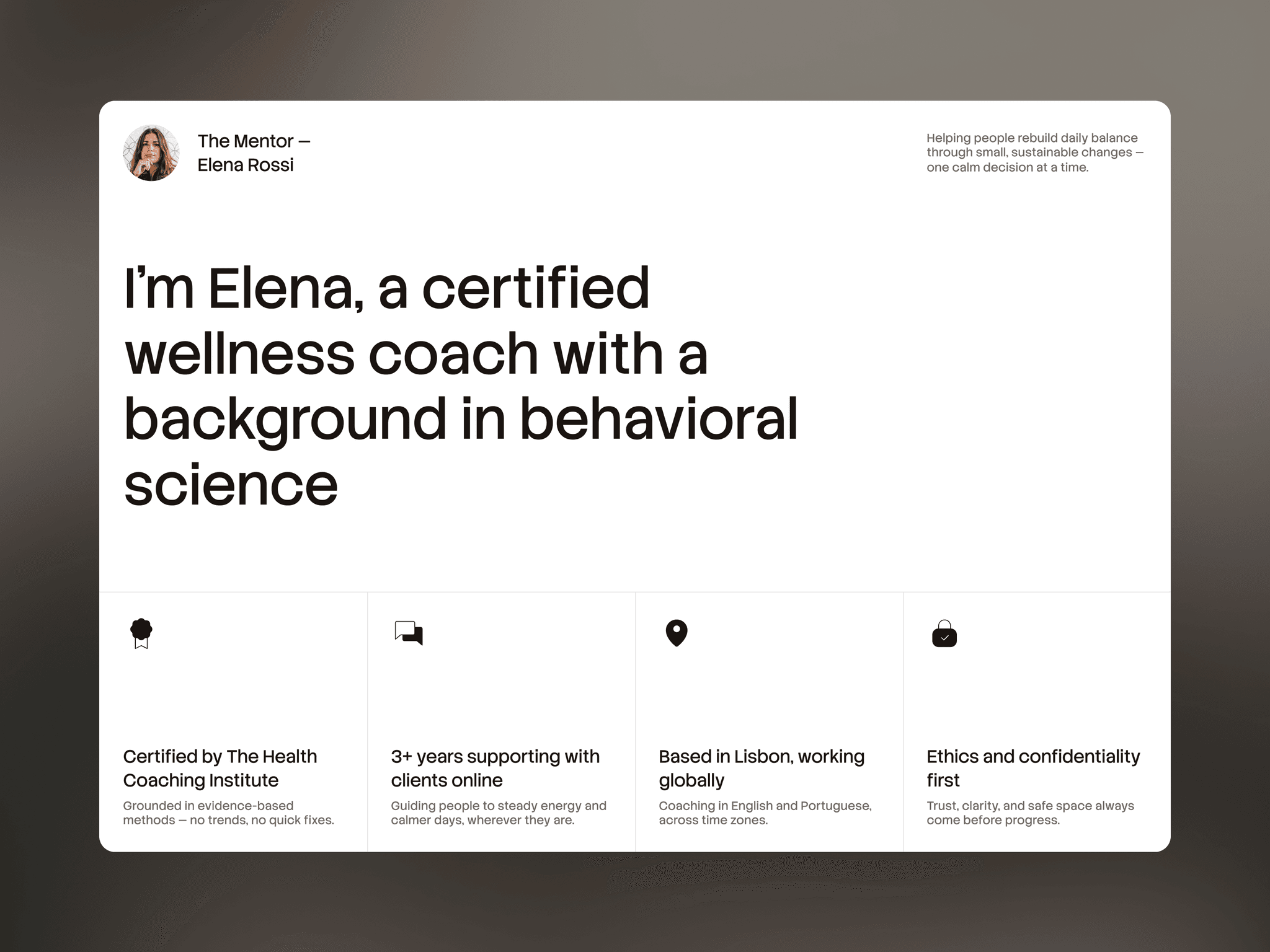
CalmCoach — 8,481 impressions, 1,980 views. 23%.

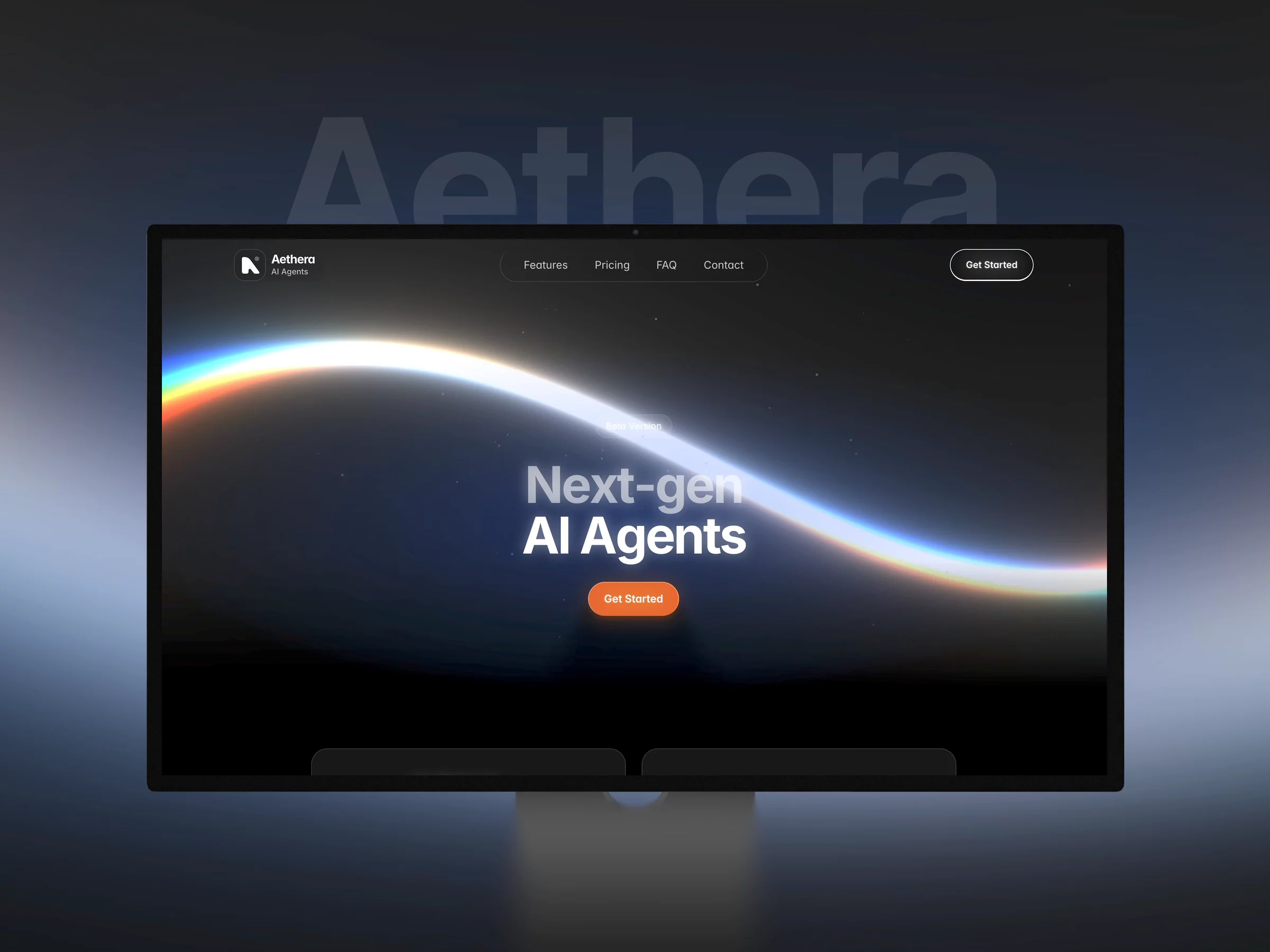
Aethera — 15,474 impressions, 2,110 views. 14%.

CreatorLab — 7,968 impressions, 480 views. 6%.

CreatorLab is my newest and most expensive template, the one I put the most into. The marketplace is showing it to about as many people as CalmCoach. Four times fewer of them open it.

That reframes the problem. I'd been treating the listing page as the thing to fix — description, gallery, video. But almost nobody is reaching the listing page. Whatever is going wrong happens one step earlier, in the card inside the grid: first image, title, byline, price.

I don't know yet which of those it is. The honest list of suspects:

the first frame of the video, which is what the card shows at rest

a title that means nothing unless you're already looking for a course platform

$69 sitting next to a row of free and $29 templates

a thumbnail that reads as "another SaaS template" at grid size

So before assuming a template isn't selling because it isn't good enough: check that ratio. If impressions are high and views are low, the product isn't the problem and neither is the listing page. Nobody has seen either one yet.

Kseniia Bator
Kseniia Bator3w

Last week I didn't build a new template. I rebuilt how the three I already have are presented — and the most useful thing I found was hiding in the video player.

All three listings had a preview video in the first gallery slot, and all three looked soft. Interface text was mush. I assumed compression and was about to re-record with "better settings", which is the kind of fix that costs a day and changes nothing.

So I pulled the master playlist instead. Framer serves preview videos through Mux as adaptive HLS — you can open stream.mux.com/<id>.m3u8 and read the ladder.

All three of mine topped out at 1440×1080, at 1.4–1.9 Mbit/s. That number explained everything:

→ Mux never creates a rendition above the source. Whatever you upload is the ceiling a buyer will ever see.

→ Framer recommends 1600×1200. And 1440×1080 is exactly 1920×1080 cropped to 4:3 — which is what happens when you export 16:9 and crop afterwards. Cropping doesn't add pixels, it removes them.

→ On a Retina screen the gallery slot is 700–900 CSS px, so 1400–1800 physical. A 1440px-wide video gets stretched. That's the mush.

→ Small interface text and thin lines are the worst case for H.264 at that bitrate, and every extra encode pass makes it worse. Mine had two.

The fix wasn't better settings. It was setting the aspect ratio at recording time: shrink the browser window to 4:3, record with QuickTime (Retina gives you 2400×1800), edit on a 4:3 timeline, export once at 15–20 Mbit/s, upload that file directly. No crop step, no second encode.

You can check your own in a minute: open your listing, find the .m3u8 request, look at the top rendition. If it's below 1600×1200, that's the best your template will ever look to a buyer.

Fixing three listings moved more than a fourth template would have. Distribution was the bottleneck, not production.

Kseniia Bator
Kseniia Bator1mo

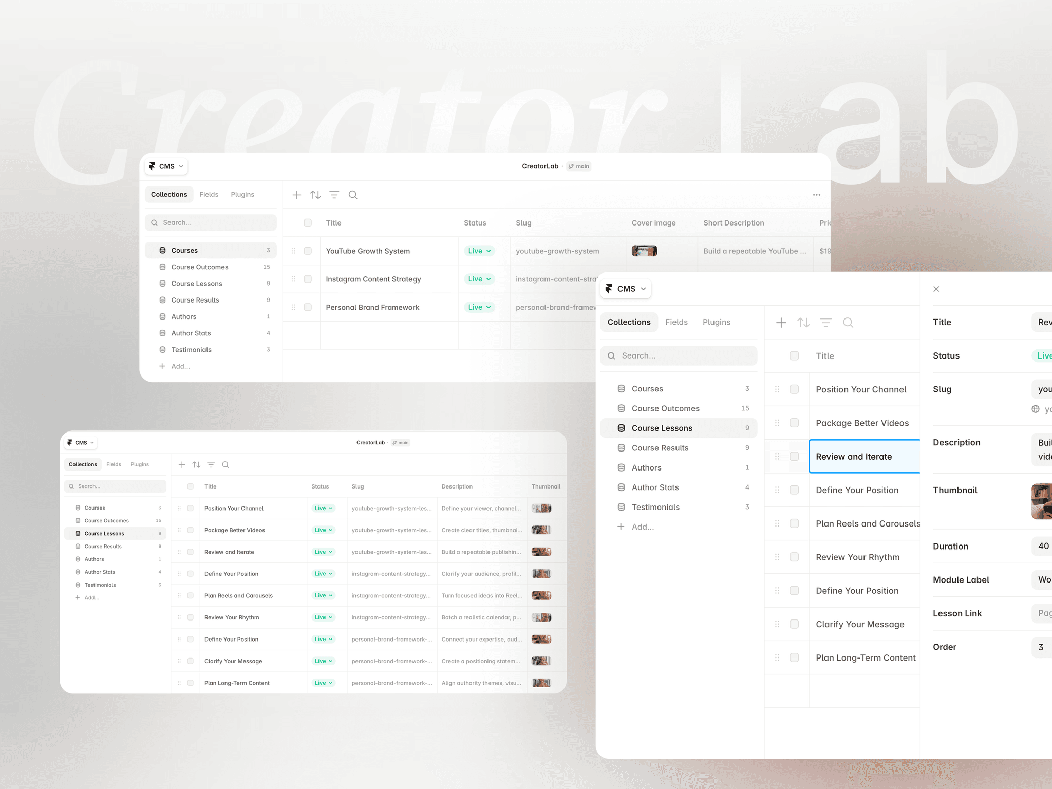
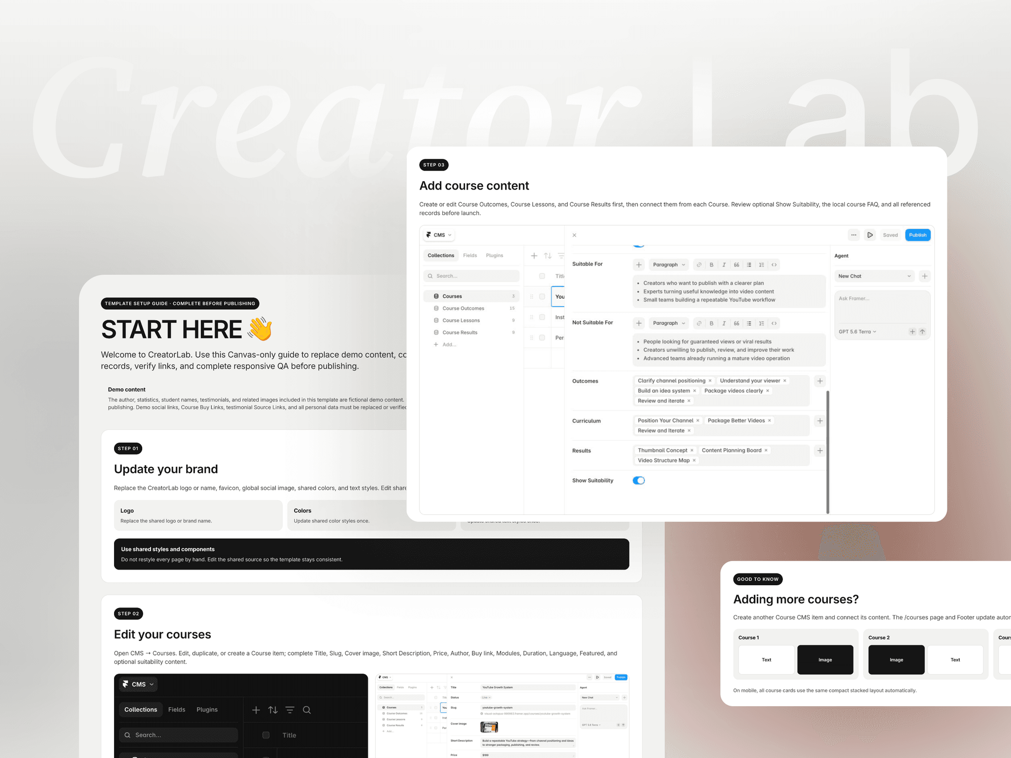
Seven CMS collections sounds like overkill until you have to add a course.

My first version of CreatorLab had five different course card designs and zero database thinking behind them. It looked great on the canvas. Then I asked the only question that actually matters for a template: what happens when the buyer adds their sixth course?

The answer was that they'd be editing five places, in five layouts, because I liked variety 😅

So I threw it out and restarted from the CMS instead of the canvas. The rules I ended up with:

→ If it repeats and the client will add more later — collection.

→ If it repeats but the count is fixed and the content is structural — component.

→ If it's referenced from more than one page — collection, even when it feels small.

→ If a field is optional for the buyer, it needs a designed empty state, or it becomes a support message later.

That's how seven connected collections appeared. Not to look impressive on a feature list, but so adding a course stays a content task instead of turning into another website project.

Curious how others draw this line — do you start from the canvas or from the CMS?

Kseniia Bator
Kseniia Batorin Marketplace·1mo

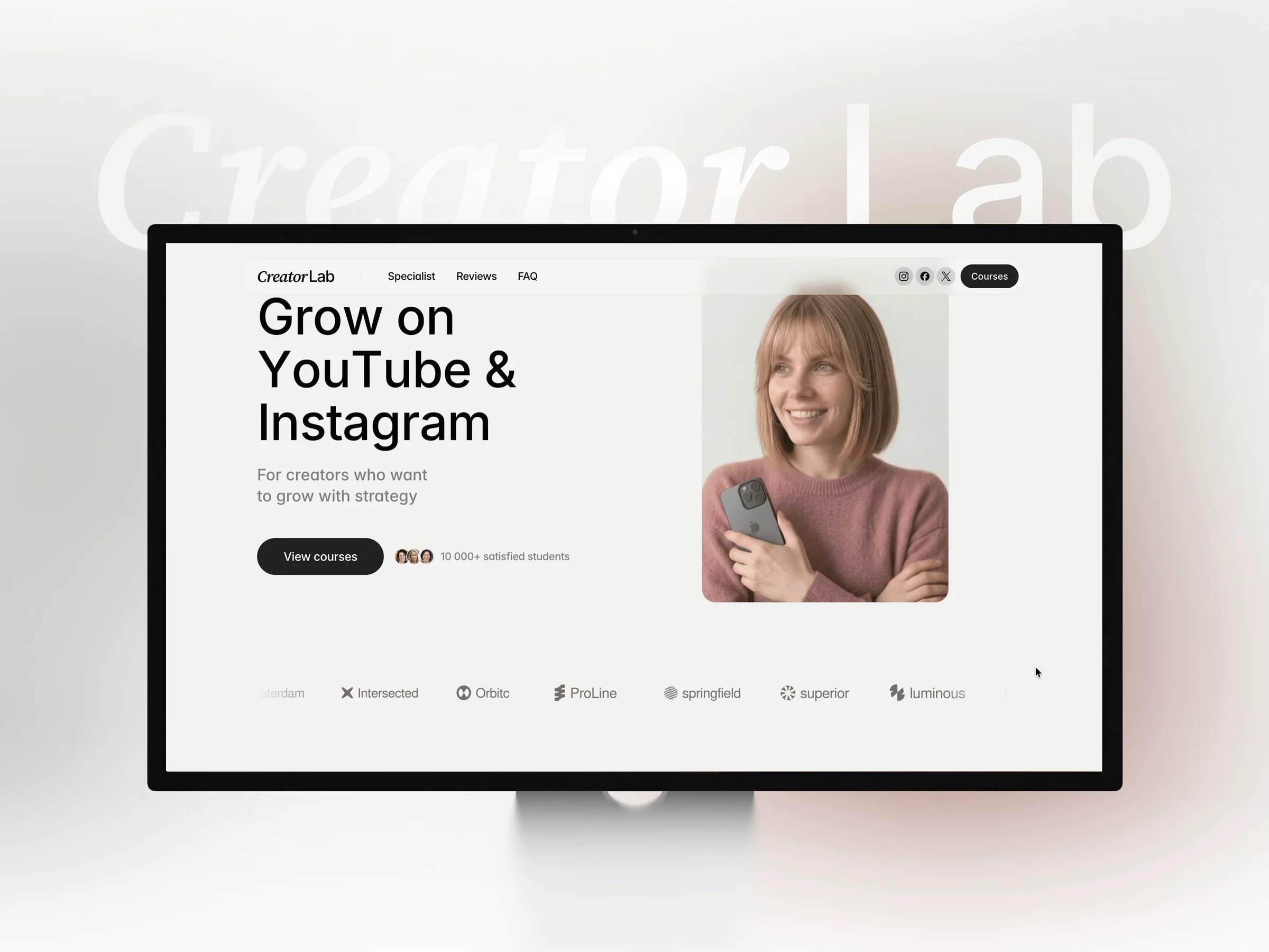
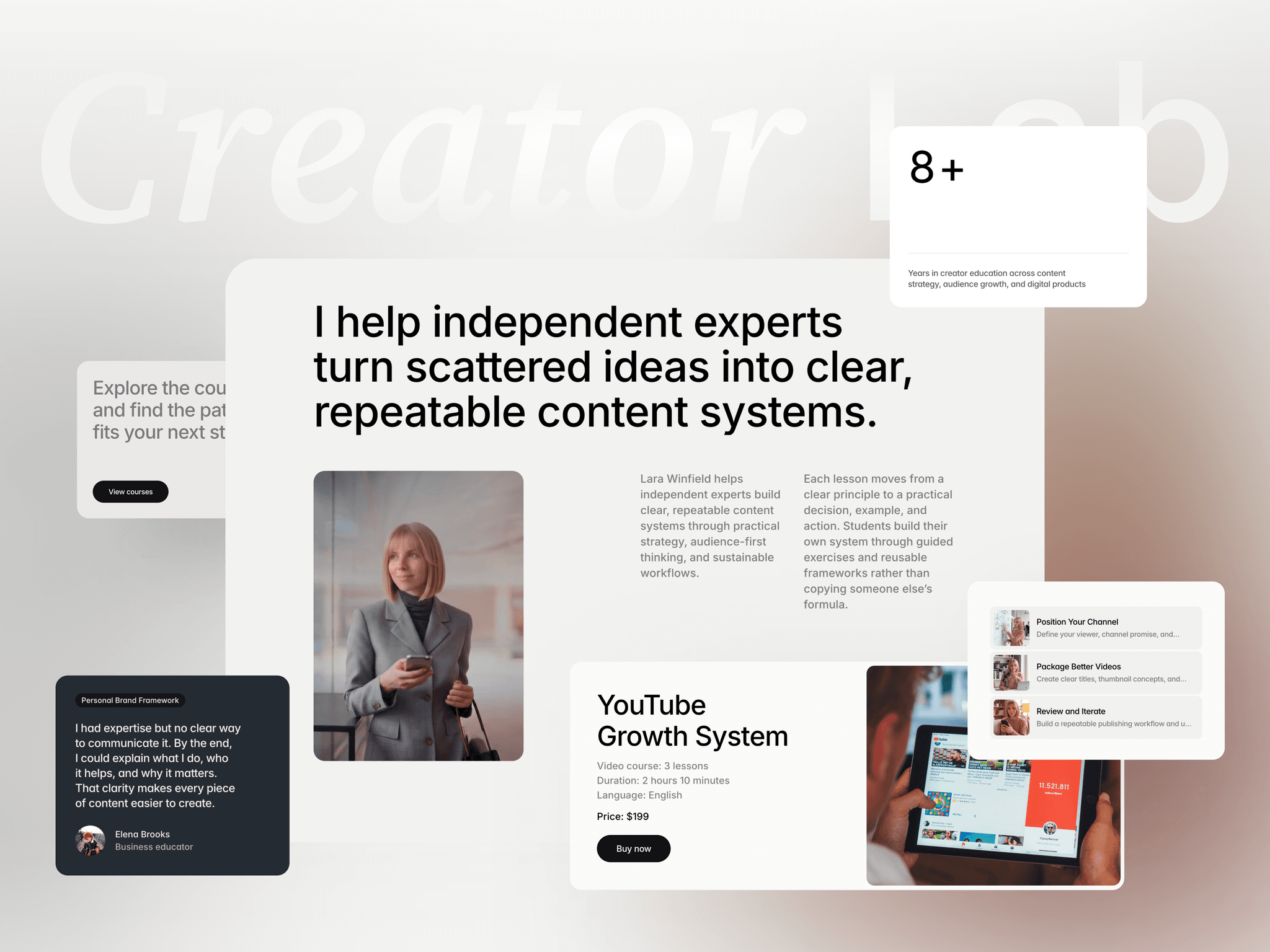
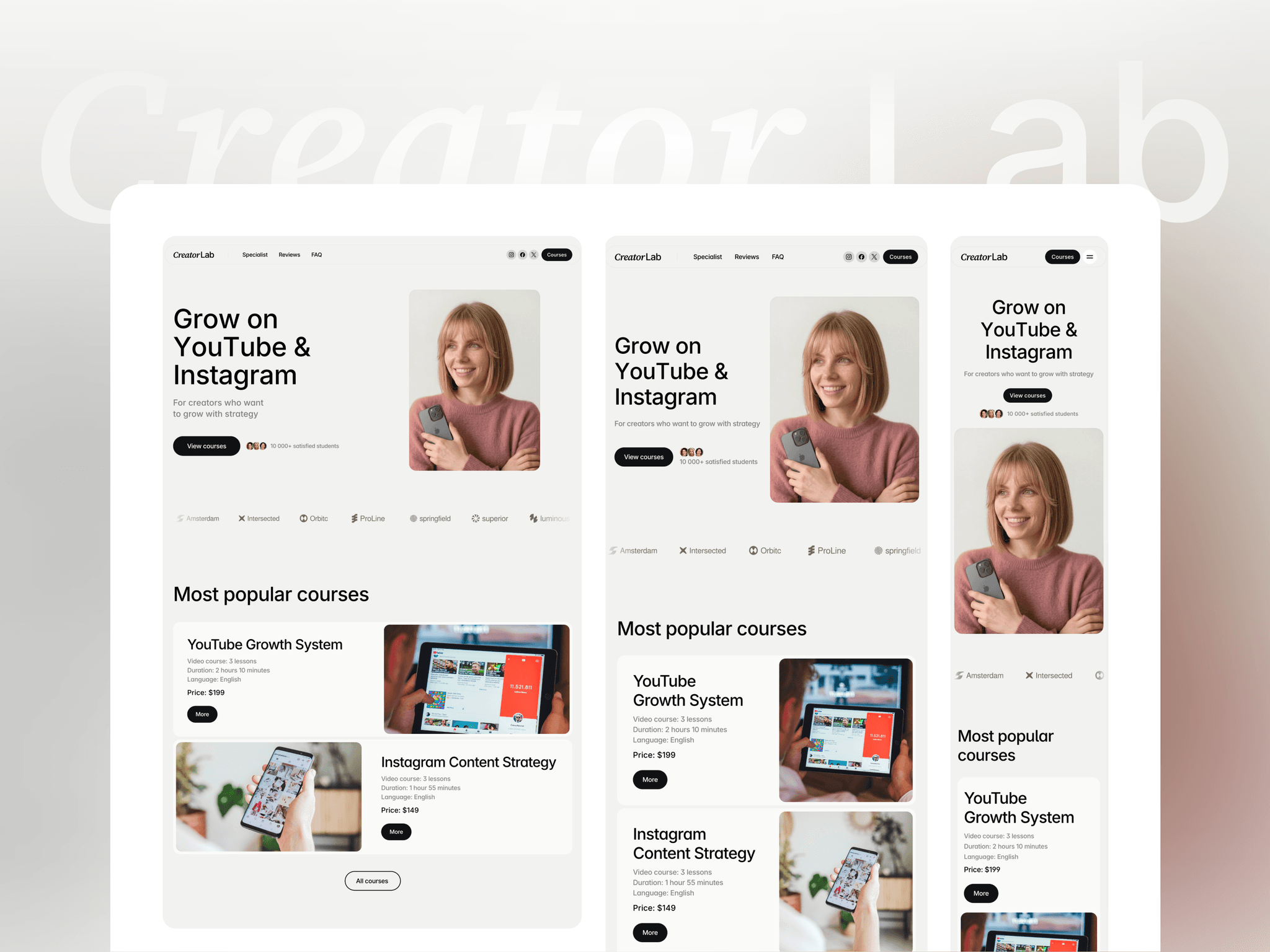
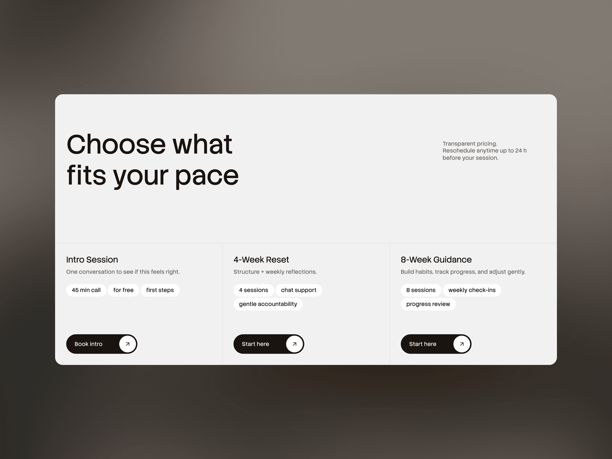
Meet CreatorLab — a CMS-powered Framer template for course creators, coaches, and educators. Launch and manage multiple course pages with structured CMS collections, responsive layouts, conversion-focused sections, and a detailed setup guide.