About Vibra
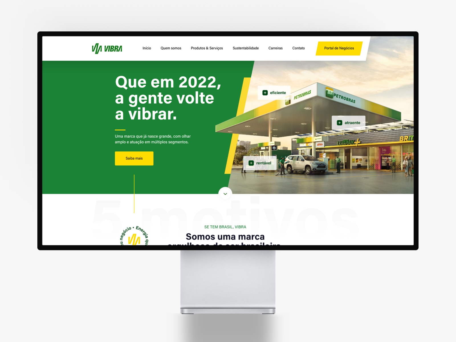
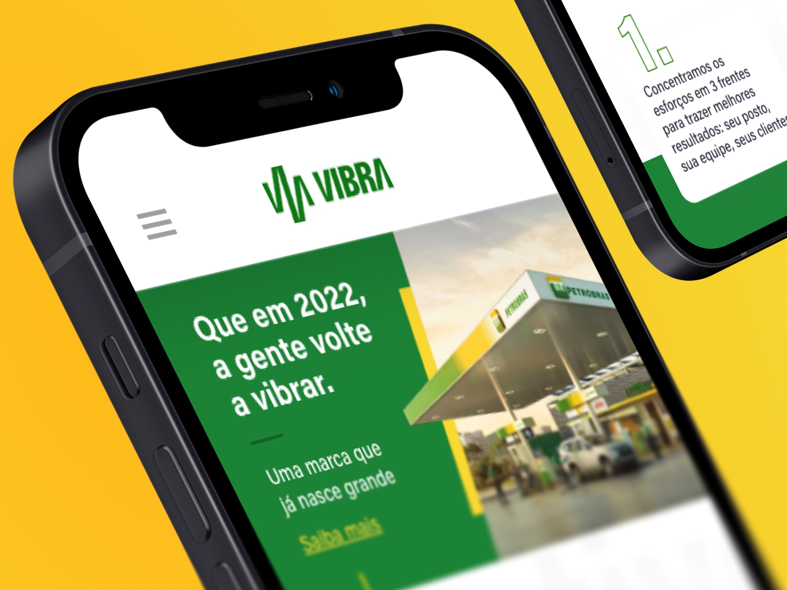
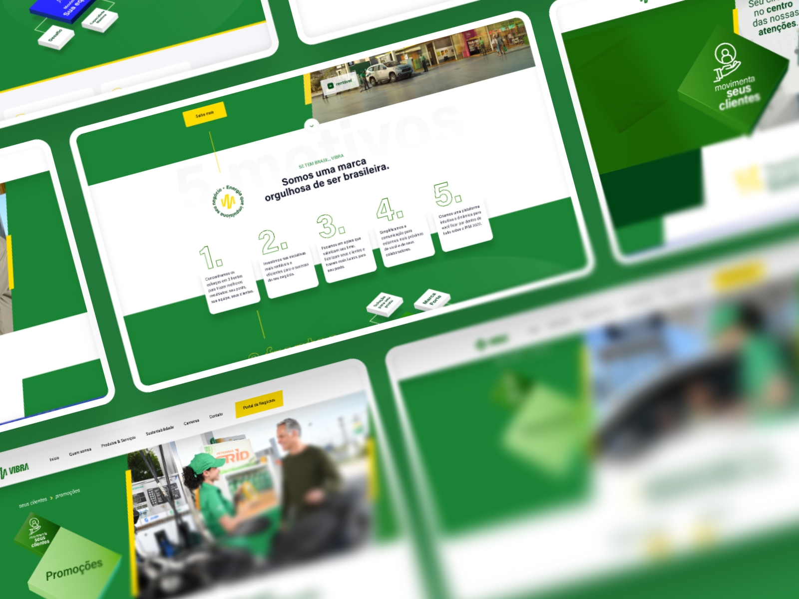
Português: A identidade visual combina o verde vibrante com o amarelo da marca em uma UI de geometria marcada, onde recortes diagonais atravessam do hero ao botão do portal. Os componentes reforçam essa linguagem: as etiquetas flutuantes sobre a fotografia, por exemplo, funcionam como chips de atributo que hierarquizam a mensagem sem depender de texto corrido, o tipo de decisão de UI que a Wama aplica em seus projetos de interface. Navegação limpa e bem espaçada, CTAs amarelos de alto contraste e a tipografia monumental ao fundo completam o sistema, construindo uma narrativa consistente de energia, clareza e orgulho brasileiro.
English: The visual identity combines vibrant green with the brand's yellow in a UI of bold geometry, where diagonal cuts run from the hero to the portal button. Components reinforce that language: the floating labels over the photography, for example, work as attribute chips that structure the message without relying on running text, the kind of UI decision Wama applies in its interface projects. A clean, well-spaced navigation, high-contrast yellow CTAs and the monumental background typography complete the system, building a consistent narrative around energy, clarity and Brazilian pride.