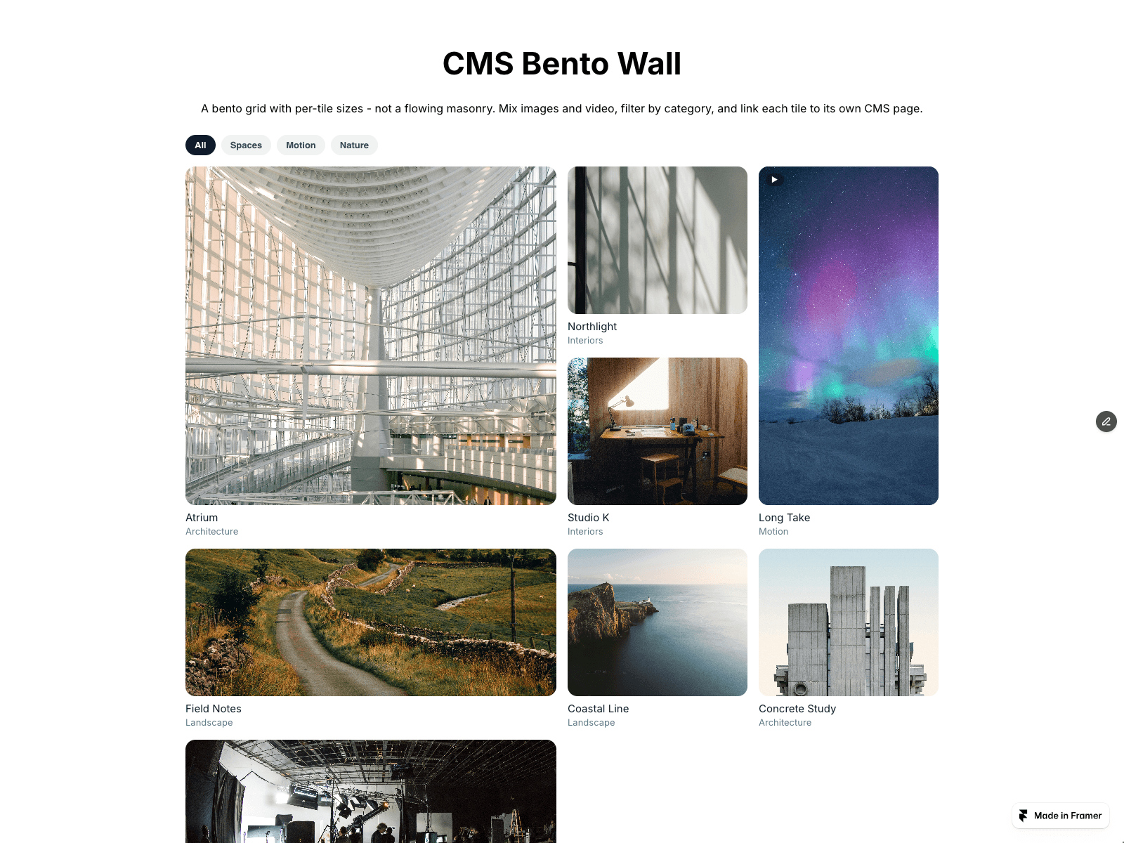
A bento grid with per-tile sizes - not a flowing masonry. Use it when you want a deliberate layout rhythm: mix 1x1, 2x1, 1x2 and 2x2 tiles so your hero shot, video loop and detail crops each get the weight they deserve.
Tiles can be images or video - video plays on hover with a poster fallback and command-based playback control. Category filter chips are generated from your tiles. The focus view opens any tile full-screen with arrow-key browsing, Esc to close and focus restore.
Per-tile CMS Link connects any tile to its own CMS page or URL - no CMS collection required. The grid is container-based responsive from two to four columns, wide tiles shrink automatically to fit, and there is no horizontal overflow at any width. prefers-reduced-motion is respected without disabling interaction, and the static canvas fallback keeps the Framer editor fast.
Everything is configurable from the properties panel: tiles, sizes, columns, gap, filters, colors, captions and focus view.
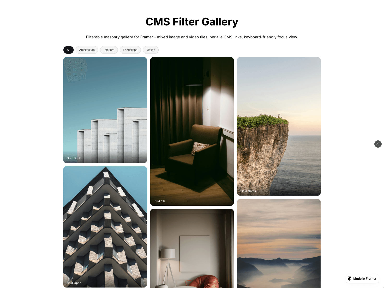
Try the live demo, then get the component and paste it straight into your project. Works on the free plan. Prefer a flowing masonry instead? Search Aisol for CMS Filter Gallery.