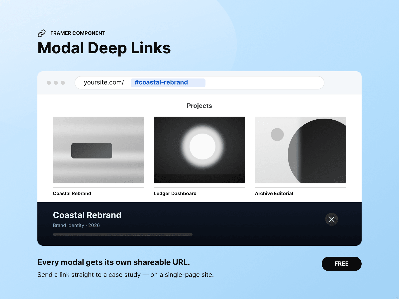
A complete case-study modal for a CMS collection. Click a project to open it over your grid, with a unique URL you can share:
yoursite.com/#ledger-dashboard
Deep linking is built in, so you don’t need a separate component.
Place one instance inside your collection item, bind its fields, and publish. Adding a project is as simple as adding a CMS item—there’s nothing to configure individually.
Choose Case Study, Photography, or Studio. Each layout arranges the sections differently. You can also define a custom order in one field:
ctx, i1, st1, p23, outcome
Sections without content automatically disappear, so shorter projects never leave empty headings or unwanted gaps.
The card begins in greyscale. On hover, colour sweeps across the image, rule, and title as one continuous gesture.
Control the direction, duration, easing, edge softness, and resting opacity.
Six typography groups are included: Title, Subtitle, Label, Statement, Body, and Description.
Each group provides controls for font, weight, size, letter spacing, line height, colour, and paragraph spacing. Type scales responsively on narrower screens and stops at a minimum size you define.
Escape key, overlay click, close button, and browser Back
A single scroll container that responds on the first gesture
Scroll-position restoration when the modal closes
Focus management and keyboard focus trapping
Mobile bottom-sheet layout with safe-area padding
Optional parallax for selected images
Automatic reduced-motion support
Static Canvas and export rendering
CMS rich text, including lists, headings, links, bold, and italics
Content is supplied through CMS-bound component properties rather than designed layers. This allows every collection item to populate its own modal without manually wiring each project.
Modal content is not intended to replace an indexable CMS project page. If per-project SEO is important, use dedicated CMS pages instead.