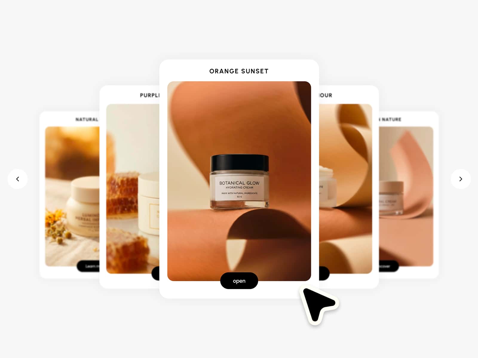
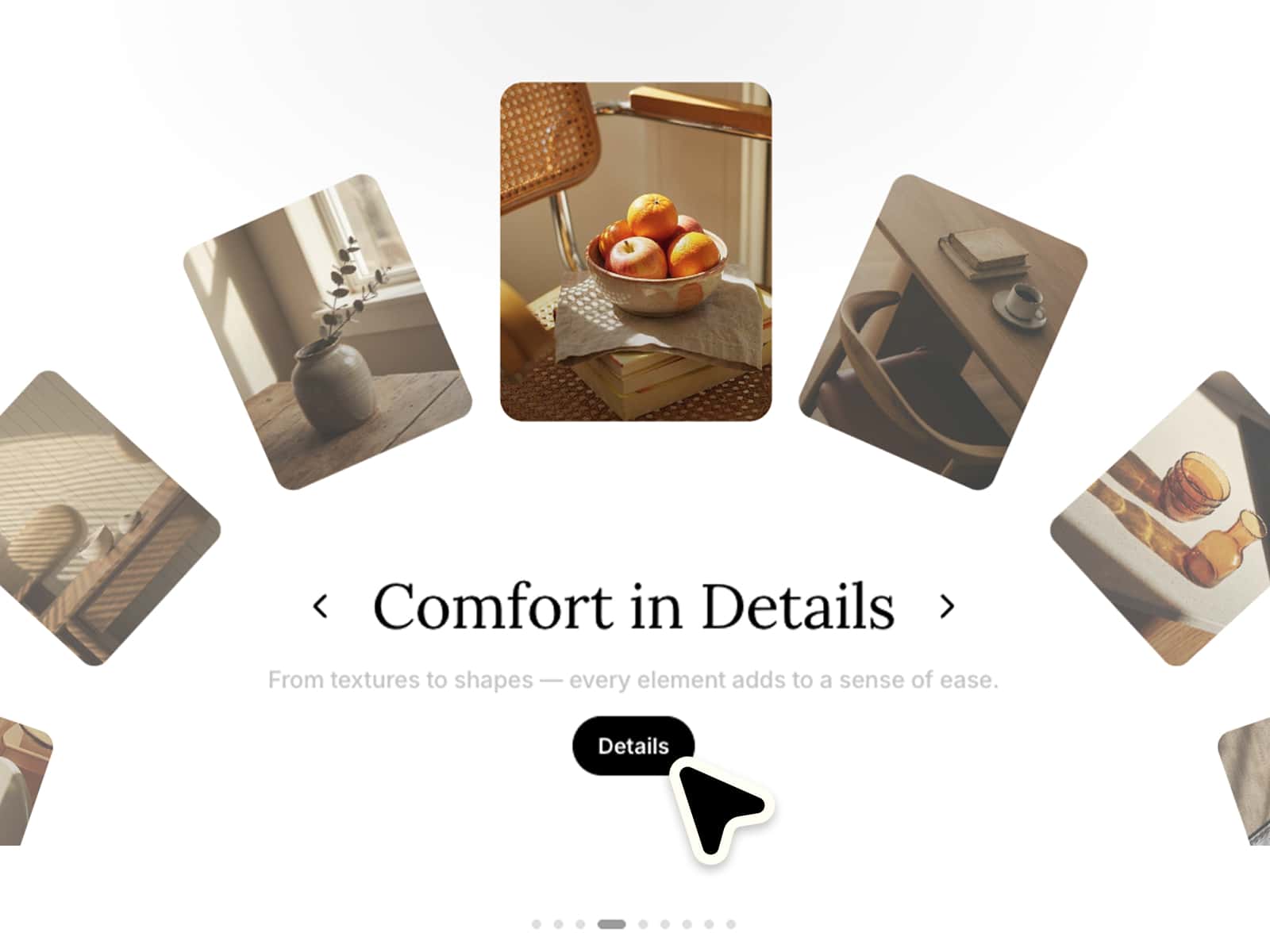
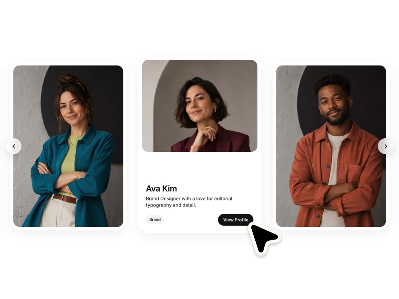
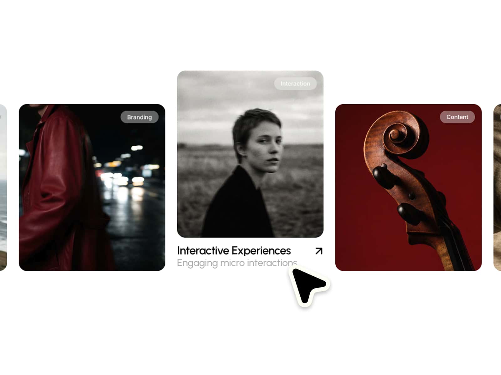
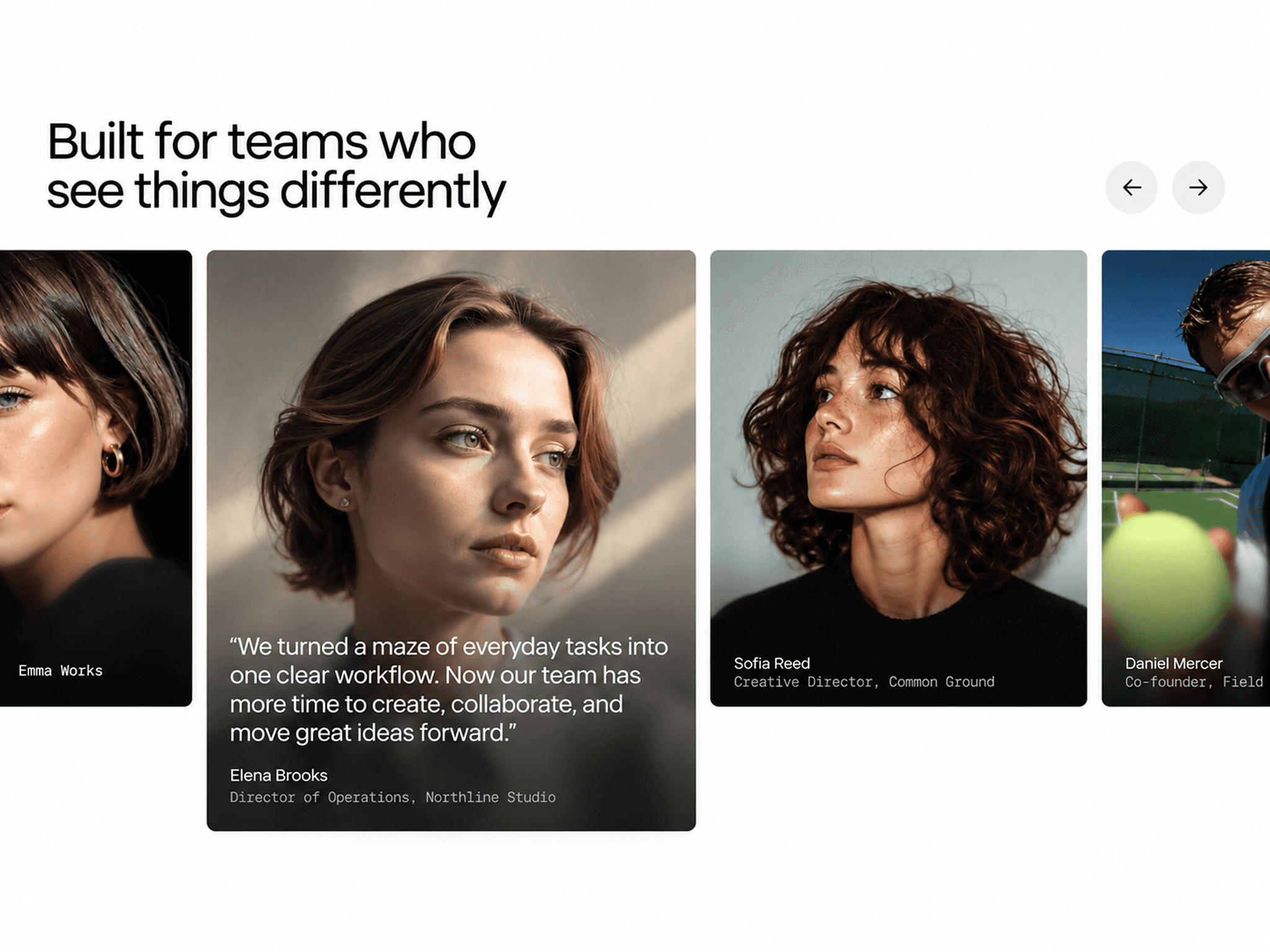
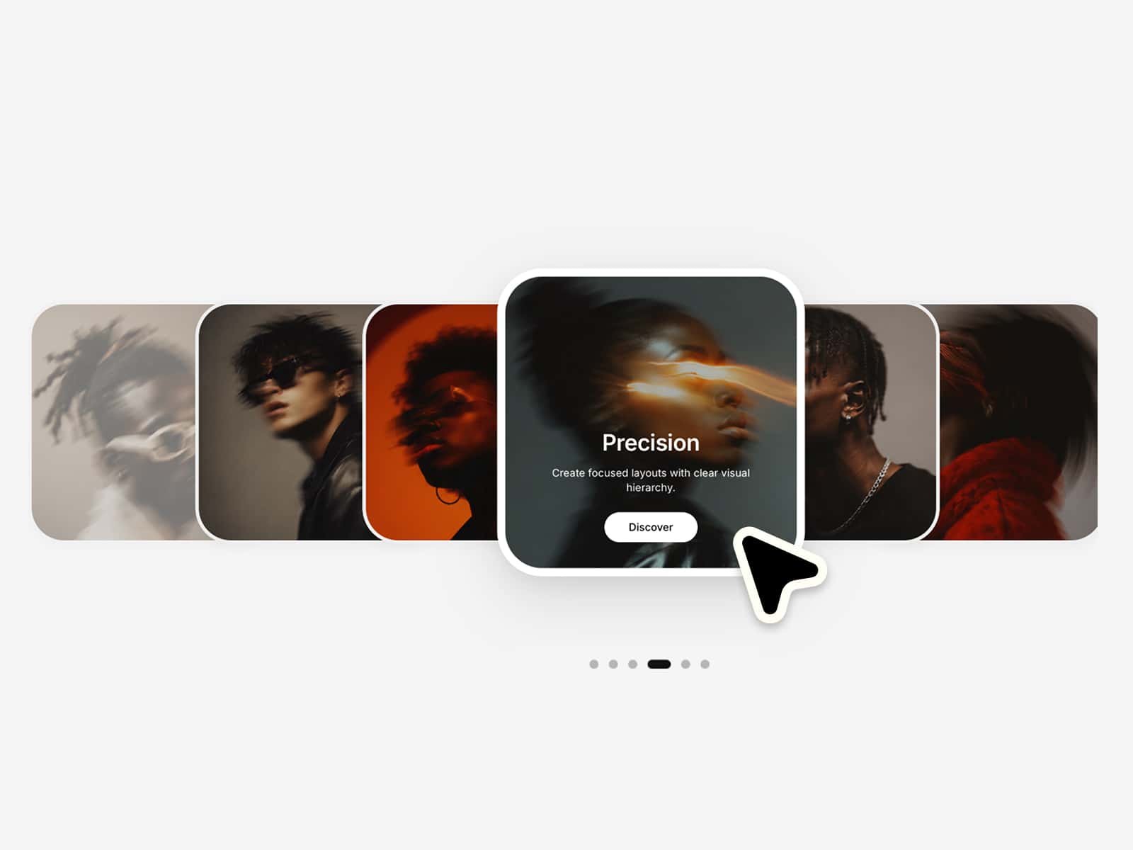
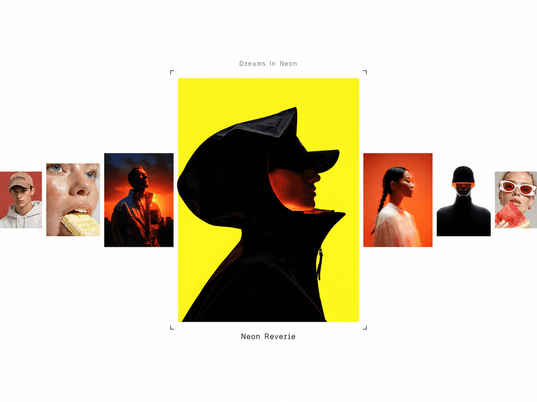
Fan Carousel — a responsive Framer component showing image cards in a layered, fanned layout with smooth transitions, drag, scroll & keyboard navigation, clickable cards, overlays, tags, and editable headlines.
Use Cases
Landing heroes, campaigns, product collections, portfolios, travel sections, editorial stories, galleries, and brand presentations — when you want a carousel that feels more expressive and dynamic than a standard slider.
Customization
Fully editable via the panel: card content (images, titles, subtitles, tags, links), headlines, layout (size, fan spread, rotation, scale, radius, animation speed), drag & scroll behavior, per-device positioning, plus full typography and color control. Dramatic by default, flexible for any direction.
Responsive
Desktop: larger cards, wider spread, full depth
Tablet: spread, rotation & headlines scale down
Mobile: tighter spread, softer rotation, smooth touch nav
Visual & layout
Fanned cards with subtle rotation, one centered in focus
Depth via scale, rotation, offset, shadow & z-index
Image-first cards with title, subtitle & tag overlays
Topic + main headline above the carousel
Interaction
Drag/swipe, arrow-key & optional scroll navigation
Click-to-focus, active card opens its link
Hover feedback & bottom indicators
Preview
Fan Carousel — a responsive Framer component showing image cards in a layered, fanned layout with smooth transitions, drag, scroll & keyboard navigation, clickable cards, overlays, tags, and editable headlines.
Use Cases
Landing heroes, campaigns, product collections, portfolios, travel sections, editorial stories, galleries, and brand presentations — when you want a carousel that feels more expressive and dynamic than a standard slider.
Customization
Fully editable via the panel: card content (images, titles, subtitles, tags, links), headlines, layout (size, fan spread, rotation, scale, radius, animation speed), drag & scroll behavior, per-device positioning, plus full typography and color control. Dramatic by default, flexible for any direction.
Responsive
Desktop: larger cards, wider spread, full depth
Tablet: spread, rotation & headlines scale down
Mobile: tighter spread, softer rotation, smooth touch nav
Visual & layout
Fanned cards with subtle rotation, one centered in focus
Depth via scale, rotation, offset, shadow & z-index
Image-first cards with title, subtitle & tag overlays
Topic + main headline above the carousel
Interaction
Drag/swipe, arrow-key & optional scroll navigation
Click-to-focus, active card opens its link
Hover feedback & bottom indicators
Preview