About Morph Deck
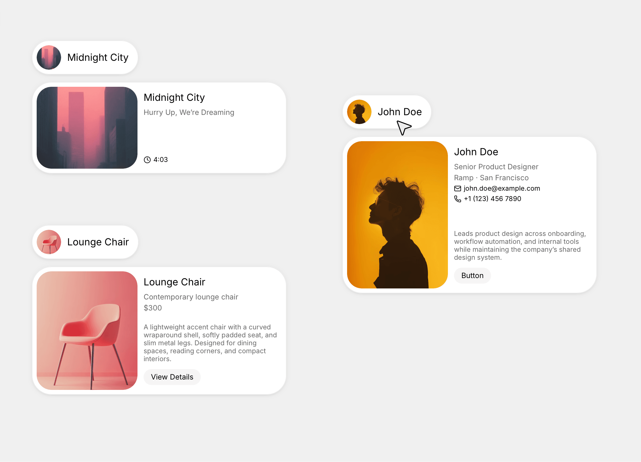
Morph Deck is a responsive Framer component for interactive card decks that fan out and expand, with an overlapping fanned layout, click-to-expand morph, cards that dock beneath the open one, your own components as the cards, hover lift, a blur-in entrance, and multiple independent decks per page.
Use Cases
Works well for:
portfolio highlights
project and case-study showcases
product feature cards
service or pricing cards
team and people cards
photography and gallery decks
testimonial and review sets
feature tours
"what we do" sections
Perfect when you want a card section that invites a click and opens into detail, instead of a flat grid or a plain carousel.
--------------------------------------------------------------
Customization
Fully customizable via the properties panel:
connected cards (your own components, up to 8)
overlap
tilt
open size
dock offset
overflow (clip or spill)
padding
hover lift
hover scale
morph spring (open and close motion)
entrance on or off
entrance trigger (in view or on load)
entrance stagger
entrance duration
entrance rise
entrance blur
canvas preview (fan or expanded)
Each card is your own component with Collapsed and Expanded variants, the card design stays yours. The deck only handles the fan, the morph, and the docking.
--------------------------------------------------------------
Responsive Behavior
Desktop: full fan with hover lift; click a card to expand it while the rest dock beneath it.
Tablet: same structure, sized to the component's width.
Mobile: hover is dropped and cards open on tap; layout adjusts for narrow widths.
Morph Deck fits itself to whatever container you place it in.
--------------------------------------------------------------
Preview: https://morph-deck-preview.framer.website/
Included: The component and its DeckCard overrides, plus the live preview with tutorial.
Note: hover lift is pointer-only (cards open on tap or touch), and each card needs two variants named exactly Collapsed and Expanded.