About Orbit Project
Orbit Projects is a responsive Framer code component designed for portfolios, creative studios, agencies, and visual project showcases
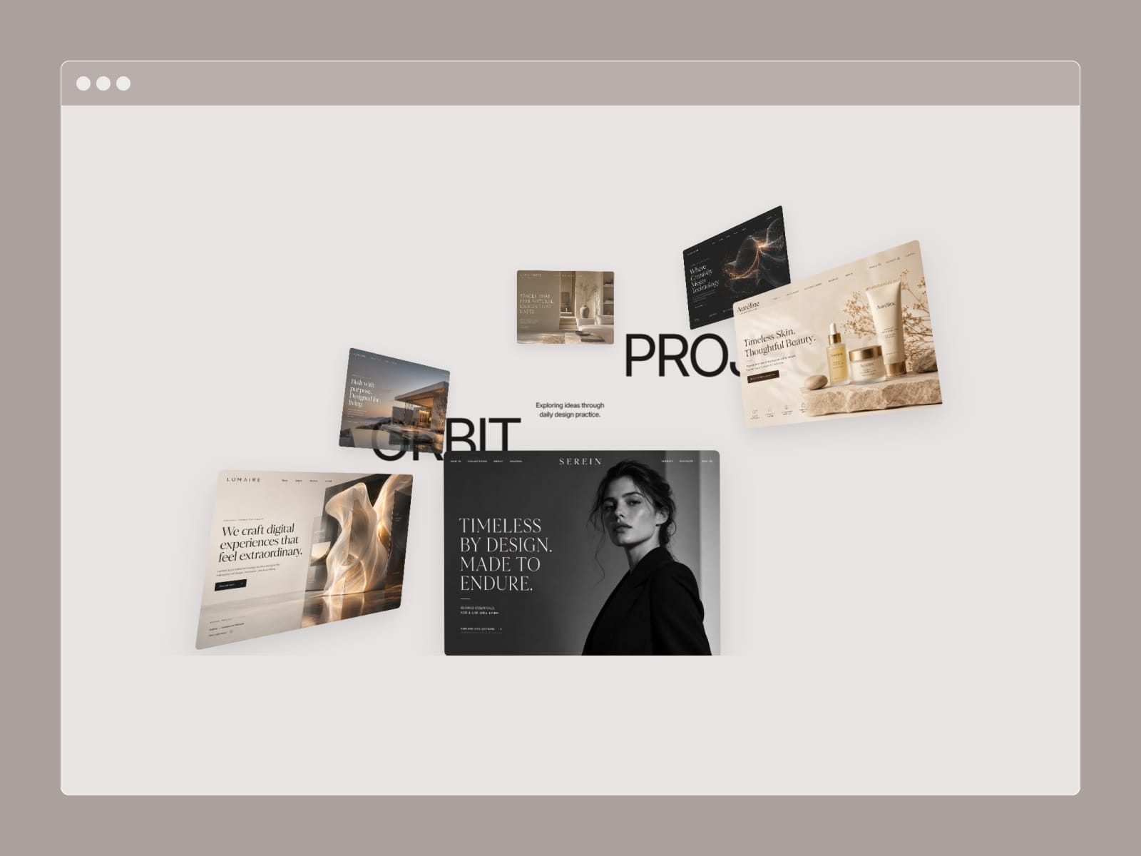
On desktop, projects move through a smooth 3D orbit as you scroll, using perspective, depth, rotation, scale, and opacity to create a layered cinematic presentation. As the interaction progresses, the cards transition into a clean structured grid, giving the section a strong beginning, motion sequence, and final layout.
The component includes controls for project images, links, card background, radius, aspect ratio, image fit, label typography, label color, depth opacity, depth scale, image quality, perspective, orbit position, rotation, scroll length, start offset, and motion smoothness.
Typography and content are fully customizable, including separate desktop, tablet, and mobile text styles, colors, spacing, and alignment. The center copy used in the desktop animation automatically becomes supporting content in the responsive layouts.
Tablet and mobile use a simplified responsive grid instead of the 3D scroll interaction, keeping the experience clean, fast, and easy to navigate on smaller screens. You can independently control tablet and mobile columns, padding, spacing, typography, and layout preview directly from the Framer properties panel.
The built-in Canvas controls also let you preview the desktop animation at any progress point or switch between desktop, tablet, and mobile layouts while designing.
Everything is configurable directly inside Framer, with no external setup required.