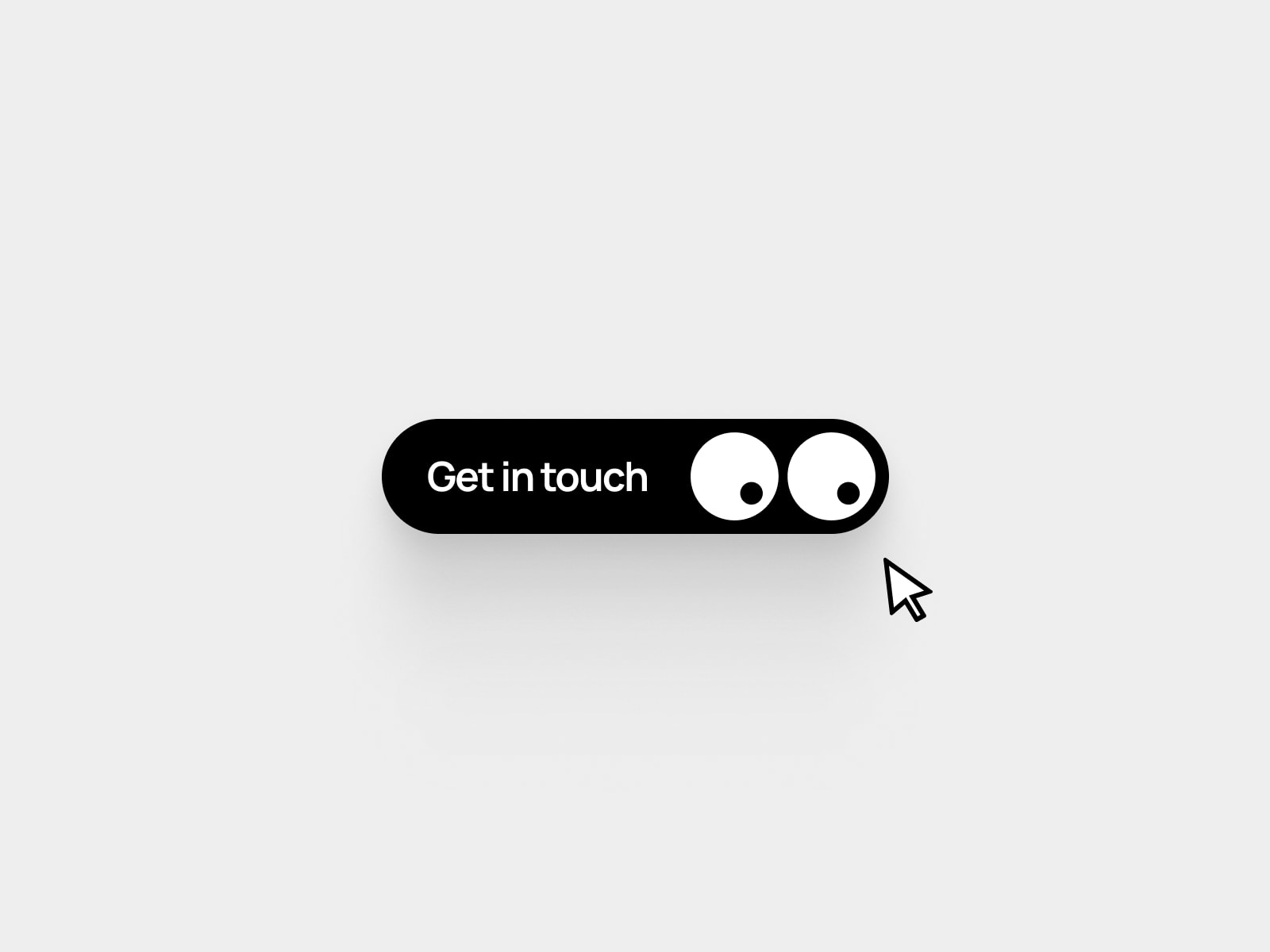
Description SplitTextButton is a polished interactive button component that brings a satisfying typographic animation to your Framer projects. On hover, the original label slides out downward while individual letters fly in from alternating directions with a staggered delay — creating a dynamic, layered reveal effect that feels premium without being distracting.
Every detail is customizable through Framer's property panel. Switch between solid and gradient backgrounds for both default and hover states. Full color control over text, border, and background in both states.
Key features:
Staggered letter animation on hover — alternating up/down entry per character
Original label slides out as hover letters fly in
Solid or gradient background — toggled per state with angle control
Separate hover label — show different text on hover if needed
Full typography control: size, weight, letter spacing
Border color, width, and border radius
Padding H/V controls
Hover text and background color independent of default state
Animation speed control
Built-in link field — same tab or new tab
On Click event handler
Static renderer safe — no animations in editor or export
Semantic HTML — <button> with no link, <a> with link
Keyboard accessible and screen reader friendly
Tags button, animation, hover, typography, stagger, letters, interactive, text, effect, creative