Full Description
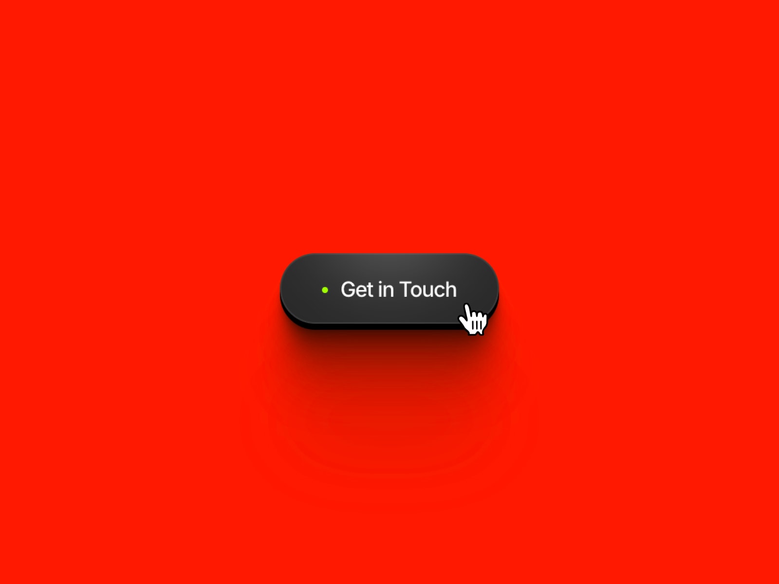
WebGL Button is an interactive, code-based button component that renders a real-time WebGL liquid simulation inside its shape — no video, no GIF, just live shader animation. Move your cursor across it and the liquid tilts and sloshes; click it and it "gulps" down before settling back.
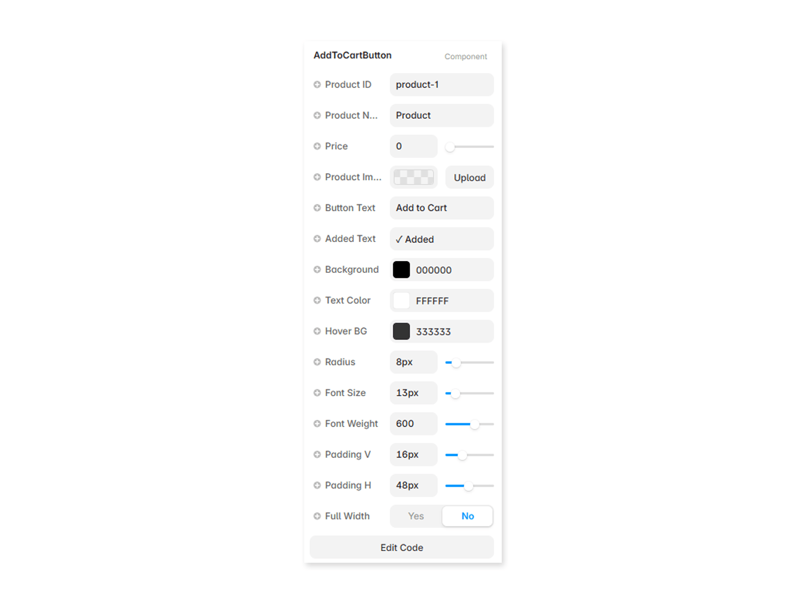
Fully customizable directly from the Framer properties panel, no code editing required:
Liquid Color — recolor the animated liquid to match your brand
Background — set the button's base color independently of the liquid
Typography — full font control (family, weight, size, letter-spacing) via Framer's native font picker
Text Color
Icon Image — upload your own icon (SVG/PNG), with adjustable size and gap from the label
Padding — size the button by adjusting padding rather than dragging the frame, so it always hugs its content
Corner Radius
Link — turn it into a working link with optional new-tab behavior, or leave it as a plain interactive button
Great for hero CTAs, form submit buttons, or any spot where a subtle, tactile animation adds polish without feeling gimmicky.
Key Features
Live WebGL shader animation, not a video/GIF
Cursor-reactive tilt and slosh physics
Click "gulp" interaction
Fully themeable: liquid color, background, text, icon
Custom icon upload with size/gap controls
Auto-sizing via padding (hug-content behavior)
Works as a button or a link (with new-tab option)
Follows Framer's static-render guidelines (no animation on canvas/export, only in live Preview/published site)

Full Description
WebGL Button is an interactive, code-based button component that renders a real-time WebGL liquid simulation inside its shape — no video, no GIF, just live shader animation. Move your cursor across it and the liquid tilts and sloshes; click it and it "gulps" down before settling back.
Fully customizable directly from the Framer properties panel, no code editing required:
Liquid Color — recolor the animated liquid to match your brand
Background — set the button's base color independently of the liquid
Typography — full font control (family, weight, size, letter-spacing) via Framer's native font picker
Text Color
Icon Image — upload your own icon (SVG/PNG), with adjustable size and gap from the label
Padding — size the button by adjusting padding rather than dragging the frame, so it always hugs its content
Corner Radius
Link — turn it into a working link with optional new-tab behavior, or leave it as a plain interactive button
Great for hero CTAs, form submit buttons, or any spot where a subtle, tactile animation adds polish without feeling gimmicky.
Key Features
Live WebGL shader animation, not a video/GIF
Cursor-reactive tilt and slosh physics
Click "gulp" interaction
Fully themeable: liquid color, background, text, icon
Custom icon upload with size/gap controls
Auto-sizing via padding (hug-content behavior)
Works as a button or a link (with new-tab option)
Follows Framer's static-render guidelines (no animation on canvas/export, only in live Preview/published site)
 Nazam Azam