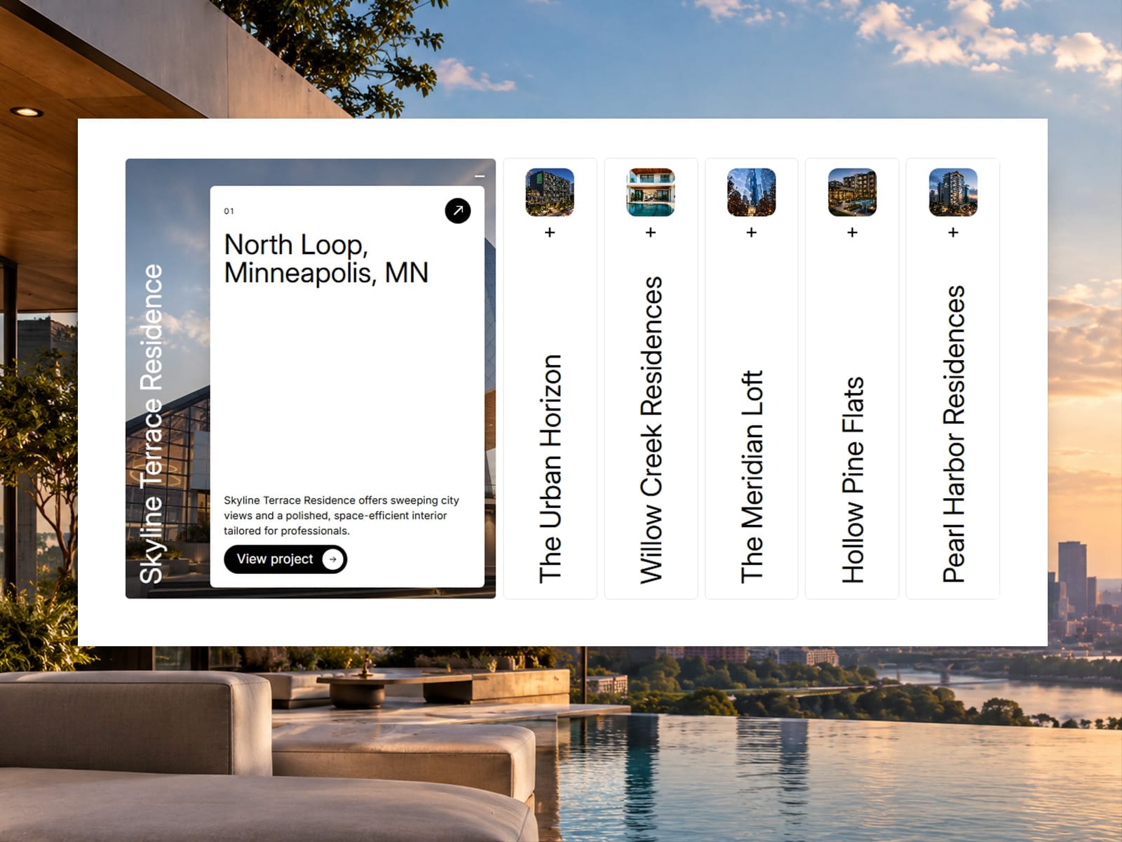
Showcase Accordion is a Framer component that turns projects, services or products into a smooth, interactive image accordion. Panels start as slim strips with a thumbnail and vertical title, then expand into a full-bleed image with a floating info card and a call-to-action button, all animated with GSAP. It works in row or column layout, takes panels manually or from the Framer CMS, and can autoplay with a progress bar that pauses on hover and focus. You can control fonts, text transforms, colors, spacing and the button’s hover effects, or connect your own button component. It supports keyboard navigation, ARIA roles and reduced-motion preferences, and it turns animations off on the canvas and in exports. It suits portfolios, case studies, agency services, menus, product showcases and landing page sections.