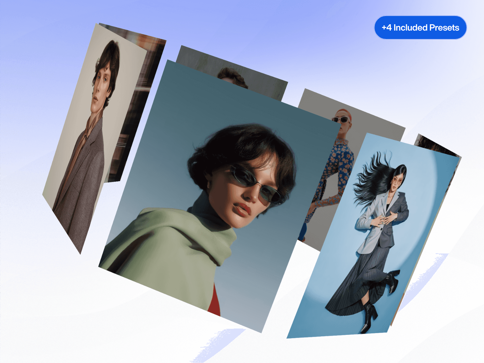
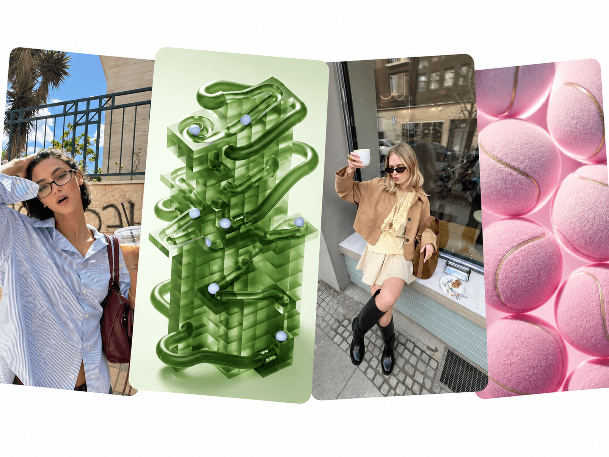
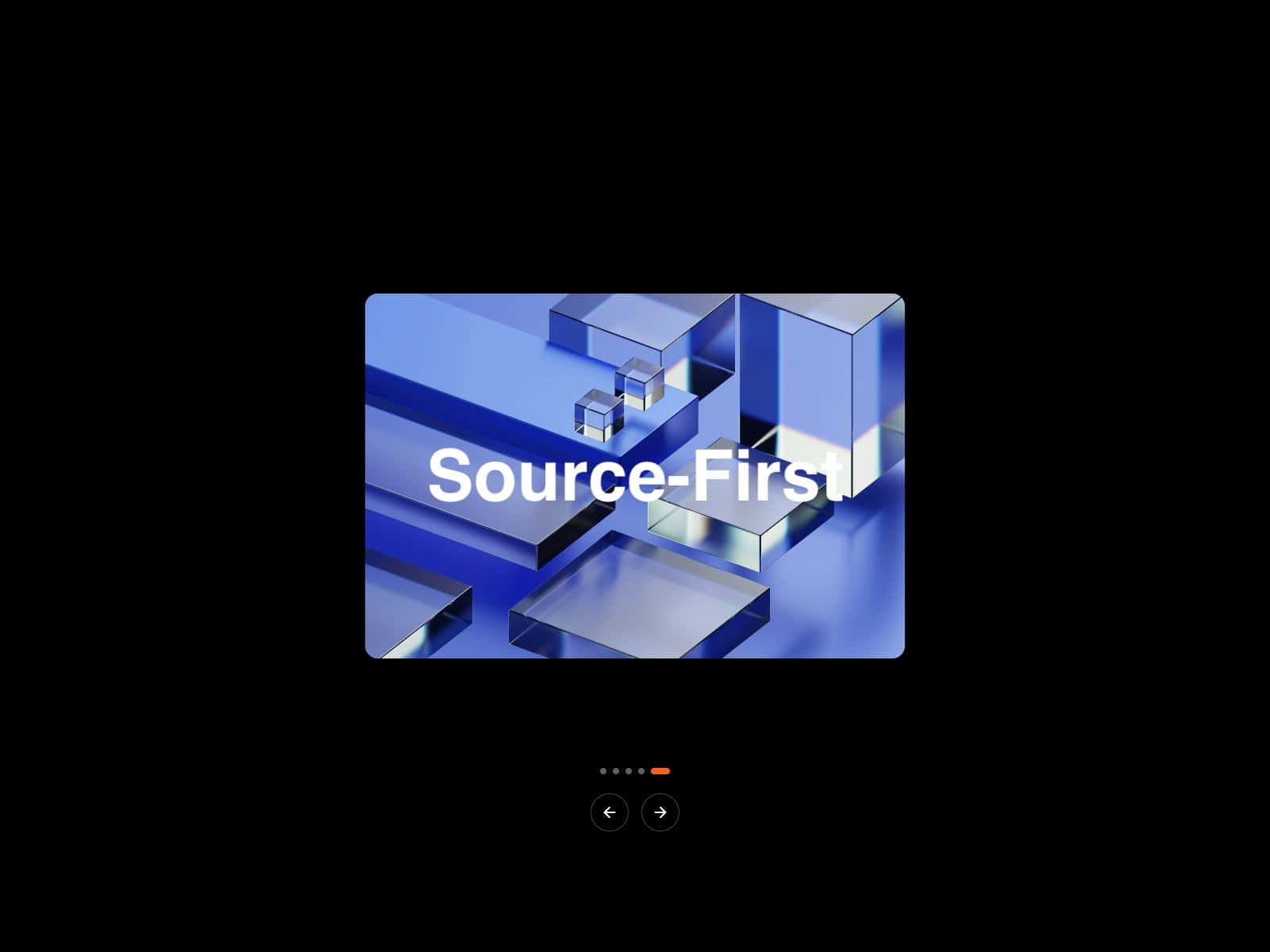
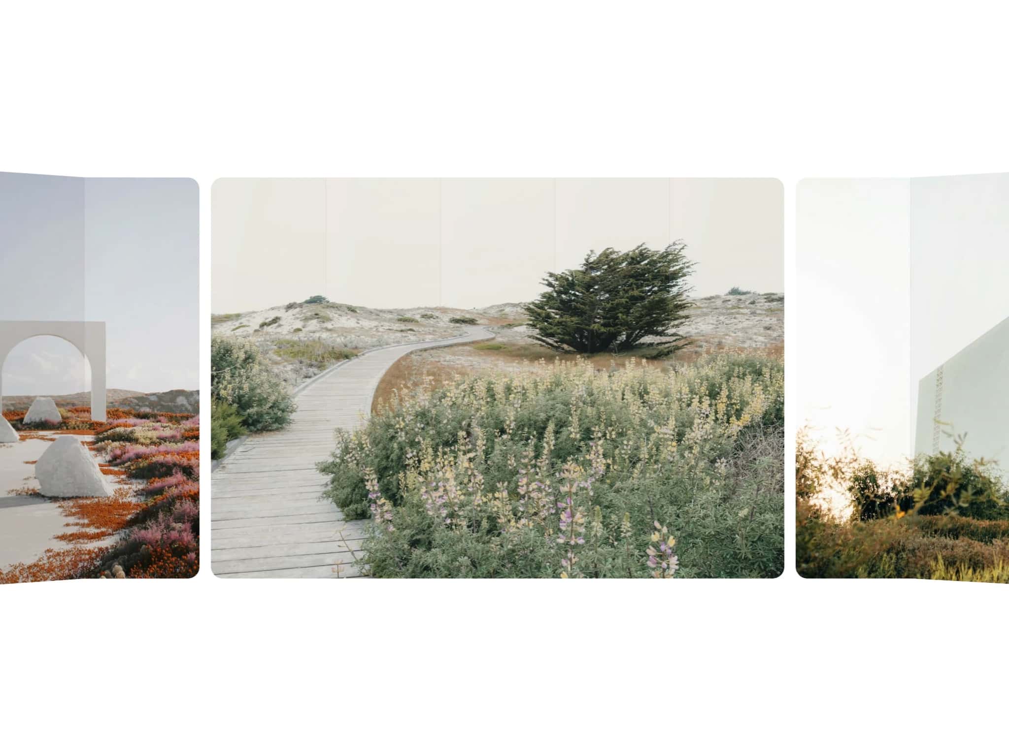
About 3D Ring Carousel
Most carousels feel flat, rigid, and limited. This one doesn’t.
3D Ring Carousel creates a true spatial experience - items wrap around a convex ring, glide with momentum, and respond naturally to drag, swipe, and scroll. The result feels closer to a physical object than a typical slider.
Drop it into your Framer project, connect your cards, and you instantly get a premium interactive carousel that feels smooth, modern, and alive.
What makes this different from other carousels
Unlike many carousel components that force you into predefined image or video placeholders, this one gives you full design freedom.
You design your cards directly on the Framer canvas with hover states, buttons, links, badges, or any custom layout, then simply connect those frames to the carousel. That’s it.
There are:
No locked templates
No predefined media slots
No content restrictions
Because the items are real Framer layers, this works beautifully as a product carousel, portfolio carousel, team carousel, or logo carousel - fully customized to your design system.
Instructions
Copy and paste the component into your Framer project
Drop 3D Ring Carousel onto your canvas and resize it to fit your layout
In the right-hand panel, click Items dropdown and select any Frame or Component Instance (repeat for each item)
Use Radius to control how far items spread from the center
Use Perspective to control the depth of the 3D effect
Toggle Auto Rotate to enable continuous spinning
Fine-tune speed, direction, and hover behavior
Enable Edge Fade to softly mask the left and right edges
Preview to experience full interaction - drag, swipe, and wheel all work live.
How It Works
The component includes 15 property controls organized into logical groups.
Properties Control
Cards: Connect Framer frames or components as carousel items.
Initial Angle: Sets which item faces front on load (0° = first item centered).
Radius: Controls distance from the ring center.
Perspective: Controls CSS 3D depth - lower values create a stronger convex carousel effect.
Repeat Count: Duplicates items to create a seamless infinite carousel loop.
Auto Rotate: Enables continuous rotation and reveals Speed, Direction, and Hover Slow.
Direction: Sets left or right rotation.
Speed: Controls automatic spin speed.
Hover Slow: Slows or pauses rotation on hover.
Draggable: Enables mouse drag interaction.
Drag Sensitivity: Controls how much rotation occurs per pixel of drag.
Momentum: Controls how long the ring coasts after release (natural momentum scroll feel).
Mobile Drag: Enables touch swipe on mobile and tablet.
Scroll Wheel: Allows rotation via mouse wheel or trackpad.
Edge Fade: Adds a soft mask on left/right edges with more adjustable.
Features
- True 3D Ring:
Items arc toward the viewer using translateZ, creating a genuine 3D ring - not a flat slider.
- Momentum Physics:
After drag or flick, the ring continues naturally with friction-based deceleration.
- Auto-Rotate Controls:
Fully configurable speed, direction, and hover slow-down.
- Drag, Swipe & Scroll:
Supports mouse drag, touch swipe (axis-locked), and optional wheel control, making it a fully drag carousel experience.
- Infinite Loop:
Items repeat seamlessly with no visible seam.
- Edge Fade:
Optional gradient mask for a premium finish.
- Connect Any Component:
Works with images, cards, product tiles, team members, logos, any Framer layer.
- Responsive & Layout-Aware:
Works in sections, grids, and full-bleed layouts.
- Performance Optimized:
60fps smooth rotation with GPU-friendly transforms.
- Safari & WebKit Compatible:
Includes required compatibility for consistent rendering.
Use Cases
Portfolio Showcase: Display case studies in a premium portfolio carousel.
Team Section: Spin through team members in an engaging rotating carousel.
Product Display: Show products in a high-end 3D slider layout.
Logo Wall: Create an animated logo carousel for partners and sponsors.
Testimonials: Rotate review cards smoothly.
App Features: Present UI screens in a circular flow.
Hero Accent: Use as an interactive visual element near your headline.
Made with ❤️ by Soyeb
© 2026 Soyeb. All rights reserved.
Refund Policy: Due to the digital nature of these components, all sales are final, and once delivered they cannot be returned or refunded. Please review product details and demos before purchasing, and feel free to reach out if anything is unclear.
Have questions or need a custom Framer component? Reach out at heysoyebali@gmail.com