About Hero Section Gallery
Hero Gallery is a centered hero section with a headline, intro and button above a staggered row of image cards. Every animation is a preset you choose from the properties panel, so you can change the feel of the page without touching code.
Pick how the headline arrives:
Rise
Blur
Letters
Lines or Fade.
Choose how the cards enter:
Fan Out
Rise
Scale or Unfold.
Set what happens on scroll:
Grow Center, Parallax or Spread.
Then choose a hover effect and a pace, and the whole sequence stays in sync.
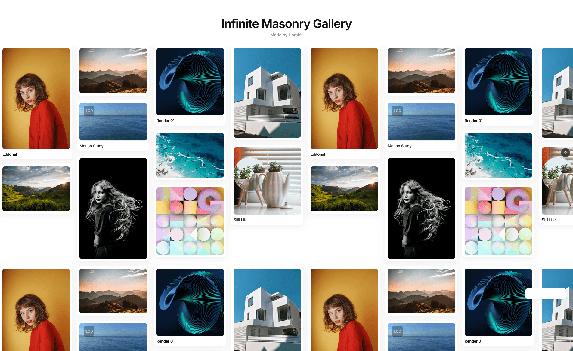
The button comes in Filled, Outline or Soft styles, three sizes, three shapes, and an optional arrow. Add 3, 5 or 7 images with optional captions that show on hover or all the time. Colors, fonts, spacing and card sizes are all editable.
It’s responsive down to mobile, respects reduced-motion settings, and appears static on the canvas and in thumbnails so previews always look finished. It makes no network requests.