About Arrow Fill Button
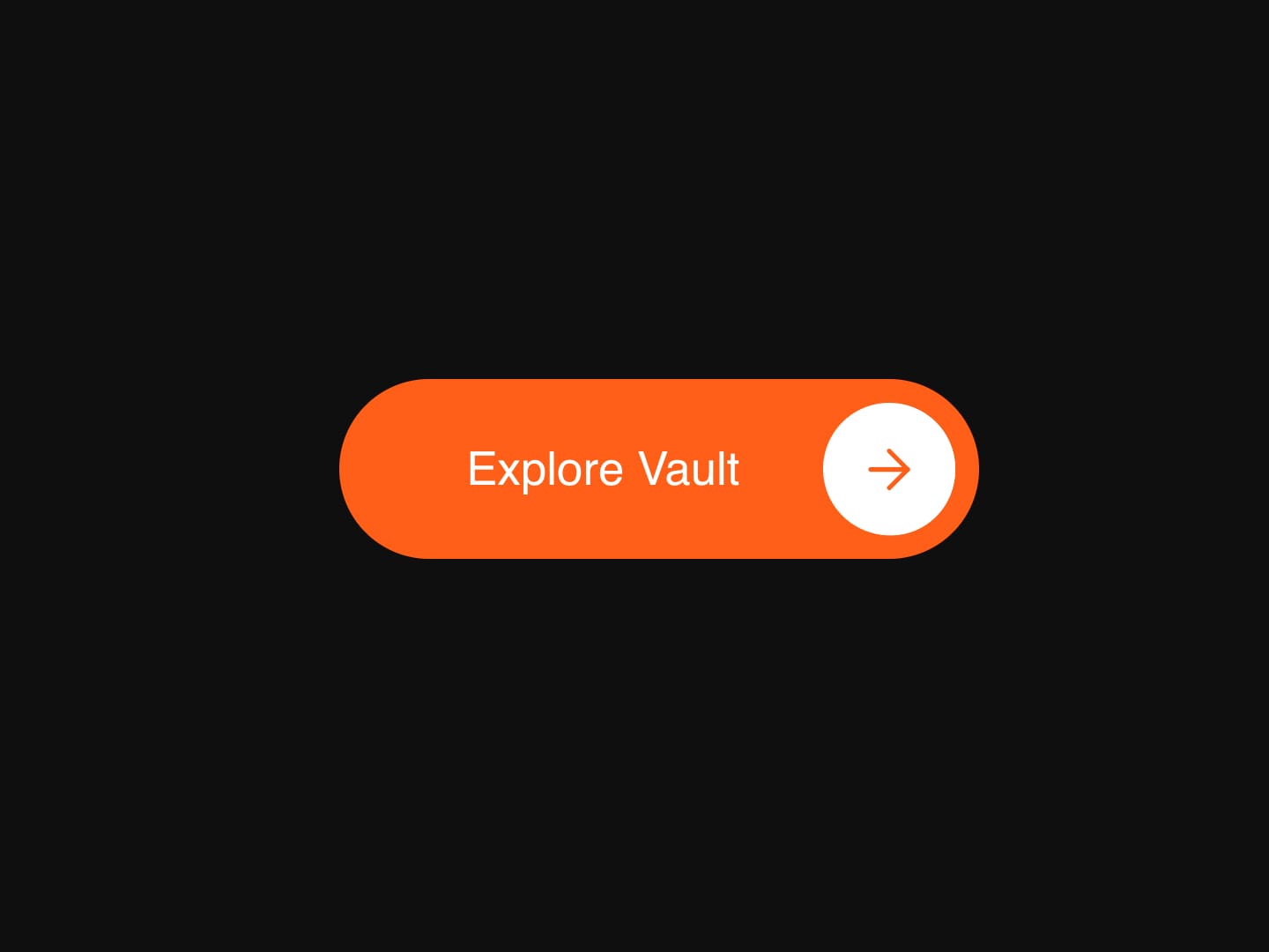
Arrow Fill Button is an animated CTA button for Framer built around a hover-fill interaction. As visitors hover, a circular fill expands from behind the arrow icon to cover the entire label while a matching arrow slides in from the other side, creating a smooth, deliberate reveal instead of a flat color swap.
Built for CTAs, hero buttons, and nav links, every color layer - background, fill, hover-fill, and arrow, is set independently, so it drops into a dark or light brand palette without fighting the defaults.
◆ Key Features
Fill Hover Interaction - A circular fill expands from behind the arrow to cover the full label on hover.
Swapping Arrow Icon - The arrow slides out while a matching one slides in as the fill completes.
Independent Color Controls - Background, fill, hover-fill, and arrow colors are all set separately.
Adjustable Animation Duration - Control exactly how fast the fill and arrow swap play out.
Toggleable Fill Effect - Turn the fill off entirely for a flat, static button.
Touch-Friendly Press State - On mobile, the fill triggers on press-and-hold instead of hover.
Fluid Responsive Sizing - Scales smoothly with viewport width across desktop, tablet, and mobile.
New Tab Support - Open the link in a new tab with a single toggle.
Reduced Motion Support - Respects
prefers-reduced-motionfor visitors who've asked for less animation.Canvas & Export Safe - Renders cleanly on the Framer canvas and in static exports without animating.
◆ A CTA Built to Draw the Eye
Arrow Fill Button turns a plain call-to-action into a small moment of visual delight, without needing a single line of custom code. It's built for the button that visitors are meant to actually notice - hero sections, pricing CTAs, and nav "explore" links.
Keywords: Arrow Fill Button, CTA Button, Fill Button, Hover Button, Animated Button, Framer Button, Call to Action, Button Component, Framer CTA, Interactive Button