About Caption Gallery
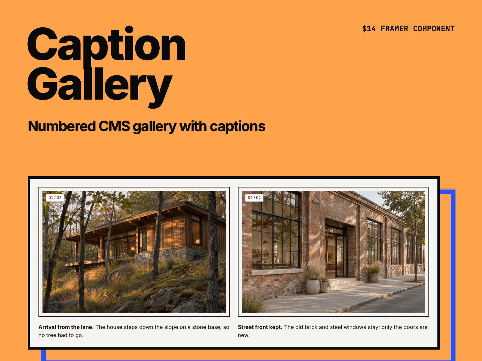
Caption Gallery turns a CMS Gallery field or a Collection List into a numbered gallery with captions. Click a picture to see it full screen. Made for case studies, project pages and photo walls.
One column, grid or masonry. On smaller screens the grid uses fewer columns by itself.
Tall pictures get narrower so they fit on the screen. Set Max height (720 px by default) and align them left or center.
Numbers 01, 02, … or 01 / 12 in any corner of each picture.
Captions come from each image's alt text. Write "Short title. Longer text." to make the first sentence bold (optional).
Full-screen view with arrows, swipe, ← → Home End and Esc. Keyboard focus stays in the view while it is open and goes back to the picture when it closes.
With a Collection List, each picture can open its CMS item page instead. Hover zoom is optional.
No new CMS fields needed. Your images stay in the page, so search engines still see them and their alt text.
You set the colors of the frame, numbers and captions, and the fonts of numbers and captions. Animations stop for visitors who turn on reduced motion on their device.
To connect it on a CMS page, choose Insert → CMS → Fields → your Gallery field, select Caption Gallery and pick that grid in Content.
After you buy, you get the component link on the Polar receipt page and by email. Paste it into your Framer project (⌘V).
License: one project per purchase, for yourself or one client (Framer Single-Use Commercial License). Please don't share the component link, or resell or redistribute the component or its code.
Made by H SHIFT WORKS. Our Framer templates: https://www.framer.com/@hshiftworks/