About Card Menu Navbar
Card Menu Navbar
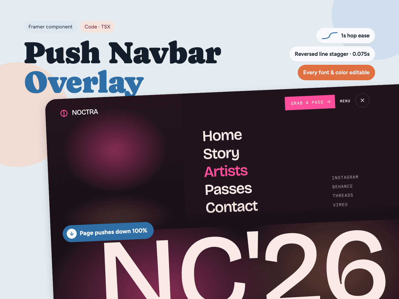
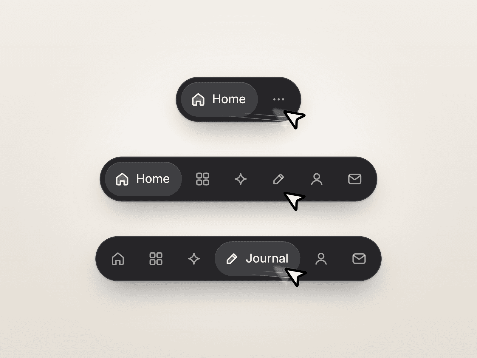
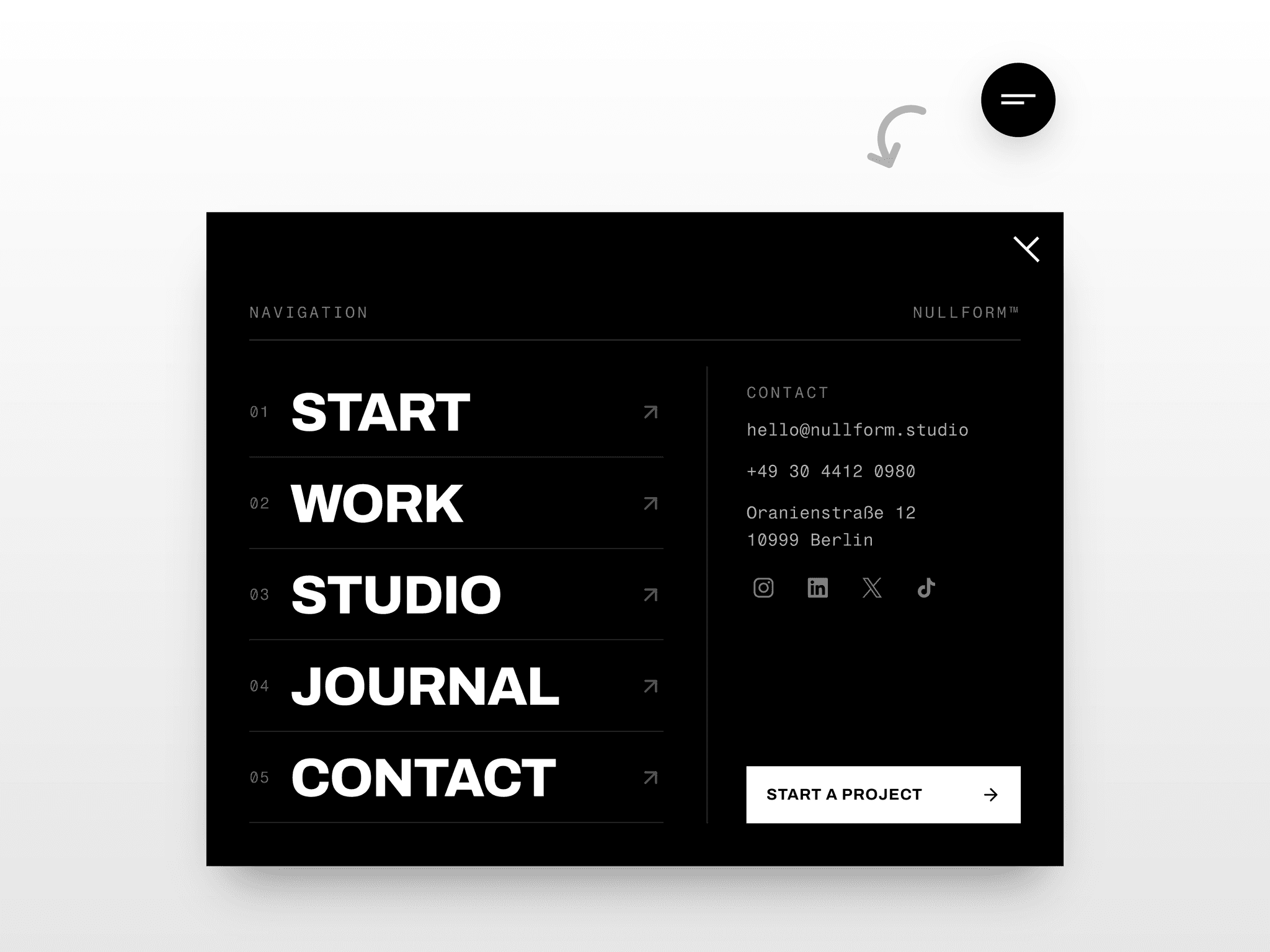
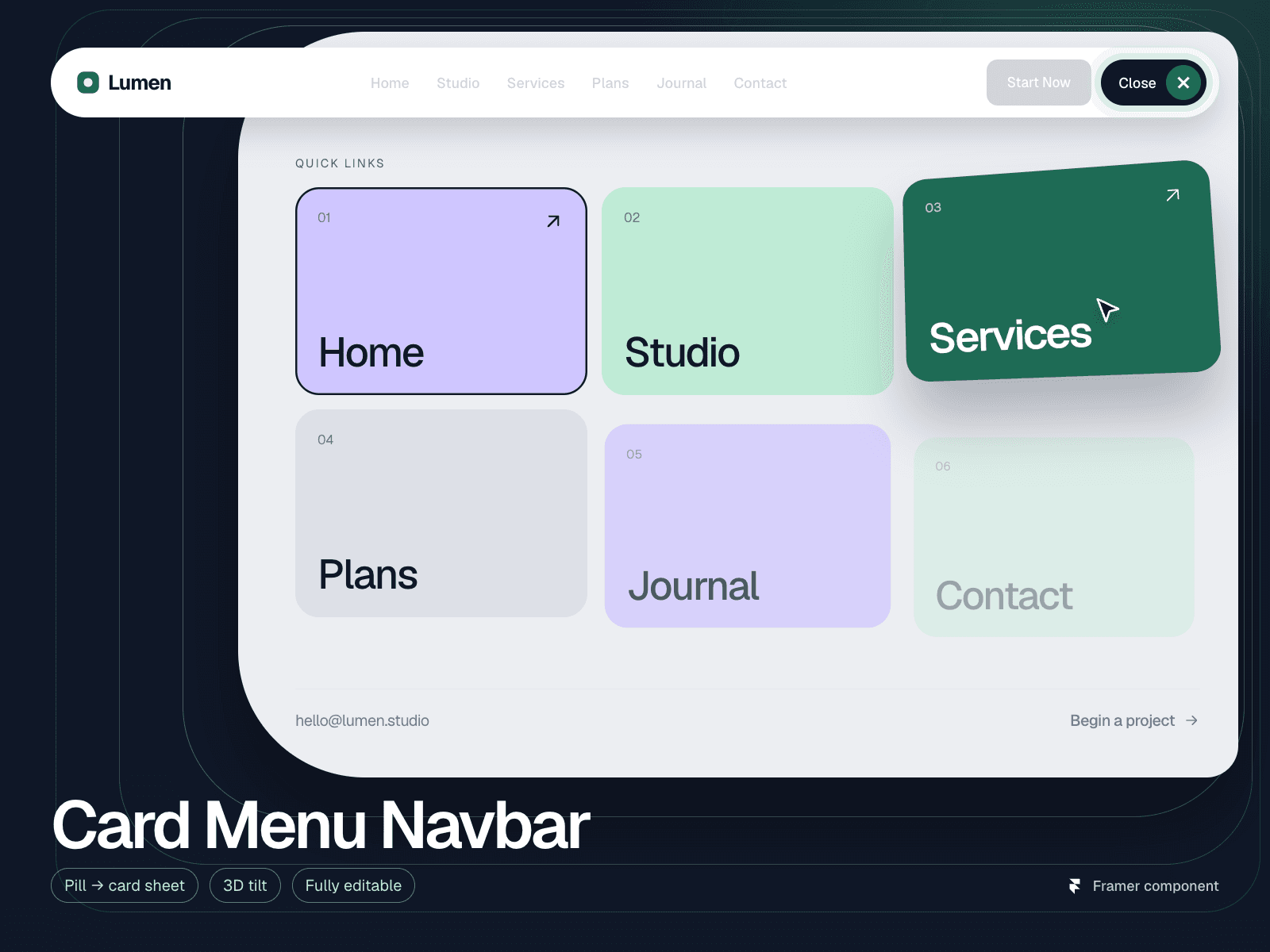
is a responsive Framer navigation component that turns a simple menu pill into a full-screen sheet of colour cards. The sheet expands from the pill with a smooth clip-path reveal, the cards rise in with a staggered fade, and the pill label and icon morph into a close state.
Features
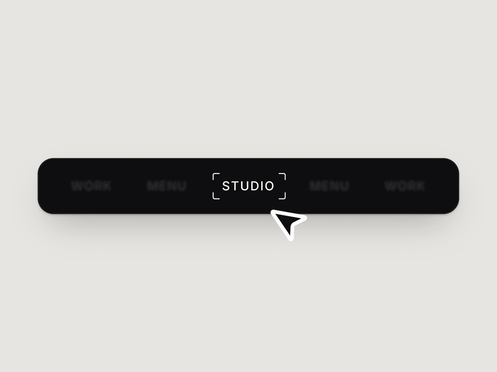
Navbar with logo, links, CTA button and menu pill
Full-screen card menu with 1–6 columns and separate phone columns
Palette colours, or a custom colour and image per card
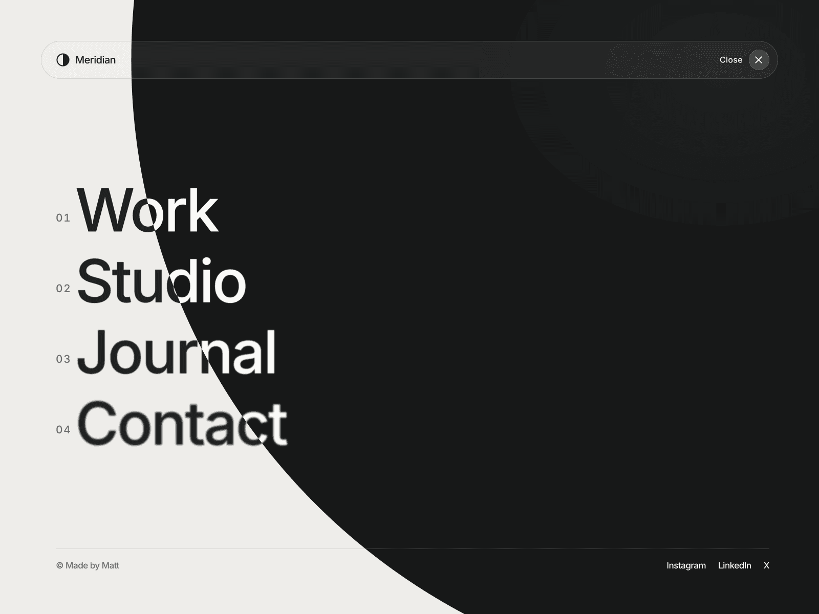
Colour, image or video background for the menu sheet
Auto highlight for the current page
Optional 3D tilt and hover shadow on cards
Menu footer with email and CTA link
Custom breakpoints for tablet, phone, small phone and short screens
Animation speed control, or switch motion off
Built for real sites
No external libraries, fonts or scripts
Respects prefers-reduced-motion
Keyboard friendly: Escape to close, focus trap, ARIA labels
Scroll lock while the menu is open
Works inside sticky and fixed layers
Canvas preview shows the open menu while you design
Fully customisable
Every colour, font, spacing, radius and label is editable from the properties panel. Use a text or image logo, add up to 18 links, and choose which links appear in the bar and which in the menu.
Ideal for agency, studio, portfolio, SaaS and startup websites that want a premium mobile menu and clean full-screen navigation in Framer.
Keywords: Framer navbar, Framer navigation component, full-screen menu, mobile menu, hamburger menu, card menu, animated menu, overlay menu, responsive navbar, Framer header, Framer component.