About Cascade Card Slider
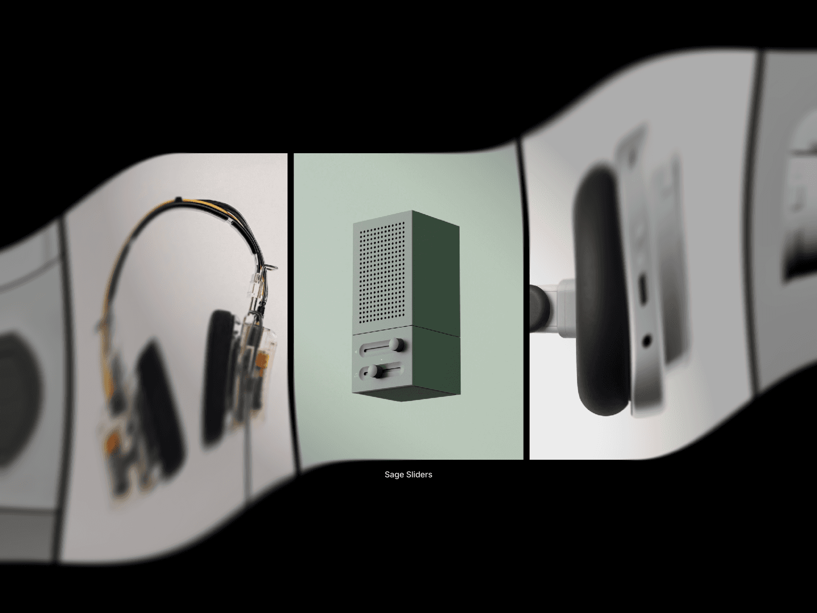
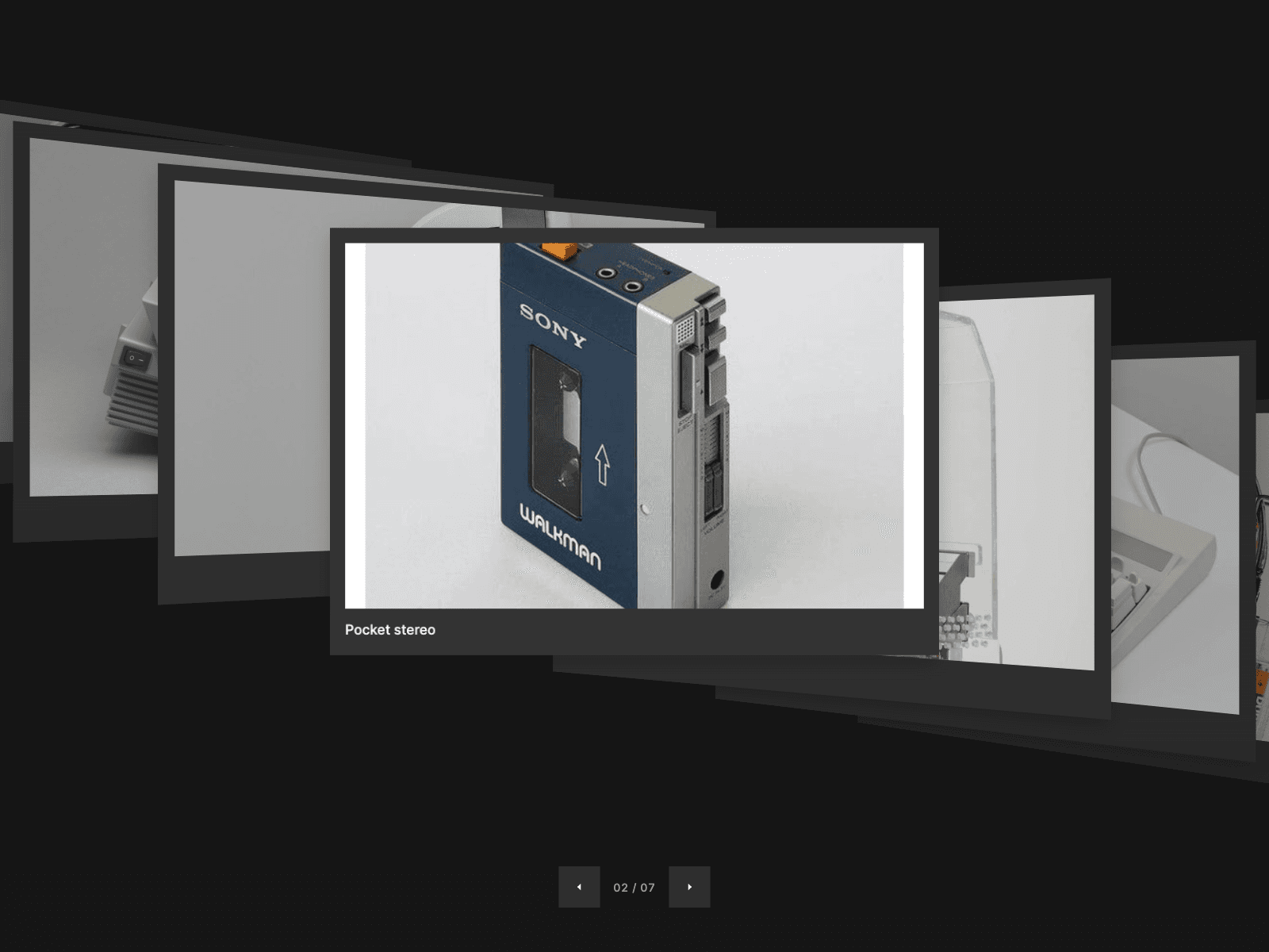
Cascade Carousel shows your work as a stack of framed cards seen in perspective. The front card is flat and readable. Earlier cards climb up and back to one side, later cards step down and back to the other, each turning toward the viewer. Moving between cards is one smooth spring, and the cascade leans slightly with the cursor.
Built for portfolios, case studies, product showcases, galleries and launch pages: anywhere a flat slider feels too plain.
Features
Cards: images or videos (MP4, WebM or MOV) with a title and optional link, in frames with width, colour, radius, fill and shadow. The cascade scales to fit any frame.
Cascade: Step X and Y set the diagonal, Depth pushes cards back, Turn swings their edges. Tilt, Roll and Perspective angle the whole stack. Choose how many side cards show, with Dim and Blur per step.
Navigation: arrows with three icon styles and an optional counter, drag and swipe with momentum, trackpad swipes, keyboard, and click any side card to bring it forward. Loop or stop at the ends, any spring or tween, and autoplay that pauses on hover.
Captions: front card, all cards or none, with full font controls.
Intros: Fan Out, Rise or Fade, with duration and stagger.
Parallax: the cascade leans toward the cursor.
Interactions: On Change and On Card Click events.
Accessible: labelled carousel, slide labels, live announcements, keyboard support, and reduced motion respected.
Efficient: plain DOM and CSS 3D, transforms written directly, intros wait until on screen, videos load only near the front.
Editable code: open, documented source with a guide for AI coding agents.