About Chain Menu Gallery
The photos and the active word are one row, not two stacks pinned to the sides.
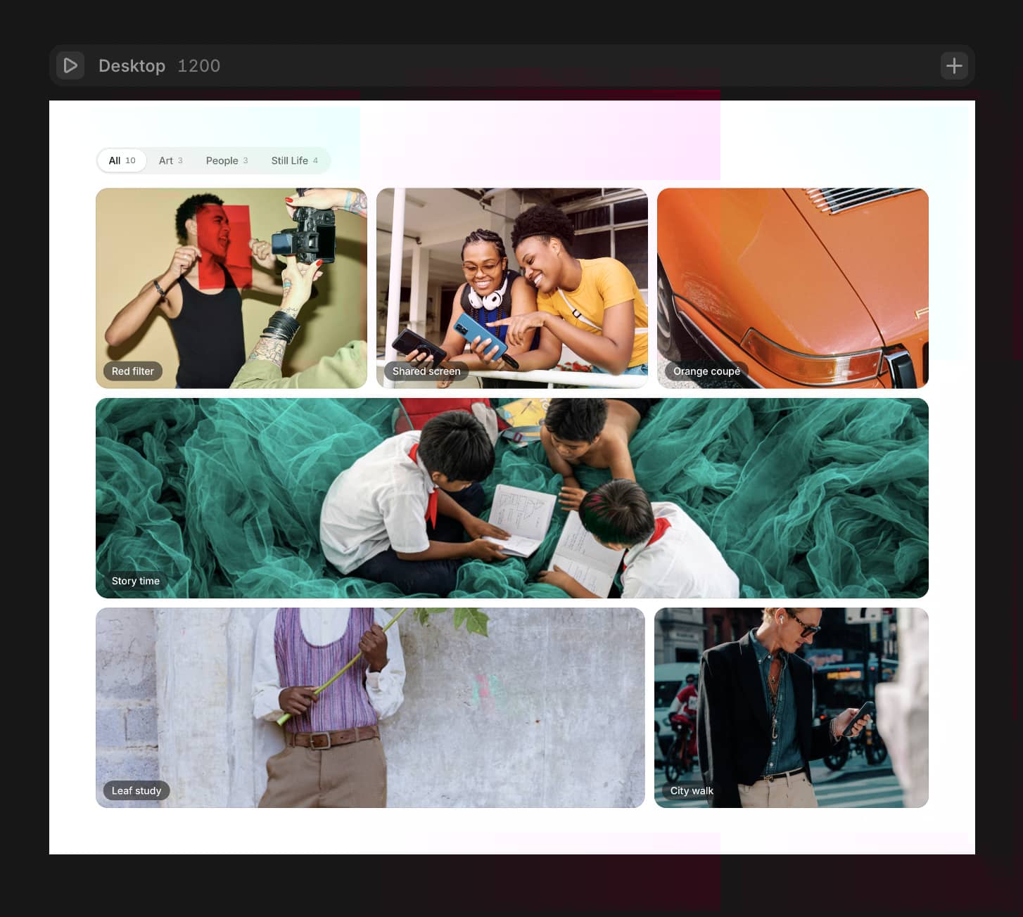
Hover a service and the gallery rebuilds around that word: the images shift to open exactly the room the new word needs. Since every word is a different width, the photos travel horizontally as well as vertically, each frame leaving a moment after the one before it, so the row moves like a chain instead of a block. While they travel, every frame crossfades to a photo from the new category.
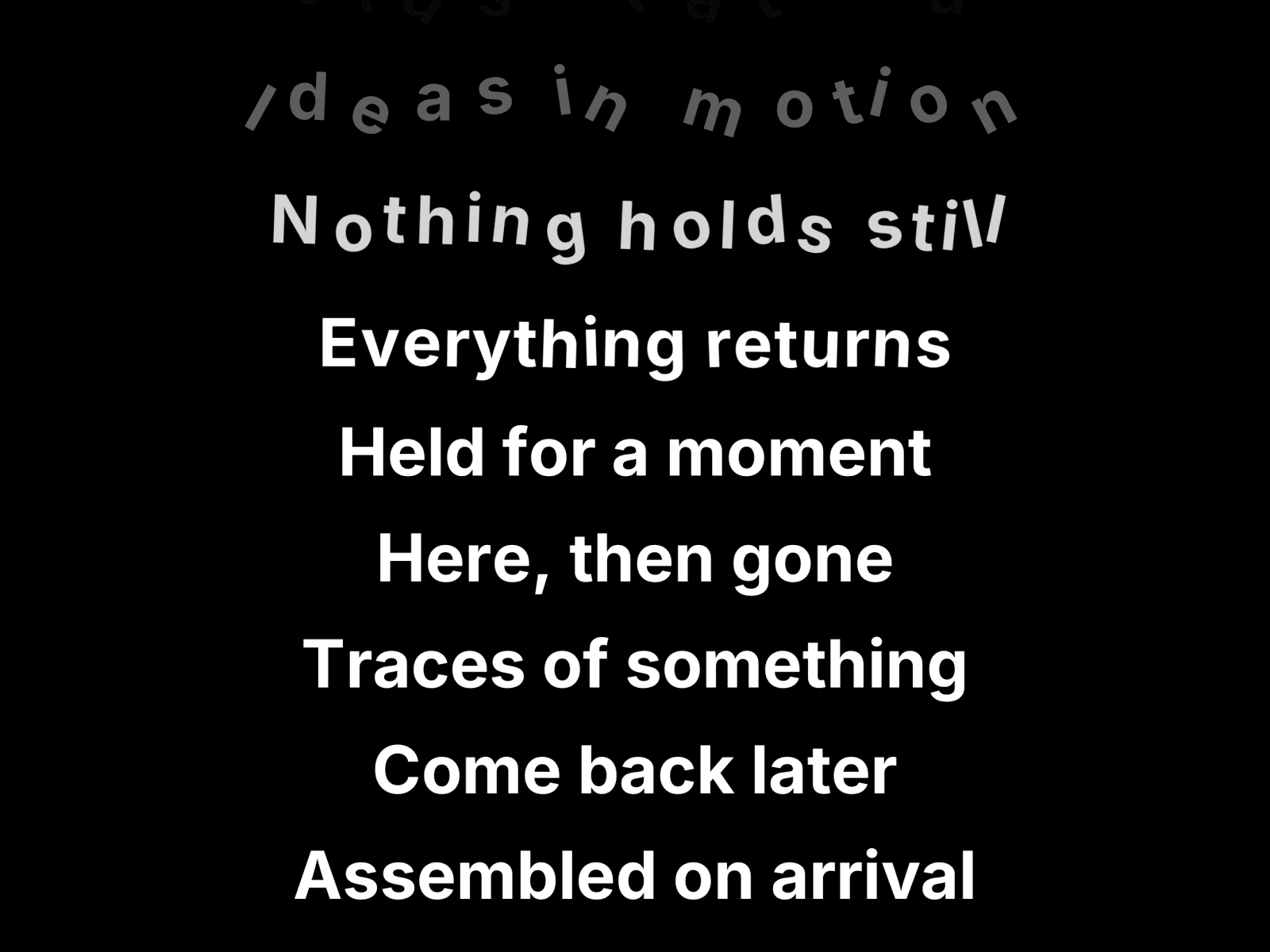
On phones it becomes a picker wheel. Below the breakpoint the menu turns into a wheel you spin with your thumb, images anchored to the edges of the screen. It does not pin the section or take over the page scroll: it is a one screen block that behaves like any other. Only the middle band answers a vertical drag, so the rest of the screen keeps scrolling, and a tap brings any word to the centre.
No breakpoint variants needed. Everything scales from the measured width of the container, not the viewport, so it works the same inside a narrow column as it does full bleed.
What you can change: any number of items, each with its own images, and categories can have different photo counts. Font, size, line height, text and background colour. Image size, gap, radius, and how much of the side images bleed off the edge. Speed, chain delay and chain direction, crossfade length, sideways drift on pointer move. Layout: Auto, Row or Wheel, with your own switching width.
Good for service menus, agency and studio index pages, portfolio categories, project lists and capability sections.
One frame loop writes the transforms, so it composites on the GPU and never re renders React while you interact. It respects prefers-reduced-motion and renders a still, settled frame on the canvas and in exports.
Note: the Framer canvas has no hover or gestures, so the component sits still there. Use the Preview item control to pick which item shows open, and hit Preview to try it for real.