About CMS Ribbon Carousel
Use it with CMS in three steps: 1. Drop a Collection List into Cards (CMS) and turn off its Pagination: the source list is hidden, so its Load more button is not shown; every loaded item becomes a card. 2. The dots, arrows and keys follow the item count. 3. If you want captions, name the layers inside the item Title, Body and Image; the ribbon then styles them and reads Title for screen readers.
Cards are static copies of your items: Framer hover/press variants and interactive components inside an item do not run on the copies (links still work). Item images must use https URLs.
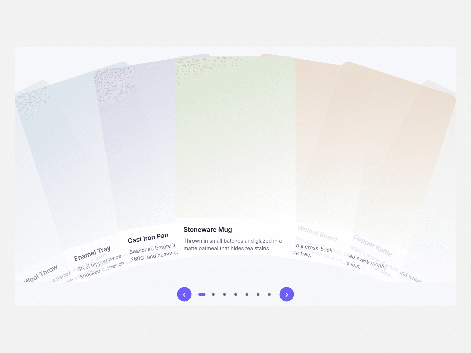
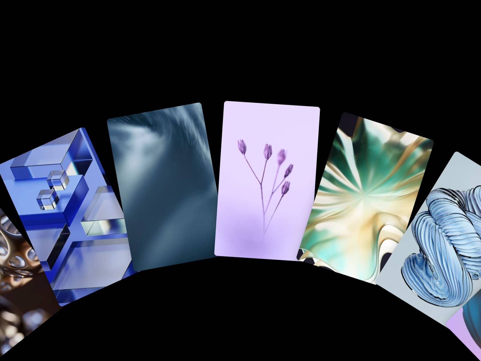
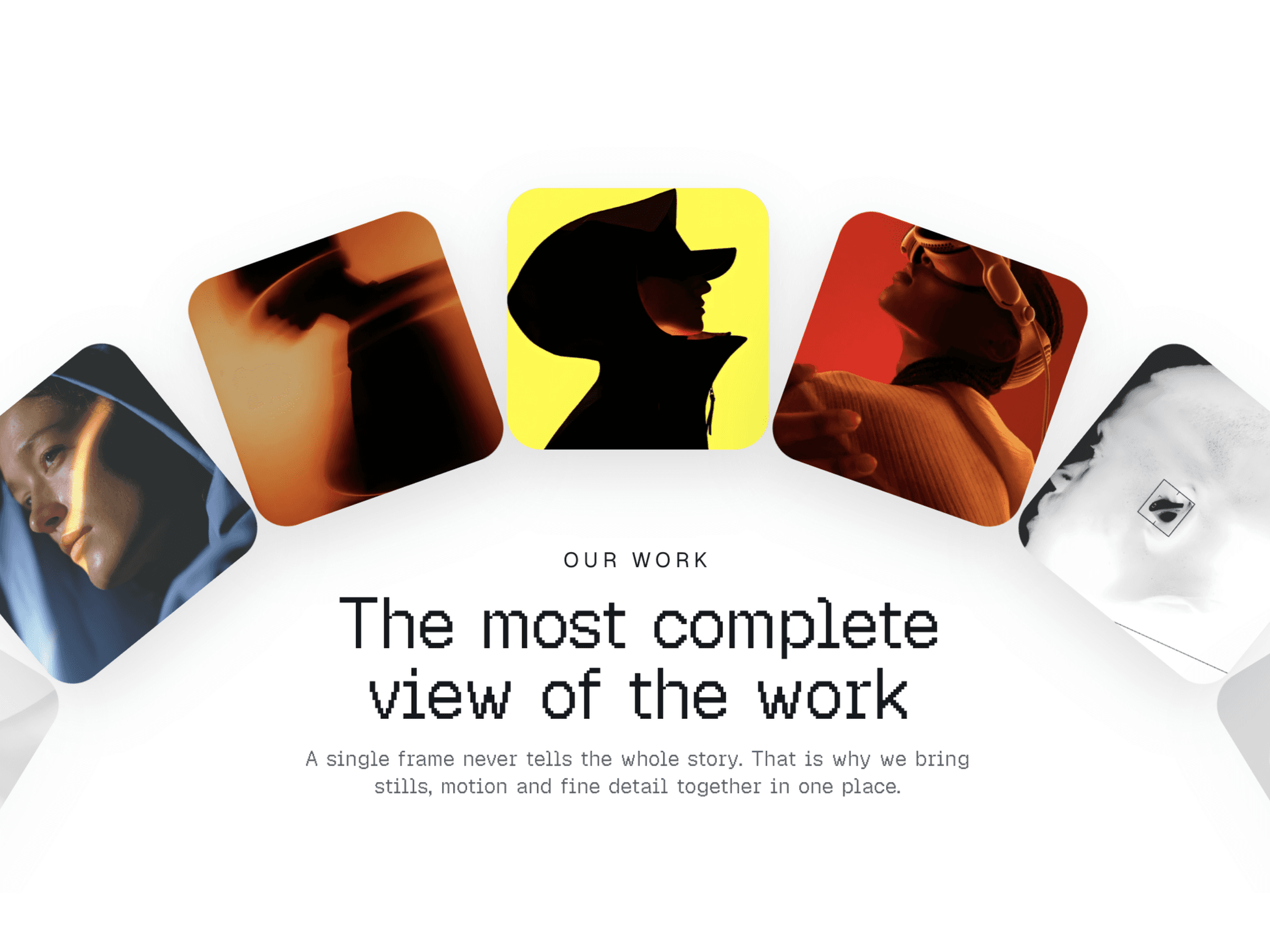
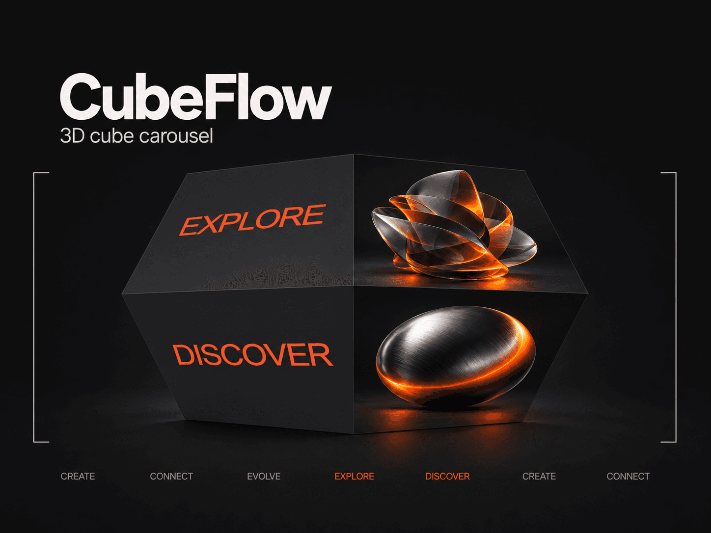
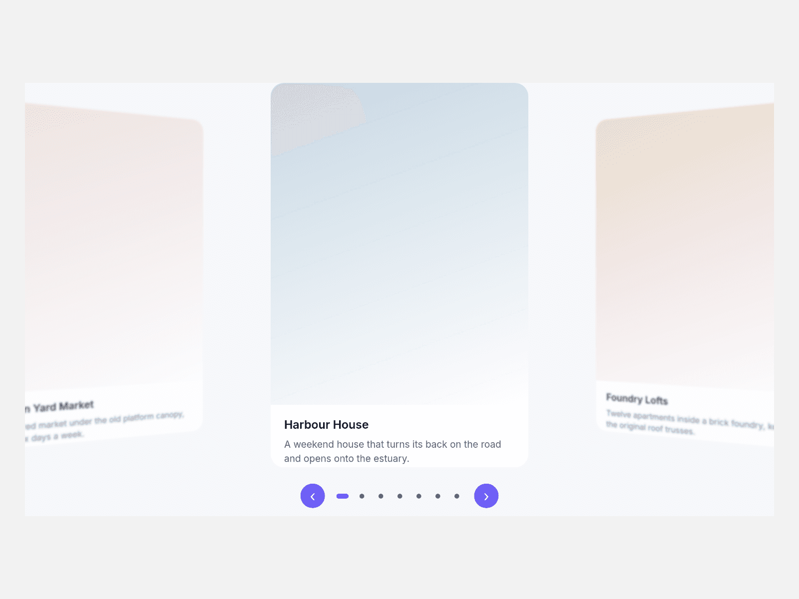
Cards sit on a curved 3D ribbon: the middle card stays upright, the cards beside it turn, sink and soften.
Key features
- Real CMS cards. Each Collection List item becomes its own card.
- Turn off Style CMS Layers to keep your own card design.
- Drag with snap, horizontal wheel, arrow keys, dots and arrow buttons.
- Autoplay that pauses on hover or keyboard focus.
- Endless loop, or stop at both ends.
- Reduced motion: cards arrive without animation.
What you control
- Cards (CMS) slot, or hand-made Items with title, caption, image, alt text, link and tint
- Curve, depth, perspective, card width, narrow width and breakpoint, gap, visible cards, radius
- Autoplay, loop, edge softening, arrows, dots, five colours, font, text size, max width, alignment and labels
The canvas shows the Collection List as you built it; the ribbon runs in Preview and on the published site.