About FX Before & After
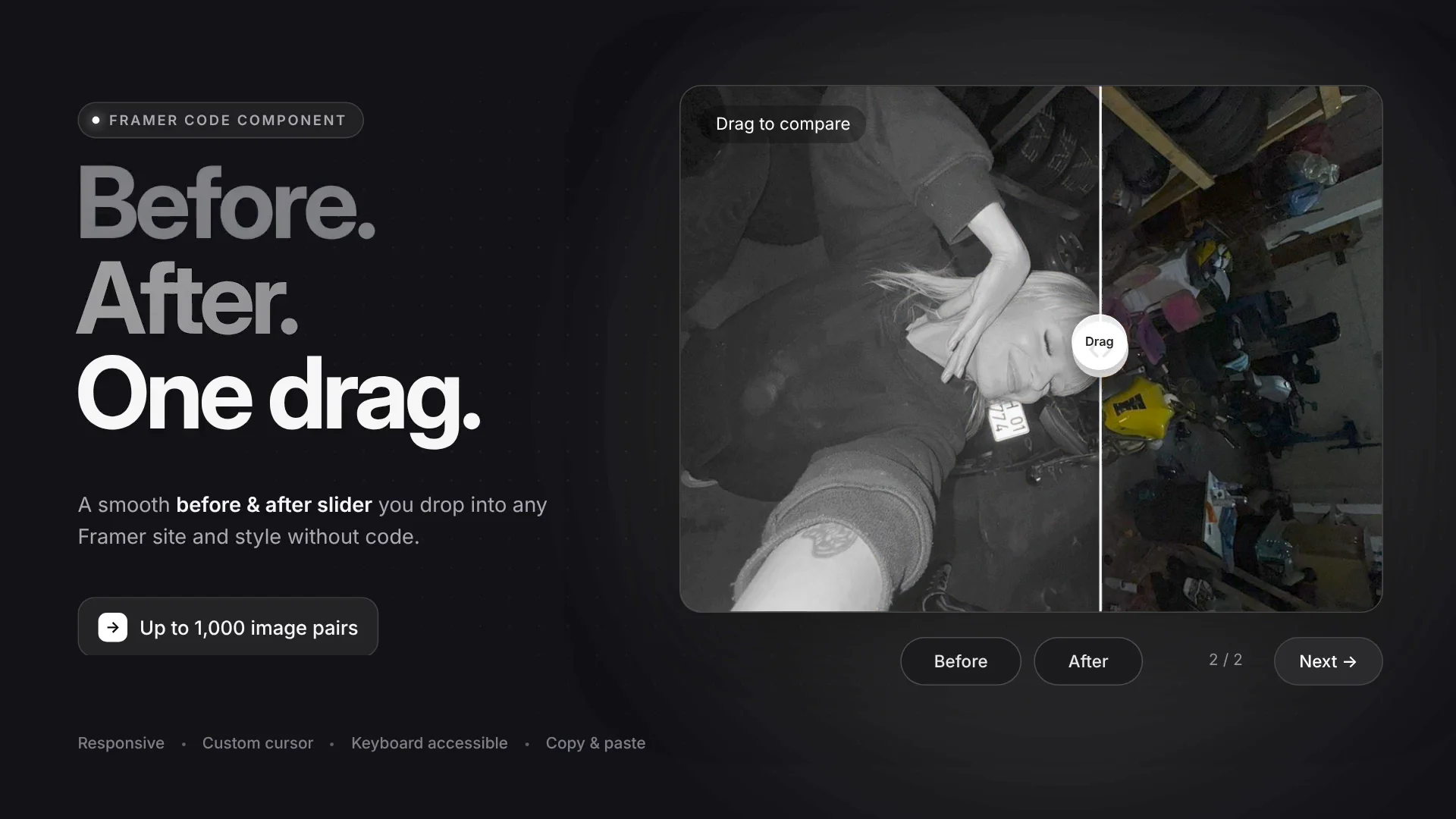
A fully customizable Before & After Image Slider Component built natively for Framer. Designed to showcase image comparisons, redesigns, photo edits, products, or portfolio work effortlessly.
Everything in this component can be customized directly from the Framer control panel with zero coding required.
Multiple Image Pairs: Add, remove, and manage up to 1000 image pairs to cycle through.
Card Sizing: Set to
Fill,Fixed, or maintain preciseRatio.Dimensions: Custom Card Width, Card Height, and Space Around margins.
Corners & Spacing: Adjust Card Rounding (Border Radius) and inner padding.
Custom Background & Card Fill: Full color control over component containers.
Borders: Enable/disable borders, change Border Width, Border Color, and Border Style (Solid, etc.).
Interactive Handle (Knob): Toggle handle visibility, change Knob Size, Knob Color, and Arrow Color.
Divider Line: Adjust Line Color and Line Width (thickness).
Slider Start Position: Set default split percentage (e.g., 50%).
Drag Behavior: Enable full-card dragging or restrict drag to handle only.
Overlay Text: Show/hide helper texts (e.g., "Drag to compare").
Typography Controls: Full control over Text Content, Font Family, Font Size, and Color.
Positioning: Move overlay text to Top Left, Top Right, Bottom Left, etc.
Text Badges: Adjust background fills, padding, margins, and rounding.
Custom Cursor: Enable a custom drag cursor, control Cursor Size, Fill, Border, Text, and Font Size.
Navigation Controls: Show/hide "Before", "After", and "Next" buttons, adjust button placement (Below Card / On Card), space between buttons, and counter display (
1/2).
If you have any questions or need support with the component, feel free to reach out to me at miraframez@gmail.com.
If you use this component in your project, I'd love to see what you created! Tag me on X