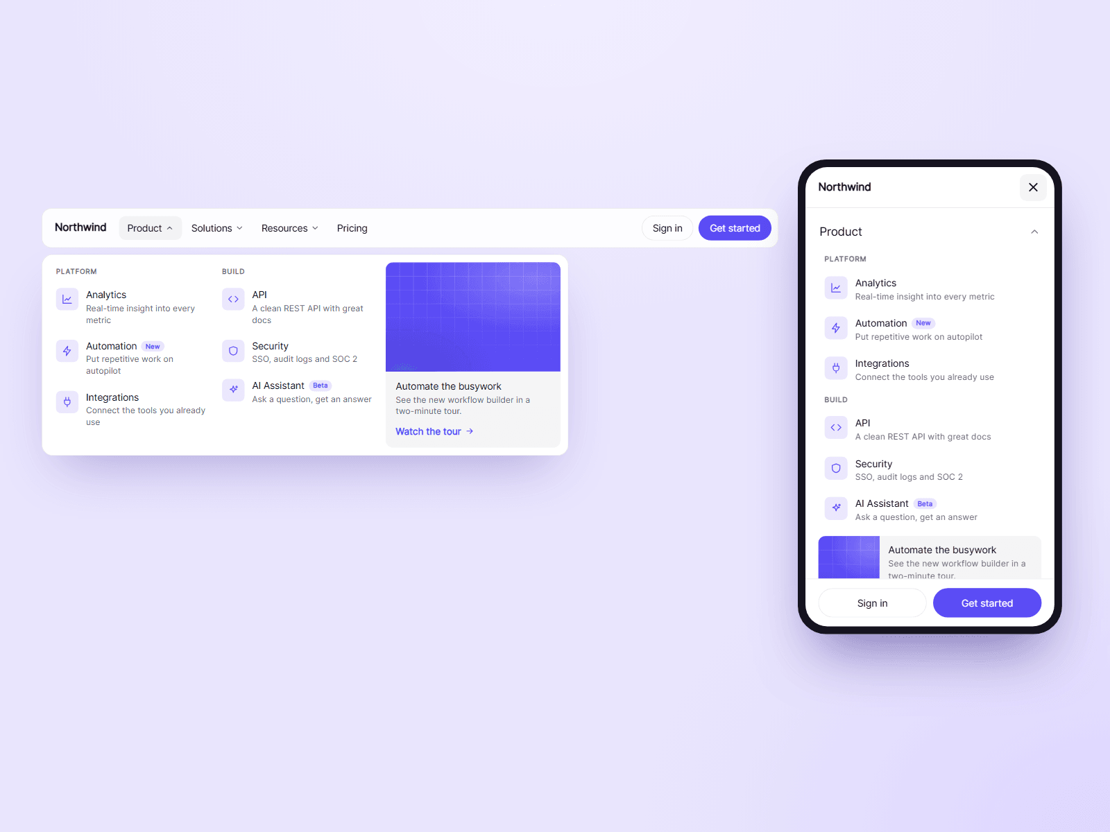
About Glide Mega Menu
A complete mega menu navigation in one component. As visitors move from one menu to the next, a single panel glides over and reshapes itself to fit, instead of closing and opening again. On phones it becomes a full screen menu.
What you can customize
Everything is set from the property panel. No code needed.
- Logo image, logo text and two buttons
- Menus: a label, a link, the panel's links and an optional card with an image
- Links: one per line as Title | Text | Link | Icon | Badge. A line starting with # starts a new column
- 28 built-in icons, or any emoji
- Panel: Glide (fits each menu) or Full Width
- Open on hover or click
- Dim the page behind an open panel
- On scroll: turn solid, or hide on the way down and show on the way up
- Phone menu: Accordion or Slide, and the width where it takes over
- Colors, blur, radius, bar height and font
Details
- The page being visited is highlighted, along with its menu in the bar.
- Hover waits a moment before opening, so the panel does not flash while the pointer passes over the bar.
- The panel closes on a link click, a click outside, Escape, or when the pointer leaves.
- Keyboard: arrows move between menus and links, Escape closes, and Tab goes from a menu into its panel. Screen readers hear which panel each menu opens and whether it is open.
- The phone menu stops the page behind it from scrolling and keeps your two buttons at the bottom.
How to use
Add the component at the top of your page and set its width to Fill. To keep it on screen, set Position to Fixed and Z Index to 10. Open Menus and type your links. Open the preview to try the hover and the phone menu.
Code
This is a code component. Unlinking is not available, so the source cannot be viewed or edited. Updates arrive through the Update button in your Assets panel.
Support
Email joviseo1106@gmail.com. Replies usually take up to 3 business days. More components are at https://joviseo.vercel.app