About Scroll To Top Ring
Scroll To Top Ring Button
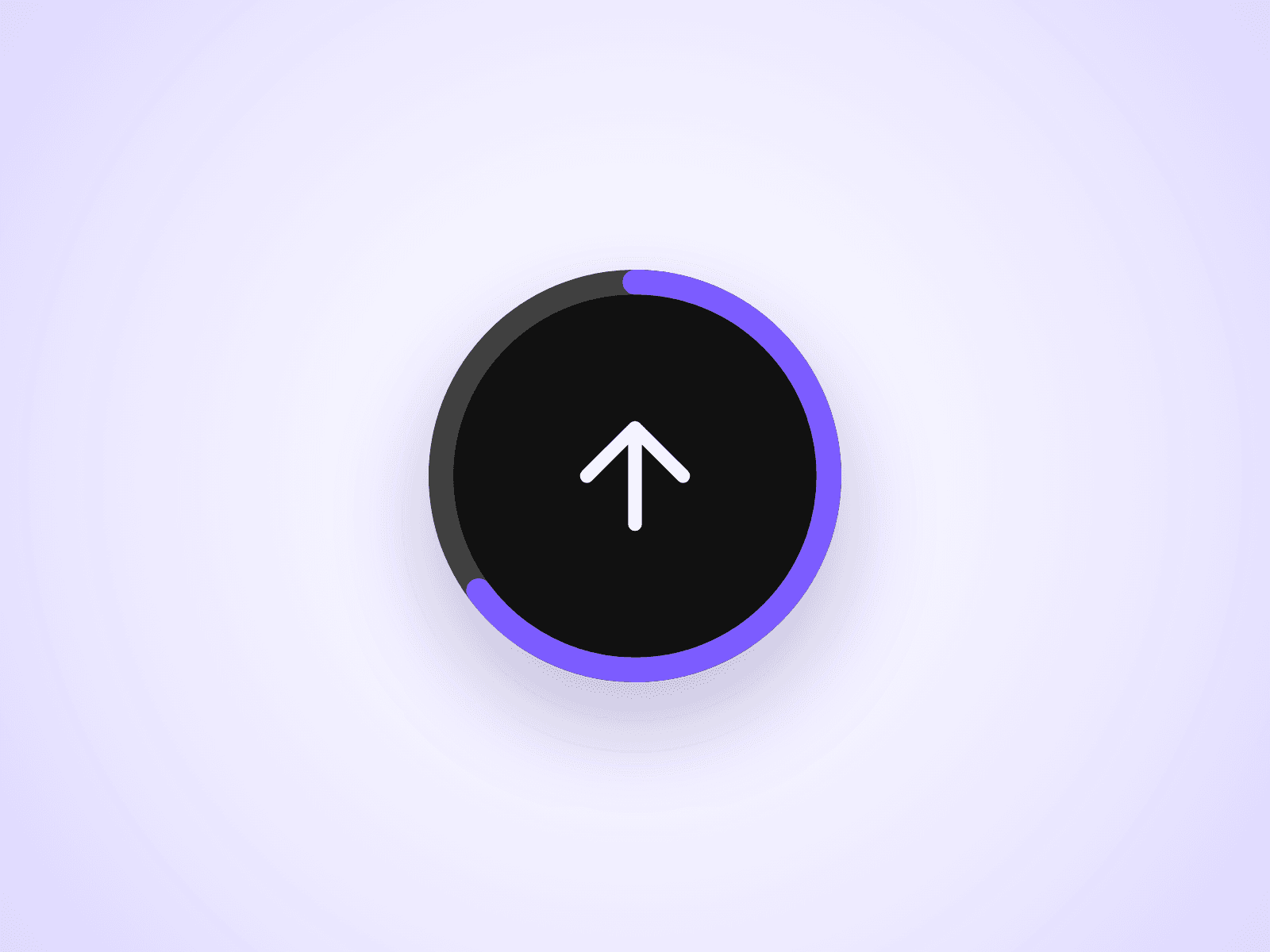
A back-to-top button for Framer sites that also shows reading progress. A ring around the button fills as visitors scroll down the page, and one click takes them back to the top.
Customizable Properties
Everything is set from the property panel, with no code editing.
- Show After: scroll distance before the button appears (0–3000px)
- Smooth: smooth scroll or instant jump
- Fill and Shadow: background color and box shadow
- Icon: arrow or chevron, with color, size and stroke
- Ring: color, track color and thickness, or hide it
- Hover Scale and Transition: hover size and appear animation
Why This Component
Most scroll-to-top buttons only scroll. This one doubles as a scroll progress indicator, so long pages such as blog posts, docs and landing pages get two features in one small button. It is lightweight and stays hidden until visitors need it.
How To Use
Drop the component on your page and set its position to Fixed. Pin it to the bottom and right at 24px, keep width and height equal, and raise its Z Index so it stays above your sections.
About The Code
This is a code component, but no coding is needed. To keep quality consistent and deliver updates, unlinking is not available, so the source code cannot be viewed or edited. When an Update button appears next to the component, apply it to get the latest version.
Need Help?
Email joviseo1106@gmail.com. Questions are usually answered within 3 business days.
More Resources
Pair it with Reading Progress Bar, a free scroll progress bar with a matching look. Live demo, license and more components: https://joviseo.vercel.app