About Hyperiux Flip Card
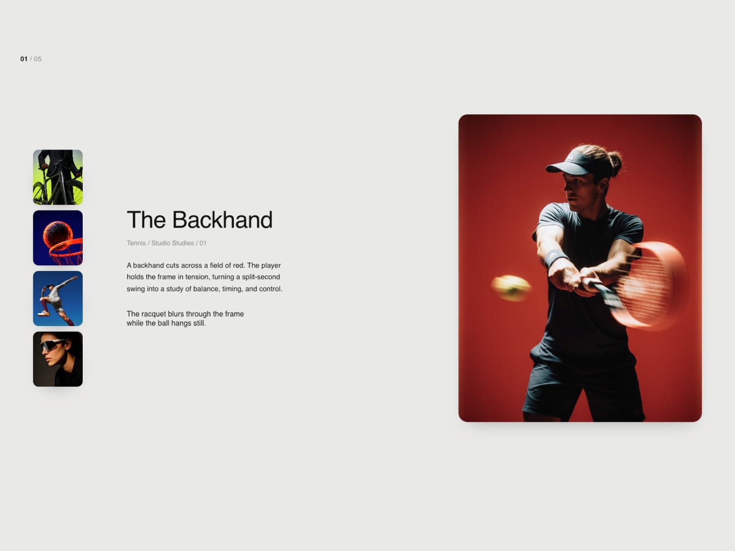
Hyperiux Flip Card starts as a stack of overlapping cards. Clicking the stack triggers a GSAP Flip transition that spreads it into a hero image and a vertical rail of thumbnails, using the same DOM nodes throughout - nothing is unmounted or re-rendered. Clicking a rail thumbnail runs the same Flip transition to swap it into the hero position.
Each card can carry its own title, meta line, description, and caption. When a new card is selected, that text fades out and reveals back in line-by-line (via GSAP SplitText). Clicking the empty background or pressing Escape collapses the view back to the stack.
◆ Key Features
GSAP Flip Transitions: Stack-to-gallery and hero-swap animations run on the same DOM nodes via GSAP's Flip plugin, not a remount.
Per-Card Content: Title, meta, description, and caption can be set individually for each card.
Text Reveal on Change: The selected card's text fades out and reveals line-by-line via SplitText when a new card is chosen.
Keyboard Navigation: Arrow keys move between cards while the gallery is open; Escape collapses it back to the stack.
Click-Outside to Close: Clicking the empty background area collapses the gallery back into the stack.
Configurable Stack Look: Per-card stack offset (X/Y) and rotation are exposed as controls.
Flip Duration & Easing: Transition duration and easing curve (5 presets) are controls.
Responsive Layout: Switches to a stacked mobile layout (hero, text, thumbnail grid, no Flip transition) below 700px, and scales down proportionally between 700–900px.
Reduced Motion Fallback: Flip and SplitText animation is skipped when
prefers-reduced-motionis set; content appears directly in its final state.Optional Counter: A 00/05-style counter can be toggled on or off.
◆ When to Use It Built for a small, curated set of images with distinct captions - a portfolio grid, a case-study gallery, a small product lineup - rather than a long list, since the stack view is designed around a handful of cards.