About Metrics Grid
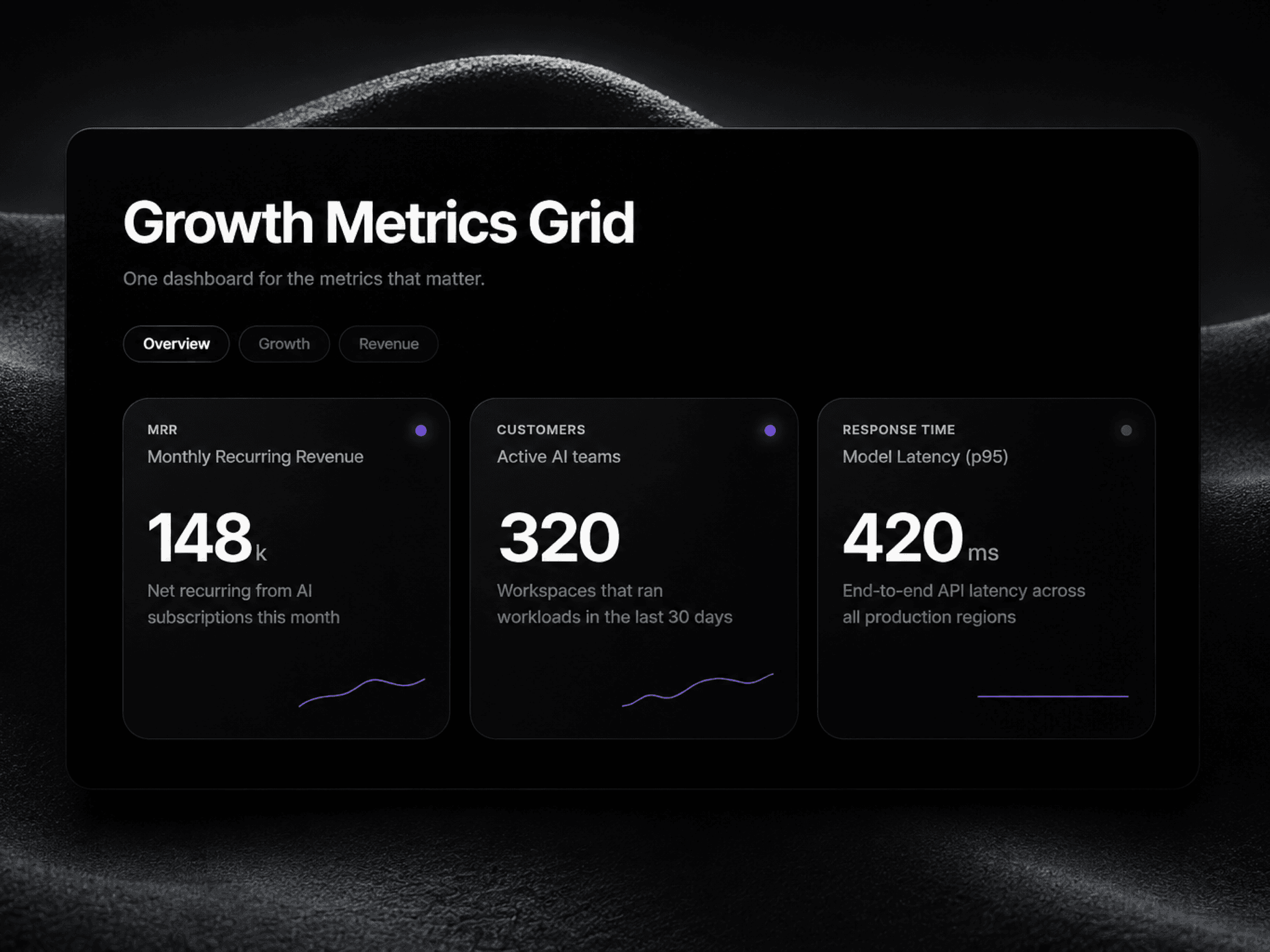
This component is built to showcase important performance data without overwhelming the page. It includes tabbed categories, animated count-up values, sparklines, trend dots, and responsive grid cards, making it useful for hero sections, proof sections, product pages, and investor-style landing pages. Its structure is reusable, easy to customize, and designed to communicate progress, trust, growth, and reliability at a glance.
Best for:
SaaS landing pages.
AI products and dashboards.
Fintech and trading brands.
Agency case-study pages.
Startup homepages and product proof sections.
Component controls in right panel
Toggle heading on/off
Edit heading, description text
Toggle description on/off
Adjust spacing between heading, tabs, description, and card grid
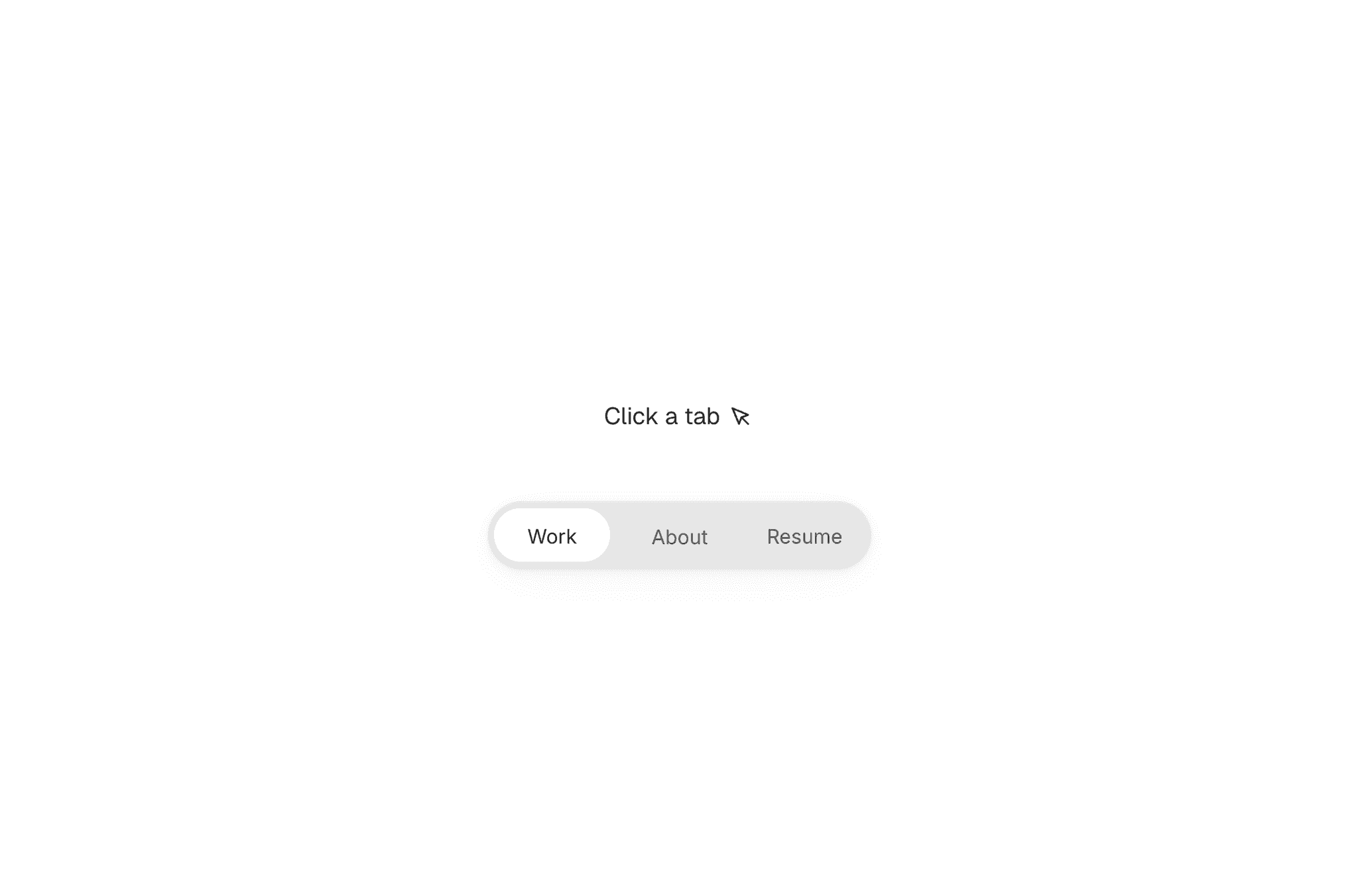
Toggle category tabs bar on/off
Enable/disable auto-rotate between categories
Set tab auto-rotate speed (seconds)
Toggle sparkline and trend dot in cards
Enable/disable card hover lift effect and reduced motion
Adjust gap between cards in the grid
Adjust outer padding around the whole component
Adjust card corner radius
Toggle card shadow on/off
Adjust card glass blur amount
Toggle transparent background on/off
Change component and card's background, border and accent color
Change all text colors
Set font family and their sizes for all texts including card titles etc
Manage categories (add/remove/reorder)
Edit each category tab label
Manage metrics inside each category (add/remove cards)
For each metric card: set eyebrow label, title, value, suffix, subtext, and trend direction (up/down/flat)
It helps a page feel data-backed and trustworthy while staying visually minimal. It is especially useful when you want to show business performance, customer results, product growth, or operational credibility in a compact block.
Use cases:
“Trusted by teams worldwide” sections.
Revenue and growth highlight blocks.
KPI panels under hero sections.
Client results / ROI sections.
Product analytics previews.