About Obsidian Navbar
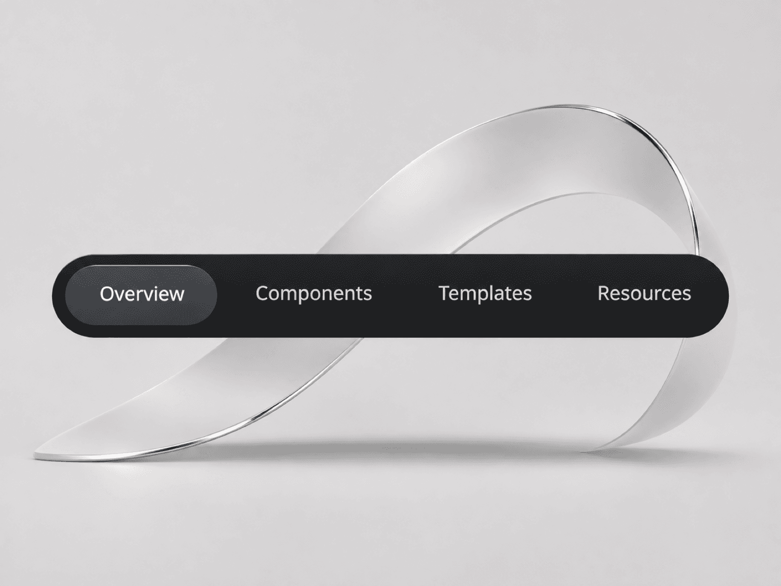
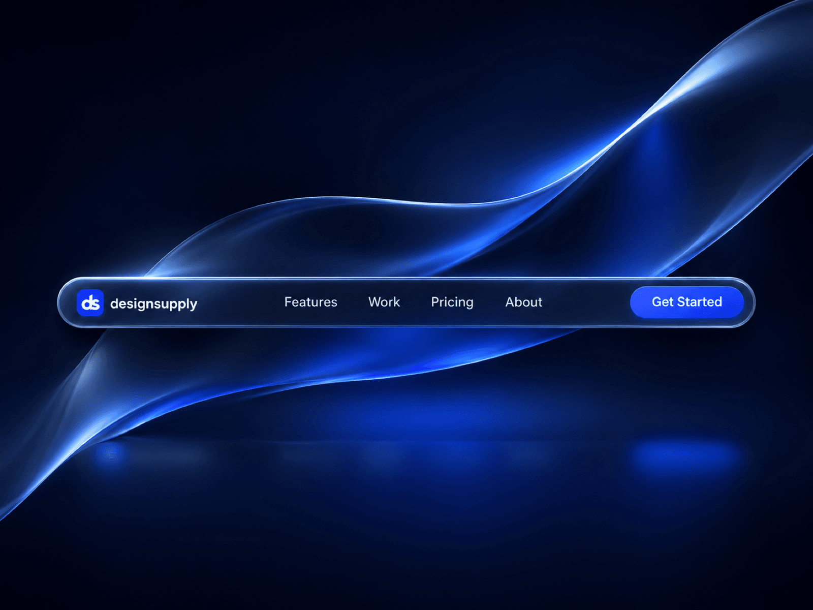
Obsidian Navbar is a free glass navigation component for Framer with a dark translucent surface, fine rim highlights and a cobalt call to action. Its rounded silhouette keeps your brand, key pages and next step together in one compact bar.
Glass and motion
Soft background blur adds depth while the light edges define the shape. Navigation links brighten on hover, and a moving shine passes across the CTA on hover. The result is a restrained glassmorphism treatment with a clear visual focus.
Desktop and tablet layouts with four navigation links and one CTA.
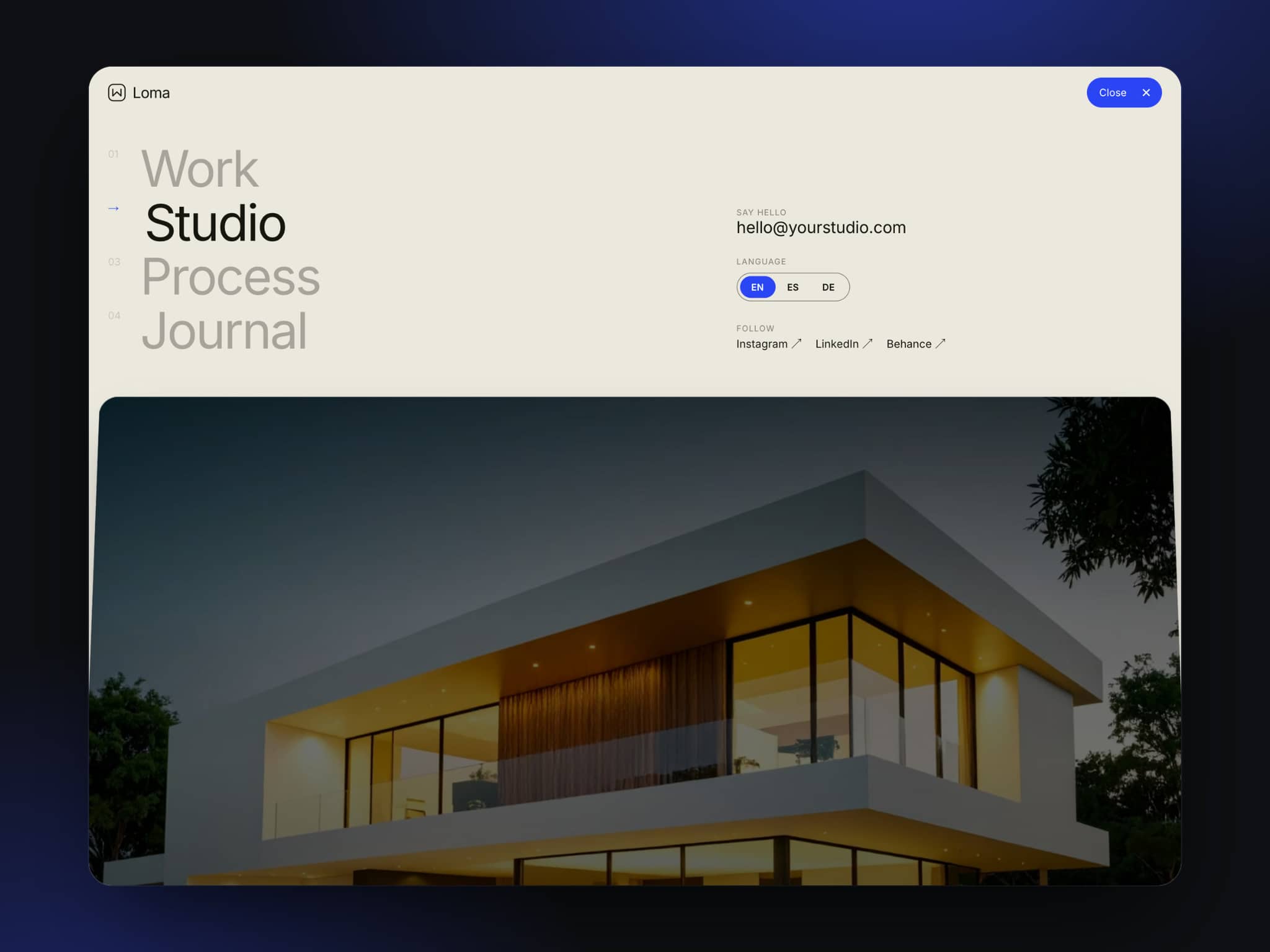
A compact phone state that expands into a vertical menu.
A menu icon that animates between open and closed states.
Spring transitions, link hover states and a full-width mobile CTA.
Make it yours
Start with your own name and destinations, then adapt the finish to your site. Change the wordmark through Logo Name. Inside the component, the reusable link and button instances expose their labels, URLs and new-tab settings.
Built with native Framer layers, the navbar can be edited on the canvas. Adjust the glass fills, typography, spacing, corner radii, shadows and motion in the component editor to create your own variation.
Where it fits
Use it on a digital product launch, a creative portfolio, a small studio website or a focused campaign page. The dark default pairs naturally with immersive hero sections, restrained layouts and websites with a strong accent color.
Made by Design Supply