About Playful Step Cards
✦ Give every step a little personality.
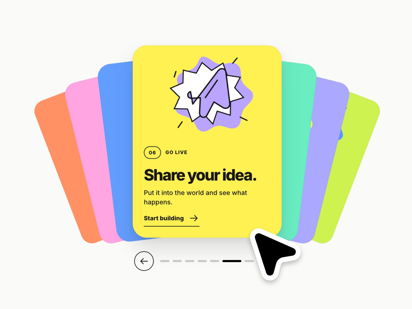
Turn a simple how-it-works section into a playful card experience. Each step gets its own bright color, abstract illustration and smooth spring transition, with the next cards peeking out from behind. Make it completely your own with flexible controls for layout, styling and motion :)
⚙ What you can customize
Easily adapt every part of the component to match your own brand and style.
Step labels ✦ Headlines ✦ Descriptions ✦ CTA labels ✦ Links ✦ Card colors ✦ Accent colors ✦ Abstract illustrations ✦ Card height ✦ Corner radius ✦ Stack spread ✦ Animation speed ✦ Section label ✦ Typography ✦ Background & text colors
🎯 Perfect for
How-it-works sections ✦ Service processes ✦ App onboarding ✦ Product journeys ✦ Feature explanations ✦ SaaS websites ✦ Agency websites ✦ Creative portfolios ✦ Landing pages
📱 Responsive by default
The stacked cards adapt to their container width, with a wide editorial layout on desktop and an illustration-first layout on smaller screens. Text and CTAs stay visible without hovering.
🖱 Included interactions
Spring card transitions ✦ Animated card rotation ✦ Playful illustration hover effects ✦ Arrow navigation ✦ Clickable step indicators ✦ Background-card selection ✦ Touch swipe ✦ Keyboard navigation ✦ Full-card links when configured ✦ Reduced-motion support
🔗 Live Preview
https://cooperative-interface-022571.framer.app/
––––––––
❤ Thank you so much for your support! I genuinely appreciate every download. I hope you have fun customizing this component and making it your own. Happy building!