About Product Grid Preview
A full-height, cross-wipe product preview grid with auto-cycling detail shots — fully responsive, fully customizable.
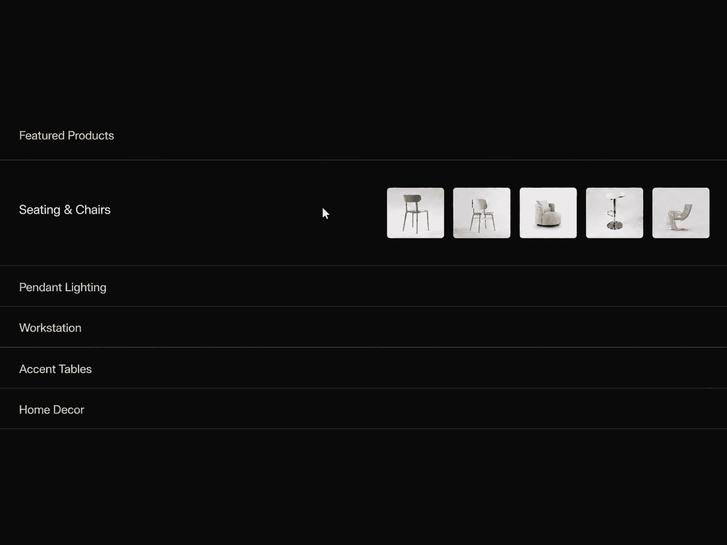
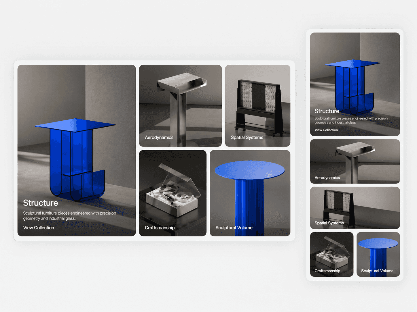
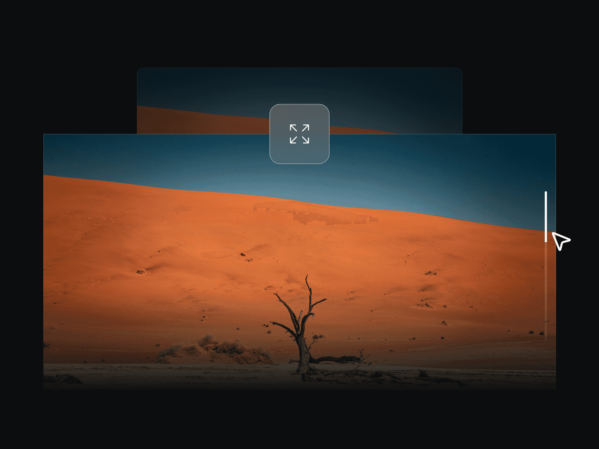
Product Grid Preview turns a standard product grid into an interactive browsing experience. Hover over a product on desktop or tap on touch devices to reveal a large preview on the opposite side, with a smooth cross-shaped clip-path transition.
No code required. Everything is controlled directly through Framer's property panel.
Features
Interactive product grid
Hover preview on desktop
Tap interaction on touch devices
Large opposite-side product preview
Cross-shaped clip-path reveal
Animated grid fade and movement
Main image + up to 3 detail images per product
Automatic detail-image cycling
Instant or fade image transitions
Custom product names and prices
Custom CTA text
Responsive tablet and mobile layouts
Image object-fit controls
Static renderer support
Customize
Products
Product names
Prices
Main images
Detail images
Image alt text
CTA text
Grid columns
Horizontal and vertical gaps
Grid padding
Image aspect ratio
Image fit
Border radius
Preview background
Preview scale
Cross reveal width
Preview image fit
Title and price visibility
Currency symbol
Typography and colors
Hover delay
Reveal and animation speeds
Detail cycling interval
Transition style
Responsive breakpoints and spacing
How It Works
Add your products and images through the Framer property panel. On desktop, hover over a product to reveal its large preview on the opposite side of the grid. On touch devices, simply tap a product to open its preview.
Need help setting it up?
If you’re not sure how to use the component or want us to set it up directly in your Framer project, contact us at support@russetsupply.com
Explore More
Russet Supply is a growing collection of ready-to-use Framer components and templates trusted by 500+ users.