About Proof Deck
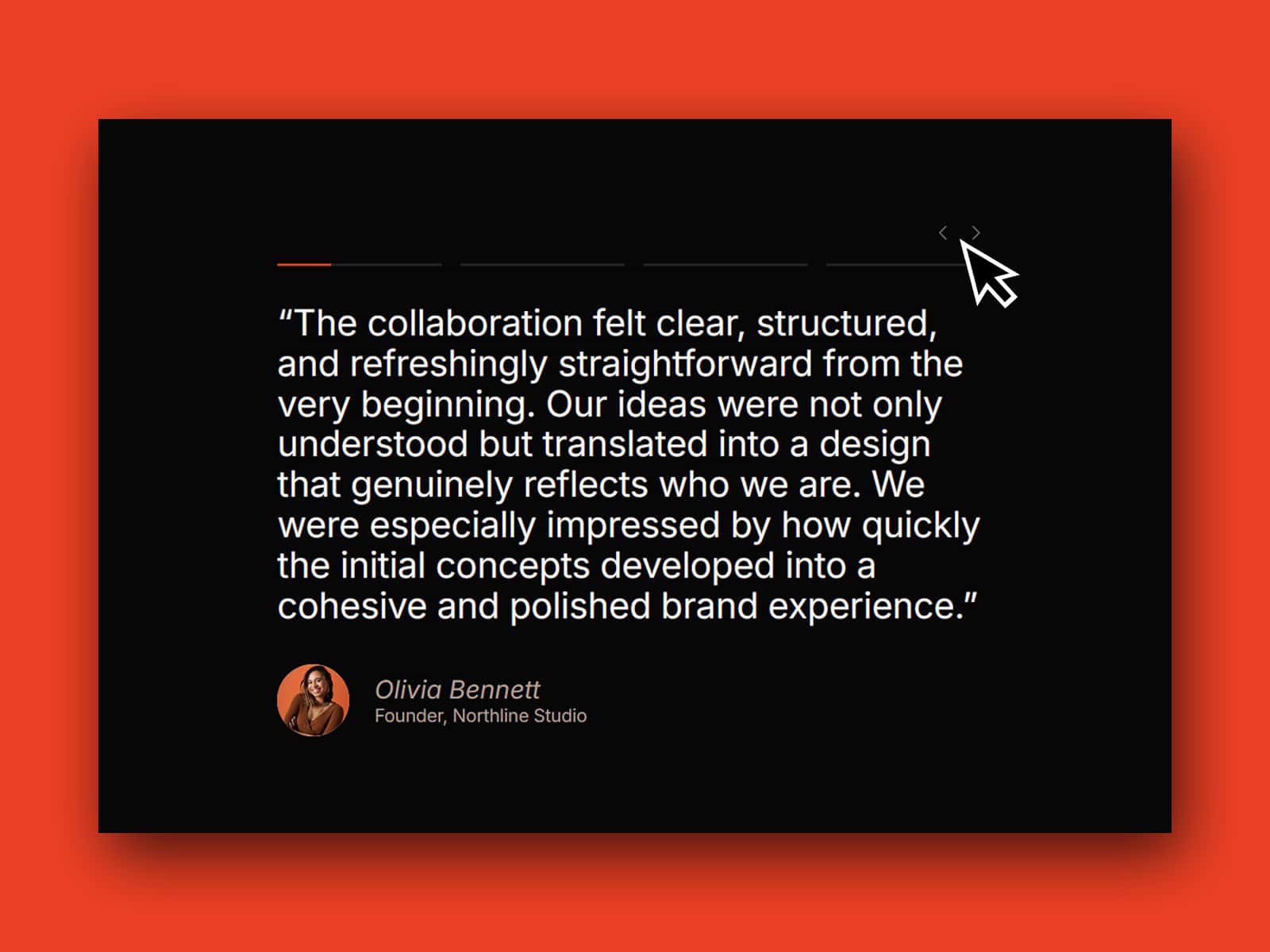
ProofDeck is a fully customizable animated testimonial slider for Framer. It uses a dual-card layout — one card for the author photo, one for the quote — and cycles through testimonials automatically while a progress bar counts down to the next slide. Everything about how the component looks and behaves is configurable from the properties panel. No code required.
Key features
Dual-card layout with independent control over each card's size, position, rotation, opacity, and animation
Smooth animated transitions between testimonials — choose between Instant, Ease, or Spring for both card movement and opacity independently
Auto-play with configurable duration and a progress bar that visually tracks time until the next slide
Tab bar with company logos for manual navigation — tabs wrap automatically if the container gets too narrow
Starting index control — choose which testimonial is shown first
Up to 10 testimonials supported
Three ready-to-use demo styles included — light, dark, and minimal
Content per testimonial
Each testimonial has its own set of fields, all editable from the properties panel:
Show image — show or hide the author image independently per testimonial
Author image — the image shown in the author card
Quote — the main testimonial text
Author name and role
Company logo — displayed in the tab bar
Image card background color — set per testimonial
Quote card background color — set per testimonial
Dual-card layout
The image card and quote card are configured independently. For each card you can set:
Width and height
Padding and border radius
Initial position — X, Y, rotation, and opacity before the animation plays
Final position — X, Y, rotation, and opacity after the animation plays
The component animates between the initial and final values on every testimonial change. Overlap, offset, rotation — all of it is your call. The demos show one possible arrangement but the layout is entirely up to you.
Animation
Card movement and opacity each have their own transition setting. Choose from Instant, Ease, or Spring. Spring gives you full physics control — stiffness, damping, mass, and delay — so you can dial in exactly the feel you want.
Auto-play settings & behaviour
Auto-play is enabled by default. As soon as the user manually clicks a tab to switch testimonials, auto-play is permanently deactivated for that session. Refreshing the page resets it.
Duration — how long each testimonial stays visible before advancing
Progress bar height — how tall the progress bar inside the active tab is
Progress bar color — match it to your design
Tab bar
The tab bar displays one company logo per testimonial. Clicking a tab switches to that testimonial and resets the auto-play timer. Style options include background color, active state background and border, padding, border radius, gap between tabs, and logo size.
Quote card typography and layout
Inside the quote card settings you can also control:
Font, size, weight, and color for the quote, author name, and role independently
Horizontal alignment — left, center, or right
Vertical distribution — start, center, end, space between, space around, or space evenly
Gap between content elements
Responsiveness
ProofDeck is not automatically responsive, but it's fully configurable per breakpoint in Framer. You decide how the component looks and behaves on each screen size. The tab bar is the exception — it uses flexbox and wraps automatically when the container gets too narrow.
How to use
Copy the component URL you receive after purchase and paste it into your Framer project.
Add your testimonials and fill in the content fields for each one.
Set the initial and final position of each card to define the animation.
Choose your transition type and fine-tune the feel with the spring controls.
Style the tab bar and auto-play settings to match your project.
Check your layout across breakpoints and adjust as needed.
Using the pre-made demos
Along with the component you'll receive a remix link for the demo page featured on the marketplace listing. It includes three demo styles — light, dark, and minimal. Copy any instance directly into your project and customize from there.
Refunds and support
All sales are final. Due to the digital nature of this product, purchases cannot be refunded. I recommend reading the product details carefully and reaching out with any questions before buying. You can contact me at adipurdila@gmail.com or on x.com/adipurdila.
What's included in support
Direct access to the author for questions
Help with technical questions about features and settings
Assistance with reported bugs and issues
Support response time is up to 2 business days.