About Service Accordion
Service Accordion – Click-to-Expand Service List with Full Image Reveal
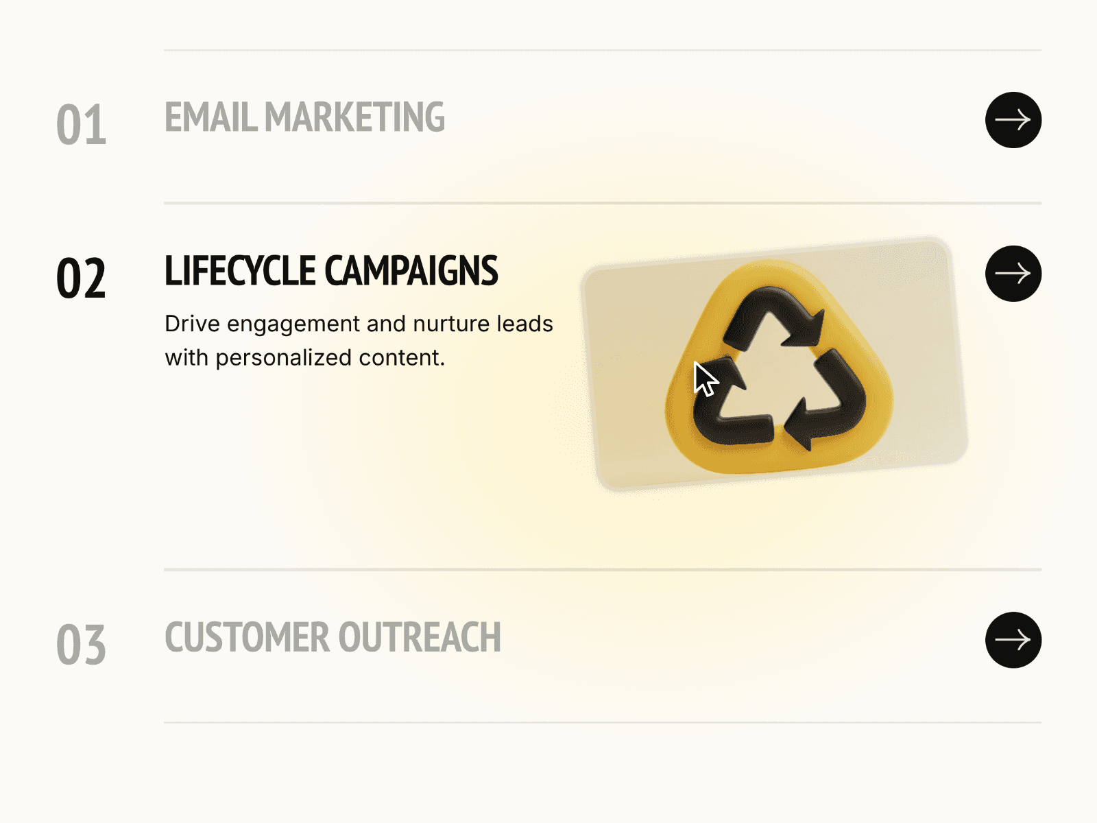
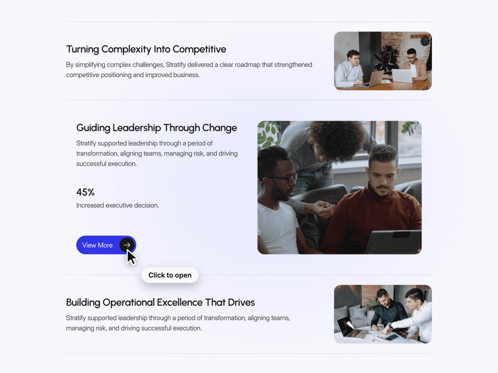
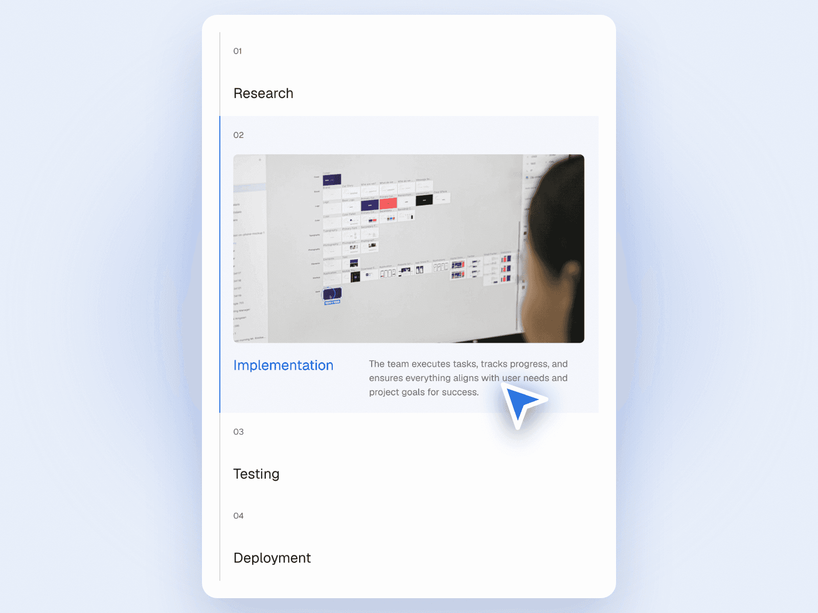
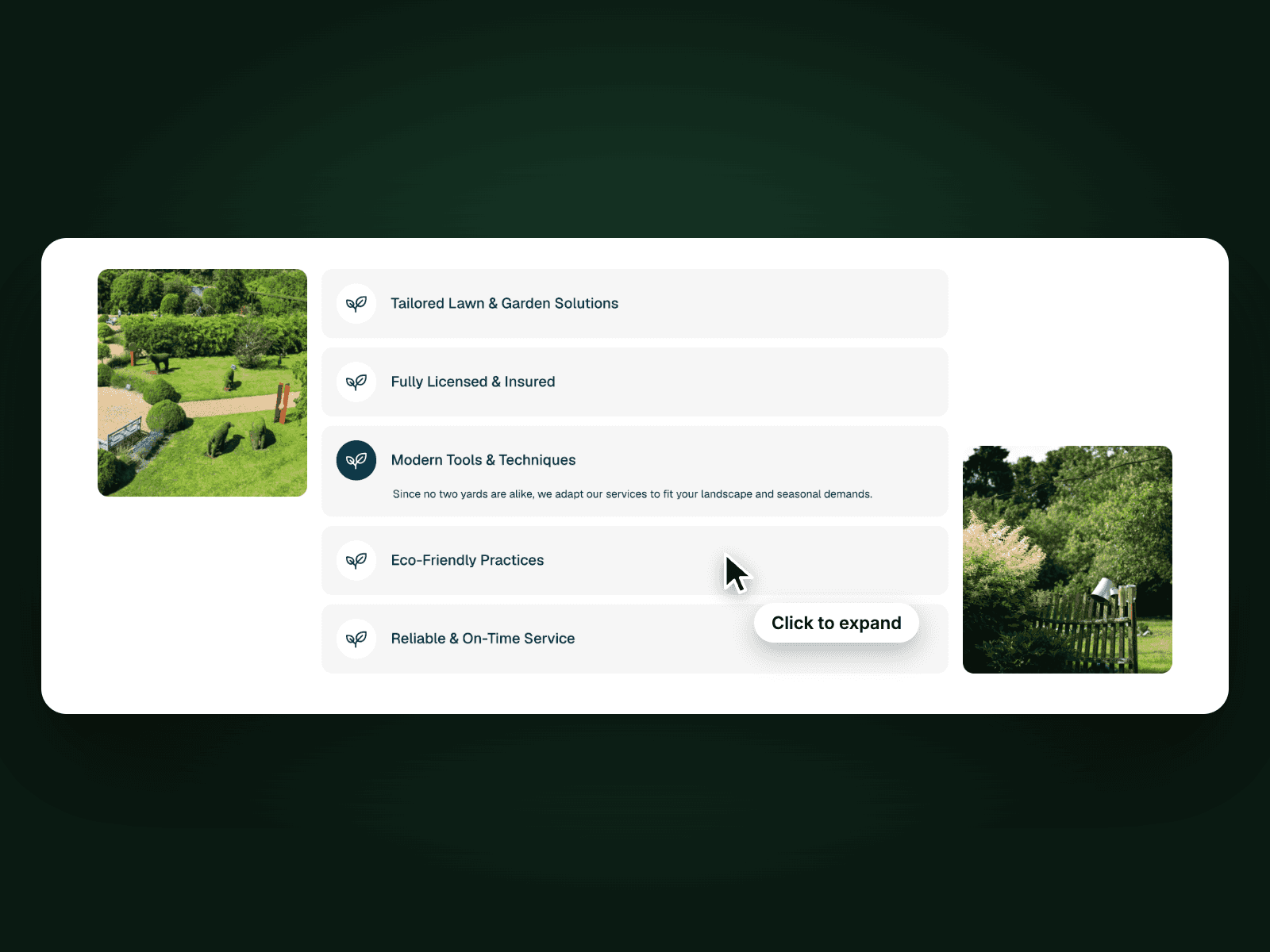
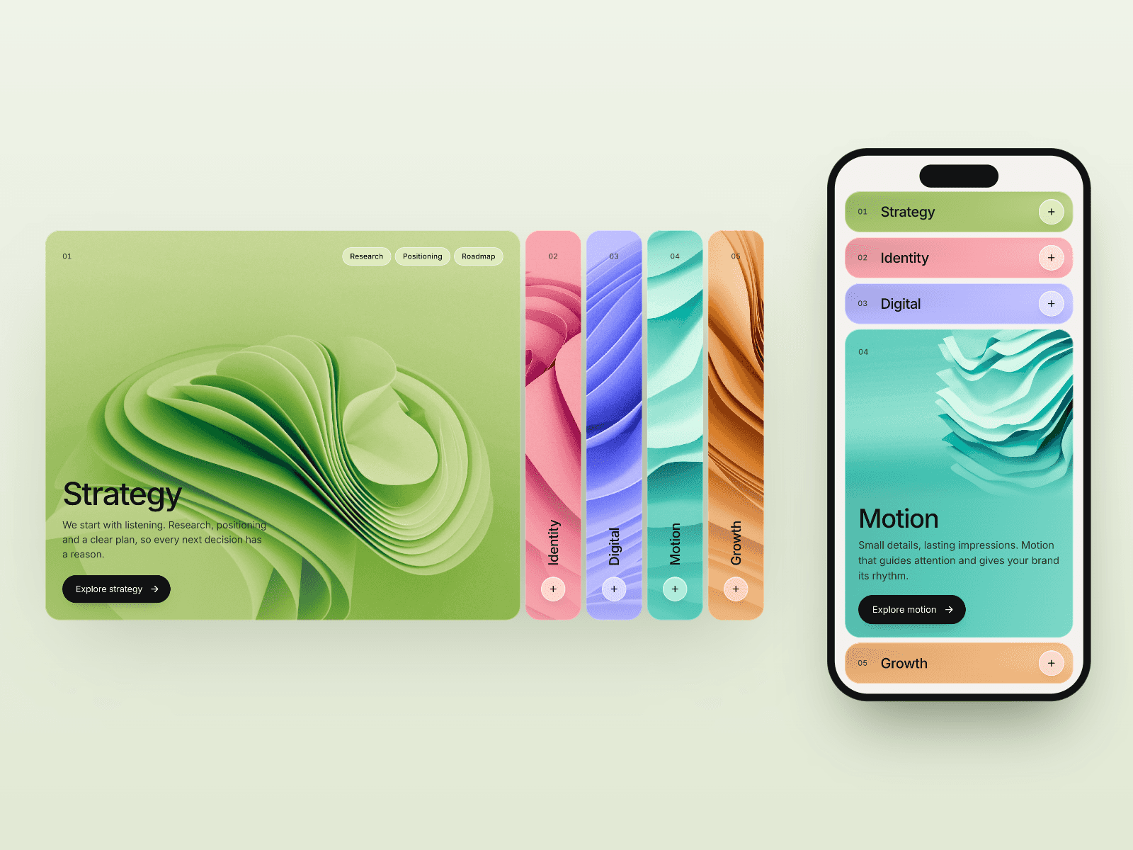
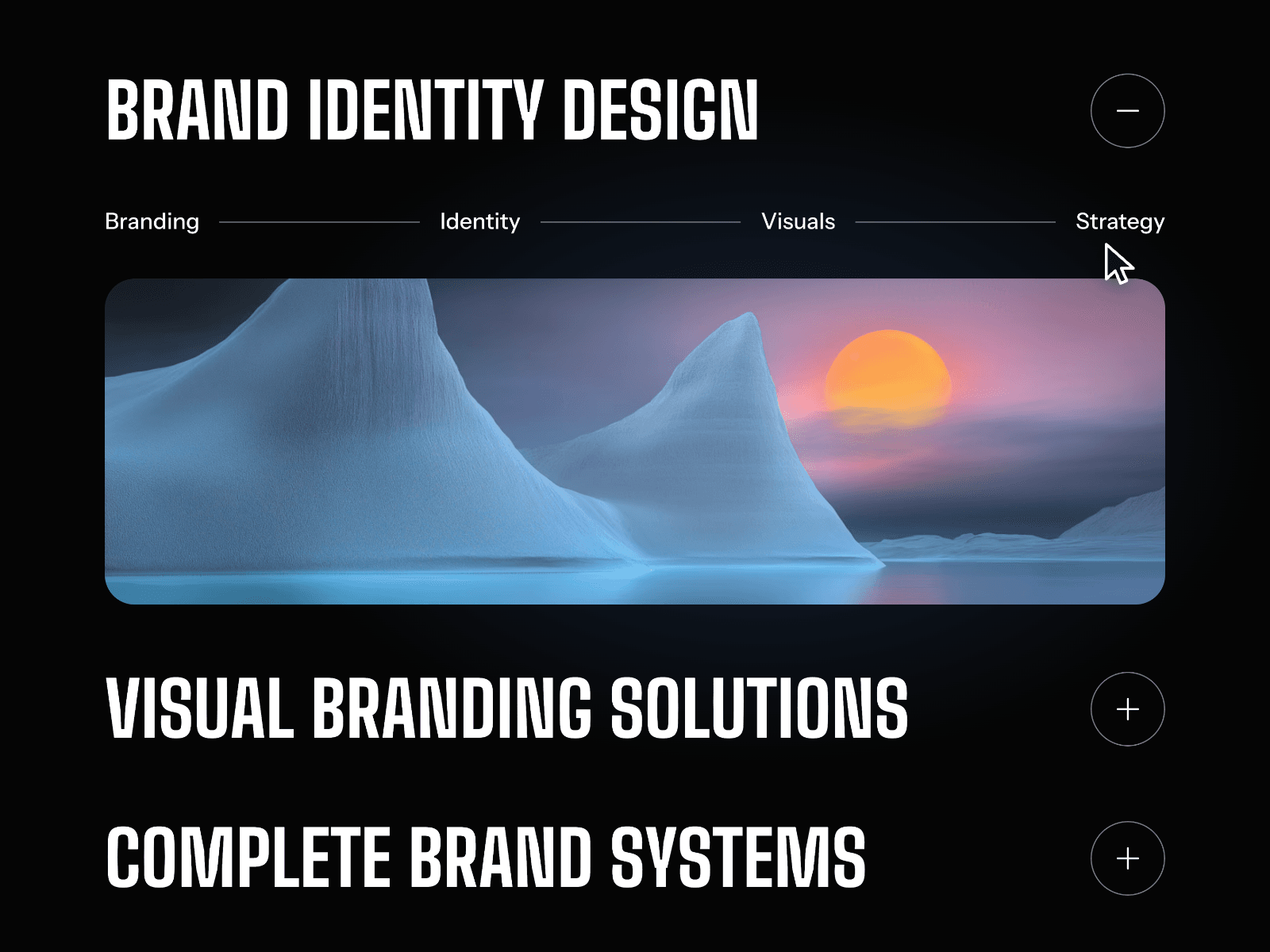
Service Accordion is a modern, interactive Framer component that transforms a clean service list into a bold, immersive experience. Instead of showing everything at once, it displays a minimal numbered layout by default — and dramatically expands to reveal a full-width image alongside service details the moment a visitor clicks. The cinematic image reveal, smooth expand animation, and elegant motion give your agency, studio, or portfolio a premium, editorial feel with almost no setup required.
Click-to-Expand Image Reveal
Expands to reveal a large, full-width image and service details on click.
Inactive items stay minimal and greyed out — keeping focus sharp.
Smooth height and opacity transitions feel natural and intentional.
Supports numbered sequencing (01, 02, 03...) for structured storytelling.
Only one item expands at a time — clean, focused, distraction-free.
Fully responsive and optimized for modern GPU-accelerated performance.
Customizable Design Controls Service Accordion includes full Framer property controls so you can instantly match it to your brand or layout.
Customize
List Items – Add, remove, or reorder as many services as needed.
Title & Description – Edit service name and body text per item.
Image – Add a unique full-width image to each accordion item.
Image Height – Control how tall the revealed image panel appears.
Number Style – Adjust size, color, and opacity of index numbers.
Typography – Customize font size, weight, and spacing throughout.
Divider Style – Adjust line color, thickness, or remove entirely.
Arrow Button – Toggle, resize, or restyle the CTA arrow per item.
Transition Speed & Easing – Control how quickly items expand and collapse.
Active & Inactive Colors – Fine-tune contrast between open and closed states.