
Tanjim IslamStudio


Your Growth Partner For SAAS, AI & Startup Founders. Framer Certified Partner & Expert. Open to Collab. DM me at hello@gr8rstudio.com
Norell just hit 1K appreciations on Framer. 💥
Thank you for using it, remixing it, and building with it. 🙌
Still free, still yours → https://framer.link/CVlmpWG
It’s still free to grab now - https://framer.link/3jD63iU
Four dentists, four individual profile pages. Not four headshots in a grid — four actual pages, each with qualification, years of experience, and specialisation.
Patients pick a dentist by looking at their face first. That is not a design opinion, it is how the decision actually gets made. Someone is choosing a person who will put their hands in their mouth, and that is judged on the same instinct we use to size up a stranger.
A name under a photo does not answer anything. A profile page does — how long they have practised, what they specialise in, one line in their own voice.
→ Real portraits, not stock headshots
→ Specialisation stated in words a patient uses, not a code
→ Give each person their own page, not just a card
When the service is delivered by a specific human, the human is the product. Design the site like that is true, because for a dental clinic, it is.
Meridian AI Agent Website is live now 💥
An AI agent infrastructure Framer template with four CMS collections covering docs, case studies, blog, and legal pages, plus a five-feature capability section and a four-step deployment flow. Built for developer platforms and agent tooling startups.
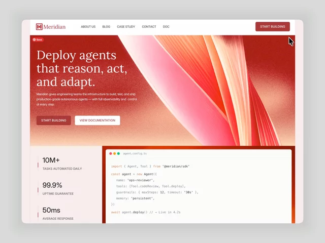
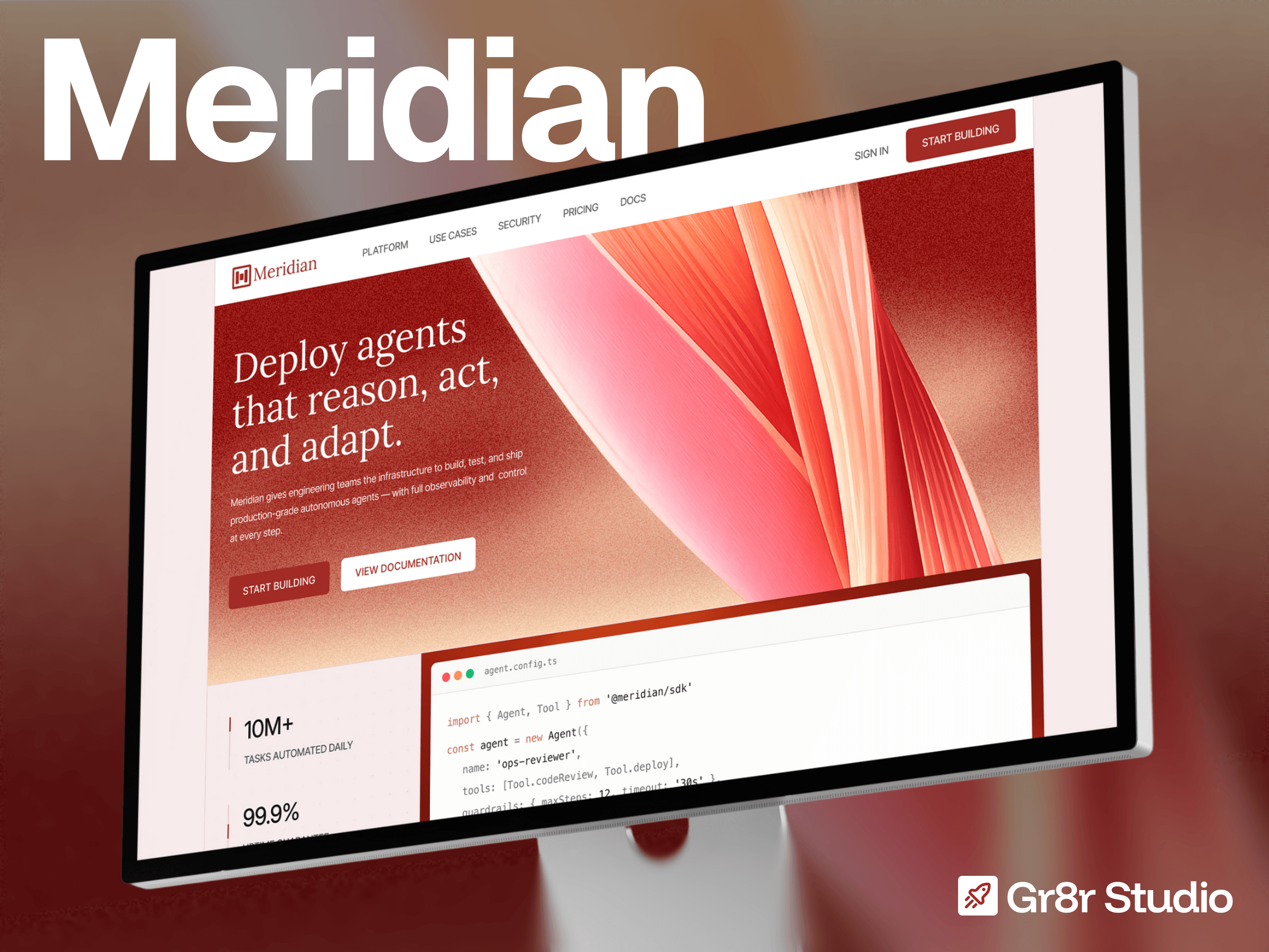
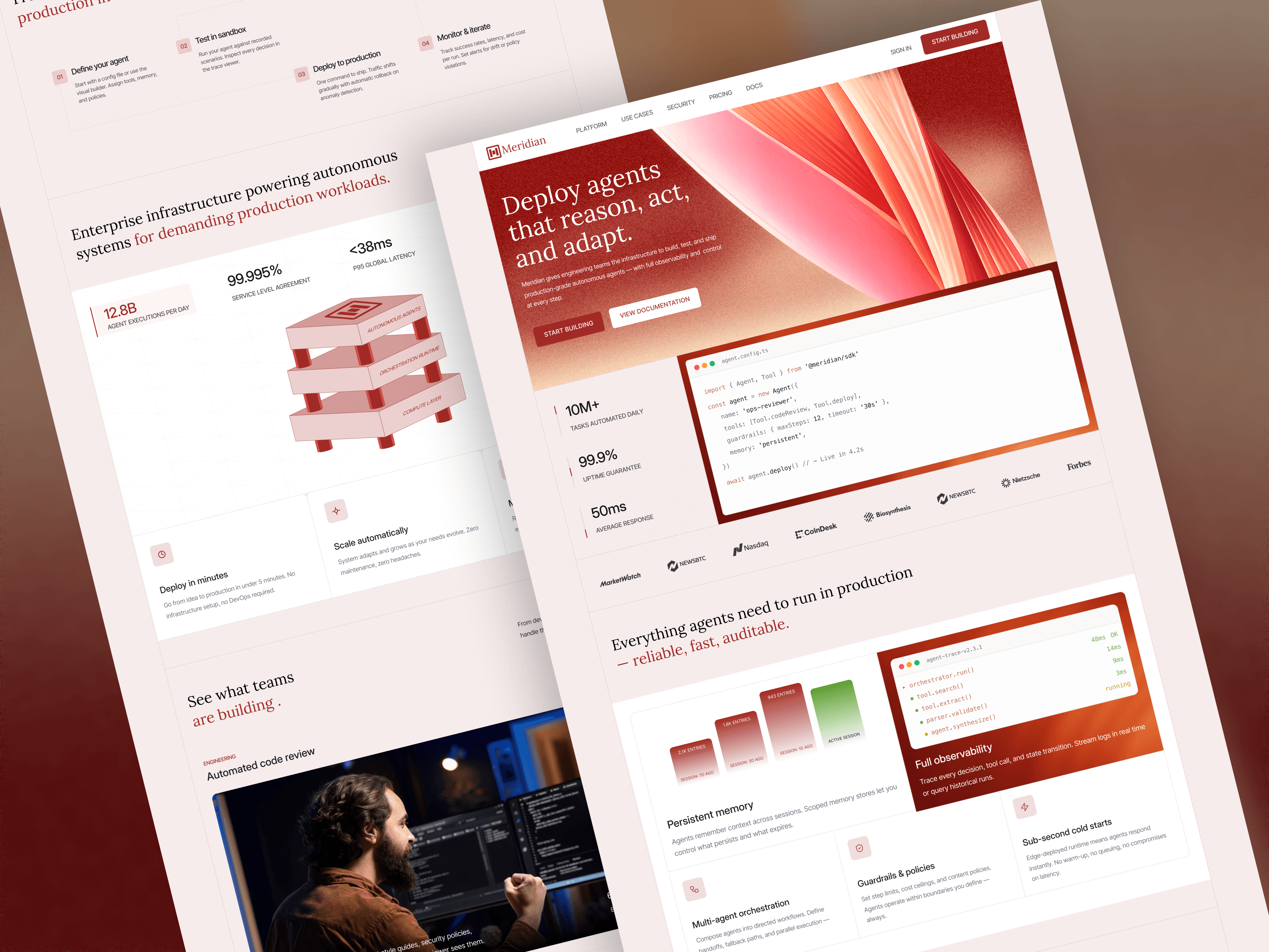
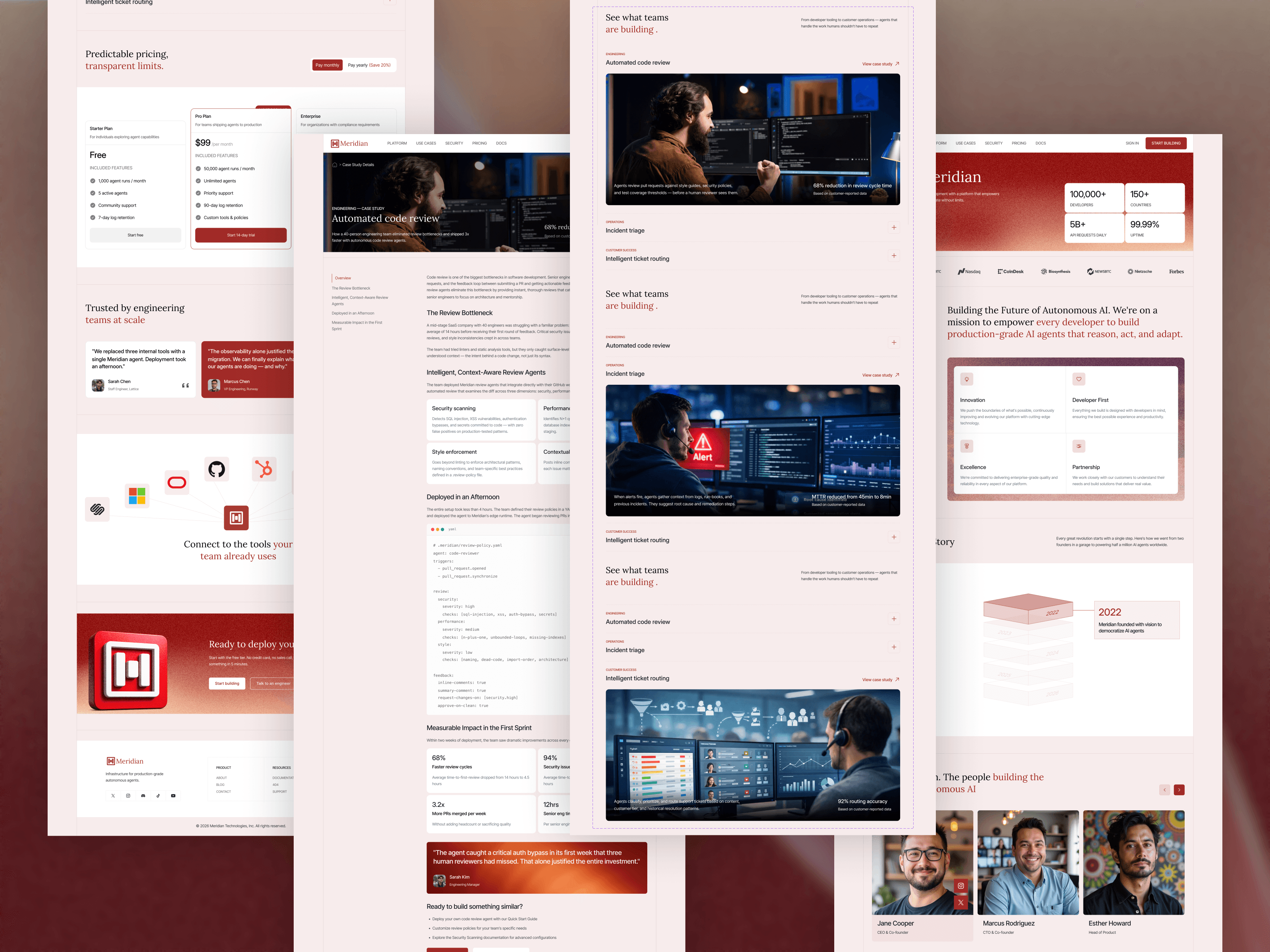
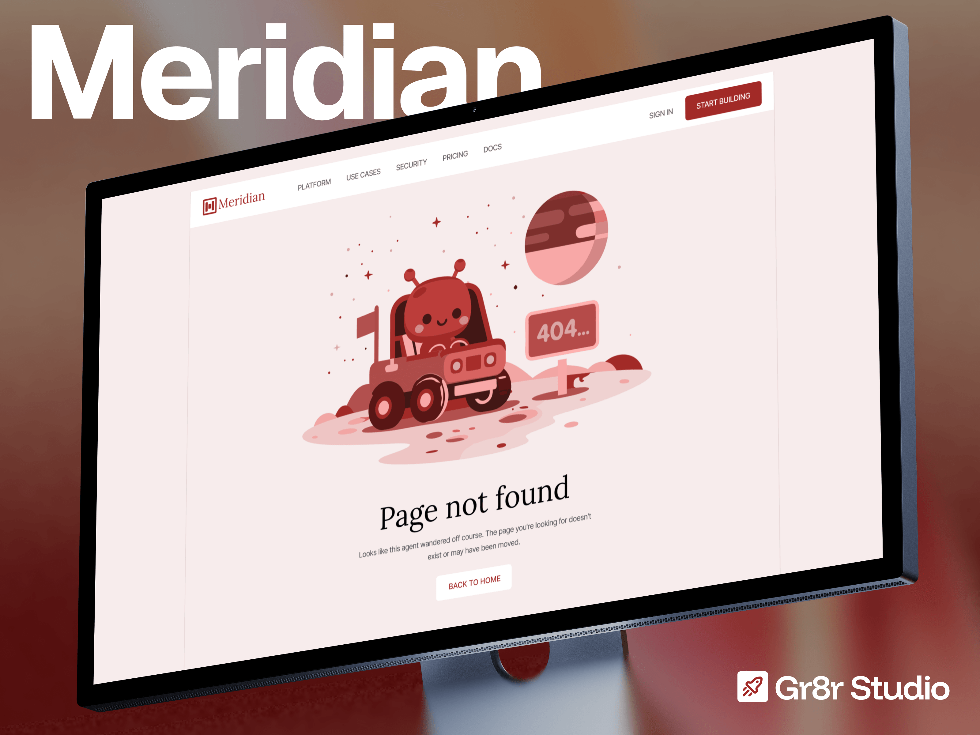
Free to use. Made for you - https://framer.link/zkqyc31
Built a bold AI SaaS website template for founders who want to launch fast without looking generic. Clean layouts, conversion-focused sections, and easy Framer customisation ready to make your product feel launch-ready.
#Framer #SaaS #AITemplate #WebDesign
Take it. No purchase, no email, no catch - just duplicate it 👇 https://framer.link/prrY7Cy
1 year old, but still one of those designs that holds up.
Clean, flexible, and ready to give your next project a strong head start. Grab it now and make it your own.
Nobody searches for "workflow automation." They search for whatever they are tired of doing by hand. That is why Aoutive opens with six named jobs instead of six feature cards.
Free, live soon. coming something special 🔥
I built a website for a product that does not exist. Meridian - an AI agent infrastructure platform I invented before I designed a single section.
Free on the marketplace very soon 🔜 stay tuned
Nexus is live. A dark AI agent orchestration Framer template with an agent network hero, six-card feature grid, four-step deployment process, and three-tier pricing. Built for automation platforms and enterprise AI startups.
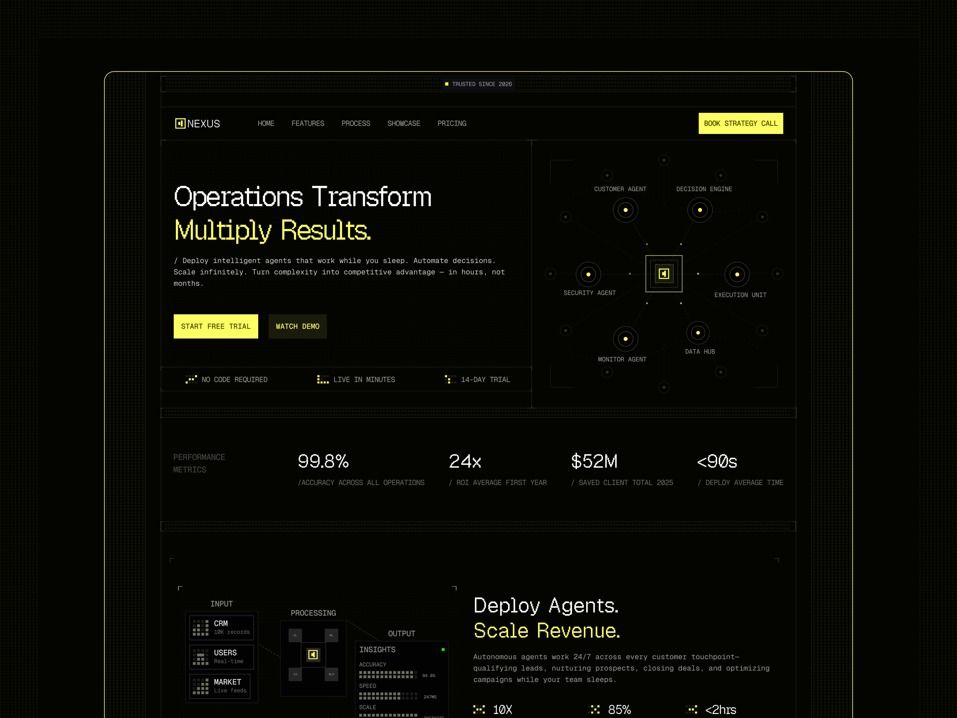
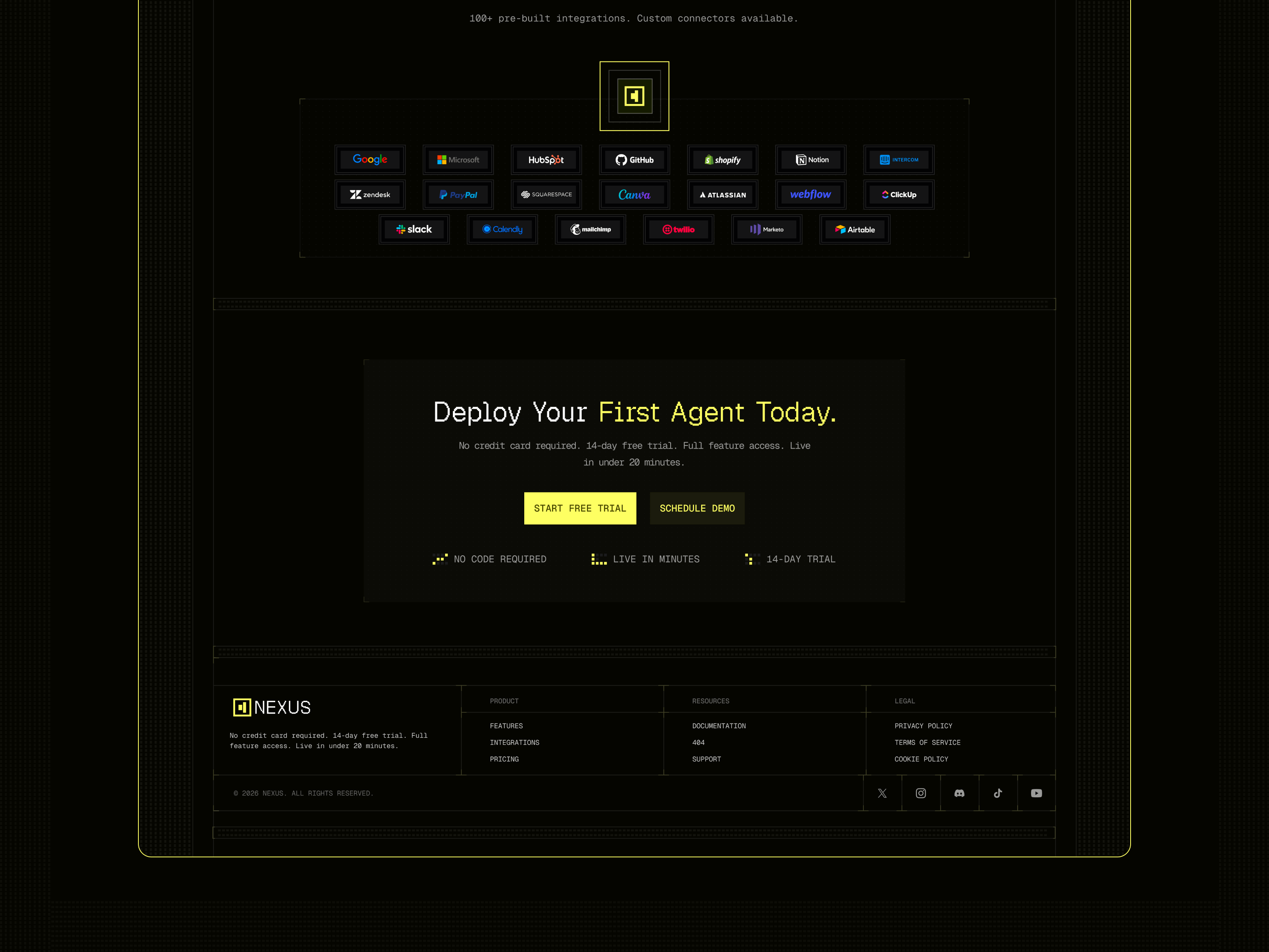
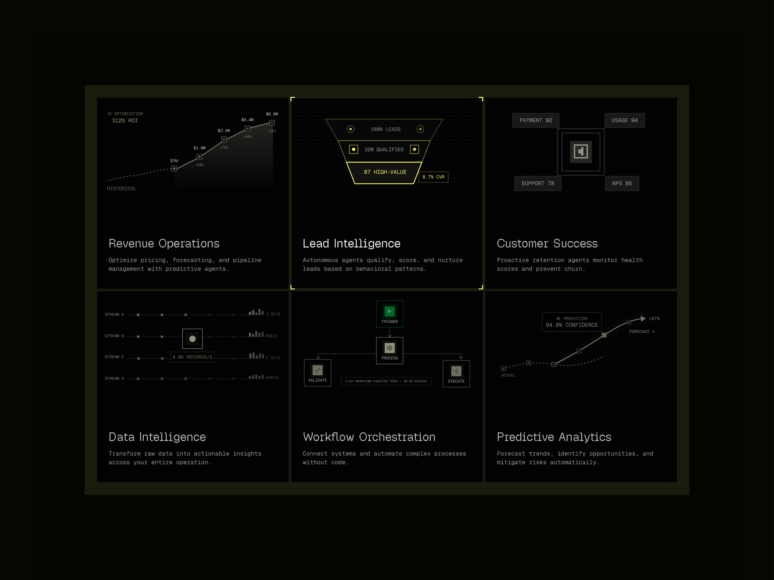
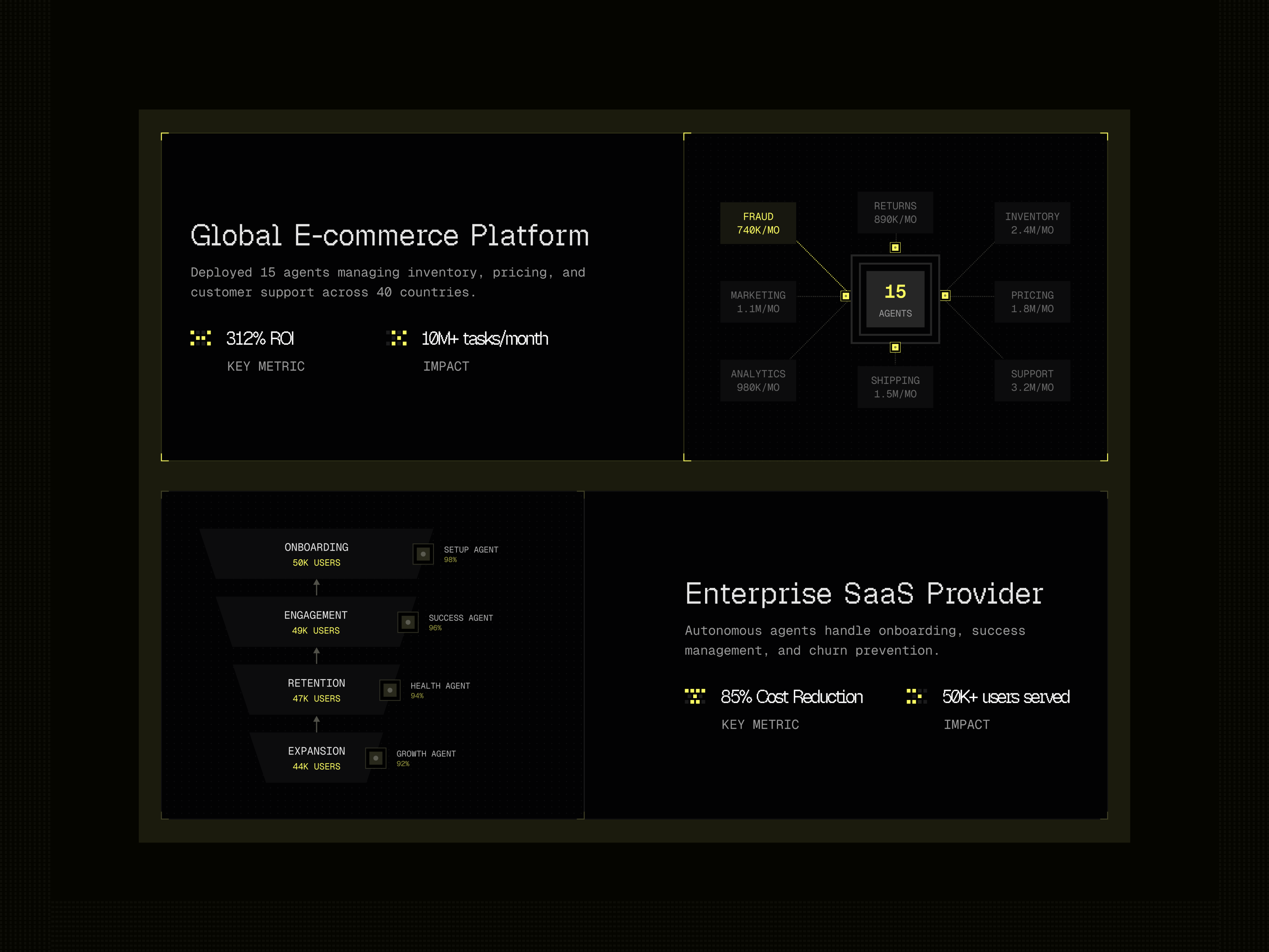
Free to use. Made for you - https://framer.link/cKeJMRb
The dashboard in this template shows loads, drivers, and auto-dispatch rates.
Not "analytics." Not a chart with unlabelled axes. A logistics dispatch board.
That was a deliberate risk, and it is the thing I would defend hardest.
Generic AI templates all have the same hero mock - a purple gradient, three floating cards, numbers that mean nothing. It works for everyone, which means it convinces no one.
A visitor evaluating an AI product looks at the dashboard mock for about two seconds and asks one question: does this thing do work that resembles mine?
An abstract chart cannot answer that. A dispatch board can, and if the visitor runs a fleet, it just did.
→ Pick one vertical for the hero mock
→ Real column headers, real row labels
→ Make it swappable, but ship it specific
The counter argument is that specificity narrows the audience. In practice, vagueness narrows it more. Nobody has ever recognised themselves in a placeholder.
Specific is easier to change than convincing.
Take it. No purchase, no email, no catch - just duplicate it 👉 https://framer.link/flekKau
Six faces with names and job titles on a cleaning company website.
Not stock. The actual people who will be in your house on Tuesday.
Think about what is being bought here. A stranger gets a key to your home while you are at work. Nobody is comparing service lists at that point — they are deciding whether to be uncomfortable.
James Wilson, Office Cleaning Lead. Now there is a person, not a company.
When the service happens inside someone's home, the team page is the trust page.
Grab it for free now - https://framer.link/CVlmpWG
Six awards, no badges.
The standard is a row of gold laurel graphics. I built a table instead: award, issuing body, arrow.
Badges are unreadable at a glance. Tables get read, because reading is what tables are for.
And a wall of laurels says please notice we were recognised.
A quiet list just says we were.
Confidence is a design decision, not a personality trait.
Xenova · Creative Agency Framer Template
Grab it for free now - https://framer.link/vWwnmPc
Grab it for free - https://framer.link/qRoUJKH
I put starting prices inside the services accordion. Not on a pricing page. Inside the services section itself.
Studios hate this. The argument is always the same - every project is different, a number caps what you can charge, we prefer to qualify on a call.
Here is the version of that argument nobody says out loud: the call is where you find out whether the person can afford you, and you would rather have the call.
The buyer would not.
A founder comparing four studios is not trying to negotiate. They are trying to build a shortlist without emailing four strangers about money. If your number is missing, you are not mysterious. You are extra work.
→ "Brand identity, from 8,000" removes nothing from your negotiating position
→ The word from carries every bit of flexibility you need
→ Wrong-fit enquiries disappear, and that is the point
The studios that publish numbers are not the ones with nothing to protect. They are the ones who got tired of hour-long calls that were never going to close.
Grab it now for free - https://framer.link/33OYPjT
The comparison section is the most uncomfortable block on a SaaS homepage.
But the table is not about your competitor. It is about a buyer trying to justify the decision to someone above them. They need language they can paste into a message.
So compare against the current method, not a named rival. "Manual proposals" beats naming a company. And include one thing you do not do.
Attacking a competitor makes you look nervous. Comparing against the old way makes you look inevitable.
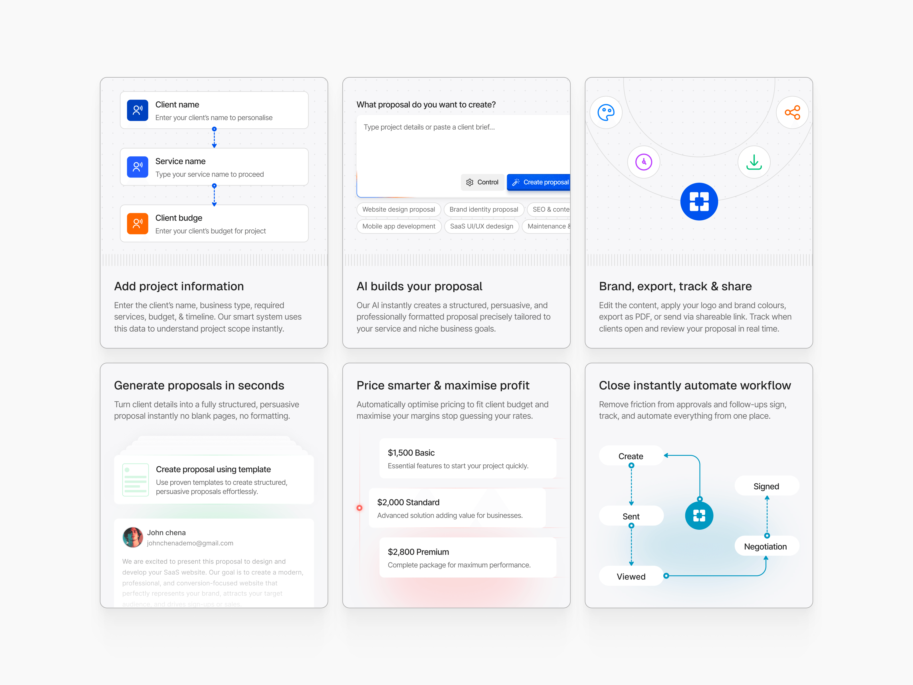
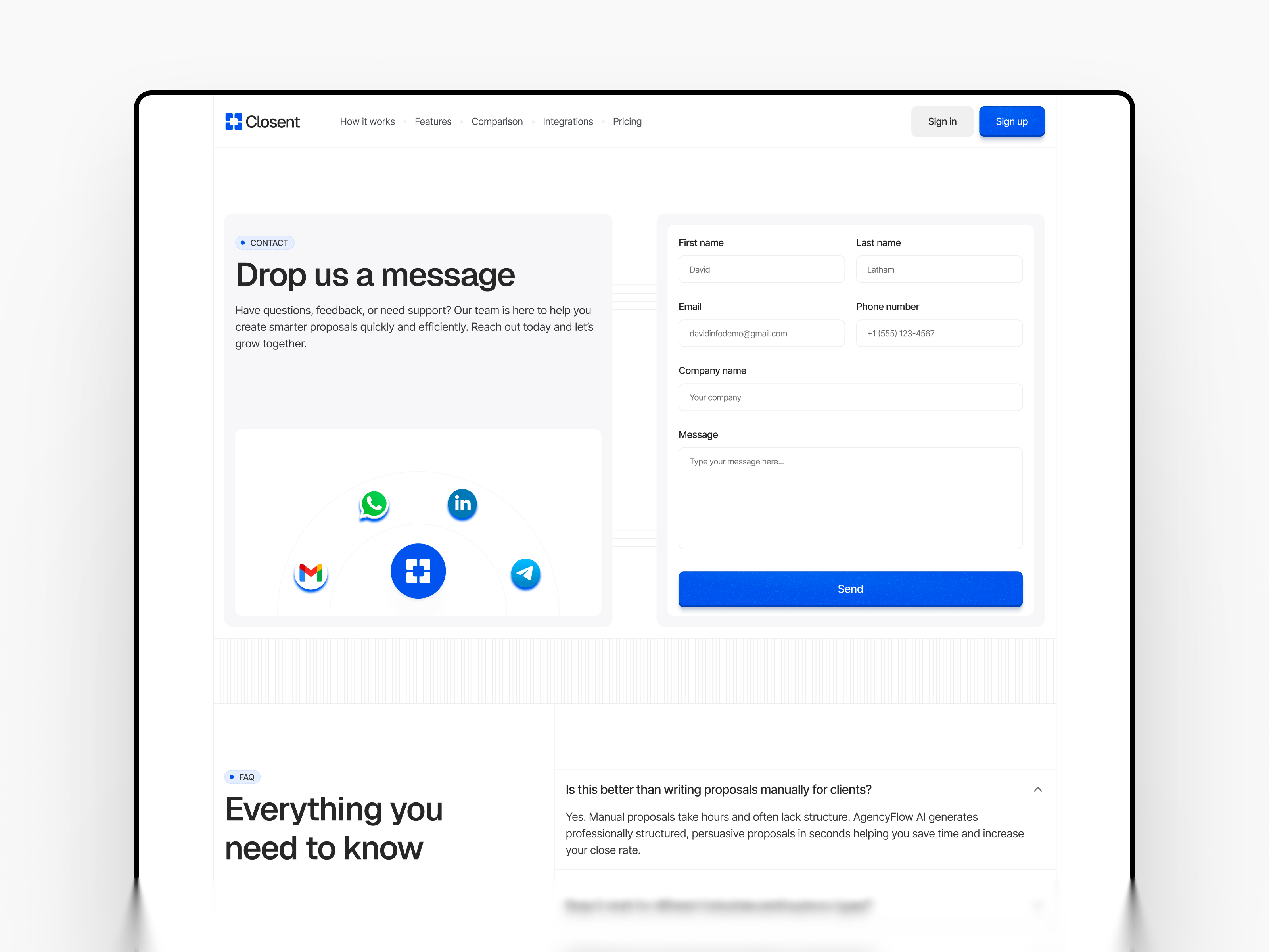
Closent is live. An AI proposal automation Framer template with a three-step process, comparison section, integrations block, and three-tier pricing across 6 pages. Built for agency software and freelancer platform founders.
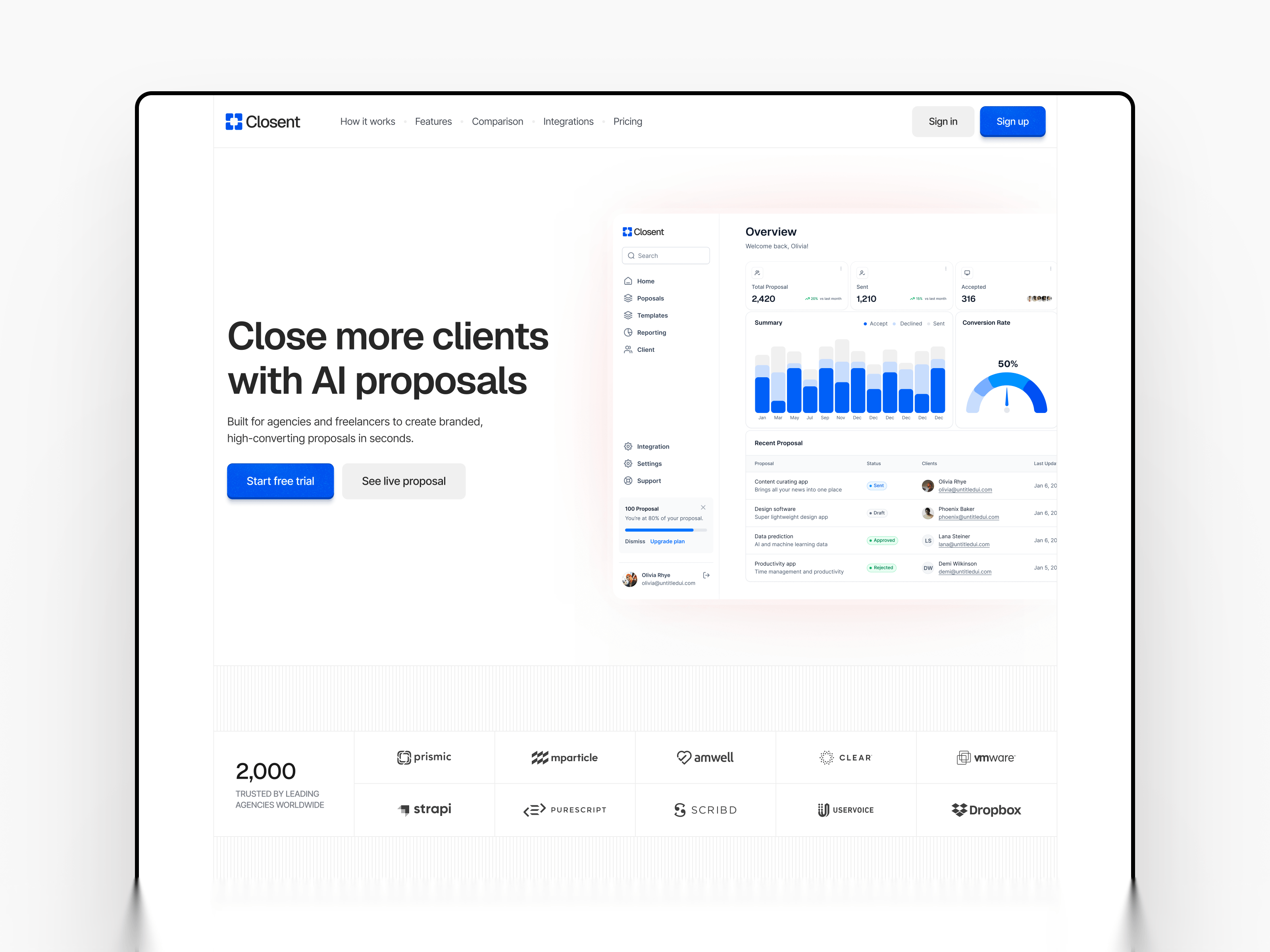
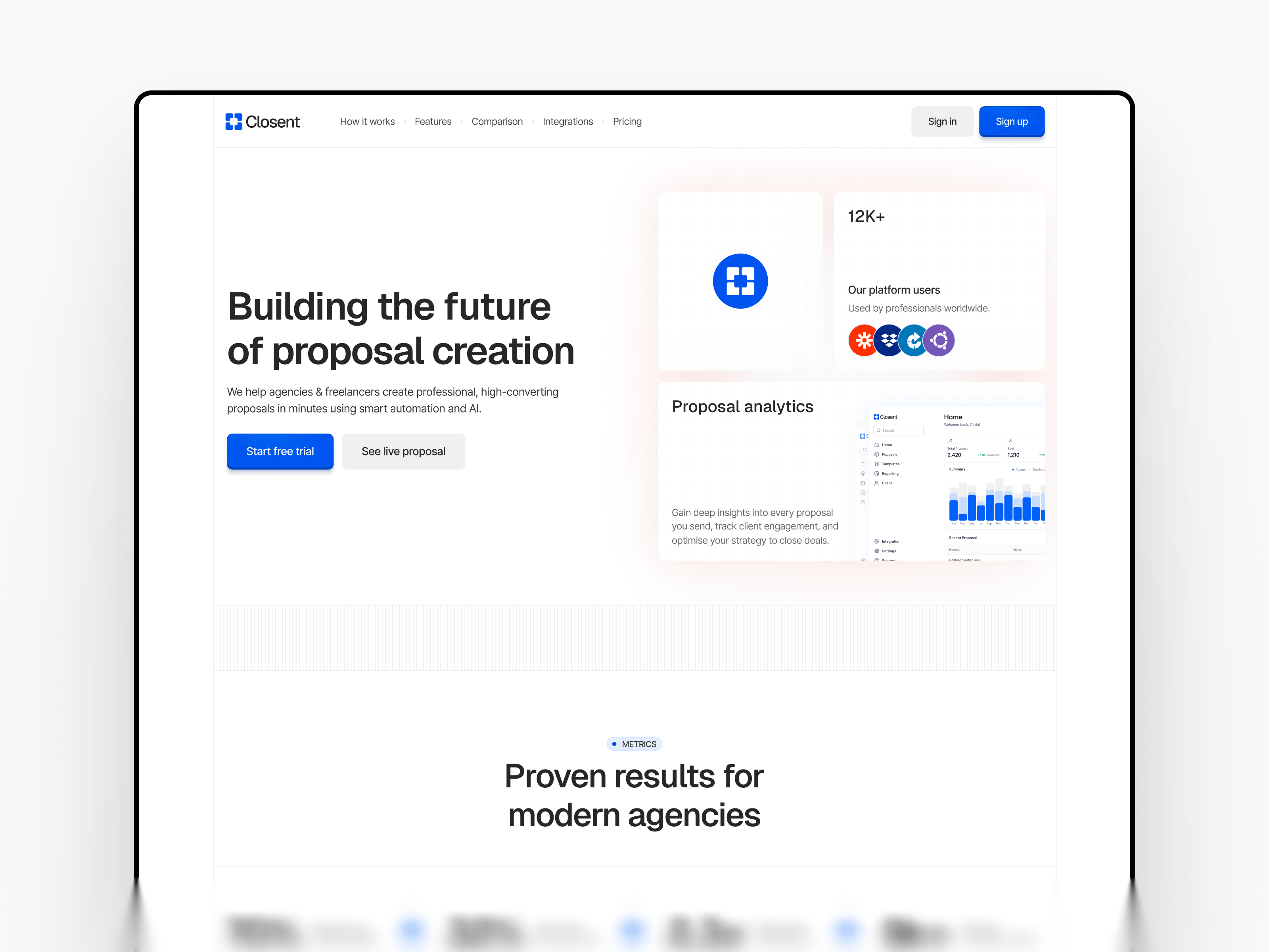
Grab it for free - https://framer.link/v3b3m6M
A small green badge on the corner of a project card. Plus 240 percent.
That badge is the reason someone clicks the case study. Not the thumbnail, not the client name, not how good the layout looks.
Marketing agencies get this backwards constantly. The portfolio grid is six beautiful screenshots and a project title, and the results are buried inside the detail page where nobody scrolls.
The grid is the hook. Put the outcome on it.
→ One number per card, visible before the click
→ Name the metric, not just the percentage
→ Keep the timeframe attached
"Plus 240 percent organic traffic in five months" on a card does more work than the entire case study behind it, because it filters. A local dentist scanning your grid stops at the number that matches the problem he has.
Screenshots prove you can design.
Numbers prove you can deliver.
An agency selling marketing is being judged on the second one. The grid should say so before anyone clicks.
It’s still free to grab now - https://framer.link/CVlmpWG
929 studios have used a template I nearly did not publish.
I sat on Norell for two weeks because I thought the typography was too plain next to what was ranking at the time. Everything on the front page was animated, layered, loud.
I published it plain anyway.
The plain one is the one that worked, and I still find that hard to internalise. Every time I start something new, the instinct is to add.
Restraint is not a style. It is a decision you have to keep making.
Rebuilt the demo video this week. A year later, the parts I fussed over have dated. The parts I left alone have not.
Grab it for free - https://framer.link/rDYl2UB
250 plus integrations.
That line sits on almost every automation SaaS homepage, and it is the least believable thing on the page.
Not because it is a lie. Because it is a wall.
A visitor does not want 250. They want one. They want to know if it works with the thing their team already opens every morning, and a giant number does not answer that.
What answers it is the logo they are looking for, visible without scrolling, plus a search field for the rest.
So the grid changed job:
→ Show the twelve everyone actually asks about
→ Make the count secondary, not the headline
→ Give each one a real page, not a tooltip
The number is scale. The logo is relief. Buyers need relief first.
Same principle everywhere on a SaaS site. Big claims establish that you are serious. Specific proof is what gets someone to sign up.
Grab it for free - https://framer.link/z42LN48
I used to think the careers page was the least important page on a website.
I built it last, half-heartedly, usually because a client asked. Two roles, a stock photo of people near a whiteboard, done.
Then I watched how technical buyers actually research a tool.
An engineer evaluating a developer platform does not stop at pricing. They go looking for evidence the company will still exist in eighteen months, because adopting a tool means writing code against it. If the company dies, that work dies.
So they check three things.
Careers. Three open engineering roles reads as funded and building. An empty page reads as a side project. No page at all reads as one person with a Stripe account.
The blog. Not to read it - to check the date on the last post. A blog that stopped eight months ago says more than any feature section.
The changelog. Same question: is this thing still moving?
None of this comes up in a sales call. Nobody emails a founder to ask if they are about to run out of money. So the site has to answer it unasked.
→ Careers is a trust signal, not HR
→ Keep two or three roles live even when hiring is slow
→ Only date your blog posts if you will keep publishing
The pages that convert are not always the pages that sell. Some of them just prove you are still here.