Raedio DesignPro Expert

Designing Framer sites with a sense of whimsy, but never on a whim. 👋 I'm Rae
Starfish Studios is my second project in a row to be featured on Contra's homepage 😇🧚♂️✨
My favorite interaction from my recent work for Starfish Studios. The perfect touch of playfulness for an industry-leading Minecraft development agency.
All about play: website redesign for Starfish Studios. This project is by far my favorite to date. I never would have thought I'd have anything to do with Minecraft, but finding the balance between a super playful brand and the professionalism that turned Starfish into an industry leader trusted by Disney, McDonald's, and Nickelodeon was the challenge of my dreams.
Unfortunately, the team decided at the last minute to move off of Framer and develop the site themselves. But the version I developed is too good not to share.
This week's work in progress: a redesign of Sensitive Boy Studio's website. Julia's pottery is all about functionality and simplicity. Her wares are everyday luxury items with a touch of wabi sabi imperfection. Think editorial minimalism, not asceticism.
Small win—not my first commission, but it is my first from a template sale. I've been using Framer for a couple of years and it feels great to make some small steps in expanding my business.
What're your favorite "low luxury" e-commerce websites? Think more of a special occasion purchase to brighten every day life than a true luxury.
So far, I really love https://bourgine.net/ and https://tsu-lange-yor.au/
Any you think I should add to the inspo mix for my new template?
Juicy! 🍊 Fresh! 🧚♂
Big plans for updating my site, but being forced to tackle them in bite sized chunks.

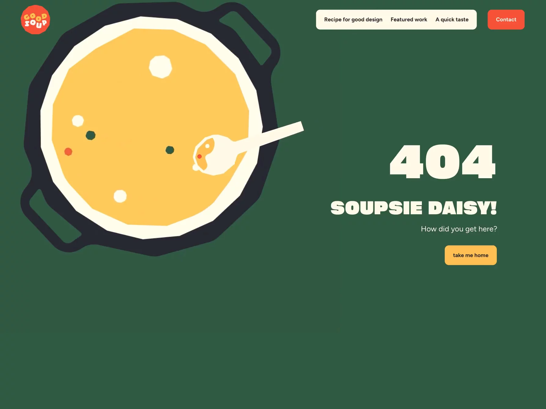
The 404 page we created with @Rachel Cohen for our recent Good Soup project.
What do you think to 'Soupsie Daisy', do you ship it? 👍 / 👎
You might hate me for saying this, but using AI generated "photography" on your websites— especially of people—makes your site look cheap, leaves users with a sense of unease, and ultimately makes them question your trustworthiness. My go-to alternative is Dupe Photos. It's free, open source, royalty-free user generated content. It's not a perfect fit for every project, but it'll get you pretty far.
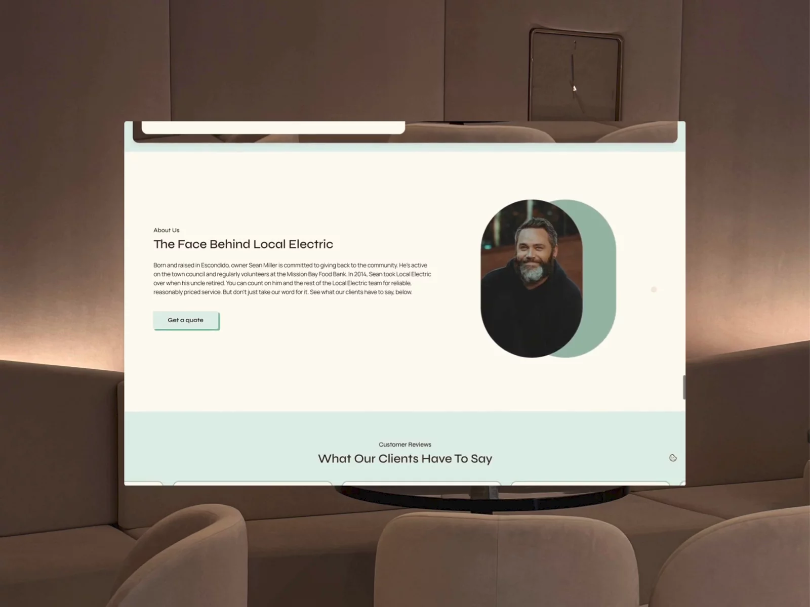
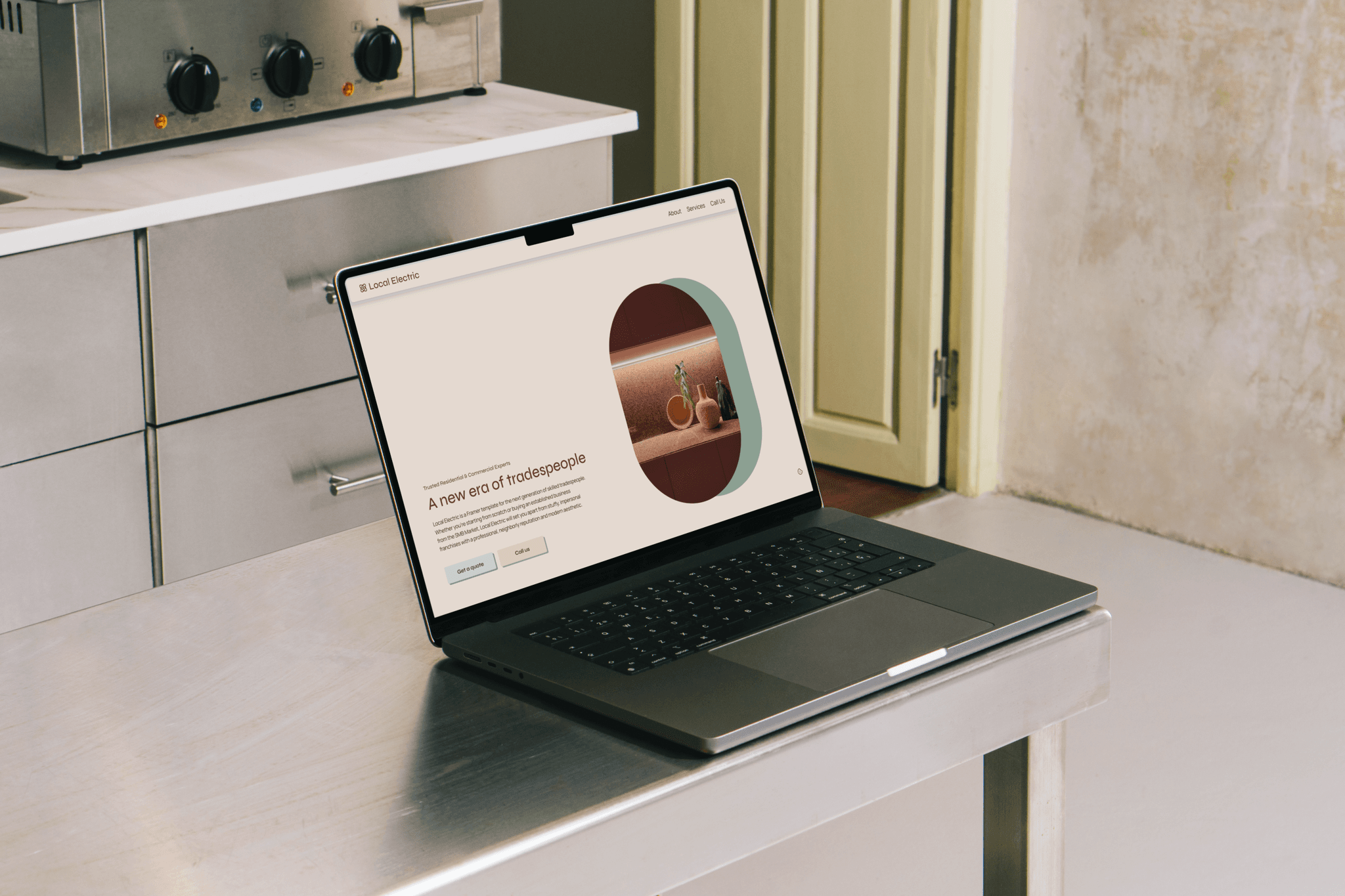
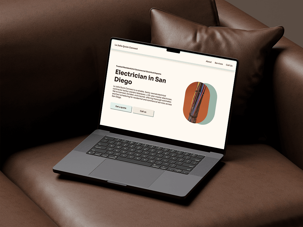
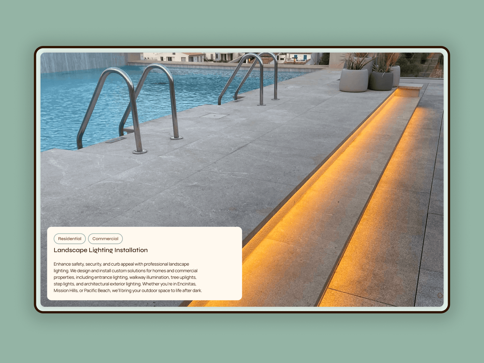
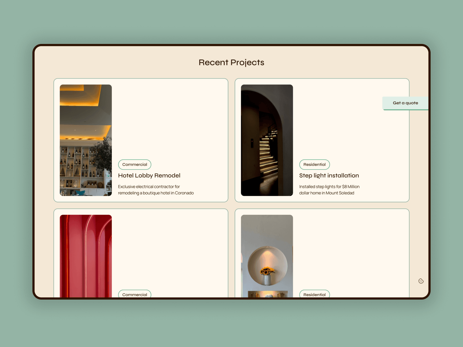
Local Electric: A new framer template for the next generation of skilled tradespeople. Because the young electricians, plumbers, and carpenters taking over from retirees shouldn't be stuck with a website from y2k.
Whenever I feel stuck I end up tinkering with my website. This week's victim: my newly redesigned contact page featuring a framer university component I adapted for behuman and loved so much I needed it on my own site.
I've always used browser based email apps and hate accidentally clicking on an email to find its opened a system default mail app I never use and don't even have set up. I think this is such a genius improvement on an established (dare I say outdated?) UX pattern.
Which camp do you fall into? Copy the email address and paste it where you want or click to open the system default?
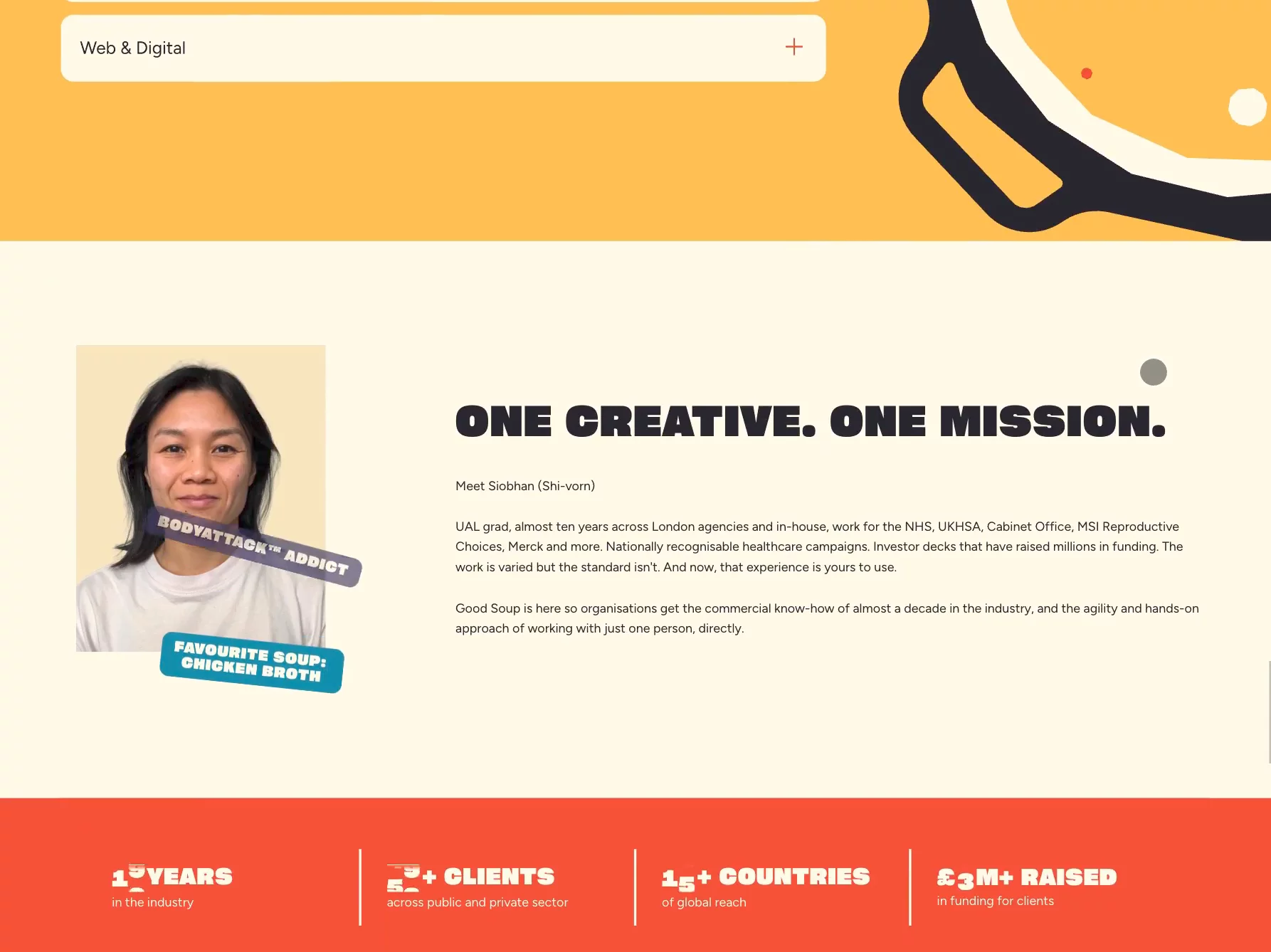
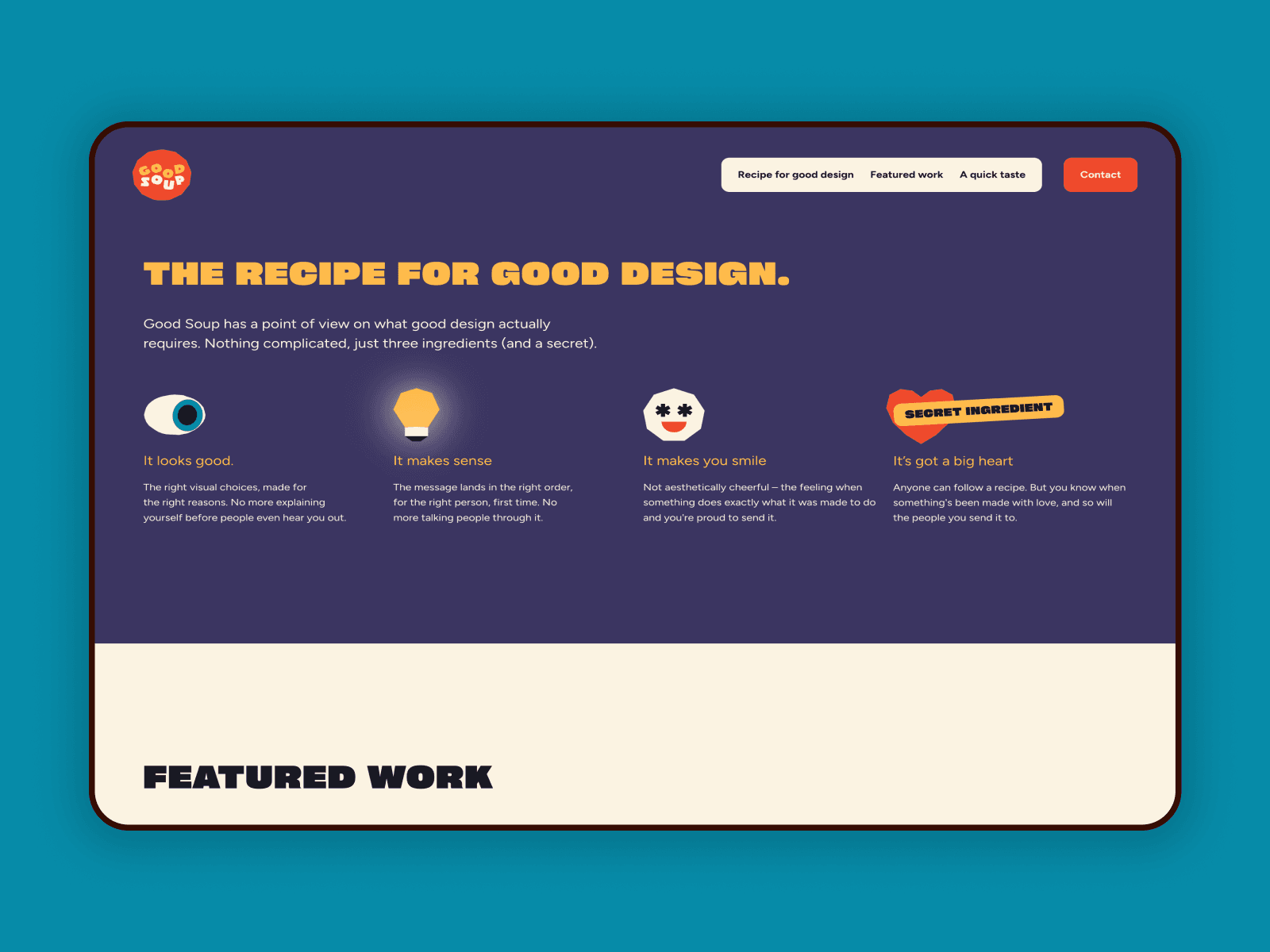
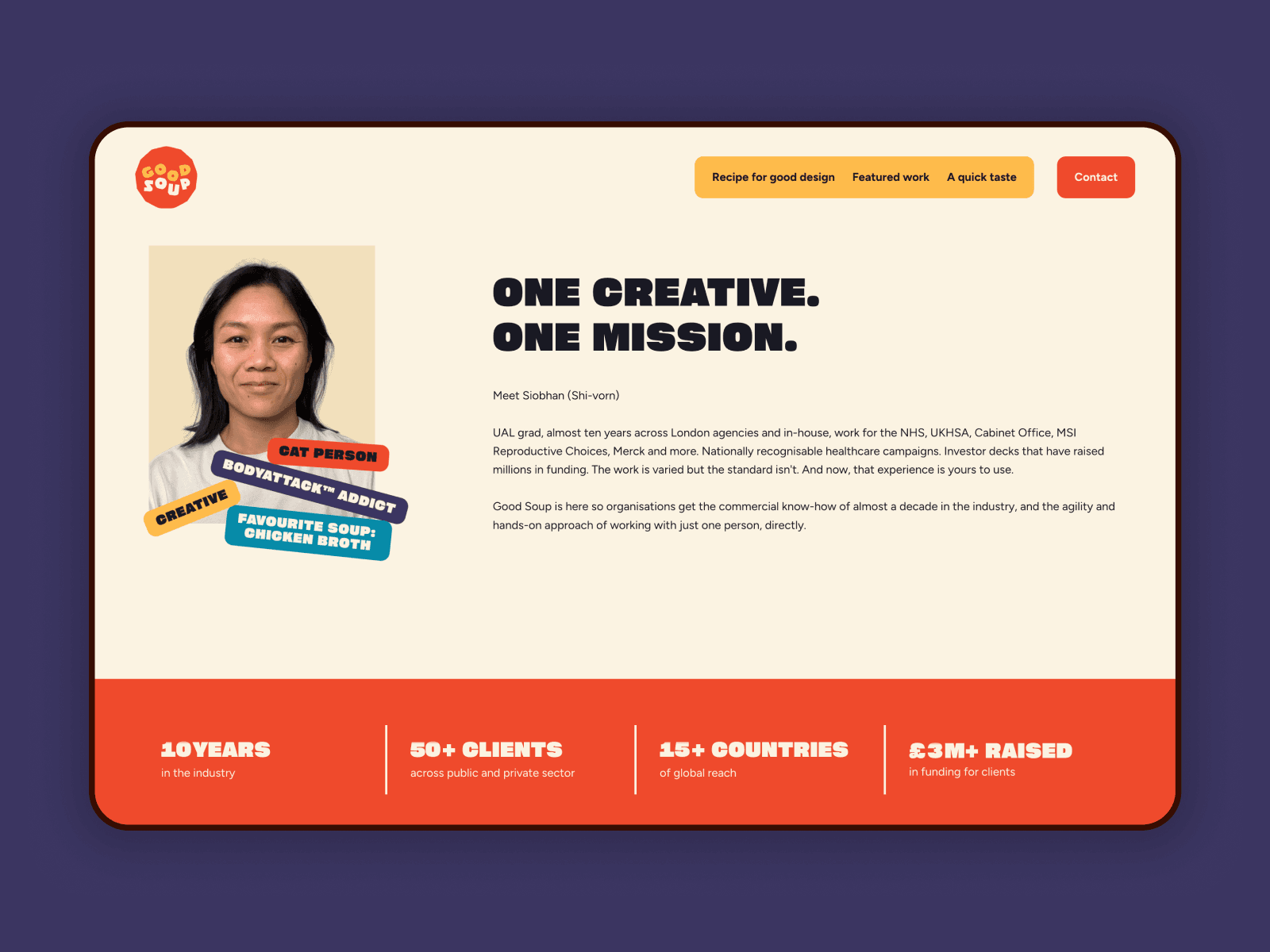
I got some lovely news this evening after a bout of designer's existential dread this AM—my recent development project, Good Soup Studio, is being featured on Contra's homepage 🙂

Broke down how Kudos (one of my templates) structures its CMS: 9 collections, a shared taxonomy across Projects/Articles/Team, and when to reference vs. merge data.
I was so stoked to collaborate with Siobhan on the Good Soup Studio website. Her designs are so bright, bold, and fun—the perfect jumping off point for my motion design.
I'm trading web updates for wares with a ceramicist friend of mine who built her site in wix. I haven't used wix since I switched to framer a few years ago but holy crap I did not realize what an incredible decision that switch was. I'm pulling my hair out trying to make updates to this site. I mean... they don't even have basic UI elements like FAQ accordions available. It's crazy. Feels good to know I made the right decision.
Designing Framer sites with a sense of whimsy, but never on a whim. 👋 I'm Rae
Starfish Studios is my second project in a row to be featured on Contra's homepage 😇🧚♂️✨
My favorite interaction from my recent work for Starfish Studios. The perfect touch of playfulness for an industry-leading Minecraft development agency.
All about play: website redesign for Starfish Studios. This project is by far my favorite to date. I never would have thought I'd have anything to do with Minecraft, but finding the balance between a super playful brand and the professionalism that turned Starfish into an industry leader trusted by Disney, McDonald's, and Nickelodeon was the challenge of my dreams.
Unfortunately, the team decided at the last minute to move off of Framer and develop the site themselves. But the version I developed is too good not to share.
This week's work in progress: a redesign of Sensitive Boy Studio's website. Julia's pottery is all about functionality and simplicity. Her wares are everyday luxury items with a touch of wabi sabi imperfection. Think editorial minimalism, not asceticism.
Small win—not my first commission, but it is my first from a template sale. I've been using Framer for a couple of years and it feels great to make some small steps in expanding my business.
What're your favorite "low luxury" e-commerce websites? Think more of a special occasion purchase to brighten every day life than a true luxury.
So far, I really love https://bourgine.net/ and https://tsu-lange-yor.au/
Any you think I should add to the inspo mix for my new template?
Juicy! 🍊 Fresh! 🧚♂
Big plans for updating my site, but being forced to tackle them in bite sized chunks.
The 404 page we created with @Rachel Cohen for our recent Good Soup project.
What do you think to 'Soupsie Daisy', do you ship it? 👍 / 👎
You might hate me for saying this, but using AI generated "photography" on your websites— especially of people—makes your site look cheap, leaves users with a sense of unease, and ultimately makes them question your trustworthiness. My go-to alternative is Dupe Photos. It's free, open source, royalty-free user generated content. It's not a perfect fit for every project, but it'll get you pretty far.
Local Electric: A new framer template for the next generation of skilled tradespeople. Because the young electricians, plumbers, and carpenters taking over from retirees shouldn't be stuck with a website from y2k.
Whenever I feel stuck I end up tinkering with my website. This week's victim: my newly redesigned contact page featuring a framer university component I adapted for behuman and loved so much I needed it on my own site.
I've always used browser based email apps and hate accidentally clicking on an email to find its opened a system default mail app I never use and don't even have set up. I think this is such a genius improvement on an established (dare I say outdated?) UX pattern.
Which camp do you fall into? Copy the email address and paste it where you want or click to open the system default?
I got some lovely news this evening after a bout of designer's existential dread this AM—my recent development project, Good Soup Studio, is being featured on Contra's homepage 🙂
Broke down how Kudos (one of my templates) structures its CMS: 9 collections, a shared taxonomy across Projects/Articles/Team, and when to reference vs. merge data.
I was so stoked to collaborate with Siobhan on the Good Soup Studio website. Her designs are so bright, bold, and fun—the perfect jumping off point for my motion design.
I'm trading web updates for wares with a ceramicist friend of mine who built her site in wix. I haven't used wix since I switched to framer a few years ago but holy crap I did not realize what an incredible decision that switch was. I'm pulling my hair out trying to make updates to this site. I mean... they don't even have basic UI elements like FAQ accordions available. It's crazy. Feels good to know I made the right decision.
Starfish Studios is my second project in a row to be featured on Contra's homepage 😇🧚♂️✨
My favorite interaction from my recent work for Starfish Studios. The perfect touch of playfulness for an industry-leading Minecraft development agency.
All about play: website redesign for Starfish Studios. This project is by far my favorite to date. I never would have thought I'd have anything to do with Minecraft, but finding the balance between a super playful brand and the professionalism that turned Starfish into an industry leader trusted by Disney, McDonald's, and Nickelodeon was the challenge of my dreams.
Unfortunately, the team decided at the last minute to move off of Framer and develop the site themselves. But the version I developed is too good not to share.
This week's work in progress: a redesign of Sensitive Boy Studio's website. Julia's pottery is all about functionality and simplicity. Her wares are everyday luxury items with a touch of wabi sabi imperfection. Think editorial minimalism, not asceticism.
Small win—not my first commission, but it is my first from a template sale. I've been using Framer for a couple of years and it feels great to make some small steps in expanding my business.
What're your favorite "low luxury" e-commerce websites? Think more of a special occasion purchase to brighten every day life than a true luxury.
So far, I really love https://bourgine.net/ and https://tsu-lange-yor.au/
Any you think I should add to the inspo mix for my new template?
Juicy! 🍊 Fresh! 🧚♂
Big plans for updating my site, but being forced to tackle them in bite sized chunks.
The 404 page we created with @Rachel Cohen for our recent Good Soup project.
What do you think to 'Soupsie Daisy', do you ship it? 👍 / 👎
You might hate me for saying this, but using AI generated "photography" on your websites— especially of people—makes your site look cheap, leaves users with a sense of unease, and ultimately makes them question your trustworthiness. My go-to alternative is Dupe Photos. It's free, open source, royalty-free user generated content. It's not a perfect fit for every project, but it'll get you pretty far.
Local Electric: A new framer template for the next generation of skilled tradespeople. Because the young electricians, plumbers, and carpenters taking over from retirees shouldn't be stuck with a website from y2k.
Whenever I feel stuck I end up tinkering with my website. This week's victim: my newly redesigned contact page featuring a framer university component I adapted for behuman and loved so much I needed it on my own site.
I've always used browser based email apps and hate accidentally clicking on an email to find its opened a system default mail app I never use and don't even have set up. I think this is such a genius improvement on an established (dare I say outdated?) UX pattern.
Which camp do you fall into? Copy the email address and paste it where you want or click to open the system default?
I got some lovely news this evening after a bout of designer's existential dread this AM—my recent development project, Good Soup Studio, is being featured on Contra's homepage 🙂
Broke down how Kudos (one of my templates) structures its CMS: 9 collections, a shared taxonomy across Projects/Articles/Team, and when to reference vs. merge data.
I was so stoked to collaborate with Siobhan on the Good Soup Studio website. Her designs are so bright, bold, and fun—the perfect jumping off point for my motion design.
I'm trading web updates for wares with a ceramicist friend of mine who built her site in wix. I haven't used wix since I switched to framer a few years ago but holy crap I did not realize what an incredible decision that switch was. I'm pulling my hair out trying to make updates to this site. I mean... they don't even have basic UI elements like FAQ accordions available. It's crazy. Feels good to know I made the right decision.