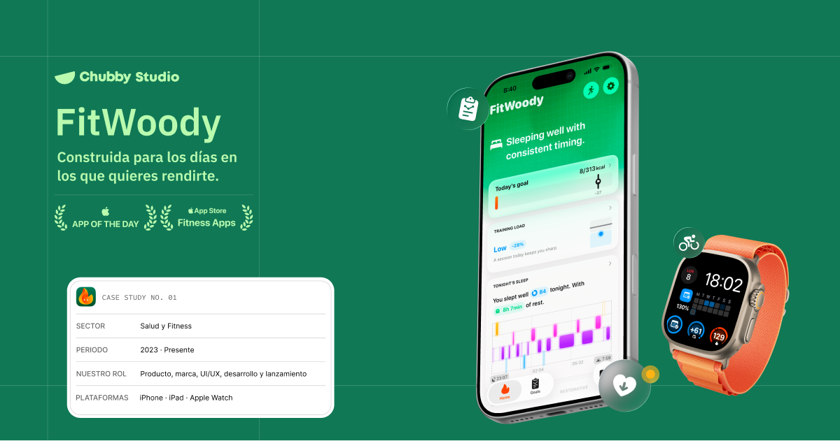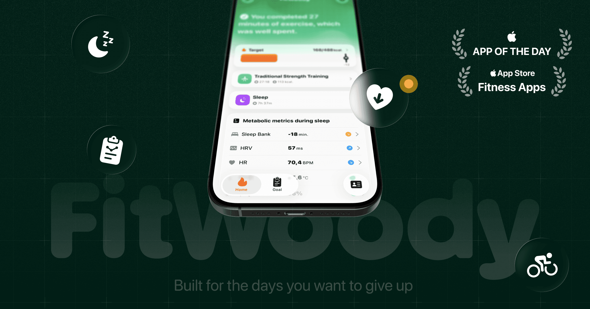
FitWoody · Our first case study, built with Framer Agents
We finally shipped the first case study on our new studio site, and it's the one we'd been putting off: our own app.
Eight chapters, each with its own color section, two interactive timelines (nine weeks of public betas, and nine releases in nine months), a side-by-side comparison of the same screen in English and Arabic with the layout mirrored, and inline video throughout instead of static screenshots.
Two things made it possible:
Almost all of it was built with Claude through MCP, driving Framer directly. Not "generate me a landing page" real back and forth on structure and components, with me deciding and the agent building.
The product videos were recorded in Matte, which is why the device footage looks the way it does.
https://chubby.studio/en/fitwoody
Happy to go into detail on any of it.