About IslandMenu
Most Framer menus give you one level. The moment a client asks for Work → Websites → Marketing, you're rebuilding the whole thing with stacks, overlays and three variants you have to keep in sync.
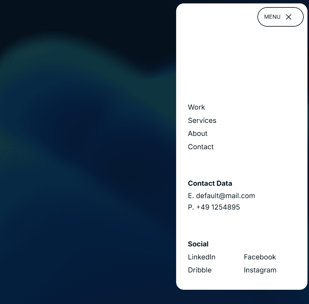
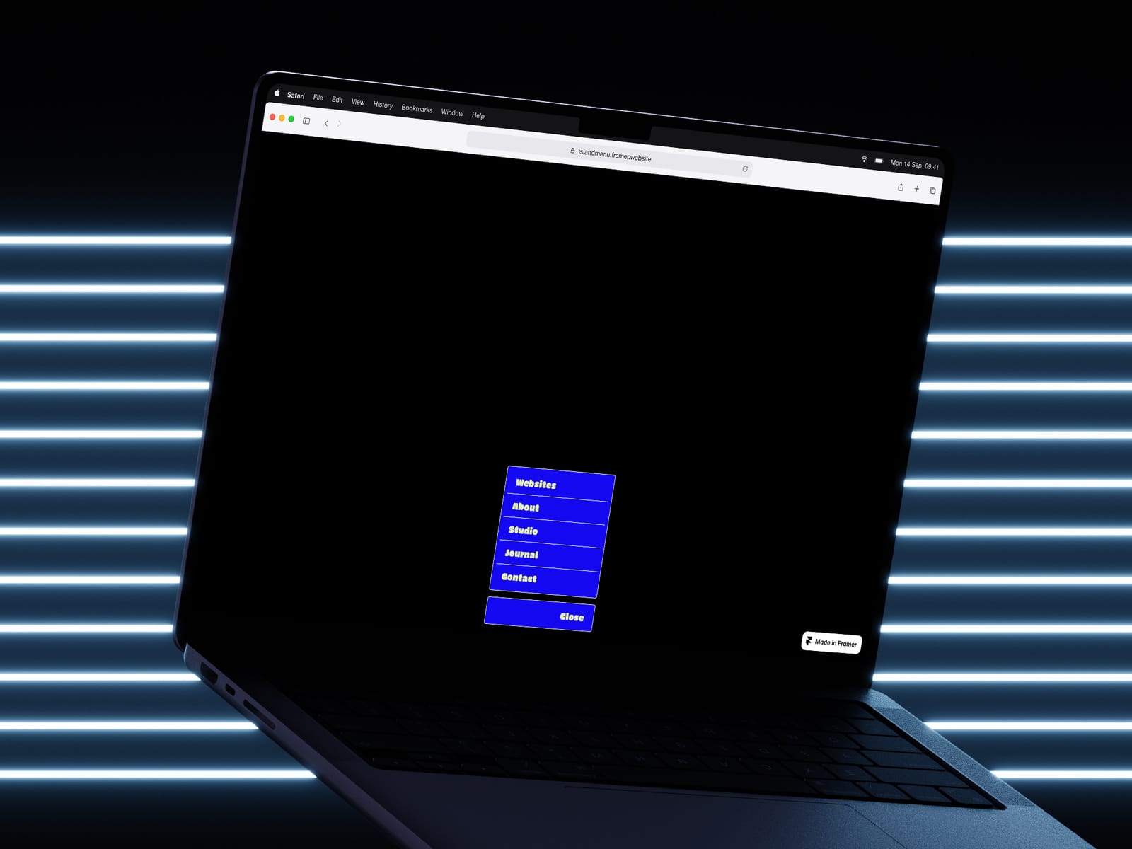
IslandMenu handles it in one component. A collapsed pill sits in your layout at 52px. Press it and it expands around its own anchor, so a centered menu grows symmetrically instead of shoving your logo sideways. The panel measures the live viewport every time it opens: it flips up when there's no room below, clamps to the screen edges, narrows itself on phones, and scrolls internally when the list runs past the fold.
Submenus are built the way navigation actually works. Every item has a Label, its own Link, and a Submenu of more items with the same fields, four levels deep. Each row gets a real Framer link picker, so you point at pages in your project instead of typing paths. An item can be a destination and a way in at the same time: Work links to /work and still opens its branch.
On desktop, submenus fly out beside their parent row and pick a side automatically when they'd run off screen. On phones they fold into an indented accordion. That switch is automatic, and you can force either one.
Closing runs the opening sequence in reverse. Open branches unwind leaf first, rows stagger out, then the panel collapses back into the pill. Nothing blinks away.
Two materials. Solid, with full control over surface, border, text, muted, hover fill and hover text. Or liquid glass: a tinted translucent body that blurs and saturates the page behind it, with a specular rim along the top edge. Glass sets its own text colors so it stays readable over photography.