About Navbar Pill
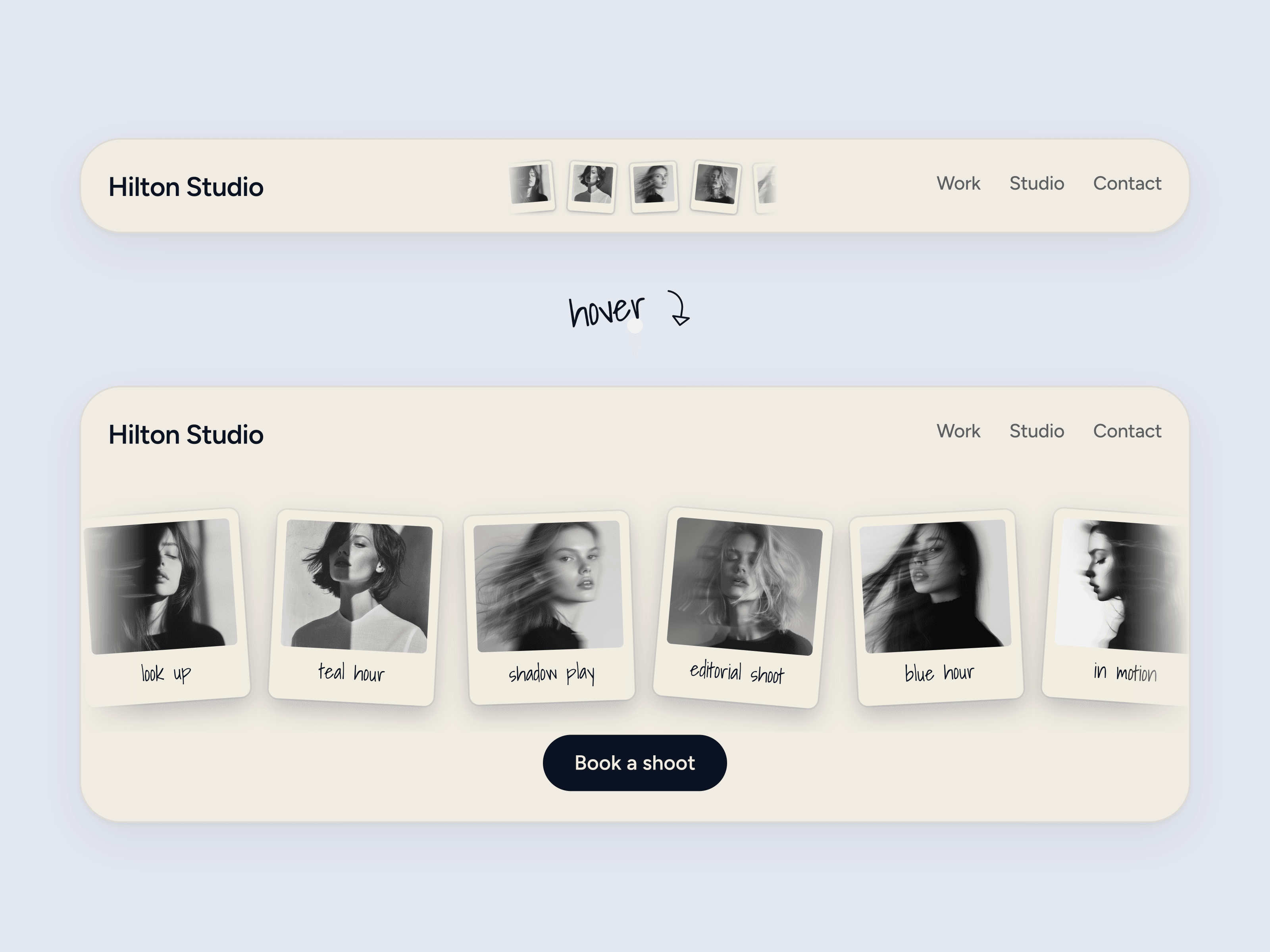
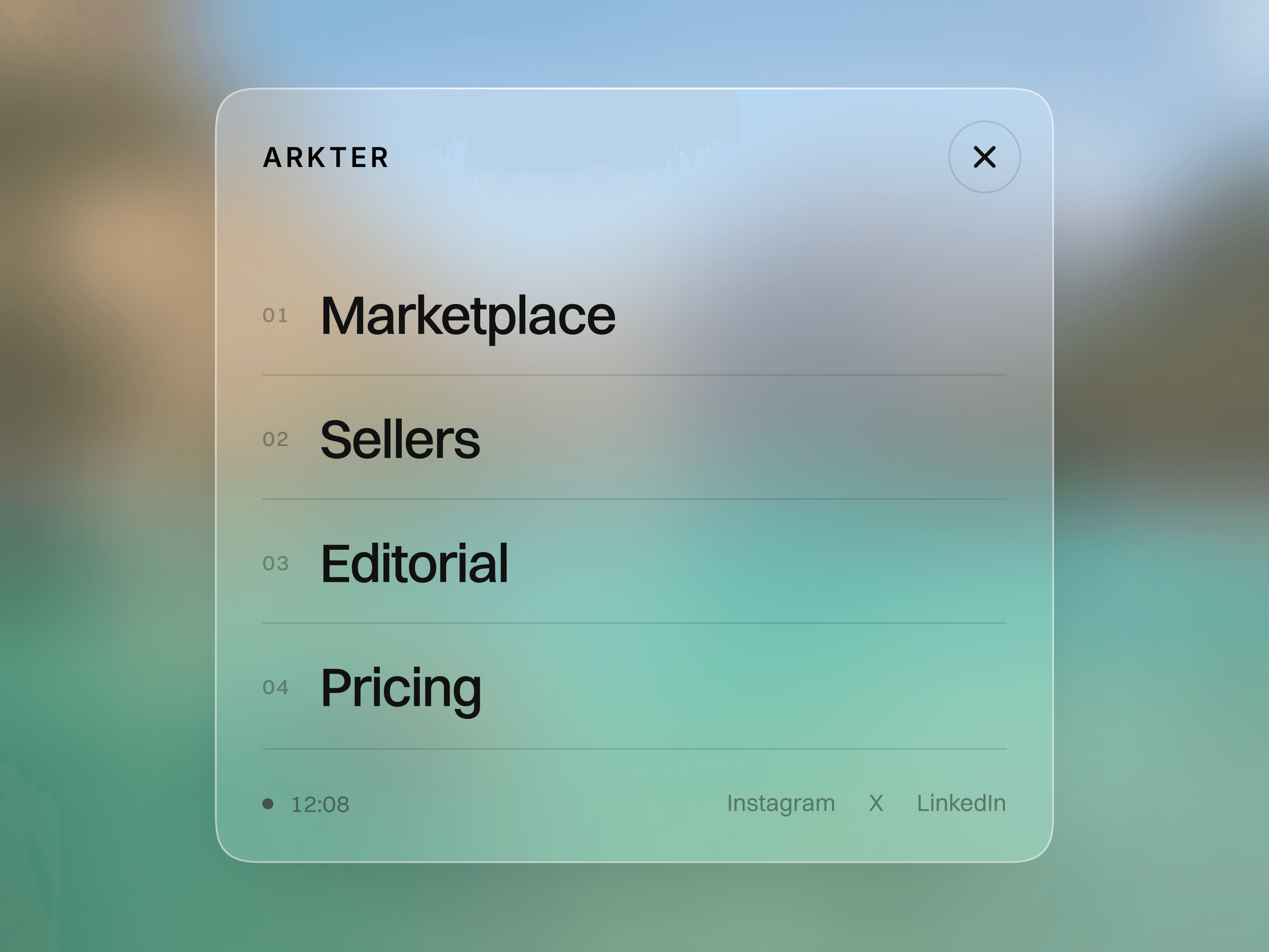
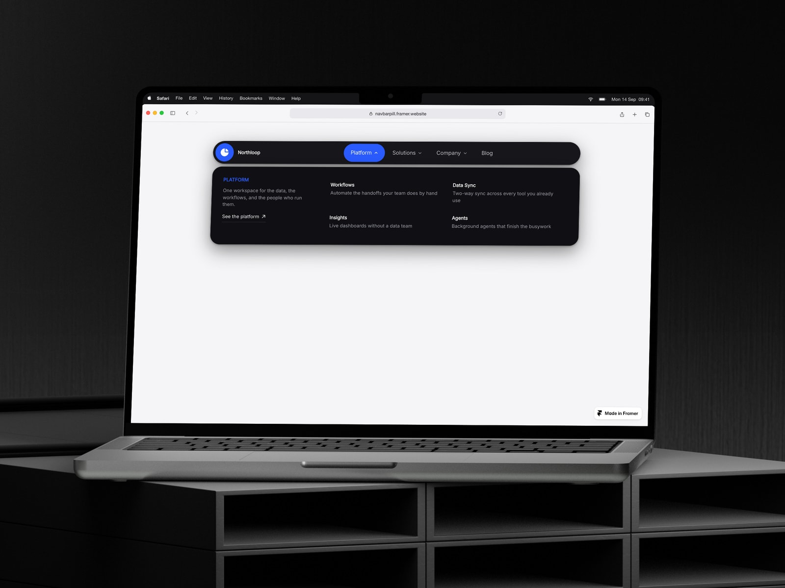
A floating pill navigation bar with hover mega-menu panels on desktop and a real accordion drawer on mobile. Drop it in, point the menu at your pages, and match it to your brand with six colour controls and two font controls.
Mega-menu panels. Each menu item can open a panel with an eyebrow, a blurb, a "view all" link and a two-column grid of titled sub-links. Items without sub-links stay plain links.
Sub-links from one text field. Type Label|Description|/link, one per line. The description and the link are both optional.
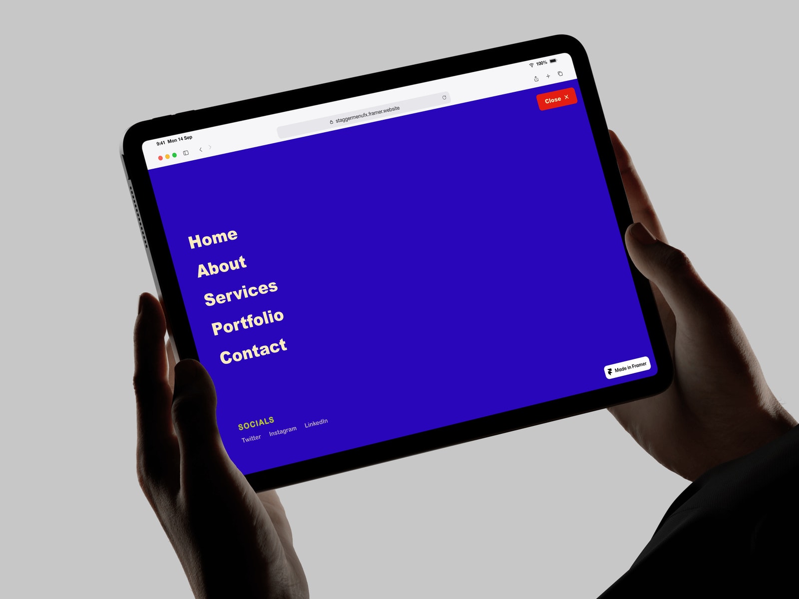
A real mobile drawer. Below a width you set, the bar collapses to a burger and opens an accordion drawer with expanding sub-items and an optional full-width button.
Container-based, not viewport-based. It measures its own width, so it collapses correctly inside a sidebar, a modal or a narrow section, and it shows the right state on the canvas at every breakpoint.
Six colours, two fonts. Bar, panel, text, muted, accent and on-accent, plus separate nav and panel typography. Borders, hover states and separators derive from those automatically.
Shape controls. Bar height, max width, corner radius, panel offset, and a separate panel radius cap so a full pill bar does not round the panel away.
Hover or click, and accessible either way. Real buttons for the triggers, aria-expanded and aria-controls, visible focus rings, Escape and outside-click to close, and a prefers-reduced-motion fallback.