About Comparison Table Kit
Compare plans side by side
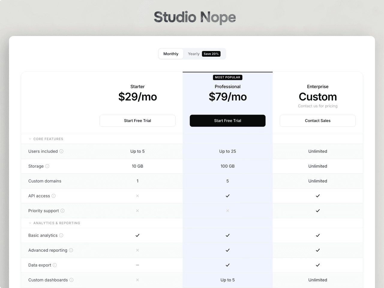
Comparison Table Kit lays out plans or products in columns and features in grouped rows. Each value is a checkmark, a cross, a dash for partial, or your own text such as "Up to 5" or "10 GB". It drops in with sample plans and a finished style, so you replace the content and publish.
Billing toggle
Switch between two prices per plan, for example monthly and yearly, with an optional discount badge. You choose which period shows first.
Collapsible categories
Group features under category rows that visitors can fold open and closed. Start any group folded to keep long tables short.
Highlight a plan
Mark a column as featured to tint it from header to bottom button, add a badge like "Most Popular", and give its button the filled style.
Tooltips
Add a short explanation to any feature. It shows on hover and on keyboard focus, stays inside the screen, and Escape closes it.
Sticky header
On long tables the plan names, prices and buttons stay pinned at the top while visitors scroll, then slide away at the end of the table.
Works on every screen
Breakpoints follow the width of the component. On phones the feature column stays in place while the plans scroll sideways.
Your design
Fonts, colours, sizes, spacing, corner radius, shadows, stripes and hover states are all in the properties panel. Plan icons come from Framer's Phosphor and Feather sets.
Keyboard and screen readers
Every button, option, category and tooltip is reachable with the keyboard and shows a focus ring. Screen readers hear the selected billing period, which categories are open and each tooltip.
Setup
Paste the component link, drop it on a page and set Width to Fill. The full guide is on the preview page.