About Hero Banner Pro
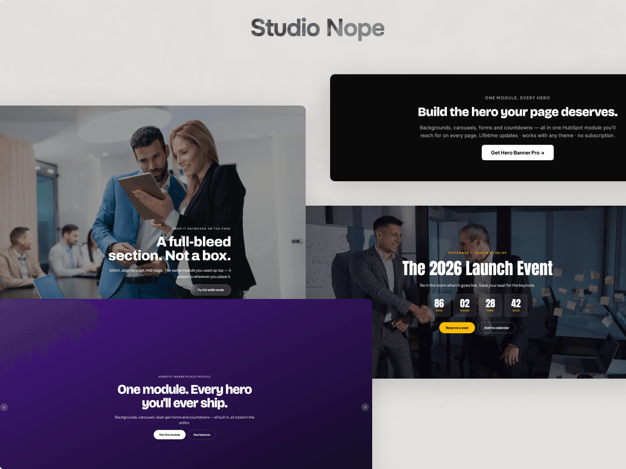
A hero and banner section for Framer. Use it as a full-height landing hero, a lead-gen banner with a form, a launch countdown, a sale banner or a simple section header. Every color, font, spacing value and animation is a property control, so there is no CSS to write.
Backgrounds
Solid color, gradient, image or video, from a URL or an uploaded file. An overlay color or gradient keeps text readable, and image and video backgrounds can drift with the scroll.
Carousel
Switch to carousel mode and stack slides. Each slide has its own background, colors, alignment, buttons, form and countdown. Slide or fade transitions, autoplay with a pause button, arrows, dots and swipe.
Forms
Connect your own Framer forms and show one below the copy or beside it as a card. The card, labels, inputs and submit button take their styles from the panel, or keep your form's own design.
Countdown
Count down to a launch, sale or event in the visitor's time zone, with your own labels and an expired message.
Typography and buttons
A font, size and color for the eyebrow, heading, subheading, buttons, form and countdown. Primary and secondary buttons with their own colors, hover colors, borders, radius and padding.
Animation
Fade, slide or scale entrances with a stagger, a letter-by-letter heading and a scroll-down arrow. Visitors who prefer reduced motion see everything at once.
Responsive
Fluid type and padding, and tablet and mobile breakpoints that follow the component's own width, so Framer's tablet and phone frames show the right layout.
Setup
Paste the component link into your project, drop it on a page and set Width to Fill. It arrives with a ready-made default hero. The guide on the preview page covers every setting.