
Hover Bump Image is an interactive media component designed to create expressive mouse-reactive animations inside Framer, with full support for Framer CMS variables for dynamic image workflows.
As the cursor enters the component, the image reacts with a dynamic “bump” motion whose intensity depends on mouse velocity. Slow movements create subtle reactions, while faster entries generate stronger motion and more pronounced impacts. Subtle rotation based on the cursor angle adds a more natural and organic feel.
Hover Bump Image also supports image switching on click, allowing the component to behave like a lightweight interactive slider. Images can transition sequentially or randomly, making it ideal for playful showcases, avatars, floating decorative elements, or interactive galleries.
Instead of using a traditional rectangular shadow, the component includes a true object-based shadow effect that perfectly follows the transparent shape of PNGs and SVGs, creating a much more natural and premium-looking depth effect.
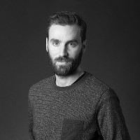
The effect works especially well with transparent PNGs, SVGs, emojis, stickers, mascots, and illustrated elements, but can also be used with traditional photos for more experimental layouts.
The component is optimized for mouse interactions and automatically disables bump behavior on mobile devices to preserve performance and avoid unwanted touch interactions. Floating animations and image switching continue to work normally on mobile.
When using multiple Hover Bump Image components on the same screen, Float Offset can be used to desynchronize animations and create more natural floating compositions.
Using lightweight and optimized images will ensure smoother animations and better overall performance.
Manual mode with uploaded images or direct URLs
CMS mode with up to 10 CMS image variables
Supports PNG, SVG, emojis, stickers, illustrations, and standard photos
Switch between multiple images on click.
Sequential mode displays images in a fixed order, while Random mode switches images unpredictably for more playful interactions.
Zoom In controls the scale animation of the incoming image, and Transition Duration defines how quickly the new image appears.
Enable or disable bump behavior.
Reactivity controls how strongly the image responds to cursor speed.
Max Offset defines the maximum horizontal and vertical movement distance during the bump animation.
Max Rotate controls the maximum rotation applied to the image, while Smoothness adjusts whether the motion feels softer and fluid or faster and snappier.
The cursor entry angle also influences image rotation, creating a more natural and organic motion feel.
Enable or disable continuous floating animation.
Amount controls the floating movement distance, while Rotate adds subtle rotational motion during the animation.
Duration defines the total floating animation cycle, and Intensity adjusts how visible and pronounced the floating effect becomes.
Float Offset creates delayed animations between multiple components, perfect for building more natural and desynchronized floating compositions.
Choose between default cursor or pointer mode.
Cover mode is ideal for traditional photos and immersive full-frame visuals, while Contain mode works especially well for transparent PNGs, SVGs, stickers, or media with varying dimensions.
Advanced shadow effect that follows the real transparent shape of PNGs and SVGs. Customize shadow intensity, radius and background color.
Drag Hover Bump Image onto your canvas
Add images manually or connect CMS variables
Customize bump and float behavior
Publish
All sales of digital products are final and non-refundable.
If you have any questions about the product, please contact me at hellonostromostudio@gmail.com before completing your purchase. I’m happy to help.
Enjoy!
 Nostromo Studio


