


NOWMO
Designer who codes. Developer who art directs. Building templates, components and custom experiences with Framer.
NOWMOExpert
MIU — The End
We spend a lot of time designing how people enter a portfolio.
But the last interaction matters too.
It's the moment that can turn browsing into another project, a conversation, or a reason to come back.
A good experience deserves a considered ending.
More content doesn't have to mean more clutter.
Overlays create another layer of information without asking the main layout to accommodate everything at once.
It's a simple way to preserve visual hierarchy while giving visitors room to explore.
Reveal more. Show less.
Good interaction can keep context while content changes.
Sticky elements are often treated as a visual effect, but they can do something more useful: preserve context while the rest of the page continues to unfold.
Keep what matters in view.
MIU — Selected Work
A portfolio isn't an archive. It's an edit.
Giving every project the same visual importance can make the strongest work harder to find.
Selected Work creates hierarchy before the visitor even starts browsing.
Selection is part of the design.
MIU — Introduction
A portfolio doesn't need to say everything at once.
Sometimes the first screen only needs to establish a point of view.
MIU keeps the introduction deliberately minimal, giving the rest of the portfolio room to unfold as you explore.
Less introduction. More identity.
MOTION CANVAS — Ring
Motion doesn't need speed to create energy.
A slower, continuous movement can give a gallery rhythm without turning the images into background noise.
The challenge is keeping things moving while still giving each image enough time to be seen.
Sometimes rhythm is enough.
A gallery doesn't need to wait for interaction.
Motion can exist as part of the composition itself — creating rhythm, depth and continuity before the user does anything.
Three layouts. Endless motion.
OVERLAP — Full Experience
A portfolio can be a composition, not a collection of cards.
OVERLAP combines two interactions into one system, letting projects share space, move through layers and create relationships with each other.
The interaction becomes part of the art direction.
OVERLAP — Interaction 02
Depth can be part of the navigation.
Instead of treating every project as an isolated card, OVERLAP lets them move through the same visual space.
The layering creates hierarchy, rhythm and a stronger sense of continuity between projects.
OVERLAP — New Component
Not every portfolio needs a grid.
OVERLAP explores a more editorial way of presenting projects — letting multiple pieces share the same space instead of separating everything into individual cards.
The interaction becomes part of the composition.
Just shipped Overlap — a CMS-powered project showcase with layered scroll reveals, image parallax and floating vignettes.
Built for portfolios that need something more expressive than a standard grid or carousel.
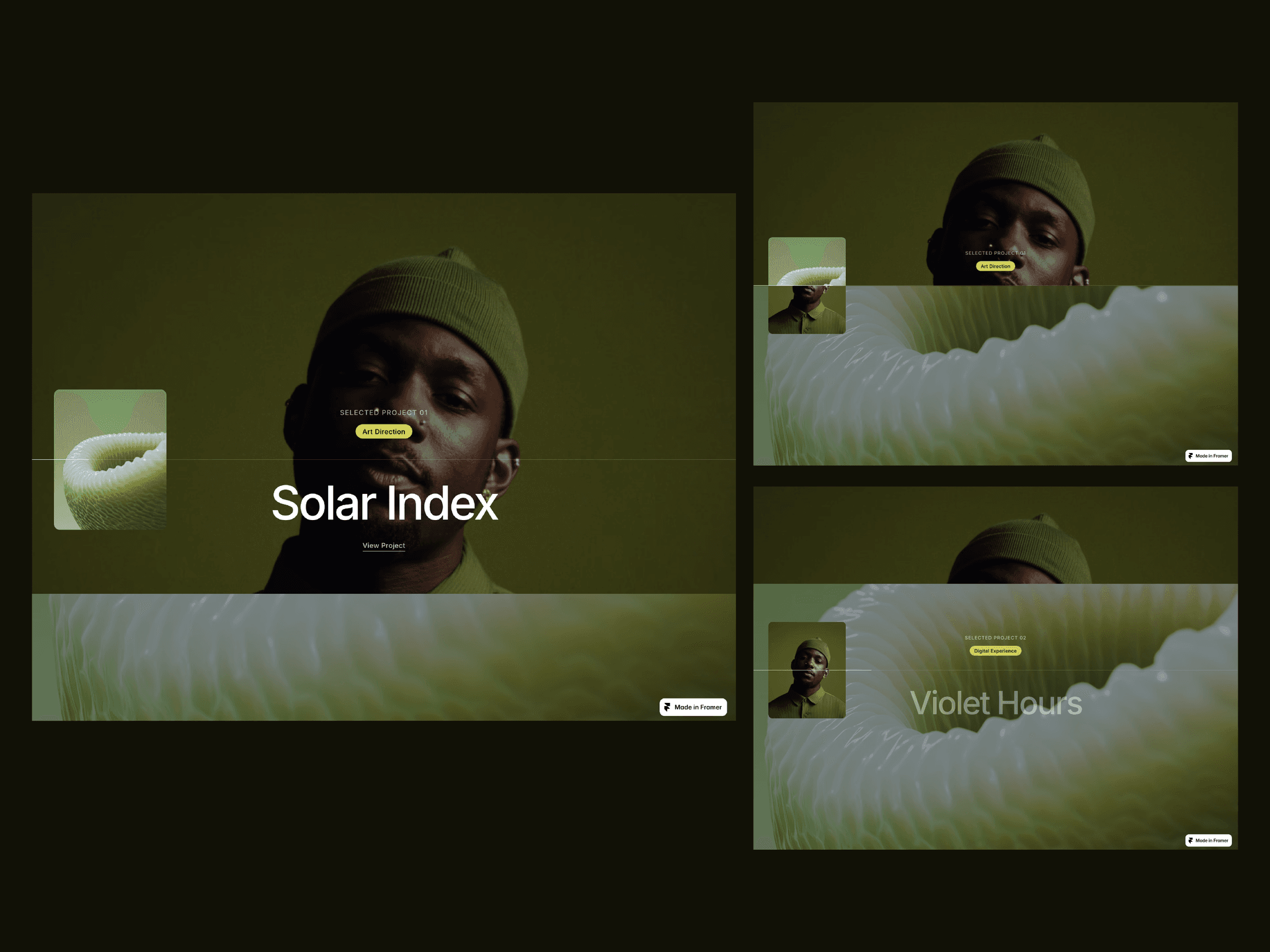
RISE — Hover
The quieter the interface, the more every interaction matters.
Too much motion breaks the mood.
Too little and the experience can feel static.
For RISE, the hover sits somewhere in between — just enough feedback to make the interface feel alive without asking for attention.
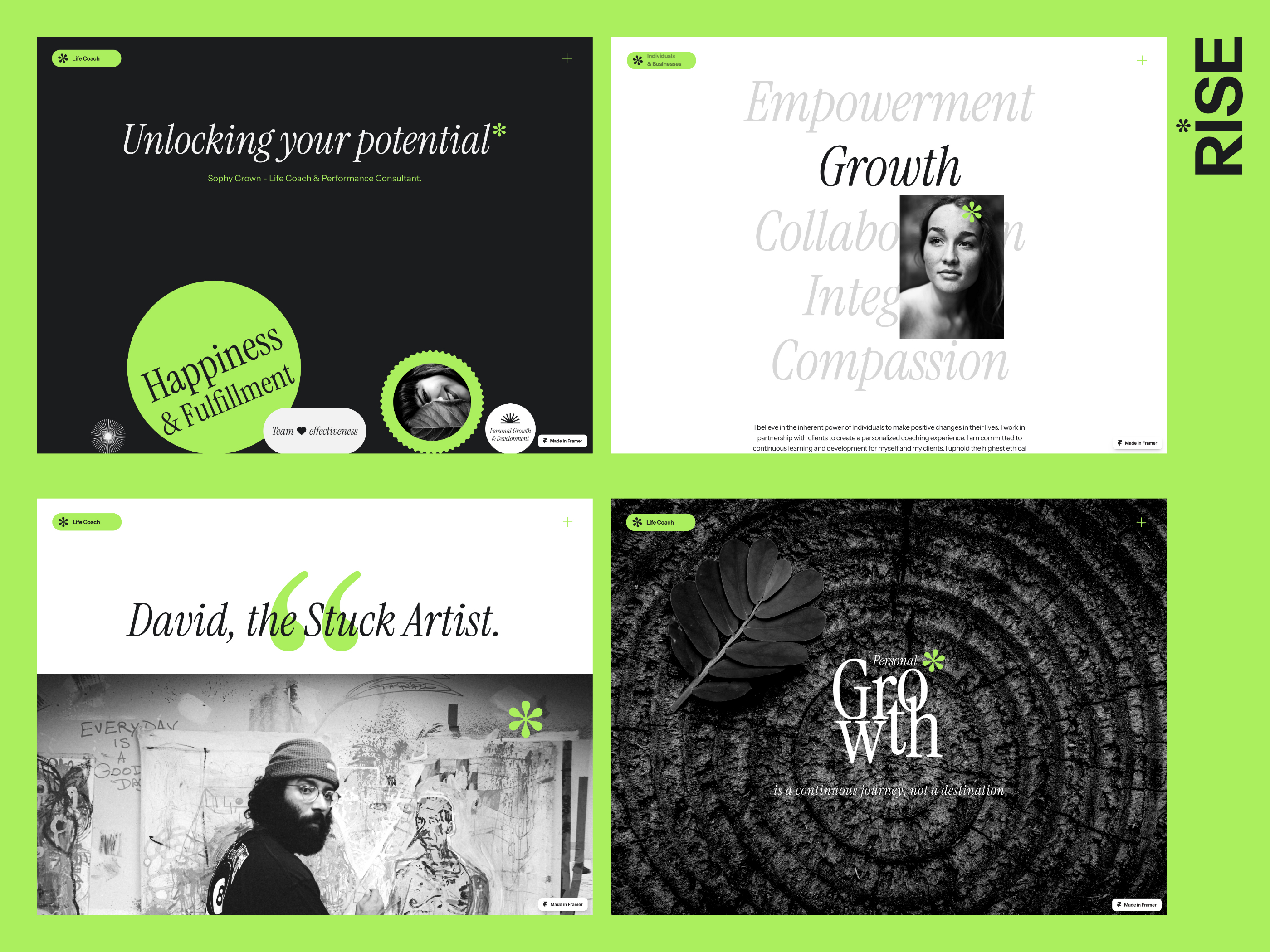
CORESPACE — Stories
Features tell people what a product does.
Stories give them a reason to care.
Putting the product into context helps turn functionality into something easier to understand — and easier to imagine using.
Sometimes the best way to explain a product isn't another feature list.
It's a story.
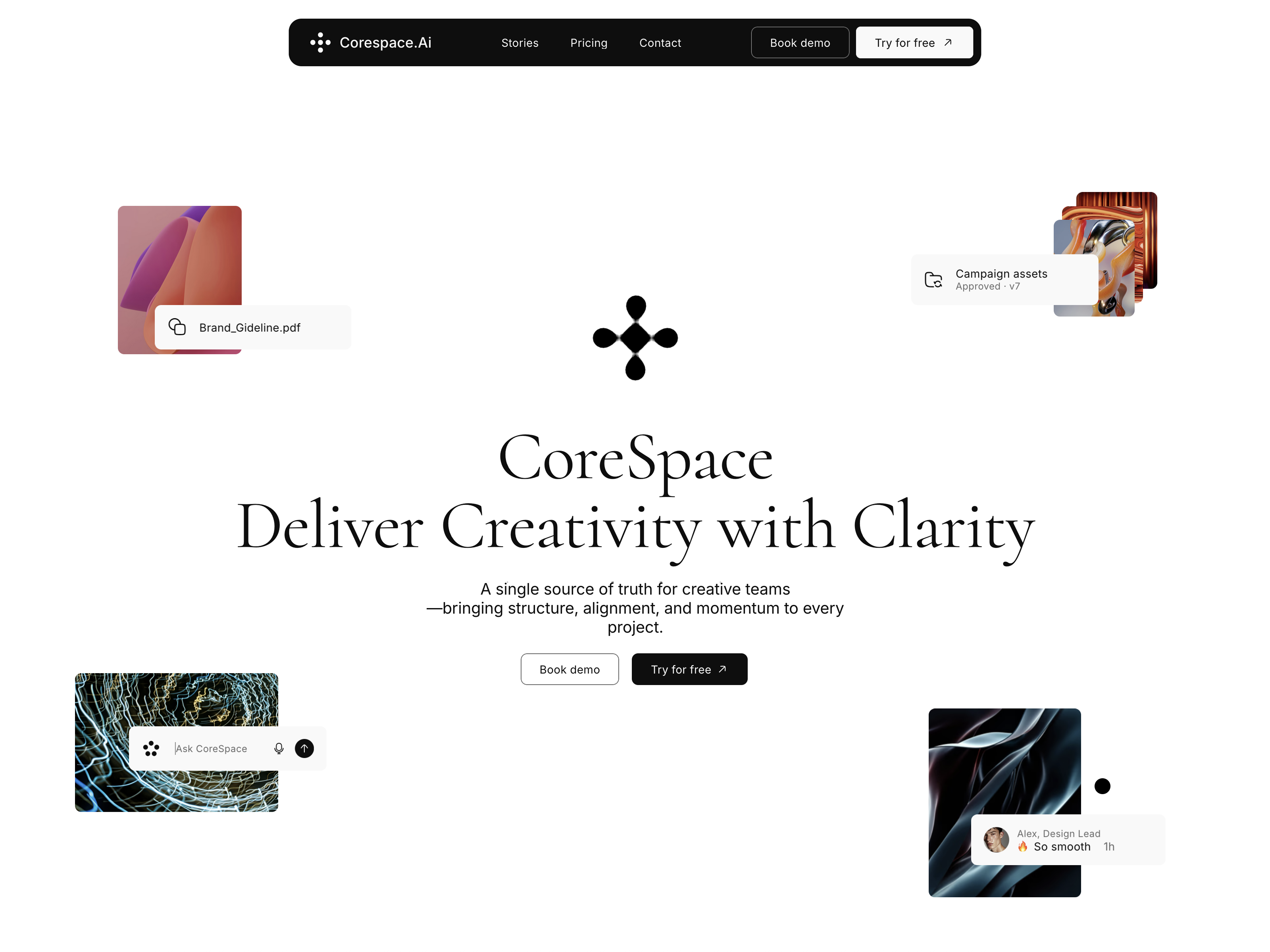
CORESPACE — Gooey Effect
Not every interaction needs a functional purpose.
Sometimes its job is simply to give the interface personality.
For CORESPACE, this little gooey interaction breaks away from the rigidity you often see in SaaS design.
Still restrained. Just a little less predictable.


