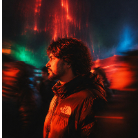
Designed a contact footer that feels like looking through a camera lens 🎞
Built this viewfinder-style contact section for Aurum — a photography portfolio template I've been working on.
The idea was simple: photographers live through a lens, so why not make the footer feel like one? The HUD overlay details, the framing corners, the minimal data layered over it — it all ties back to the identity of the person using the template.
It's functional as a contact section but it's also just… part of the aesthetic. The kind of detail that makes a portfolio feel considered rather than assembled.
Aurum is built specifically for photographers who want something editorial and intentional — not just another grid layout.
Would love to know what you think — does the concept land?

Designed a contact footer that feels like looking through a camera lens 🎞
Built this viewfinder-style contact section for Aurum — a photography portfolio template I've been working on.
The idea was simple: photographers live through a lens, so why not make the footer feel like one? The HUD overlay details, the framing corners, the minimal data layered over it — it all ties back to the identity of the person using the template.
It's functional as a contact section but it's also just… part of the aesthetic. The kind of detail that makes a portfolio feel considered rather than assembled.
Aurum is built specifically for photographers who want something editorial and intentional — not just another grid layout.
Would love to know what you think — does the concept land?